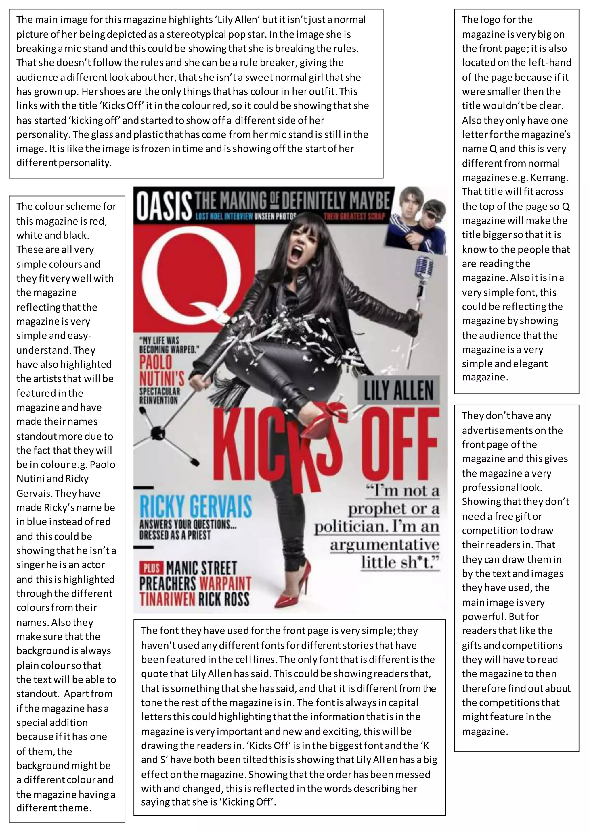
The main image forthis magazine highlights‘LilyAllen’butitisn’tjustanormal
picture of her beingdepictedasa stereotypical popstar.Inthe image she is
breakingamic stand andthiscouldbe showingthatshe isbreakingthe rules.
That she doesn’tfollow the rulesand she canbe a rule breaker,givingthe
audience adifferentlookabouther,thatshe isn’ta sweetnormal girl thatshe
has grownup. Hershoesare the onlythingsthathas colourin heroutfit.This
linkswiththe title ‘KicksOff’itinthe colourred,so it couldbe showingthatshe
has started‘kickingoff’andstartedtoshowoff a differentside of her
personality.The glassandplasticthathascome fromhermic standis still inthe
image.Itis like the image isfrozenintime andisshowingoff the startof her
differentpersonality.
The logo forthe
magazine isverybigon
the front page;itis also
locatedonthe left-hand
of the page because if it
were smallerthenthe
title wouldn’tbe clear.
Alsotheyonlyhave one
letterforthe magazine’s
name Q and thisis very
differentfromnormal
magazinese.g.Kerrang.
That title will fitacross
the top of the page so Q
magazine will make the
title biggersothatit is
know to the people that
are readingthe
magazine.Alsoitisina
verysimple font,this
couldbe reflectingthe
magazine byshowing
the audience thatthe
magazine isa very
simple andelegant
magazine.
The colour scheme for
thismagazine isred,
white andblack.
These are all very
simple coloursand
theyfitverywell with
the magazine
reflectingthatthe
magazine isvery
simple andeasy-
understand.They
have alsohighlighted
the artiststhat will be
featuredinthe
magazine andhave
made theirnames
standoutmore due to
the fact that theywill
be in coloure.g.Paolo
Nutini andRicky
Gervais.Theyhave
made Ricky’sname be
inblue insteadof red
and thiscouldbe
showingthathe isn’ta
singerhe is an actor
and thisishighlighted
throughthe different
coloursfromtheir
names.Alsothey
make sure that the
backgroundisalways
plaincoloursothat
the textwill be able to
standout. Apartfrom
if the magazine hasa
special addition
because if ithas one
of them,the
backgroundmightbe
a differentcolourand
the magazine havinga
differenttheme.
The font theyhave usedforthe frontpage isverysimple;they
haven’tusedanydifferentfontsfordifferentstoriesthathave
beenfeaturedinthe cell lines.The onlyfontthatisdifferentisthe
quote that LilyAllenhassaid.Thiscouldbe showingreadersthat,
that issomethingthatshe hassaid,and that it isdifferentfromthe
tone the rest of the magazine isin.The fontisalwaysincapital
lettersthiscouldhighlightingthatthe informationthatisinthe
magazine isveryimportantandnew andexciting,thiswill be
drawingthe readersin.‘KicksOff’isinthe biggestfontandthe ‘K
and S’have both beentiltedthisisshowingthatLilyAllenhasabig
effectonthe magazine.Showingthatthe orderhasbeenmessed
withand changed,thisisreflectedinthe wordsdescribingher
sayingthat she is‘KickingOff’.
Theydon’thave any
advertisementsonthe
frontpage of the
magazine andthis gives
the magazine a very
professionallook.
Showingthattheydon’t
needa free giftor
competitiontodraw
theirreadersin.That
theycan draw themin
by the textandimages
theyhave used,the
mainimage isvery
powerful.Butfor
readersthat like the
giftsandcompetitions
theywill have toread
the magazine tothen
therefore findoutabout
the competitionsthat
mightfeature inthe
magazine.

Q Magazine Front Page Analysis

  • 1.
    The main imageforthis magazine highlights‘LilyAllen’butitisn’tjustanormal picture of her beingdepictedasa stereotypical popstar.Inthe image she is breakingamic stand andthiscouldbe showingthatshe isbreakingthe rules. That she doesn’tfollow the rulesand she canbe a rule breaker,givingthe audience adifferentlookabouther,thatshe isn’ta sweetnormal girl thatshe has grownup. Hershoesare the onlythingsthathas colourin heroutfit.This linkswiththe title ‘KicksOff’itinthe colourred,so it couldbe showingthatshe has started‘kickingoff’andstartedtoshowoff a differentside of her personality.The glassandplasticthathascome fromhermic standis still inthe image.Itis like the image isfrozenintime andisshowingoff the startof her differentpersonality. The logo forthe magazine isverybigon the front page;itis also locatedonthe left-hand of the page because if it were smallerthenthe title wouldn’tbe clear. Alsotheyonlyhave one letterforthe magazine’s name Q and thisis very differentfromnormal magazinese.g.Kerrang. That title will fitacross the top of the page so Q magazine will make the title biggersothatit is know to the people that are readingthe magazine.Alsoitisina verysimple font,this couldbe reflectingthe magazine byshowing the audience thatthe magazine isa very simple andelegant magazine. The colour scheme for thismagazine isred, white andblack. These are all very simple coloursand theyfitverywell with the magazine reflectingthatthe magazine isvery simple andeasy- understand.They have alsohighlighted the artiststhat will be featuredinthe magazine andhave made theirnames standoutmore due to the fact that theywill be in coloure.g.Paolo Nutini andRicky Gervais.Theyhave made Ricky’sname be inblue insteadof red and thiscouldbe showingthathe isn’ta singerhe is an actor and thisishighlighted throughthe different coloursfromtheir names.Alsothey make sure that the backgroundisalways plaincoloursothat the textwill be able to standout. Apartfrom if the magazine hasa special addition because if ithas one of them,the backgroundmightbe a differentcolourand the magazine havinga differenttheme. The font theyhave usedforthe frontpage isverysimple;they haven’tusedanydifferentfontsfordifferentstoriesthathave beenfeaturedinthe cell lines.The onlyfontthatisdifferentisthe quote that LilyAllenhassaid.Thiscouldbe showingreadersthat, that issomethingthatshe hassaid,and that it isdifferentfromthe tone the rest of the magazine isin.The fontisalwaysincapital lettersthiscouldhighlightingthatthe informationthatisinthe magazine isveryimportantandnew andexciting,thiswill be drawingthe readersin.‘KicksOff’isinthe biggestfontandthe ‘K and S’have both beentiltedthisisshowingthatLilyAllenhasabig effectonthe magazine.Showingthatthe orderhasbeenmessed withand changed,thisisreflectedinthe wordsdescribingher sayingthat she is‘KickingOff’. Theydon’thave any advertisementsonthe frontpage of the magazine andthis gives the magazine a very professionallook. Showingthattheydon’t needa free giftor competitiontodraw theirreadersin.That theycan draw themin by the textandimages theyhave used,the mainimage isvery powerful.Butfor readersthat like the giftsandcompetitions theywill have toread the magazine tothen therefore findoutabout the competitionsthat mightfeature inthe magazine.