
Recommended
More Related Content
What's hot
What's hot (17)
Viewers also liked
Similar to We Love Pop Magazine Contents Page
Similar to We Love Pop Magazine Contents Page (20)
Recently uploaded
Recently uploaded (20)
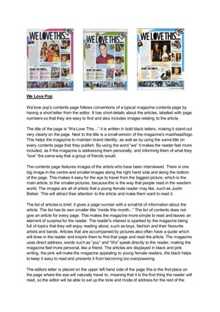
We Love Pop Magazine Contents Page
- 1. We Love Pop We love pop’s contents page follows conventions of a typical magazine contents page by having a short letter from the editor. It has short details about the articles, labelled with page numbers so that they are easy to find and also includes images relating to the article. The title of the page is “We Love This…” it is written in bold black letters, making it stand out very clearly on the page. Next to the title is a small version of the magazine's masthead/logo. This helps the magazine to maintain brand identity, as well as by using the same title on every contents page that they publish. By using the word “we” it makes the reader feel more included, as if the magazine is addressing them personally, and informing them of what they “love” the same way that a group of friends would. The contents page features images of the artists who have been interviewed. There is one big image in the centre and smaller images along the right hand side and along the bottom of the page. This makes it easy for the eye to travel from the biggest picture, which is the main article, to the smaller pictures, because this is the way that people read in the western world. The images are all of artists that a young female reader may like, such as Justin Bieber. This will attract their attention to the article and make them want to read it. The list of articles is brief, it gives a page number with a small bit of information about the article. The list has its own smaller title “inside this month...” The list of contents does not give an article for every page. This makes the magazine more simple to read and leaves an element of surprise for the reader. The reader's interest is sparked by the magazine being full of topics that they will enjoy reading about, such as boys, fashion and their favourite artists and bands. Articles that are accompanied by pictures also often have a quote which will draw in the reader and inspire them to find that page and read the article. The magazine uses direct address, words such as “you” and “We” speak directly to the reader, making the magazine feel more personal, like a friend. The articles are displayed in black and pink writing, the pink will make the magazine appealing to young female readers, the black helps to keep it easy to read and prevents it from becoming too overpowering. The editors letter is placed on the upper left hand side of the page this is the first place on the page where the eye will naturally travel to, meaning that it is the first thing the reader will read, so the editor will be able to set up the tone and mode of address for the rest of the
- 2. magazine. This also uses direct address, and informal language and slang that will appeal to young girls, such as “wow mazing.” the editor sets up a rapport by acting as if they are friends with the artists themselves, which makes the reader trust that the magazine has only the most exclusive information. They have had a picture taken “snuggled up” with the girl band, the Saturdays. This picture looks natural and unposed, which emphasizes the idea that the writer is friends with the band, further convincing the reader that the magazine has secrets that nobody else knows. The letter is signed off “Emily x” in what must be her handwriting, giving the editor's name makes the magazine feel more personal, the handwriting also giving it personality, so that the magazine feels like a friend to the reader. The layout of the contents page is almost identical on every issue of the magazine, although the colours always vary, however they are always bright colours such as pink, blue, green, and orange. This maintains brand identity whilst also preventing from becoming boring, like it would be if it was always exactly the same. The contents page has a lot of pictures which will make it more appealing to a younger reader, they appear to have used as little text as possible, to make it very easy and pleasing for a young reader. The text is very bright and bold, short concise sentences are you used to draw in the reader's attention quickly. A line of pictures at the bottom shows posters which the reader can find in the magazine, these images will catch the reader's eye and encourage them to find the page to see the full size version of the image. In some issues of the magazine puffs with things such as “for your eyes only” written in them make the reader feel as if they are being shown and told information and pictures that nobody else has seen. Overall the magazine is simple and easy for a young reader to understand, it is brightly coloured and busy to keep their attention yet it is not overpowering. The magazine has a lot of features that encourage the reader to feel like it is a friend who they are spending time with. The magazine maintains brand identity by being very similar in every issue, and also having the logo/masthead at the top right hand side of the page. The magazine is fun and youthful, and relatable for the young female target audience.