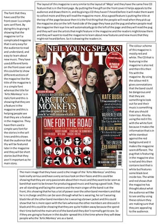
1. The colour scheme
of thismagazine is
mostlyredand
white.The CDthat is
featuringinthe
magazine isalsored
and thenthisthen
fitswiththe
magazine.Byusing
the colourred it
givesconnotations
that the band could
be dangerousand
that theyare
somethingtolook
out forand their
musicissomething
that youshould
listentoo.Alsoby
usingthe redit fits
withthe white font
because itmakesthe
informationthatisin
white standout
againstthe red
backgroundand it
makesthe magazine
seemdifferent.The
pug that isfeaturing
inthe magazine also
isred and this then
containstextthatis
white butfeatures
some blacktext
inside too.The white
and redshowsthat
the magazine has
thoughtaboutwhat
the audience willlike
to see andby using
these coloursthey
are makingsure that
theyare appealing
to the audience.
The main image thattheyhave usedisthe image of the ‘ArticMonkeys’andthey
lookreallyseriousandhave averyseriouslookontheirfacesandthiscouldbe
showingthattheyare verypassionate abouttheirmusicandtheywanttobe seenas
bandthat want to be knownforproducinggoodmusicand havinga good look.They
are all standingandfacingthe camera and the mainsingerof the band isat the
front,thisshowingthathe has a lot of power overthe otherband membersandthat
he is incharge andthis can be seenthroughwhathe is wearing,he isn’twearing
blacklike all the otherbandmembershe iswearingabrown jacketandthiscould
showthat he is more openwiththe fanswhereasthe othermembersare dressedin
blackand thiscouldbe showingthattheyare quite hiddenawaybecause the spend
theirtime behindthe mainartistof the bandand theydon’tnormallygettosee.So
if theyare goingto feature inthe double-spreadthisitthe time where theywill show
people whothe ‘ArticMonkey’are asa band.
The font that they
have usedforthe
frontcover isa simple
sans serif font.By
doingthisitsgivingit
showingthatthe
magazine isn’ta
complicatedmagazine
that isveryeasyfor
the audience toread
and understand,and
easyto learnabout
newmusic.Theyhave
useddifferentfonts
on the frontcover and
thiscouldbe to show
differentsectionsof
the magazine like the
title of the magazine is
ina simple font
whereasthe title for
‘ArticMonkeys’isin
italicfontandthis is
showingthattheyare
a feature inthe
magazine andthisis
helpingpeople see
that theyare a feature
inthe magazine.They
have thenuseda
simple sansfontfor
the storiesinthe sell
linesandthisshows
that the audience that
thy will be featured
laterinthe magazine
and theywill be short
storiesbutthat they
aren’timportantas he
mainstory.
The layoutof thismagazine isverysimilartothe layoutof ‘Mojo’and theyhave the same free CD
feature thatisin the frontpage.By puttingthe free giftonthe frontcoverit helpsappealstothe
audience anddrawsthemin,and bygivinga CD theyhaven’theardbefore itwill make themwant
to collectmore andtheywill readthe magazine more.Alsoagoodfeature isputtingthe title at
the top of the page because thenitisthe firstthingthat the people will readwhentheypickup
the magazine also onthe left-handside of the page theyhave putthe pug andwhenpeople read
the magazine theireye line will automaticallygotothe leftof the page andtheywill readthe pug
and theywill see the artiststhatmightfeature inthe magazine andthe readersmightknowthem
and theywill wanttoreadthe magazine tolearnaboutnew featuresandnew musicthatthey
mightnot heardbefore.Soitisdrawingthe readersin.