1. The title for the contents page isn’t as noticeable as it would
be in other magazines. The title is still at the top of the page
but isn’t in a massive size or in a fancy font, it’s quite simple
and out of the way and most people wouldn’t notice it. This is
could be to show off that the magazine isn’t a very bold
magazine its very simple and this could be reflecting the
collage that it’s representing. It doesn’t have a big title but it
does have big page numbers so this is something that stands
out to the people reading the magazine and they notice them
and now straight away that this is the contents page.
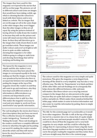
The images they have used for this
magazine correspond to the stories that
will be on that page. The pictures are all
in different colours and some are images
that would have been taking a while ago
which is showing that the school in is
touch with their history and is very
linked as a whole. The six images that
are on the page are all in the same shape
as the other images, they aren’t bigger
than the other images so they are all
equal. By using the pictures instead of
having all text it really draws the readers
in because they will see the picture and
some will stand out more than others to
them. So then they will therefore go to
the images that really draws them in and
go read that article. These images use
duller colours and aren’t as bright so will
draw in quite an older audience,
showing that magazine is for older
children going to college or sixth form
and showing them things that will be
studying and looking into.
The layout for the magazine is very
simple and this also makes it very
effective because they have placed the
images to correspond equally to the text,
making use that the images aren’t being
over powdered by text but also there is
an equal mix between text and image. By
putting the images at the top of the
magazine draws the readers in and they
will want to go and read more, also they
have kept each different section of
information is different places e.g.
contents and departments are in
different places that is split by a line.
This makes the magazine very easy to
read and very simple to work out if you
need look for any specific information.
The sub-heading for the stories don’t have a
short description, they just have one word.
This is effective because it’s making the
reader intrigued e.g. ‘Teamwork’ and
‘Making the Grade’. These sub-headings to
the readers could have a complete different
stories to what they thought and by putting
one word it’s making the readers wonder
about the article and they will want to
know the story because there isn’t a
description.
The colours used for this magazine are very simple and quite
monotone This gives the magazine a very elegant look,
showing off the detail in a very simplistic way but also a very
effective way. The title for ‘Departments’ is in black and then
all the other titles and sub-headings are in a burgundy this
helps shows the different between a title and main
information. Also these colours are a very big contrast
compare to the images that are also present on the page
because they are quite dull colours compare to the blue and
yellow and pink etc. Which makes them standout behind the
white page, which makes it easier to look at information and
also easier to read the information by putting them in simple
colours e.g. black.