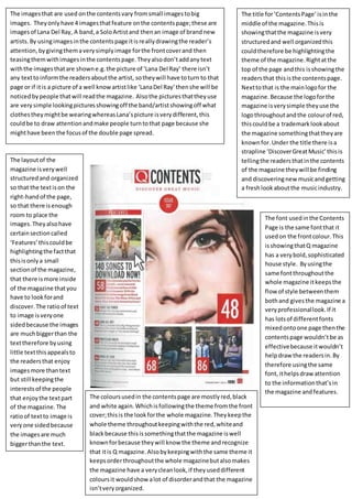
The contents page of a music magazine uses images and minimal text to draw readers' attention. There are four images of artists including Lana Del Rey. The images tease the articles without including identifying text, prompting readers to explore further. The magazine maintains a consistent and recognizable style through its simple logo, color scheme of red, black, and white, and use of the same font throughout to provide a clean, organized, and professional look.
1. The imagesthat are used onthe contentsvary fromsmall imagestobig
images. Theyonlyhave 4 imagesthatfeature onthe contentspage;these are
imagesof Lana Del Ray, A band,a SoloArtistand thenan image of brandnew
artists.By usingimagesinthe contentspage itisreallydrawingthe reader’s
attention,bygivingthemaverysimplyimage forthe frontcoverand then
teasingthemwithimagesinthe contentspage.Theyalsodon’taddanytext
withthe imagesthatare showne.g.the picture of ‘Lana Del Ray’ there isn’t
any texttoinformthe readersaboutthe artist, sotheywill have toturn to that
page or if itis a picture of a well knowartistlike ‘LanaDel Ray’thenshe will be
noticedbypeople thatwill readthe magazine. Alsothe picturesthattheyuse
are very simple lookingpicturesshowingoff the band/artistshowingoff what
clothestheymightbe wearingwhereasLana’spicture isverydifferent,this
couldbe to draw attentionandmake people turntothat page because she
mighthave beenthe focusof the double page spread.
The title for‘ContentsPage’isinthe
middle of the magazine.Thisis
showingthatthe magazine isvery
structuredand well organizedthis
couldtherefore be highlightingthe
theme of the magazine.Rightatthe
top of the page andthis isshowingthe
readersthat thisisthe contentspage.
Nexttothat is the mainlogofor the
magazine.Because the logoforthe
magazine isverysimple theyuse the
logothroughoutandthe colourof red,
thiscouldbe a trademarklookabout
the magazine somethingthattheyare
knownfor.Under the title there isa
strapline ‘DiscoverGreatMusic’thisis
tellingthe readersthatinthe contents
of the magazine theywill be finding
and discoveringnew musicandgetting
a freshlookaboutthe musicindustry.
The layoutof the
magazine isverywell
structuredand organized
so that the textison the
right-handof the page,
so that there isenough
room to place the
images.Theyalsohave
certainsectioncalled
‘Features’thiscouldbe
highlightingthe factthat
thisisonlya small
sectionof the magazine,
that there ismore inside
of the magazine thatyou
have to lookforand
discover. The ratioof text
to image isveryone
sidedbecause the images
are muchbiggerthan the
texttherefore byusing
little textthisappealsto
the readersthat enjoy
imagesmore thantext
but still keepingthe
interestsof the people
that enjoythe textpart
of the magazine.The
ratioof textto image is
veryone sidedbecause
the imagesare much
biggerthanthe text.
The coloursusedin the contentspage are mostlyred,black
and white again.Whichisfollowingthe theme fromthe front
cover;thisis the lookforthe whole magazine. Theykeepthe
whole theme throughoutkeepingwiththe red,whiteand
blackbecause thisissomethingthatthe magazine iswell
knownforbecause theywill know the theme andrecognize
that itis Q magazine.Alsobykeepingwiththe same theme it
keepsorderthroughoutthe whole magazinebutalsomakes
the magazine have a verycleanlook,if theyuseddifferent
coloursit wouldshowalot of disorderandthat the magazine
isn’tveryorganized.
The font usedinthe Contents
Page is the same fontthat it
usedon the frontcolour.This
isshowingthatQ magazine
has a verybold,sophisticated
house style. Byusingthe
same fontthroughoutthe
whole magazine itkeepsthe
flow of style betweenthem
bothand givesthe magazine a
veryprofessionallook.If it
has lotsof differentfonts
mixedontoone page thenthe
contentspage wouldn’tbe as
effectivebecause itwouldn’t
helpdraw the readersin.By
therefore usingthe same
font,ithelpsdrawattention
to the informationthat’sin
the magazine andfeatures.