
Recommended
More Related Content
What's hot
What's hot (20)
Viewers also liked
Viewers also liked (17)
Similar to Modern School Magazine Cover Design
Similar to Modern School Magazine Cover Design (20)
Recently uploaded
Recently uploaded (20)
Modern School Magazine Cover Design
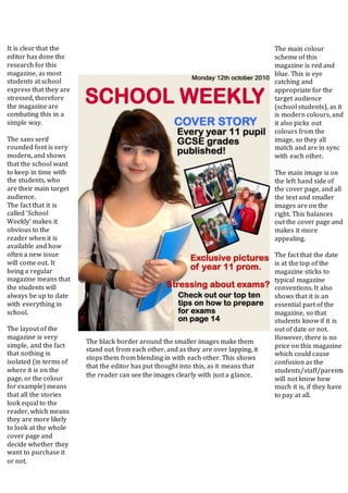
- 1. The main colour scheme of this magazine is red and blue. This is eye catching and appropriate for the target audience (school students), as it is modern colours, and it also picks out colours from the image, so they all match and are in sync with each other. The main image is on the left hand side of the cover page, and all the text and smaller images are on the right. This balances out the cover page and makes it more appealing. The fact that the date is at the top of the magazine sticks to typical magazine conventions. It also shows that it is an essential part of the magazine, so that students know if it is out of date or not. However, there is no price on this magazine which could cause confusion as the students/staff/parents will not know how much it is, if they have to pay at all. It is clear that the editor has done the research for this magazine, as most students at school express that they are stressed, therefore the magazine are combating this in a simple way. The sans serif rounded font is very modern, and shows that the school want to keep in time with the students, who are their main target audience. The fact that it is called ‘School Weekly’ makes it obvious to the reader when it is available and how often a new issue will come out. It being a regular magazine means that the students will always be up to date with everything in school. The layout of the magazine is very simple, and the fact that nothing is isolated (in terms of where it is on the page, or the colour for example) means that all the stories look equal to the reader, which means they are more likely to look at the whole cover page and decide whether they want to purchase it or not. The black border around the smaller images make them stand out from each other, and as they are over lapping, it stops them from blending in with each other. This shows that the editor has put thought into this, as it means that the reader can see the images clearly with just a glance.
- 2. The Title of this school magazine is very big and over powering which means it catches the reader’s eye, and the font is a typical school logo kind of font so fits in with the magazine genre. However, it does take the focus off of the image and the articles, which arguably could be the most important part of the magazine as it tells the readers what is inside. The skyline for this magazine is under the title, which breaks the typical conventions. Also, the colour font it is in, and the fact that it is in the shadow of the title means that it is easily lost in the magazine, and hard to see. As well as this, it is in very small font compared to the title which makes it easy to miss. The fact that the image is in the very centre is symmetrical, and could’ve potentially made a good balance, however all of the articles go down on the left hand side. This means that it is completely off balance, and it also completely obstructs the image. If they were on the other side, it wouldn’t have been so off putting as it wouldn’t have covered her face. The fact that the text also has a shadow behind it makes it even harder to read, and the orange writing is particularly difficult to understand. The magazine has kept to a colour scheme which means that it is eye catching; however the blue and range contrast each other, and don’t work well together. Also, the orange is particularly hard to read. The magazine is very empty on the left hand side, so it gives the Impression of it being unfinished, even though the other side is jam packed. The fact that the magazine has the price on the front makes it clear to the reader how much they will spend, however it is very isolated from the text, which means that the readers eye is dragged down to it, rather than reading what the articles will be about.
- 3. Overall, this magazine looks quite professional, apart from the quality of the image. The masthead is in a bluey-grey colour which is a running colour throughout the whole of the cover page. This makes it eye catching to the target audience (parents/school students), and it fits in with the school magazine genre. The image is central, so all of the cover stories and subheadings are on both sides of the image, meaning it balances out the cover page and makes it attractive and appealing to the reader. Most of the writing is in black, blue and white, however the white writing is not so easy to read as it has been placed on a light background. This means that the reader may miss out what this cover story says. The fact that the date and the price is at the very top of the page means that it is more important than even the masthead. The editor(s) may have done this as it as a school magazine, and the target audience should all know the schools name, therefore not needing to see the masthead. Clearly the date of the magazine issue is important as it lets the readers know whether it is out of date or not, and the price is also essential as it tells the reader how much they need to pay, and in this case it is free. The ‘Free’ is written in bold, black, underlined writing which shows that it is even more important than the date. This is because it means even more people will pick it up if they don’t have to pay for it. The masthead is underlined which gives the magazine a clear cut between the masthead and all the cover stories. This makes it a clear view for the reader, and means it looks less busy. The cover stories are all written in enticing ways, encouraging the reader to open up the magazine and have a look. This is particularly aimed at the students of the school, as they are more likely to be interested than their parents in ‘gossip’, ‘challenges’, and ‘battles’. It is clear from the sans serif font that it is a modern magazine, and this is done so that it appeals more to the students of the school. The caption ‘House music results are in!’, is written in sans serif, bold, capitals, which implies that it is an important story, as it is the biggest piece of text (apart from the masthead), and is very central.
- 4. Image is of a female student – this is quite stereotypical as teenage girls are seen to be coping with more stress and being more conscientious. Another reason the editor may have chosen an image of a girl as they may be seen as a better role model for students, as statistically, girls do better than boys in school. The transparency of the banners gives a modern and more professional looks which means that readers will take the magazine more seriously – as it is a school magazine, typically students won’t really want to read a school magazine however this one is very modern looking which will draw the target audience’s eyes. The fact that the skyline is at the bottom of the magazine is breaking the typical conventions however the diagonal sticker at the top is acting in its place. The fact that the two main pieces of writing (the Teenage Stress title and the actual title of the magazine) are written in a more casual, hand written font also is attractive to the target audience. It adds to the modern theme and makes it look more relatable, as if it isn’t trying too hard. The fact that it is only those two pieces of writing also makes it clear that they are the most important pieces of text – your eye is immediately drawn to them. Also, teenage stress is a huge issue nowadays at schools, and the fact that the magazine has decided to tackle that issue will also make is a very popular magazine – the editors really know what the readers want in their school magazine. The CHS stands for the school (I’m assuming). Immediately, I think that magazine isn’t a very good title for a magazine, but as it is a school magazine sold in one school, it doesn’t really need to be called anything else – what else would it be? It means it’s simple and easy to remember. The image on the right is off centre, which means that all of the writing is on the left. This is simple and effective, as it means there is a balance between the image and the text, and it is not over crowded and covering up too much of the image.