
More Related Content


Similar to Clash Magazine Double-Page Spread Analysis


Clash Magazine Double-Page Spread Analysis
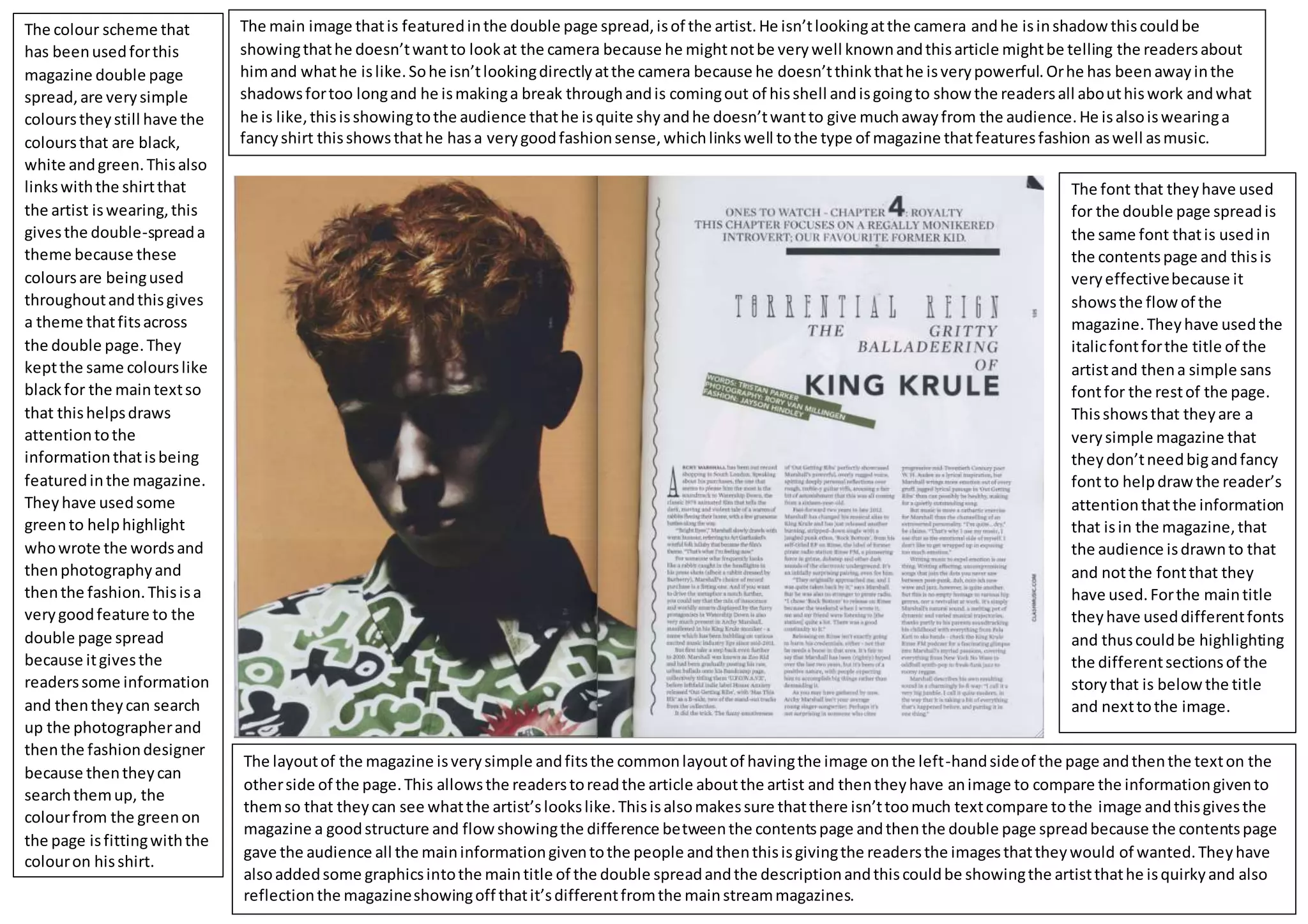
- 1. The main imagethatis featuredinthe double page spread,isof the artist.He isn’tlookingatthe camera andhe isinshadowthiscouldbe showingthathe doesn’twantto lookat the camera because he mightnotbe verywell knownandthisarticle mightbe telling the readersabout himand whathe islike.Sohe isn’tlookingdirectlyatthe camera because he doesn’tthinkthathe isverypowerful.Orhe has beenawayinthe shadowsfortoo longand he ismakinga break throughandis comingout of hisshell andisgoingto showthe readersall abouthiswork andwhat he is like,thisisshowingtothe audience thathe isquite shyandhe doesn’twantto give muchawayfrom the audience.He isalsoiswearinga fancyshirt thisshowsthathe hasa verygoodfashionsense,whichlinkswell tothe type of magazine thatfeaturesfashion aswell asmusic. The layoutof the magazine isverysimple andfitsthe commonlayoutof havingthe image onthe left-handsideof the page andthenthe texton the otherside of the page.This allowsthe readerstoreadthe article aboutthe artist and thentheyhave animage to compare the informationgivento themso that theycan see whatthe artist’slookslike.Thisisalsomakessure thatthere isn’ttoomuch textcompare tothe image andthisgivesthe magazine a goodstructure and flowshowingthe difference betweenthe contentspage andthenthe double page spreadbecause the contentspage gave the audience all the maininformationgiventothe people andthenthisisgivingthe readersthe imagesthattheywould of wanted.Theyhave alsoaddedsome graphicsintothe maintitle of the double spreadandthe descriptionandthiscouldbe showingthe artistthathe isquirkyand also reflectionthe magazineshowingoff thatit’sdifferentfromthe mainstreammagazines. The font that theyhave used for the double page spreadis the same font thatis usedin the contentspage and thisis veryeffectivebecause it showsthe flowof the magazine.Theyhave usedthe italicfontforthe title of the artistand thena simple sans fontfor the restof the page. Thisshowsthat theyare a verysimple magazine that theydon’tneedbigandfancy fontto helpdrawthe reader’s attentionthatthe information that isin the magazine,that the audience isdrawnto that and notthe fontthat they have used.Forthe maintitle theyhave useddifferentfonts and thuscouldbe highlighting the differentsectionsof the storythat is belowthe title and nexttothe image. The colour scheme that has beenusedforthis magazine double page spread,are verysimple colourstheystill have the coloursthat are black, white andgreen.Thisalso linkswiththe shirtthat the artist iswearing,this givesthe double-spreada theme because these coloursare beingused throughoutandthisgives a theme thatfitsacross the double page.They keptthe same colourslike blackfor the maintextso that thishelpsdraws attentiontothe informationthatisbeing featuredinthe magazine. Theyhave usedsome greento helphighlight whowrote the wordsand thenphotographyand thenthe fashion.Thisisa verygoodfeature to the double page spread because itgivesthe readerssome information and thentheycan search up the photographerand thenthe fashiondesigner because thentheycan searchthemup, the colourfrom the greenon the page isfittingwiththe colouron hisshirt.