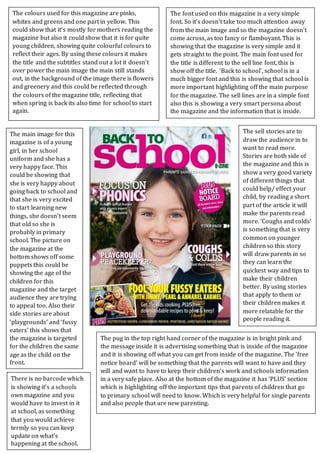
1. The colours used for this magazine are pinks,
whites and greens and one part in yellow. This
could show that it’s mostly for mothers reading the
magazine but also it could show that it is for quite
young children, showing quite colourful colours to
reflect their ages. By using these colours it makes
the title and the subtitles stand out a lot it doesn’t
over power the main image the main still stands
out, in the background of the image there is flowers
and greenery and this could be reflected through
the colours of the magazine title, reflecting that
when spring is back its also time for school to start
again.
The font used on this magazine is a very simple
font. So it’s doesn’t take too much attention away
from the main image and so the magazine doesn’t
come across, as too fancy or flamboyant. This is
showing that the magazine is very simple and it
gets straight to the point. The main font used for
the title is different to the sell line font, this is
show off the title. ‘Back to school’, school is in a
much bigger font and this is showing that school is
more important highlighting off the main purpose
for the magazine. The sell lines are in a simple font
also this is showing a very smart persona about
the magazine and the information that is inside.
The pug in the top right hand corner of the magazine is in bright pink and
the message inside it is advertising something that is inside of the magazine
and it is showing off what you can get from inside of the magazine. The ‘free
notice board’ will be something that the parents will want to have and they
will and want to have to keep their children’s work and schools information
in a very safe place. Also at the bottom of the magazine it has ‘PLUS’ section
which is highlighting off the important tips that parents of children that go
to primary school will need to know. Which is very helpful for single parents
and also people that are new parenting.
There is no barcode which
is showing it’s a schools
own magazine and you
would have to invest in it
at school, as something
that you would achieve
termly so you can keep
update on what’s
happening at the school.
The sell stories are to
draw the audience in to
want to read more.
Stories are both side of
the magazine and this is
show a very good variety
of different things that
could help/ effect your
child, by reading a short
part of the article it will
make the parents read
more. ‘Coughs and colds’
is something that is very
common on younger
children so this story
will draw parents in so
they can learn the
quickest way and tips to
make their children
better. By using stories
that apply to them or
their children makes it
more relatable for the
people reading it.
The main image for this
magazine is of a young
girl, in her school
uniform and she has a
very happy face. This
could be showing that
she is very happy about
going back to school and
that she is very excited
to start learning new
things, she doesn’t seem
that old so she is
probably in primary
school. The picture on
the magazine at the
bottom shows off some
puppets this could be
showing the age of the
children for this
magazine and the target
audience they are trying
to appeal too. Also their
side stories are about
‘playgrounds’ and ‘fussy
eaters’ this shows that
the magazine is targeted
for the children the same
age as the child on the
front.