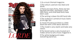
1. 1.Its a music themed magazine.
2.The colours used are red, black and
white.
3.There are many fonts, there are two
big bold red titles, and there's a few
italic fonts, and small bold fonts have
been used.
4.The writing is down the left hand side.
5.The audience is aimed at music lovers
at the age 16+.
6.I know this because there is a little
black box with a title about abortion.
7.The model is very stylish and looks very
classic.
8.The brand name is very musical so it
makes sense to call a music magazine it.
9.The white background makes
everything stand out.
2. 1.I notice that it’s about the famous singer p!nk.
2.Colours that have been used are pink, black
and white.
3.There is a bold pink font for the title, and the
rest of the fonts are either small, or not bold at
all.
4.The writing is at the top of the page and the
one word p!nk is the background of the cover.
5.The target is audience at young adults.
6.Because it’s a magazine about celebrities and
there music.
7.The model looks girly and it’s not something a
guy would pick up.
8.Yes it is typical of its brands name because its
shows what the magazine is about by the front
cover.
9. The picture of the celebrity is most effective
because it’s the biggest thing on the page and is
eye catching.
3. 1.I noticed that it’s a fashion magazine
2.Colours that are being used are mainly
yellow, blue, white, pink and black.
3.There is a number of fonts, such as;
bold title, small descriptions, and large
bold descriptions.
4.There is writing all around the outside
of the page.
5.The magazine is targeted at 13+.
6.I know this because its about the most
powerful 17 girls ages 21 and under.
7.Its a very girly magazine, not suitable
for men or boys.
8.It is typical of its brand name because
seventeen is the amount of things in the
magazine.
9.The title GIRL POWER stands out the
most because of the bold bright colour.
4. 1. Fashion magazine.
2. The colours that have been used are
yellow, blue, white, black.
3. The fonts that have been used are big and
bold but also small and not bold, they are
also all different colours.
4. The writing is at the top as the tile and
down both sides.
5. This is aimed at young adults or adults .
6. I know this because there is a section that
speaks about ‘the sex that everyone is really
having’.
7. The model is a famous magazine, called
Glamour.
8. The brand name is Glamour so its for
women so it is very typical .
9. Again the background makes everything
stand out on the page.
5. 1.Its a men magazine.
2. The colours been used are, black,
grey, yellow and white.
3. Bold fonts have been used.
4. The writing is down the left and
right.
5. The audience is targeted at young
adults mainly men.
6. I know this because its a very
manly magazine.
7. The model is a very basic layout of
a magazine cover.
8. The brand name is not relevant to
what is happening on the cover.
9. The picture in the middle really
stands out because of how big it is.
6. 1. I notice that the magazine is and advice
giving magazine.
2. The main colours that have been used are
redish purple, orange, black, white and
yellow.
3. The fonts are all the same but different
sizes and colours.
4. The writing is down the right hand side and
the left hand side and at the top.
5. the target audience is aimed at adults,
possibly 20+.
6. I know this because its about looking good
and fit, and about your appearance really
and teens and kids don’t really care about
that as much.
7. The magazine has a lot going on and has a
lot of things for you to read on the front
cover.
8. The brand name is basically the topic of the
whole magazine so it is very typical.
9. The most effective thing is the background
because it makes everything stand out.
7. 1. Its a bride magazine.
2. The colours that have been used are
white, pink, black.
3. Most of the fonts are the same apart
from the title of the magazine and the
signature at the bottom. The fonts are all
different sizes and colours as well.
4. The writing is down the left hand side and
the right hand side.
5. The target audience are brides to be.
6. I know this because it’s a bridle magazine.
7. The magazine is very girly and white, the
white shows that it’s a bridle magazine.
8. It is typical of its brand name because its
called ‘brides’ which is the whole point of
the magazine.
9. The eye catching title may be effective
because its pink and bold and stands out to
people who are planning a wedding.