Call Us 📲8800102216📞 Call Girls In DLF City Gurgaon
Magazine homepage analysis
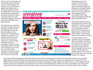
1. Colours used in the homepage are
red and pink, these are the main
colours on the homepage. The
institution may have done this to
appeal to the target audience.
Their target audience is young
teenage females so the colours are
associated with young females.
Also purple and pink are seen as
very young colours, this may
indicate the magazine is full of girly
gossip which will appeal to the
target audience.
The mast head uses a serif font,
this makes the page look formal
making the audience feel like
this homepage is serious and
their news values are true.
However, the mast head font is
designed in a way that it has a
mixture of both serif and san
serif font, this will show the
magazine is a calm homepage
and to show that their
homepage is aimed to a young
female target audience. Overall
the homepage uses a san serif
font, this is because the
homepage is aimed at a young
audience, this makes the page
look informal and interesting.
The language used on the
magazine is informal, this is
because they use rhetorical
questions and basic English, this
will appeal to the target audience
as they can read the magazine
easily, they can also understand
the homepage making it
interesting for them. Using
informal language also makes the
page look young and fresh.
Seventeen represent women as
being objects and they have to be
beautiful. For instance you see ‘girl
refined ugly’, also ‘look holiday
hot’ shows women as being
beautiful. This will appeal to the
target audience as they will find
them beautiful . Also the target
audience may want tips on beauty.
The target audience for the
magazine is young teenage girls
who are into fashion and beauty.
This is because the colours are all
pink which are stereotypically
associated with girls. Also the
written language they have used is
informal, this will appeal to a
younger audience as it is easier to
read, also this will create a younger
image for the magazine.
On the layout of the homepage the masthead is the first item you will see on the page, the institution may have done this because they want the
target audience to know their magazine is called seventeen, therefore this will create brand image for the magazine. There is a banner of links to
different sections of the newspaper, fie example fashion and beauty, this will give the target audience an insight of what is on their magazine and the
audience can pick and choose which section they want to visit. Also on the homepage there is different sections on the magazine, for instance most
popular, this will show the target audience what other viewers are reading, this may interest the audience to read what everyone else is reading.