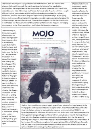
1. The colour scheme for
thiscontentspage is
quite dull coloursthis
couldbe reflectingthe
magazine andwhattype
of artistthat couldbe
featuringinthe
magazine.The dull
colourscontraststhe
redfont thatis ontoof
the image and inthe
middle of the page.By
usingthe image inblack
and white itgivesthe
artistare verydifferent
look,showingthatthere
isa verymysteriouslook
aboutthemand this
couldbe reflectingtheir
musicand whattype of
target audience they
couldbe appealingtoo.
Theyalsostick withthe
coloursthat were onthe
frontcover andby doing
thisit isgivingthe
magazine flowand
showingthatthe
magazine hasa very
goodstructure because
the themesare
throughoutthe
magazine.Byusinga
colourlike reditgiving
the magazine a very
boldlookandits making
the reader’sattention
instantlybe drawn
towardsthe textand
whatthe texthasto say.
The main image of
the contentspage is
of a younggirl and
she islookingdirectly
intothe camera. She
isrelatedtothe
quote that isto the
leftof herhead.And
thiscouldbe related
to the pose that she is
in.‘I feltlike Iwasat
the bottomof an
ocean,ThenI would
driftback up and
breathe again’.This
couldbe what the
image istryingto
symbolize therefore
by puttingherat the
bottomof the page it
isshowingthatshe is
tryingto getback up
againand above her
there are other artists
and thiscouldbe
showingthattheyare
all above of her and
theywill be getting
nearerto the top and
that’swhere she
wantsto go, so she is
makinghercome
back. Andby her
lookingatthe camera
it couldbe herlooking
at the readers
showingthatshe is
driftingbackup again
and she isbreathing
again.
The layoutof the magazine isverydifferentfromthe frontcover,ithas lesstextandithas
changedthe layout.Ithas made the mainimage be at the bottomof the page but the
backgroundof the image makesthe restof the image.Alsothathave made sure thatthe text
doesn’tconsume mostof the image andtheyare at an equal ratio.Theyalsoonlyhave a couple
of featuresinthe contentspage andthiscouldbe showingthatthe magazine isstill very
mysteriousandthisiswaythat the magazine isseenthroughthe readerseyes.Butbygiving
thema small amountof information itismakingthemwanttoreadmore andread on aboutthe
artiststhat mightfeature inthe magazine. The title of the magazine isstill atthe topand under
it hasthe date and the issue numberandthisisshowingthe readersthe magazine andkeeping
themupdatedsothat if theywantedtheycouldcollectthe issuesif theywanted.
The font that isusedforthe contentspage isverydifferentfromthe frontpage because onthe
frontpage the fontwas veryboldandall in capital letters.Thisisthe same forthe sub-titlesfor
the artiststhat are goingto be featuredinthe magazine butthe maintitle of ‘MOJO’isin a
differentfontfromthe frontcoverit isinplainblacklike before butitlookssofterandshowsthat
the magazine istakinga softapproach towardsthe readers,thisthenfitswiththe image.Under
these sub-titlestheyhave smallertextandthatthendescribesthe storythatthat wouldbe
featuringinthe magazine.The fontforthe quote that‘Corinne Bailey’saidisinadifferenttype of
fontbecause thiscouldbe showingthatshe isspeakingthisandthisishighlightingtothe reader
that itis speech.Thisgivesthe magazine averygoodflow because itisshowingthatthe textis
spiltupintodifferentsections,givingthe magazinestructure.