SlideShare a Scribd company logo
1 of 4
The typeface is consistent throughout the front
page using the same font for the masthead and
the headlines. The layout is very central with
each feature being central to the page.
An enticement has been used on the front to
cover which particularly appeals to the type of
demographic that will be reading the magazine
(parents of independent school pupils) who go
on luxury holidays and are looking for a break.
The banner used in the central part of the
magazine talks about university which is also
aimed at the independent school pupils where
the parents are probably able to afford for them
to go to university.
There is also a cover line, which makes the
statement ‘make the most of your gap year’.
This suggests that all students take a gap year
before attending university however this is not
the case, usually it is only an option for people
who can afford it.
Graphics have bee used effectively to
accentuate the enticement on the front cover. It
makes it stand out and is attractive for the
readers.
The picture used on the front cover is also
appropriate to the cover lines feature on the
front cover. It clearly shows a happy set of
pupils receiving their results. It also emphasises
the house style of the magazine.
The mode of address is very formal and is
academic which the readers of the magazine
probably expect. It also emphasises the
independent school audience.
This magazine also suggests that it has
information for students as well as pupils, which
is usually expected from magazines of the
school genre.
All the cover lines are featured at the bottom of
the magazine and with them all being in the
same typeface and colour it is difficult to
differentiate between them.
The picture also only shows girls receiving their
exam results, this could be due to the fact the
magazine is for independent schools and could
be girls only. However it is not a fair
representation of all independent schools as a
whole.
The outfits that are being worn are also typically
for a young teenage girl, so it is obvious who the
magazine is aimed at.
Again, this magazine still has a clearlayout, but
the colours used are a lot brighter and more
colourful. This reflects the image, where they
have used a young girl looking happy in
sunglasses; the bright pink colour used is
appropriate for the image.
The masthead emphasises on the word nutrition
to show what the school magazine is
predominantly about. School is used in a
different colour to still ensure emphasis on the
school element.
The magazine focuses on the picture rather than
specific articles, which are featured in the
magazine. You are not given any specific
storylines or features unlike some other
magazines that are for the same audience. I
think the magazine would be more appeal if it
did include main storylines.
The overall colour scheme on the magazine has
been kept consistently throughout with bright
pinks and yellows. You can tell that the
magazine is directed more at parents than
teachers as it features a picture of a young child
and is about school nutrition rather than things
that in the school working environment.
Overall the magazine is fairly plain and simple
with little reference to the content of the
magazine. Even the picture has little to do with
school nutrition apart from looking healthy and
happy, it does not include any nutritional
images of healthy food etc.
No advertorial content is used on the magazine
either; it’s very much just an advisory magazine
for schools.
The typeface is consistent for the cover line, but
the different font used for the masthead and
banner makes sure that you can differentiate
between the two.
The magazine also appears to be a hybrid, as it
appears to include information about schools
with health and nutrition included.
The overall house style is also very feminine
using bright pinks and other bright shades. The
little girl used on the cover also further
empathises the feminine aspect.
The masthead at the top of the magazine has
created a brand identity for the magazine and
you can easily tell front the offset which niche
audience is going to be reading the magazine.
The strapline underneath the masthead also
physically tells us specifically what audience the
magazine is directed at. ‘A parents guide to
primary school’ this allows the audience to
know exactly who and what the magazine is for.
The main image used is appropriate for the
magazine showing a primary school child and is
clearly relatable to the content of the magazine
itself.
All the cover lines are featured in the same
typeface so you are attracted to the main
articles in the magazine. Graphics have also
been used to accentuate these headlines by
using arrows almost like bullet points and
feature the main stories.
The magazine also includes enticements such as
free recipes and a notice board feature. This
makes the target audiences want to buy the
magazine.
A lure is used at the bottom of the magazine
with a picture also being included. The typeface
is also different to the cover lines so it is a main
feature of the magazine itself.
Despite having a niche audience in the fact that
it is mainly directed at parents who have
children at primary schools, it appeals to a mass
market from different social classes and
backgrounds.
The mode of address to the audience is direct
and quite chatty, they use casual language such
as ‘fussy’ and plays on words like using
alliteration with ‘playground peacekeeper’.
Again the house style of this magazine is
feminine. It suggests that it will be mainly
mothers that will read this magazine; this is
reflective in the cover lines as well.
The close up shot of the girl shows her smiling
and looking happy. This promotes the magazine
well, as it suggesting that the information
contained in the magazine will help with a
child’s school life.
The magazine overall is very plain and simple.
You can tell immediately what the magazine is
about with the help of the bold typeface and
also includes a picture, which is appropriate for
a school magazine.
The same font is used continuously for all the
titles and subtitles. This is in keeping with the
house style of the magazine and keeps to the
plain and simple theme.
The white background has worked effectively to
bring your attention to the picture and the main
articles, which are included in the magazine. The
fonts, wording and pictures are perfect for the
target audience of this magazine. Which is
clearly secondary school teachers (hence the
title.) This will be an age demographic of
between 24 upwards, and the simple layout
appeals to this wide age range.
Along the skyline of the magazine features key
articles which are included in the text. This
makes it clear and easy for people to see what is
in the magazine and whether they are
interested in buying it/reading what’s inside.
The fact that they are in different colours also
helps you differentiate between each topic. The
way that each story is separated is also very
clean and tidy.
The picture used is very much appropriate of the
topic, as it is talking about how year 10 pupils
thrive on apprenticeships. So by using an image
of a young girl in part school uniform and part
doctor’s uniform is representative of the main
topic.
An incentive is also featured on the magazine,
where it talks about winning an iPod. This is an
unusual feature on a teacher’s magazine as they
predominantly include non-fiction articles and
tend to be more factual, rarely including items
like competitions.
The target audience for this magazine is also
very obvious due to the title of the magazine,
however does limit the audience to a certain
group of people, rather than all teachers in
general it is specifically forsecondary education.
This is further emphasised by the features and
topics on the cover. The masthead is a predominant feature of the
magazine, and gives the target audience away
straight away being self-explanatory. The
shading colour of the title also makes it different
from the other text, which is in one block colour.

More Related Content

What's hot

Research of how the target audience is met from 2x front covers and 2x conten...
Research of how the target audience is met from 2x front covers and 2x conten...Research of how the target audience is met from 2x front covers and 2x conten...
Research of how the target audience is met from 2x front covers and 2x conten...kylemcgarveyy1
 
Evaluation
EvaluationEvaluation
Evaluationmediafan
 
Research on magazines! media
Research on magazines! mediaResearch on magazines! media
Research on magazines! mediaHollySheldon
 
Front Page Magazine Analysis
Front Page Magazine Analysis Front Page Magazine Analysis
Front Page Magazine Analysis tiastubbs
 
Peliminary Task Media
Peliminary Task MediaPeliminary Task Media
Peliminary Task Mediabell101
 
Preliminary Task Jamie Dear
Preliminary Task Jamie DearPreliminary Task Jamie Dear
Preliminary Task Jamie Dearjamiedear
 
Media coursework preliminary task
Media coursework preliminary taskMedia coursework preliminary task
Media coursework preliminary taskbell101
 
Preliminary Task
Preliminary Task Preliminary Task
Preliminary Task maisiejessie2
 
Media ppt presentation
Media ppt presentationMedia ppt presentation
Media ppt presentationNaomiclarkexx
 
School magazine analysis FINAL
School magazine analysis FINALSchool magazine analysis FINAL
School magazine analysis FINALhollywyemedia
 
Preliminary Magazine Research 2
Preliminary Magazine Research 2Preliminary Magazine Research 2
Preliminary Magazine Research 2Biddulph High School
 
School magazine annalasyse
School magazine annalasyseSchool magazine annalasyse
School magazine annalasyselwica1999
 
Preliminary Task
Preliminary TaskPreliminary Task
Preliminary TaskHarmonyDulay
 
School magazine annotations powerpoint
School magazine annotations powerpointSchool magazine annotations powerpoint
School magazine annotations powerpointMsiscar76
 
Evaluation
EvaluationEvaluation
Evaluationstephbeal98
 
Preliminary task
Preliminary taskPreliminary task
Preliminary taskA99elpula
 
Preliminary task
Preliminary taskPreliminary task
Preliminary taskA99elpula
 

What's hot (19)

Research of how the target audience is met from 2x front covers and 2x conten...
Research of how the target audience is met from 2x front covers and 2x conten...Research of how the target audience is met from 2x front covers and 2x conten...
Research of how the target audience is met from 2x front covers and 2x conten...
 
Evaluation
EvaluationEvaluation
Evaluation
 
Research on magazines! media
Research on magazines! mediaResearch on magazines! media
Research on magazines! media
 
Preliminary Task
Preliminary TaskPreliminary Task
Preliminary Task
 
Front Page Magazine Analysis
Front Page Magazine Analysis Front Page Magazine Analysis
Front Page Magazine Analysis
 
Peliminary Task Media
Peliminary Task MediaPeliminary Task Media
Peliminary Task Media
 
Preliminary Task Jamie Dear
Preliminary Task Jamie DearPreliminary Task Jamie Dear
Preliminary Task Jamie Dear
 
Media coursework preliminary task
Media coursework preliminary taskMedia coursework preliminary task
Media coursework preliminary task
 
Preliminary Task
Preliminary Task Preliminary Task
Preliminary Task
 
Task 10
Task 10Task 10
Task 10
 
Media ppt presentation
Media ppt presentationMedia ppt presentation
Media ppt presentation
 
School magazine analysis FINAL
School magazine analysis FINALSchool magazine analysis FINAL
School magazine analysis FINAL
 
Preliminary Magazine Research 2
Preliminary Magazine Research 2Preliminary Magazine Research 2
Preliminary Magazine Research 2
 
School magazine annalasyse
School magazine annalasyseSchool magazine annalasyse
School magazine annalasyse
 
Preliminary Task
Preliminary TaskPreliminary Task
Preliminary Task
 
School magazine annotations powerpoint
School magazine annotations powerpointSchool magazine annotations powerpoint
School magazine annotations powerpoint
 
Evaluation
EvaluationEvaluation
Evaluation
 
Preliminary task
Preliminary taskPreliminary task
Preliminary task
 
Preliminary task
Preliminary taskPreliminary task
Preliminary task
 

Viewers also liked

Mobile Marketing
Mobile MarketingMobile Marketing
Mobile MarketingElla Carpenter
 
Balancing performance, accuracy
Balancing performance, accuracyBalancing performance, accuracy
Balancing performance, accuracyshakas007
 
Hhs 497 entire course
Hhs 497 entire courseHhs 497 entire course
Hhs 497 entire courseaqlafuncfart1974
 
Oruta privacy preserving public auditing
Oruta privacy preserving public auditingOruta privacy preserving public auditing
Oruta privacy preserving public auditingshakas007
 
Peligros de la internet
Peligros de la internetPeligros de la internet
Peligros de la internetYamel222
 
Dites frases refranys
Dites frases refranysDites frases refranys
Dites frases refranysannaariadna
 
Non conventional source of energy
Non conventional source of energyNon conventional source of energy
Non conventional source of energysreegillal
 
Neisseriacea and bacillus spp
Neisseriacea and bacillus sppNeisseriacea and bacillus spp
Neisseriacea and bacillus sppRica Joy Pontilar
 
Alexa kitchengsresume 7.24.15
Alexa kitchengsresume 7.24.15Alexa kitchengsresume 7.24.15
Alexa kitchengsresume 7.24.15Alexa Kitchengs
 

Viewers also liked (11)

Mobile Marketing
Mobile MarketingMobile Marketing
Mobile Marketing
 
Balancing performance, accuracy
Balancing performance, accuracyBalancing performance, accuracy
Balancing performance, accuracy
 
Hhs 497 entire course
Hhs 497 entire courseHhs 497 entire course
Hhs 497 entire course
 
Tu vida soñada
Tu vida soñadaTu vida soñada
Tu vida soñada
 
Oruta privacy preserving public auditing
Oruta privacy preserving public auditingOruta privacy preserving public auditing
Oruta privacy preserving public auditing
 
Peligros de la internet
Peligros de la internetPeligros de la internet
Peligros de la internet
 
Ebook site
Ebook siteEbook site
Ebook site
 
Dites frases refranys
Dites frases refranysDites frases refranys
Dites frases refranys
 
Non conventional source of energy
Non conventional source of energyNon conventional source of energy
Non conventional source of energy
 
Neisseriacea and bacillus spp
Neisseriacea and bacillus sppNeisseriacea and bacillus spp
Neisseriacea and bacillus spp
 
Alexa kitchengsresume 7.24.15
Alexa kitchengsresume 7.24.15Alexa kitchengsresume 7.24.15
Alexa kitchengsresume 7.24.15
 

Similar to School Annotations

Magazines
MagazinesMagazines
MagazinesAmy Jayne
 
Music magazine research
Music magazine research Music magazine research
Music magazine research kathrynpalos
 
Magazine deconstruction
Magazine deconstructionMagazine deconstruction
Magazine deconstructionLauraJaneLee
 
School magazine analysis
School magazine analysisSchool magazine analysis
School magazine analysisKlarasa098
 
Media Magazine Front Page Three
Media Magazine Front Page ThreeMedia Magazine Front Page Three
Media Magazine Front Page Three_hayley_
 
School magazine analysis
School magazine analysisSchool magazine analysis
School magazine analysisJ_h45
 
My school magazine
My school magazineMy school magazine
My school magazineimogenbav
 
My school magazine
My school magazineMy school magazine
My school magazineimogenbav
 
My school magazine
My school magazineMy school magazine
My school magazineimogenbav
 
My school magazine
My school magazineMy school magazine
My school magazineimogenbav
 
Deconstruction of school magazines
Deconstruction of school magazinesDeconstruction of school magazines
Deconstruction of school magazinesannaloynsasmedia
 
Annotation of school magazine
Annotation of school magazine Annotation of school magazine
Annotation of school magazine 10ADunne
 
Evaluation
EvaluationEvaluation
Evaluationmediafan
 
3. deconstruction of a school magazine cover
3. deconstruction of a school magazine cover3. deconstruction of a school magazine cover
3. deconstruction of a school magazine coverbroadleythomas6027
 
Media Preliminary Task - School Magazine
Media Preliminary Task - School MagazineMedia Preliminary Task - School Magazine
Media Preliminary Task - School MagazineJackMungeMedia
 
Preliminary task
Preliminary taskPreliminary task
Preliminary taskaarons0902
 
School Magazine Evaluation
School  Magazine EvaluationSchool  Magazine Evaluation
School Magazine EvaluationDAshtonWellman
 
School Magazine Evaluation
School  Magazine EvaluationSchool  Magazine Evaluation
School Magazine EvaluationDAshtonWellman
 

Similar to School Annotations (20)

Magazines
MagazinesMagazines
Magazines
 
Music magazine research
Music magazine research Music magazine research
Music magazine research
 
Magazine deconstruction
Magazine deconstructionMagazine deconstruction
Magazine deconstruction
 
School magazine analysis
School magazine analysisSchool magazine analysis
School magazine analysis
 
School magazine
School magazine School magazine
School magazine
 
Media Magazine Front Page Three
Media Magazine Front Page ThreeMedia Magazine Front Page Three
Media Magazine Front Page Three
 
School magazine analysis
School magazine analysisSchool magazine analysis
School magazine analysis
 
My school magazine
My school magazineMy school magazine
My school magazine
 
My school magazine
My school magazineMy school magazine
My school magazine
 
My school magazine
My school magazineMy school magazine
My school magazine
 
My school magazine
My school magazineMy school magazine
My school magazine
 
Magazine cover 1
Magazine cover 1Magazine cover 1
Magazine cover 1
 
Deconstruction of school magazines
Deconstruction of school magazinesDeconstruction of school magazines
Deconstruction of school magazines
 
Annotation of school magazine
Annotation of school magazine Annotation of school magazine
Annotation of school magazine
 
Evaluation
EvaluationEvaluation
Evaluation
 
3. deconstruction of a school magazine cover
3. deconstruction of a school magazine cover3. deconstruction of a school magazine cover
3. deconstruction of a school magazine cover
 
Media Preliminary Task - School Magazine
Media Preliminary Task - School MagazineMedia Preliminary Task - School Magazine
Media Preliminary Task - School Magazine
 
Preliminary task
Preliminary taskPreliminary task
Preliminary task
 
School Magazine Evaluation
School  Magazine EvaluationSchool  Magazine Evaluation
School Magazine Evaluation
 
School Magazine Evaluation
School  Magazine EvaluationSchool  Magazine Evaluation
School Magazine Evaluation
 

School Annotations

  • 1. The typeface is consistent throughout the front page using the same font for the masthead and the headlines. The layout is very central with each feature being central to the page. An enticement has been used on the front to cover which particularly appeals to the type of demographic that will be reading the magazine (parents of independent school pupils) who go on luxury holidays and are looking for a break. The banner used in the central part of the magazine talks about university which is also aimed at the independent school pupils where the parents are probably able to afford for them to go to university. There is also a cover line, which makes the statement ‘make the most of your gap year’. This suggests that all students take a gap year before attending university however this is not the case, usually it is only an option for people who can afford it. Graphics have bee used effectively to accentuate the enticement on the front cover. It makes it stand out and is attractive for the readers. The picture used on the front cover is also appropriate to the cover lines feature on the front cover. It clearly shows a happy set of pupils receiving their results. It also emphasises the house style of the magazine. The mode of address is very formal and is academic which the readers of the magazine probably expect. It also emphasises the independent school audience. This magazine also suggests that it has information for students as well as pupils, which is usually expected from magazines of the school genre. All the cover lines are featured at the bottom of the magazine and with them all being in the same typeface and colour it is difficult to differentiate between them. The picture also only shows girls receiving their exam results, this could be due to the fact the magazine is for independent schools and could be girls only. However it is not a fair representation of all independent schools as a whole. The outfits that are being worn are also typically for a young teenage girl, so it is obvious who the magazine is aimed at.
  • 2. Again, this magazine still has a clearlayout, but the colours used are a lot brighter and more colourful. This reflects the image, where they have used a young girl looking happy in sunglasses; the bright pink colour used is appropriate for the image. The masthead emphasises on the word nutrition to show what the school magazine is predominantly about. School is used in a different colour to still ensure emphasis on the school element. The magazine focuses on the picture rather than specific articles, which are featured in the magazine. You are not given any specific storylines or features unlike some other magazines that are for the same audience. I think the magazine would be more appeal if it did include main storylines. The overall colour scheme on the magazine has been kept consistently throughout with bright pinks and yellows. You can tell that the magazine is directed more at parents than teachers as it features a picture of a young child and is about school nutrition rather than things that in the school working environment. Overall the magazine is fairly plain and simple with little reference to the content of the magazine. Even the picture has little to do with school nutrition apart from looking healthy and happy, it does not include any nutritional images of healthy food etc. No advertorial content is used on the magazine either; it’s very much just an advisory magazine for schools. The typeface is consistent for the cover line, but the different font used for the masthead and banner makes sure that you can differentiate between the two. The magazine also appears to be a hybrid, as it appears to include information about schools with health and nutrition included. The overall house style is also very feminine using bright pinks and other bright shades. The little girl used on the cover also further empathises the feminine aspect.
  • 3. The masthead at the top of the magazine has created a brand identity for the magazine and you can easily tell front the offset which niche audience is going to be reading the magazine. The strapline underneath the masthead also physically tells us specifically what audience the magazine is directed at. ‘A parents guide to primary school’ this allows the audience to know exactly who and what the magazine is for. The main image used is appropriate for the magazine showing a primary school child and is clearly relatable to the content of the magazine itself. All the cover lines are featured in the same typeface so you are attracted to the main articles in the magazine. Graphics have also been used to accentuate these headlines by using arrows almost like bullet points and feature the main stories. The magazine also includes enticements such as free recipes and a notice board feature. This makes the target audiences want to buy the magazine. A lure is used at the bottom of the magazine with a picture also being included. The typeface is also different to the cover lines so it is a main feature of the magazine itself. Despite having a niche audience in the fact that it is mainly directed at parents who have children at primary schools, it appeals to a mass market from different social classes and backgrounds. The mode of address to the audience is direct and quite chatty, they use casual language such as ‘fussy’ and plays on words like using alliteration with ‘playground peacekeeper’. Again the house style of this magazine is feminine. It suggests that it will be mainly mothers that will read this magazine; this is reflective in the cover lines as well. The close up shot of the girl shows her smiling and looking happy. This promotes the magazine well, as it suggesting that the information contained in the magazine will help with a child’s school life.
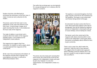
  • 4. The magazine overall is very plain and simple. You can tell immediately what the magazine is about with the help of the bold typeface and also includes a picture, which is appropriate for a school magazine. The same font is used continuously for all the titles and subtitles. This is in keeping with the house style of the magazine and keeps to the plain and simple theme. The white background has worked effectively to bring your attention to the picture and the main articles, which are included in the magazine. The fonts, wording and pictures are perfect for the target audience of this magazine. Which is clearly secondary school teachers (hence the title.) This will be an age demographic of between 24 upwards, and the simple layout appeals to this wide age range. Along the skyline of the magazine features key articles which are included in the text. This makes it clear and easy for people to see what is in the magazine and whether they are interested in buying it/reading what’s inside. The fact that they are in different colours also helps you differentiate between each topic. The way that each story is separated is also very clean and tidy. The picture used is very much appropriate of the topic, as it is talking about how year 10 pupils thrive on apprenticeships. So by using an image of a young girl in part school uniform and part doctor’s uniform is representative of the main topic. An incentive is also featured on the magazine, where it talks about winning an iPod. This is an unusual feature on a teacher’s magazine as they predominantly include non-fiction articles and tend to be more factual, rarely including items like competitions. The target audience for this magazine is also very obvious due to the title of the magazine, however does limit the audience to a certain group of people, rather than all teachers in general it is specifically forsecondary education. This is further emphasised by the features and topics on the cover. The masthead is a predominant feature of the magazine, and gives the target audience away straight away being self-explanatory. The shading colour of the title also makes it different from the other text, which is in one block colour.