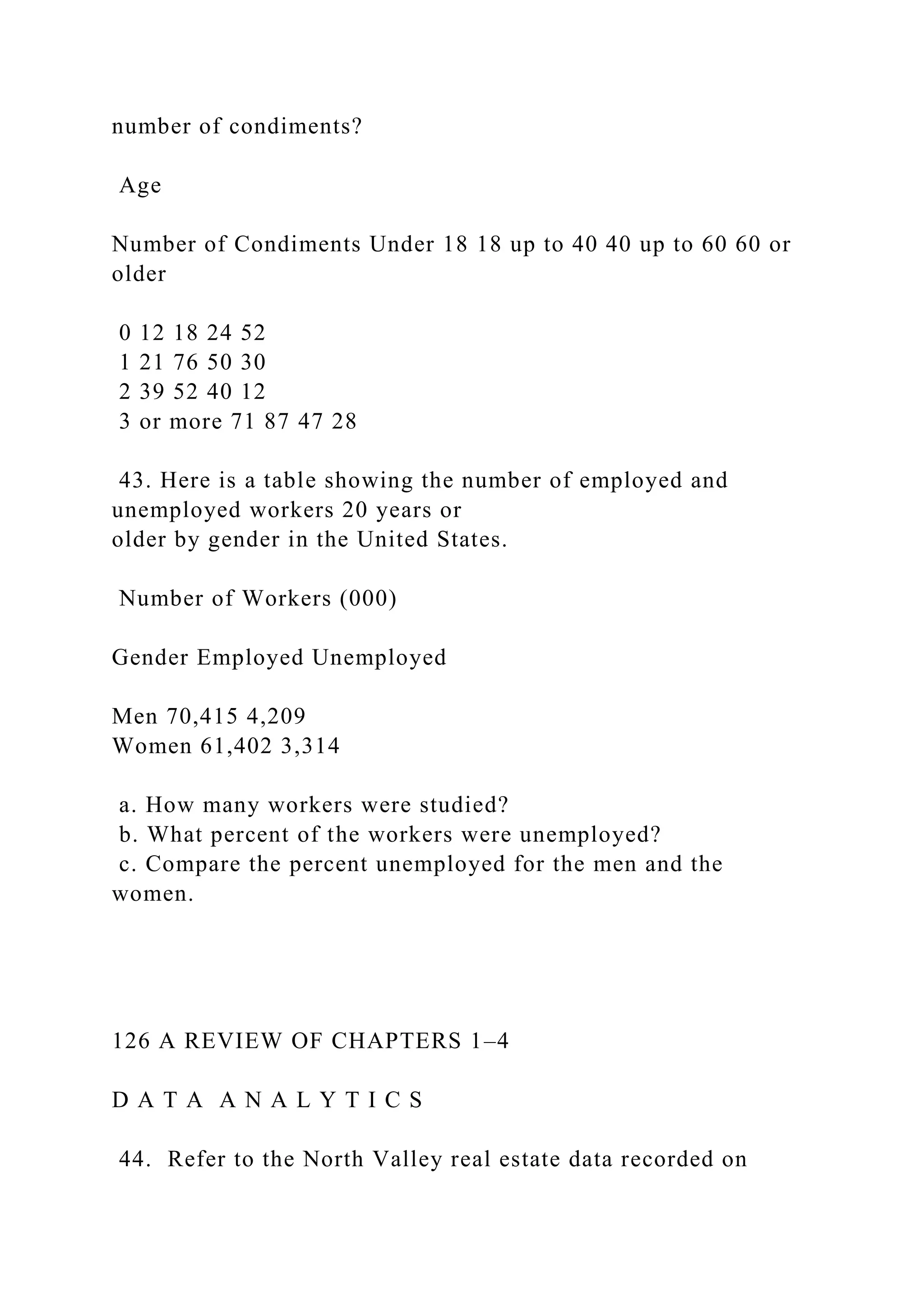
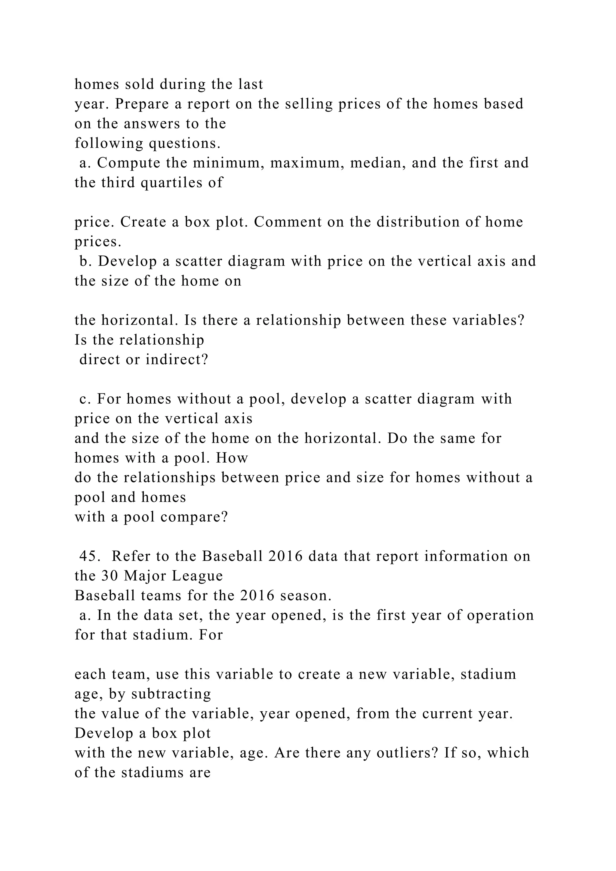
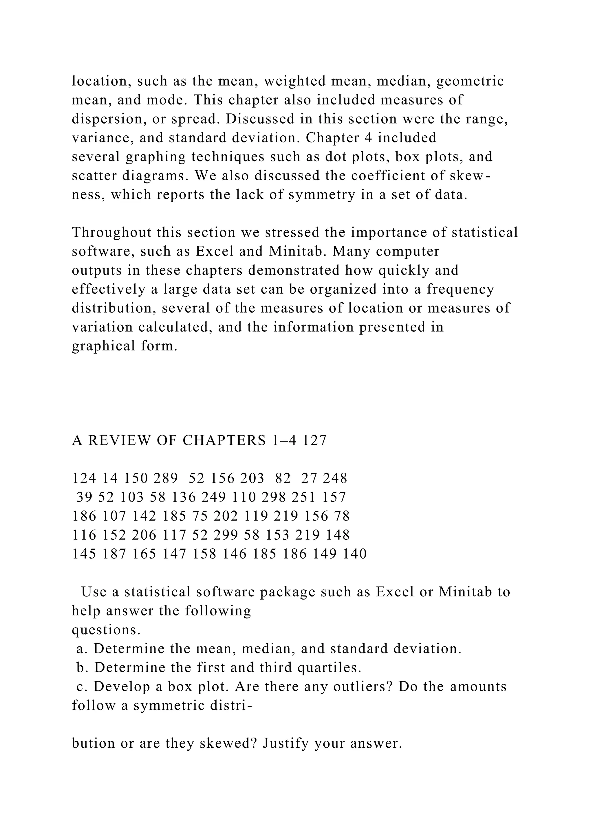
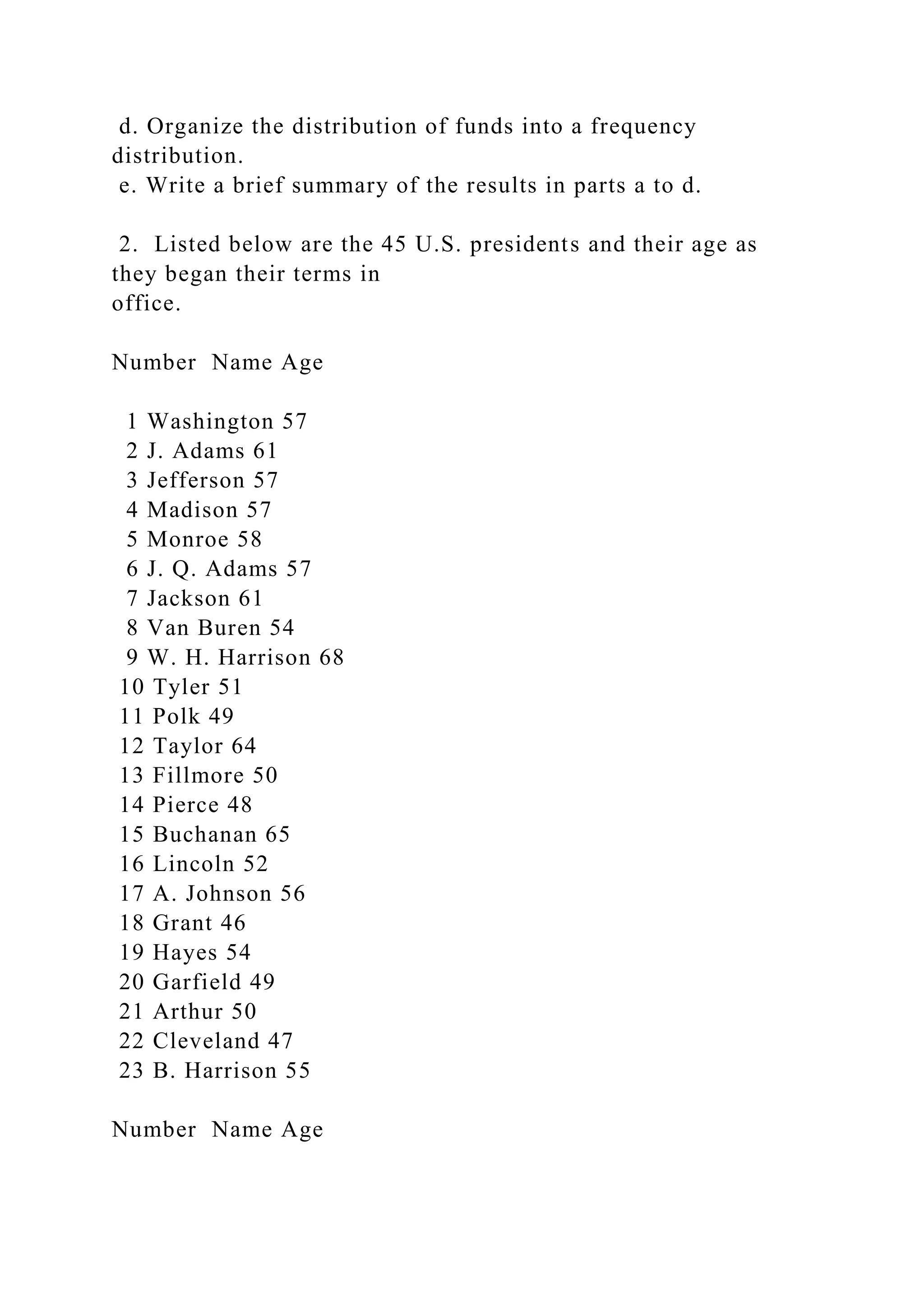
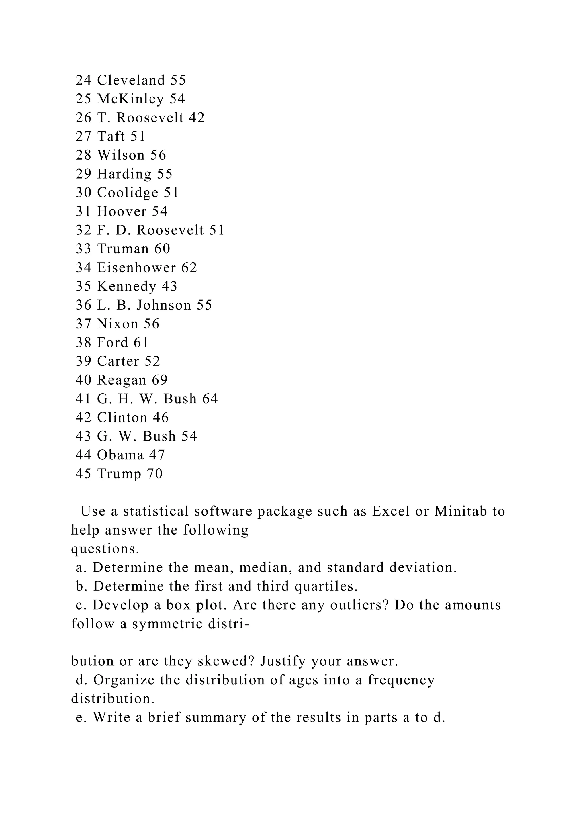
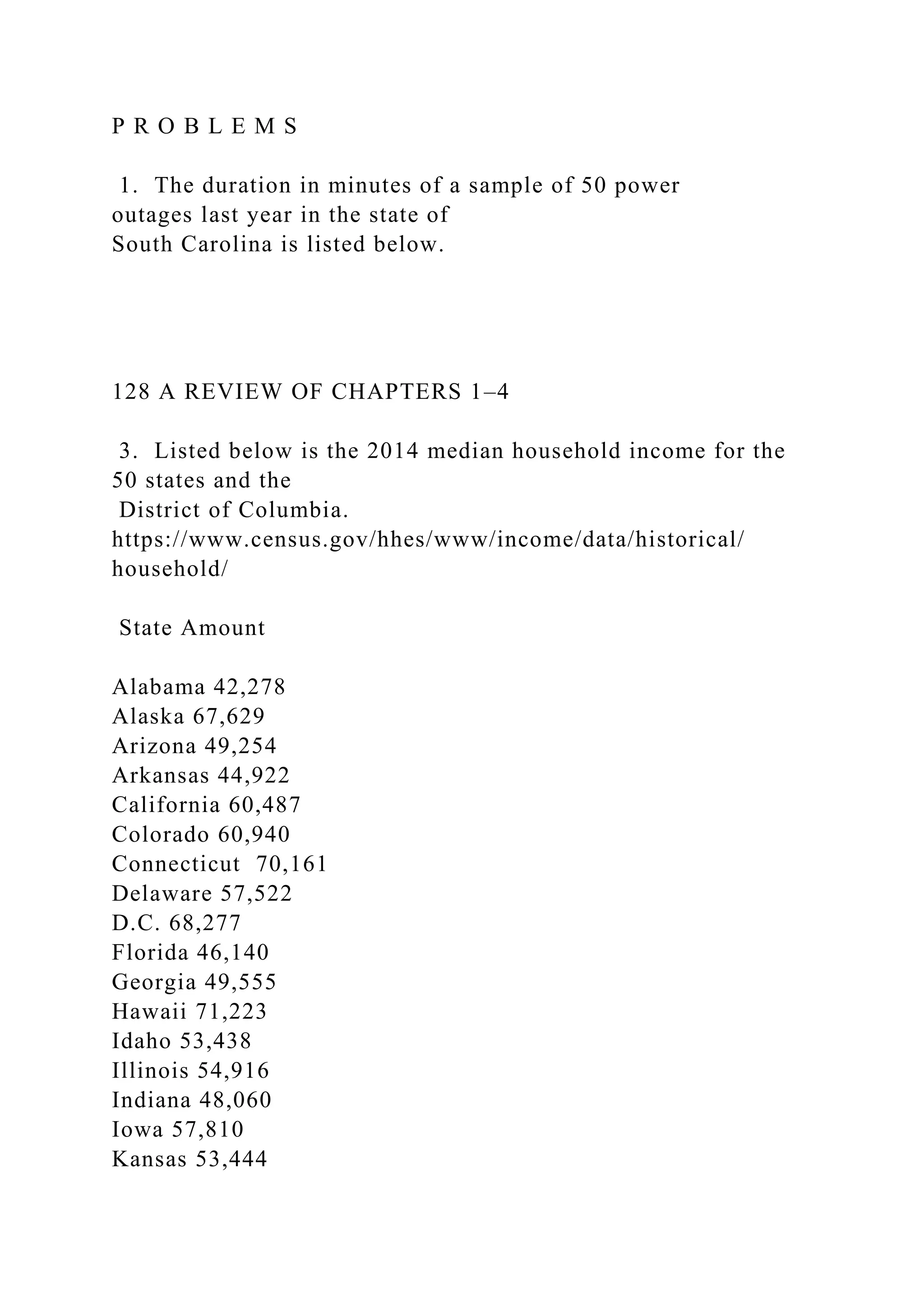
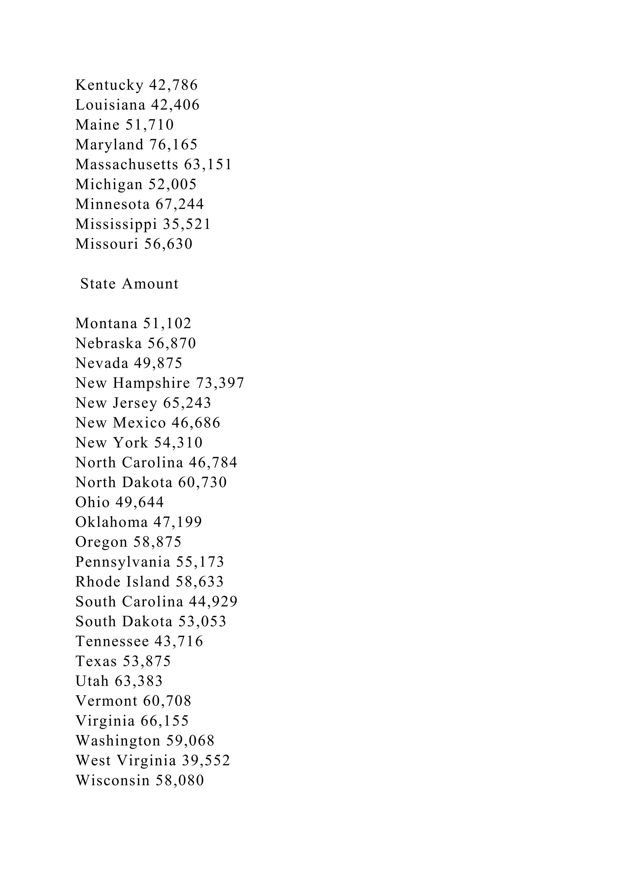
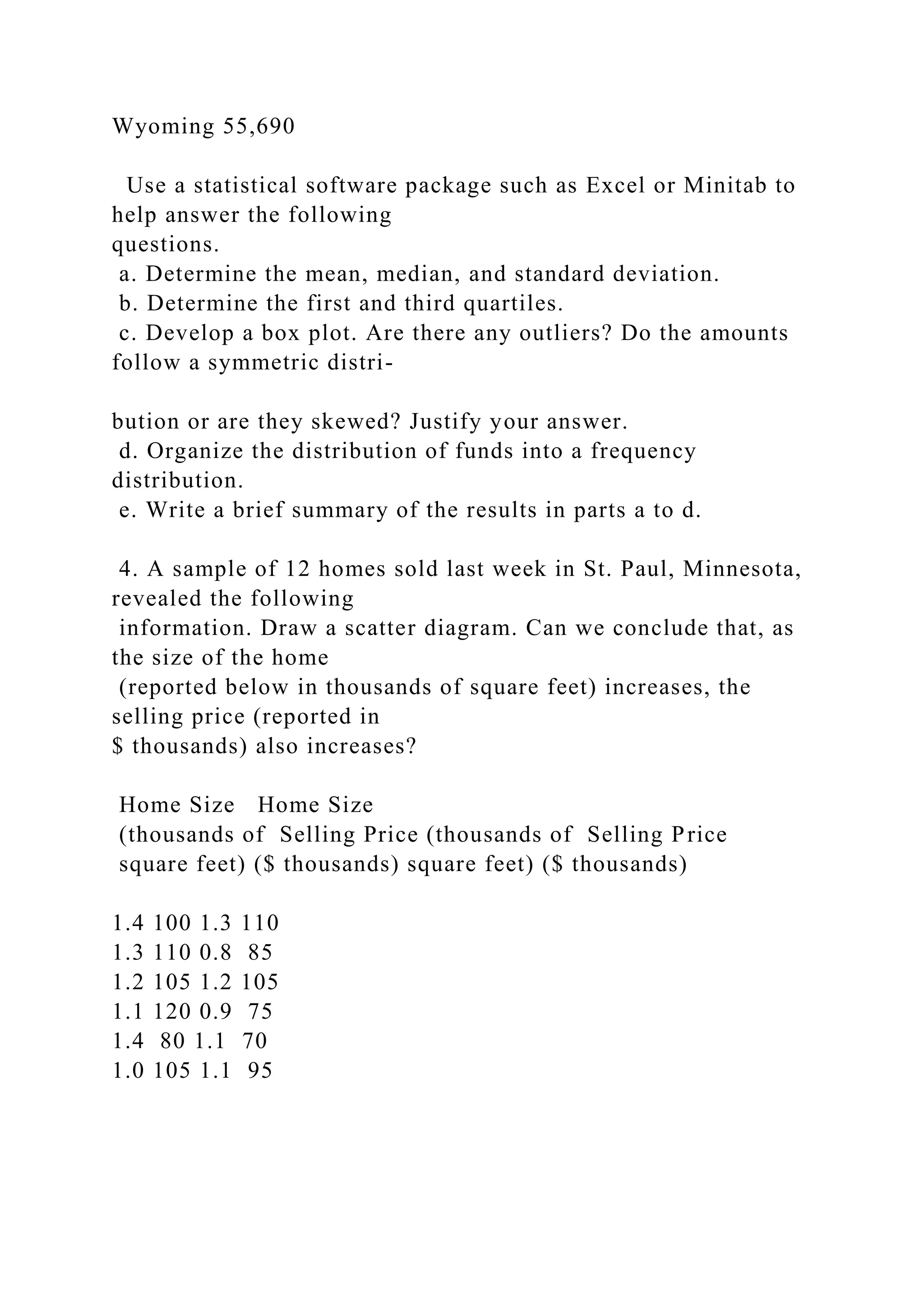
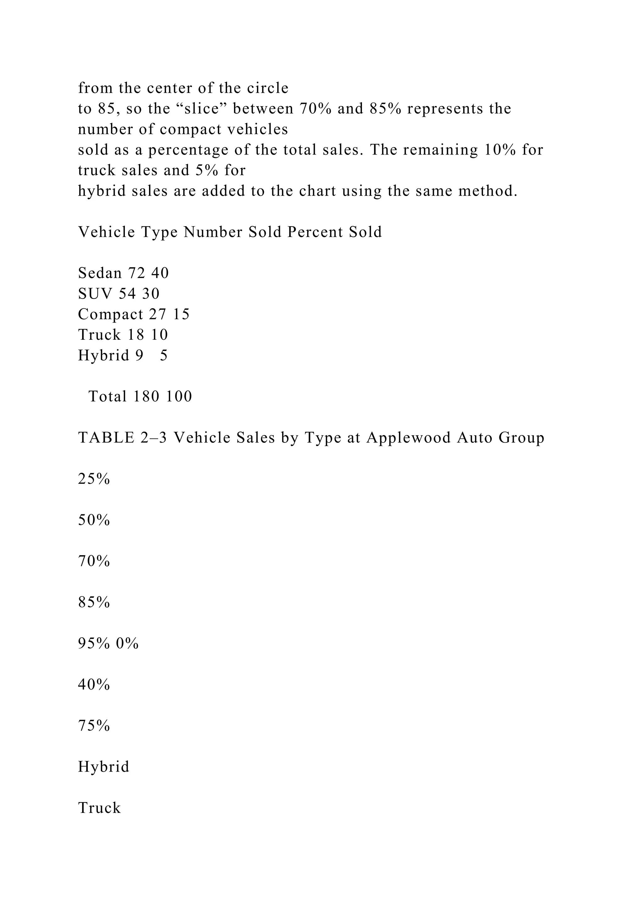
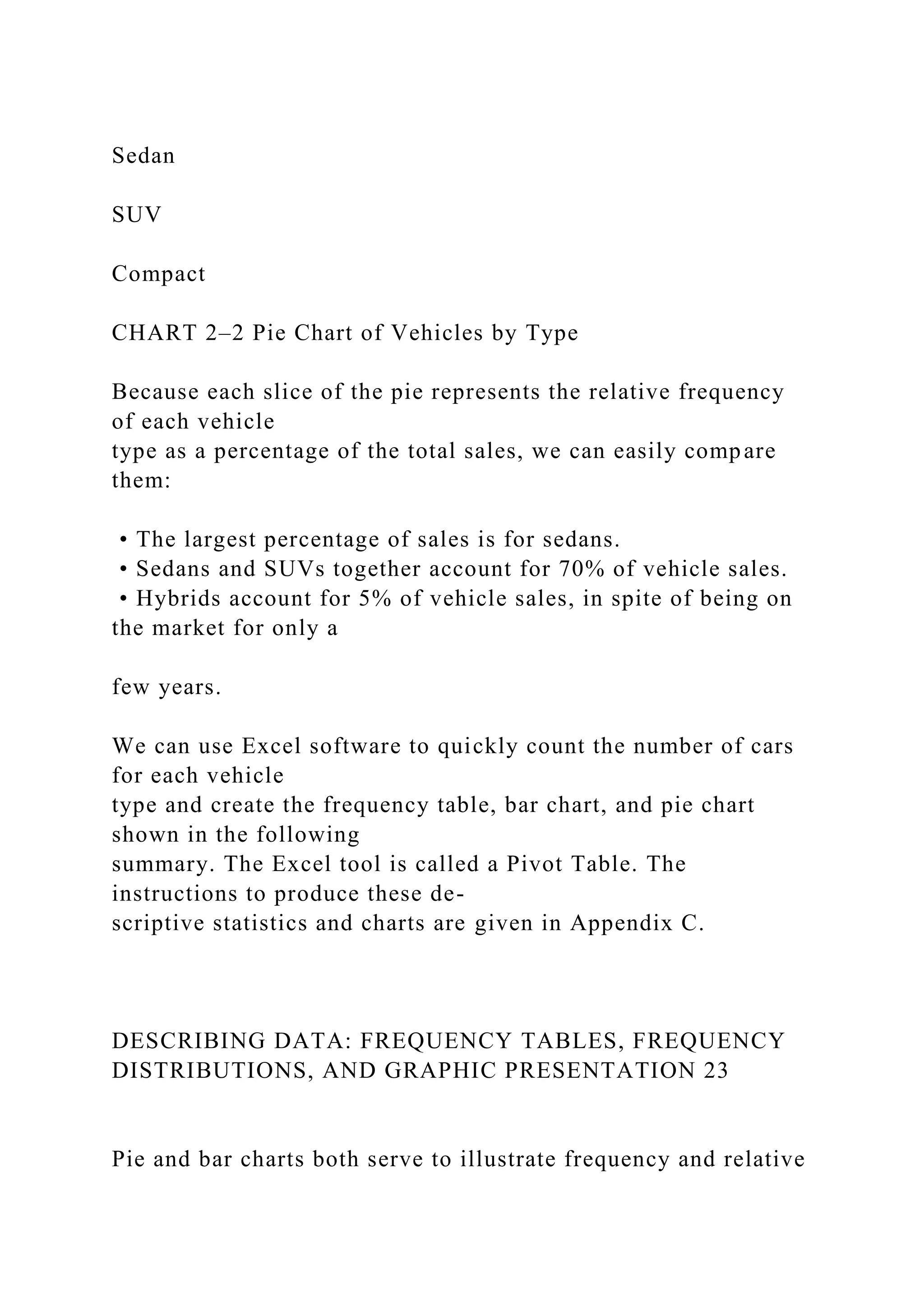
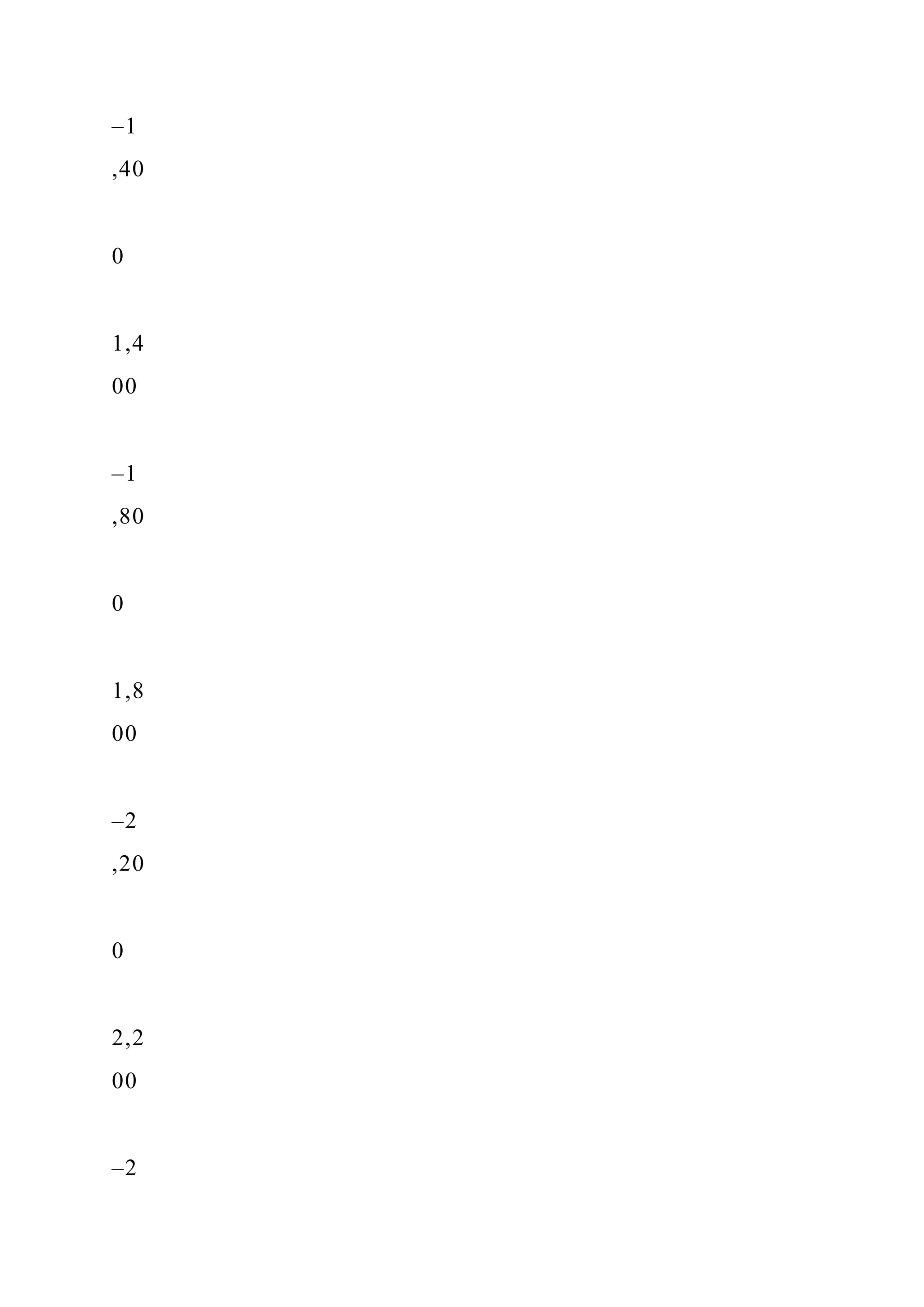
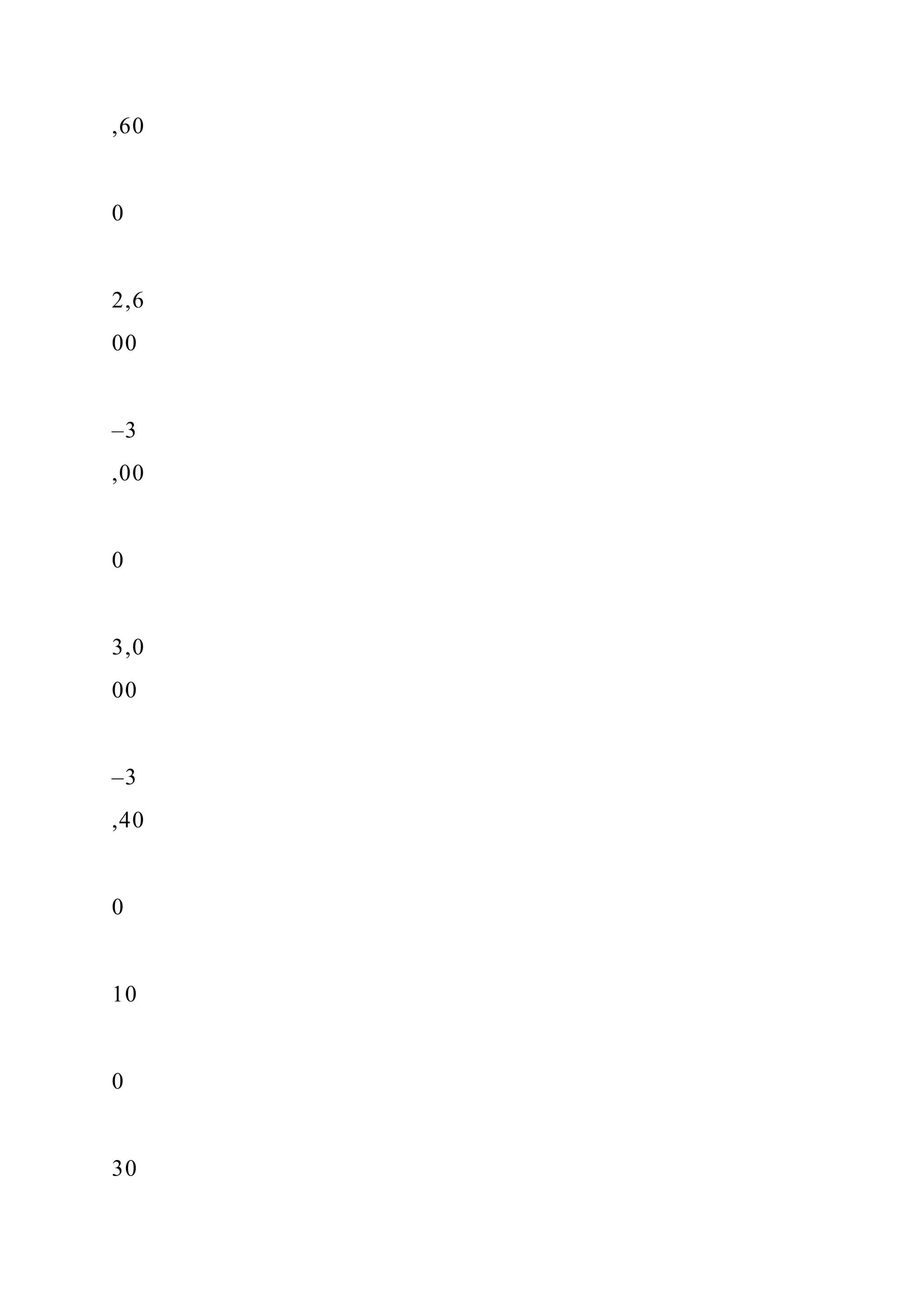
This document outlines learning objectives related to descriptive statistics, including constructing and interpreting various data displays such as dot plots, stem-and-leaf displays, and box plots. It also emphasizes the importance of visualizing data to understand its distribution and provides examples of analyzing data from real-world scenarios, including comparisons of service performance at different dealerships. The chapter serves as a foundation for further studies in exploring and interpreting data using statistical techniques.


![Similarly, deciles divide a set of observations into 10 equal
parts and percentiles
into 100 equal parts. So if you found that your GPA was in the
8th decile at your univer-
sity, you could conclude that 80% of the students had a GPA
lower than yours and 20%
had a higher GPA. If your GPA was in the 92nd percentile, then
92% of students had a
GPA less than your GPA and only 8% of students had a GPA
greater than your GPA. Per-
centile scores are frequently used to report results on such
national standardized tests
as the SAT, ACT, GMAT (used to judge entry into many master
of business administration
programs), and LSAT (used to judge entry into law school).
Quartiles, Deciles, and Percentiles
To formalize the computational procedure, let Lp refer to the
location of a desired percen-
tile. So if we want to find the 92nd percentile we would use
L92, and if we wanted the
median, the 50th percentile, then L50. For a number of
observations, n, the location of
the Pth percentile, can be found using the formula:
LO4-3
Identify and compute
measures of position.
LOCATION OF A PERCENTILE Lp = (n + 1)
P
100
[4–1]](https://image.slidesharecdn.com/learningobjectiveswhenyouhavecompletedthischapteryou-221129184702-1db7fe28/75/LEARNING-OBJECTIVESWhen-you-have-completed-this-chapter-you-docx-19-2048.jpg)
![provide summary statistics
that include quartiles. For example, the Minitab summary of the
Morgan Stanley com-
mission data, shown below, includes the first and third
quartiles, and other statistics.
Based on the reported quartiles, 25% of the commissions earned
were less than
$1,721 and 75% were less than $2,205. These are the same
values we calculated
using formula (4–1).
There are ways other than formula (4–1) to lo-
cate quartile values. For example, another method
uses 0.25n + 0.75 to locate the position of the first
quartile and 0.75n + 0.25 to locate the position of
the third quartile. We will call this the Excel Method.
In the Morgan Stanley data, this method would
place the first quartile at position 4.5 (.25 × 15 +
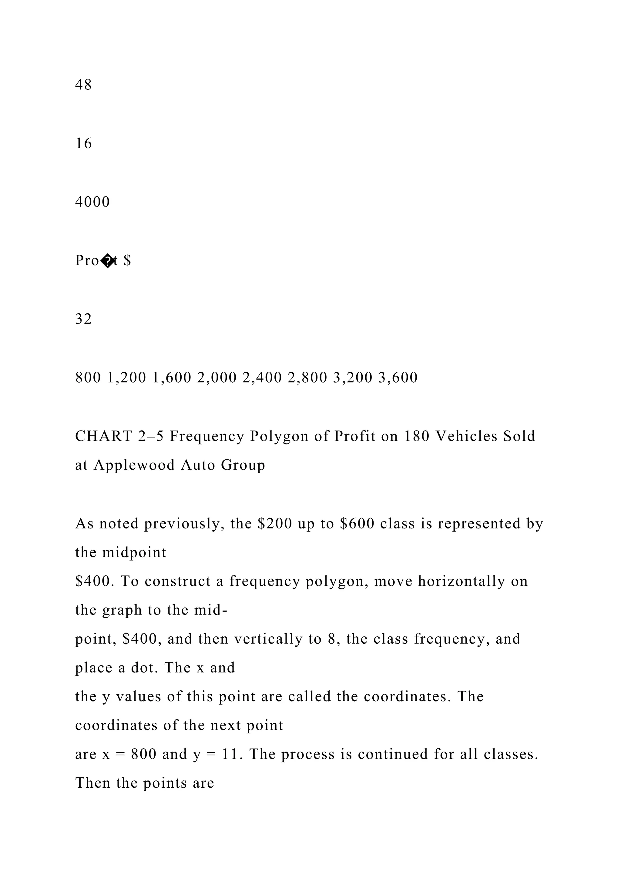
.75) and the third quartile at position 11.5 (.75 ×
15 + .25). The first quartile would be interpolated
as 0.5, or one-half the difference between the
fourth- and the fifth-ranked values. Based on this
method, the first quartile is $1739.5, found by
($1,721 + 0.5[$1,758 − $1,721]). The third quar-
tile, at position 11.5, would be $2,151, or one-half
the distance between the eleventh- and the
twelfth-ranked values, found by ($2,097 + 0.5[$2,205 −
$2,097]). Excel, as shown in
the Morgan Stanley and Applewood examples, can compute
quartiles using either of
the two methods. Please note the text uses formula (4–1) to
calculate quartiles.
Is the difference between the two methods important? No.
Usually it is just a nui-](https://image.slidesharecdn.com/learningobjectiveswhenyouhavecompletedthischapteryou-221129184702-1db7fe28/75/LEARNING-OBJECTIVESWhen-you-have-completed-this-chapter-you-docx-25-2048.jpg)


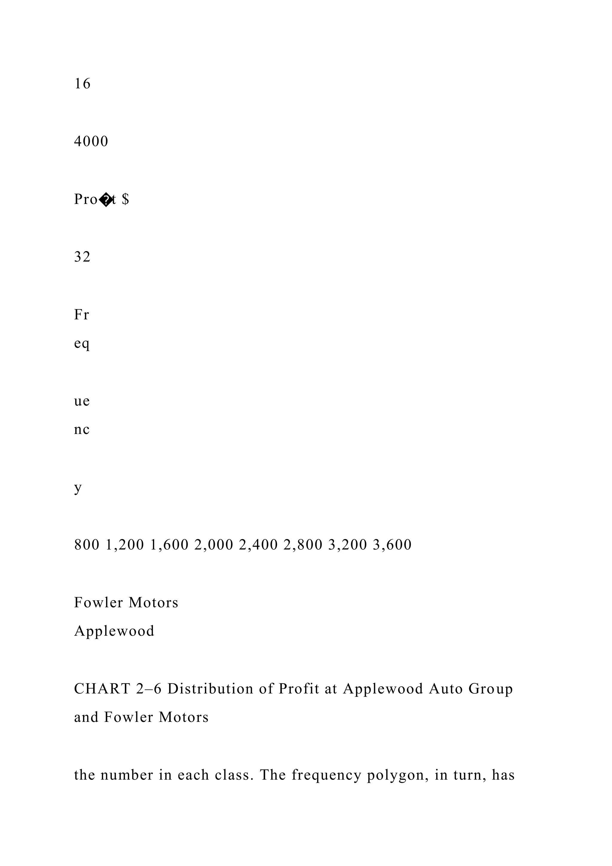
![(n − 1) (n − 2)[
∑(
x − x
s )
3
] [4–3]
Formula (4–3) offers an insight into skewness. The right-hand
side of the formula is
the difference between each value and the mean, divided by the
standard deviation.
That is the portion (x − x )/s of the formula. This idea is called
standardizing. We will
discuss the idea of standardizing a value in more detail in
Chapter 7 when we describe
the normal probability distribution. At this point, observe that
the result is to report the
difference between each value and the mean in units of the
standard deviation. If this
difference is positive, the particular value is larger than the
mean; if the value is nega-
tive, the standardized quantity is smaller than the mean. When
we cube these values,
we retain the information on the direction of the difference.
Recall that in the formula for
the standard deviation [see formula (3–10)] we squared the
difference between each
value and the mean, so that the result was all nonnegative
values.
If the set of data values under consideration is symmetric, when
we cube the stan-](https://image.slidesharecdn.com/learningobjectiveswhenyouhavecompletedthischapteryou-221129184702-1db7fe28/75/LEARNING-OBJECTIVESWhen-you-have-completed-this-chapter-you-docx-43-2048.jpg)
![dardized values and sum over all the values, the result would be
near zero. If there are
several large values, clearly separate from the others, the sum
of the cubed differences
would be a large positive value. If there are several small values
clearly separate from
the others, the sum of the cubed differences will be negative.
An example will illustrate the idea of skewness.
PEARSON’S COEFFICIENT OF SKEWNESS sk =
3(x − Median)
s
[4–2]
STATISTICS IN ACTION
The late Stephen Jay Gould
(1941–2002) was a profes-
sor of zoology and professor
of geology at Harvard
University. In 1982, he was
diagnosed with cancer and
had an expected survival
time of 8 months. However,
never to be discouraged,
his research showed that
the distribution of survival
time is dramatically skewed
to the right and showed that
not only do 50% of similar
cancer patients survive
more than 8 months, but
that the survival time could
be years rather than months!](https://image.slidesharecdn.com/learningobjectiveswhenyouhavecompletedthischapteryou-221129184702-1db7fe28/75/LEARNING-OBJECTIVESWhen-you-have-completed-this-chapter-you-docx-44-2048.jpg)
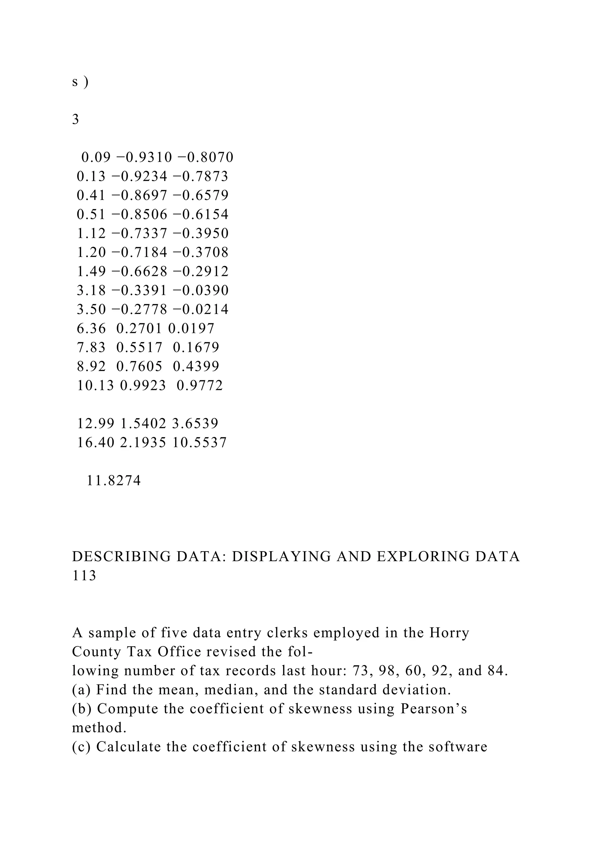
![is, the term
Σ[(x − x )/s]3 = 11.8274. To find the coefficient of skewness,
we use formula (4–3),
with n = 15.
sk =
n
(n − 1) (n − 2)
∑(
x − x
s )
3
=
15
(15 − 1) (15 − 2)
(11.8274) = 0.975
We conclude that the earnings per share values are somewhat
positively
skewed. The following Minitab summary reports the descriptive
measures, such as
TABLE 4–2 Calculation of the Coefficient of Skewness
Earnings per Share
(x − x )
s
(
x − x](https://image.slidesharecdn.com/learningobjectiveswhenyouhavecompletedthischapteryou-221129184702-1db7fe28/75/LEARNING-OBJECTIVESWhen-you-have-completed-this-chapter-you-docx-48-2048.jpg)


![value to show the lowest 25% of the values.
B. A box plot is based on five statistics: the maximum and
minimum values, the first and
third quartiles, and the median.
V. The coefficient of skewness is a measure of the symmetry of
a distribution.
A. There are two formulas for the coefficient of skewness.
1. The formula developed by Pearson is:
sk =
3(x − Median)
s
[4–2]
2. The coefficient of skewness computed by statistical software
is:
sk =
n
(n − 1) (n − 2)[
∑(
x − x
s )
3
] [4–3]
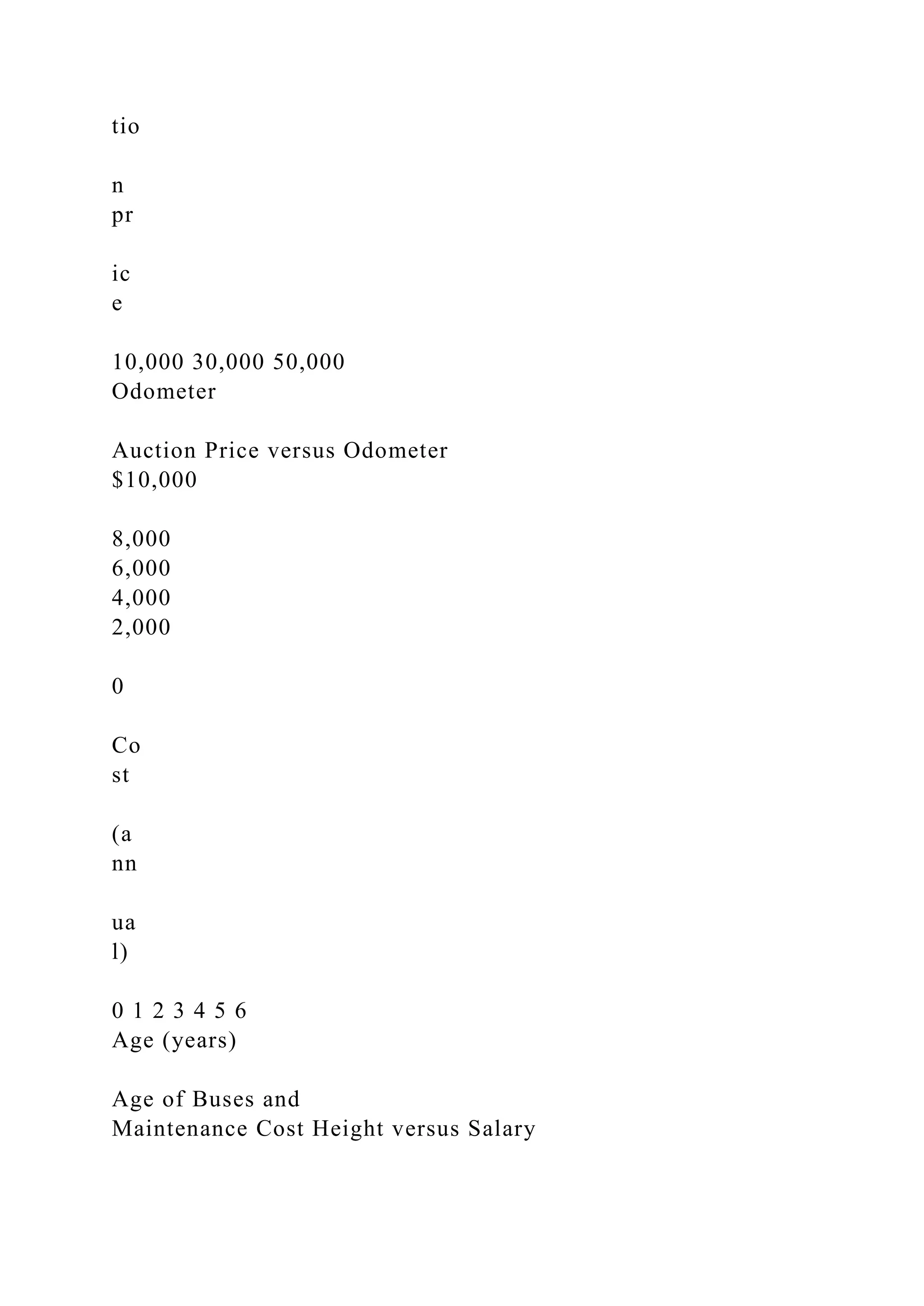
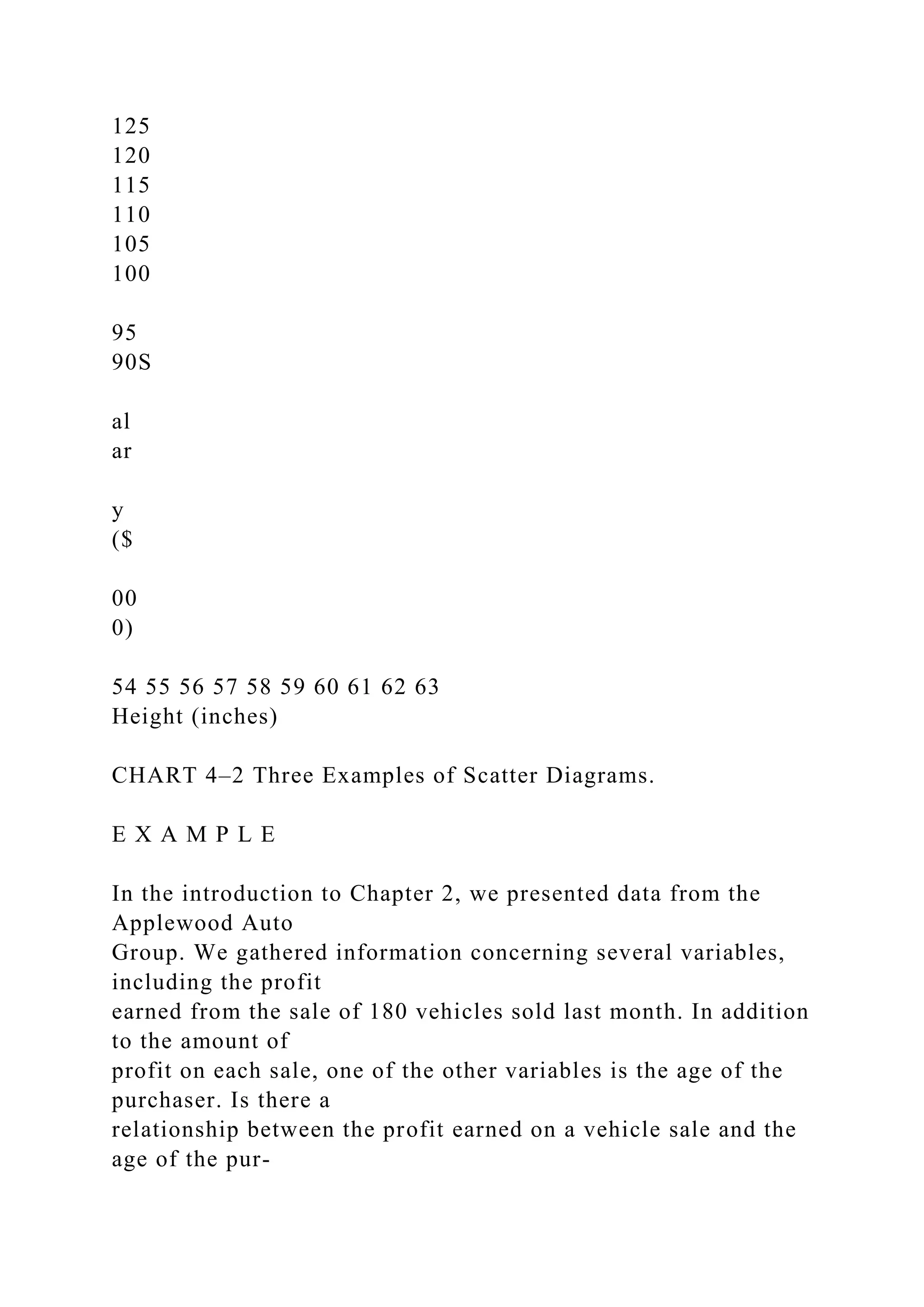
VI. A scatter diagram is a graphic tool to portray the
relationship between two variables.](https://image.slidesharecdn.com/learningobjectiveswhenyouhavecompletedthischapteryou-221129184702-1db7fe28/75/LEARNING-OBJECTIVESWhen-you-have-completed-this-chapter-you-docx-68-2048.jpg)


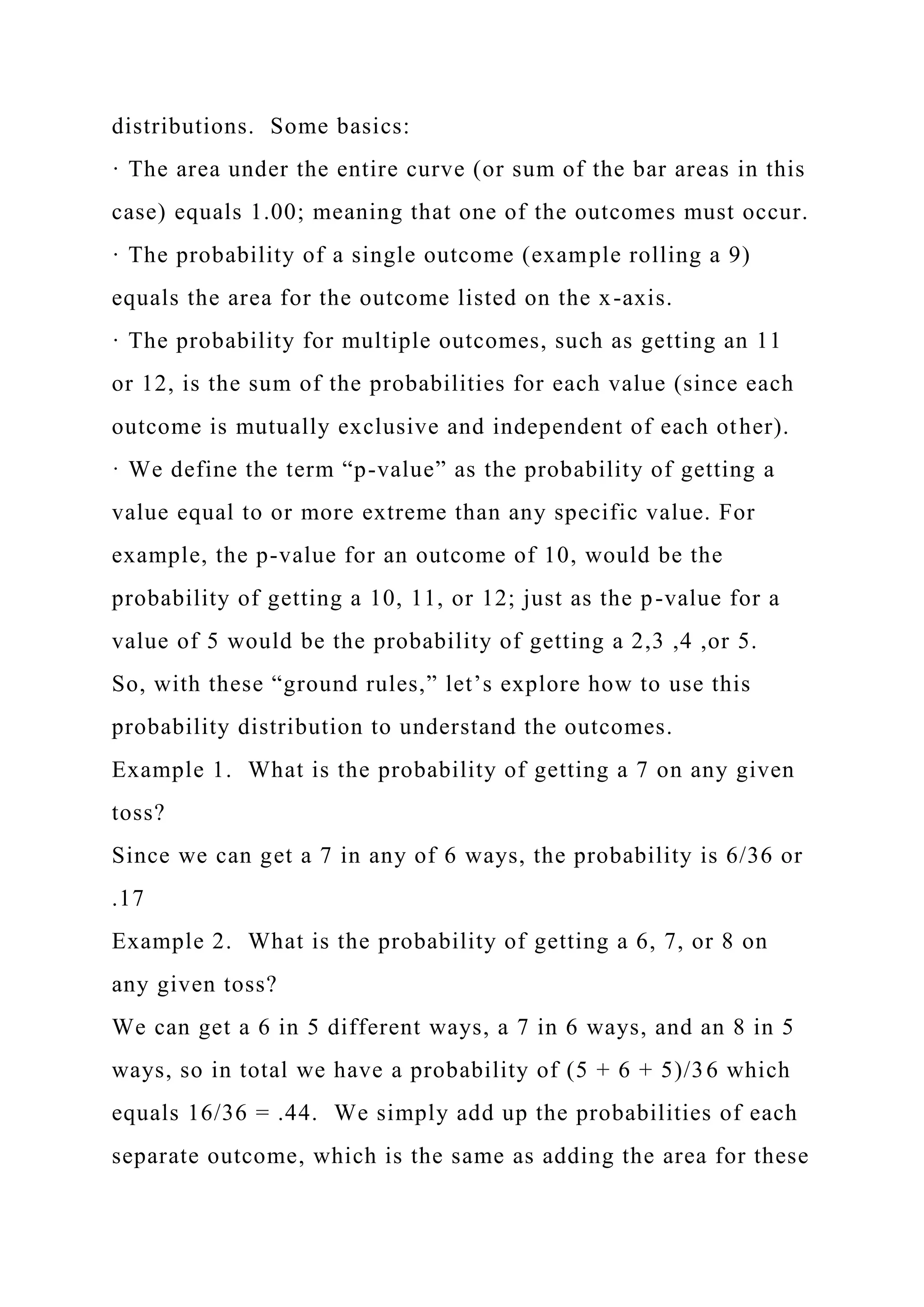
![outcomes.
Example 3. What is the probability of getting any value larger
than 4?
This asks about getting the values of 5, 6, 7, 8, 9, 10, 11, or 12.
We could, of course, simply add the areas for each to get the
answer; but a simpler way exists. We know that the probability
of getting 2 – 4 [P(2, 3, or 4)] plus the probability of getting 5 –
12 [P(5 thru 12)] must equal 1, as these two probabilities
encompass the entire range of possible outcomes. So, if P(2, 3,
or 4) + P(5 thru 12) = 1; then it makes sense to say that P(5 thru
12) = 1 - P(2, 3, or 4). This is called the compliment rule. It is
often easier to find the probability of the opposite of an event
and use the complement rule to find the desired probability. In
this case, P(2, 3, or 4) = (1 + 2 + 3)/36 = 6/36. So P(5 thru 12)
= 1 - P(2, 3, or 4) = 1- 6/36 = 30/36 or .83.
Example 4. What is the p-value of getting a 4 or less? 10 or
more?
Recall that a p-value is the probability of getting a specific
result or a more extreme result. When looking from the center
of the distribution, the more extreme results than 4 would
include getting a 3 or a 2. So, the P-value would be the
probability of getting P(2, 3, or 4), which we calculated above
as 6/36 or .17
The same thinking applies to getting a 10 or more, the related
more extreme outcomes would be 11 or 12. Since we have a](https://image.slidesharecdn.com/learningobjectiveswhenyouhavecompletedthischapteryou-221129184702-1db7fe28/75/LEARNING-OBJECTIVESWhen-you-have-completed-this-chapter-you-docx-228-2048.jpg)