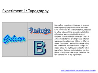
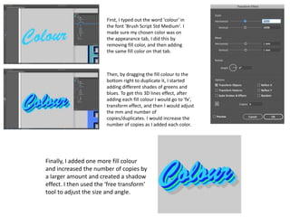
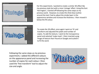
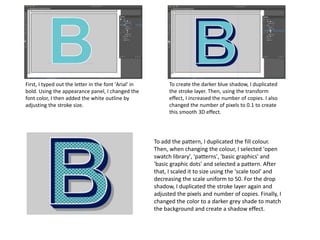
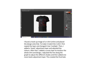
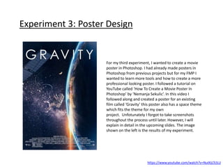
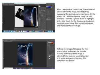
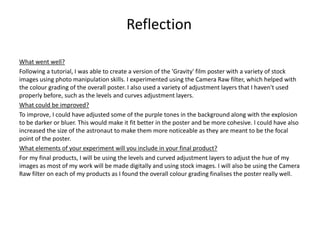
2. Experiment 1: Typography
https://www.youtube.com/watch?v=B6qHUcoEM30
For my first experiment, I wanted to practice
creating typography in Illustrator. Because I
have never used this software before, I decided
to follow a tutorial that showed multiple text
effects that were created in illustrator. I
followed a tutorial called 'Retro Text Effect in
Adobe Illustrator' by 'creatnprocess' where I
was shown how to create 3D text in different
styles. The reason I wanted to practice using
this software is because I will be using it to
create a logo for my fmp, as well as for other
text effects that may be included on my film
poster or magazine. The image shown on the
left is the results of my experiment.
3. Finally, I added one more fill colour
and increased the number of copies by
a larger amount and created a shadow
effect. I then used the 'free transform'
tool to adjust the size and angle.
Then, by dragging the fill colour to the
bottom right to duplicate it, I started
adding different shades of greens and
blues. To get this 3D lines effect, after
adding each fill colour I would go to 'fx',
transform effect, and then I would adjust
the mm and number of
copies/duplicates. I would increase the
number of copies as I added each color.
First, I typed out the word 'colour' in
the font 'Brush Script Std Medium'. I
made sure my chosen color was on
the appearance tab, I did this by
removing fill color, and then adding
the same fill color on that tab.
4. To create the 3D effect, once again I went on 'fx' and
transform and adjusted the pixels and number of
copies. To add the texture, I went to the transparency
panel and selected 'make mask'. I then inserted a png
image of texture that I found on Google and scaled it
to fit the word.
For this experiment, I wanted to create a similar 3D effect like
my previous style but with a more 'vintage' effect. Using the font
'Harrington', I started off following the same steps as my
previous work. However, to create this thick blue outline
around the text I had to adjust the stroke layer in the
appearance window and increase the thickness. I then moved it
below the fill colour.
Following the same steps as my previous
experiment, I added the different colours
on the appearance panel and increasing the
number of copies for each colour. I then
used the 'free transform' tool to adjust the
size and angle.
5. To create the darker blue shadow, I duplicated
the stroke layer. Then, using the transform
effect, I increased the number of copies. I also
changed the number of pixels to 0.1 to create
this smooth 3D effect.
First, I typed out the letter in the font 'Arial' in
bold. Using the appearance panel, I changed the
font color, I then added the white outline by
adjusting the stroke size.
To add the pattern, I duplicated the fill colour.
Then, when changing the colour, I selected 'open
swatch library', 'patterns', 'basic graphics' and
'basic graphic dots' and selected a pattern. After
that, I scaled it to size using the 'scale tool' and
decreasing the scale uniform to 50. For the drop
shadow, I duplicated the stroke layer again and
adjusted the pixels and number of copies. Finally, I
changed the color to a darker grey shade to match
the background and create a shadow effect.
6. Reflection
What went well?
I was able to create different styles of typography in Illustrator by following tutorials. This
allowed me to learn the basics of Illustrator in preparation for creating my film title using this
software.
What could be improved?
To improve, I could have experimented creating different styles of text to wider extend my
knowledge and skill. Although my experiments are different style, they are all different styles of
3D text.
What elements of your experiment will you include in your final product?
For my final products, I will be using the techniques I learned throughout this experiment. I will
most likely be working in the appearance panel to edit aspects of my text. I will also be using
the 'transform effect' within this to adjust the different layers of text and create a 3D effect. This
experiment also helped me have a general idea of how to use Illustrator which will be helpful
when creating typography for my fmp.
7. Experiment 2: T-Shirt Design
https://www.youtube.com/watch?v=TzIa0t-Ie5M&t=85s
For my second experiment, I wanted to create a
t-shirt design as I will be making merchandise
for my project. I followed a tutorial on YouTube
called ‘How To Make Merch Step By Step’ by
‘Charley Pangus’. This tutorial showed me how
to make the design in Photoshop, it also taught
me how typography can be created in
Photoshop. I took screenshots of the process
and explained how I did each step in the
upcoming slides. The image shown on the left is
the results of my experiment.
8. First, I used the shape tool to create a square shape in the
centre. I then, used rulers to outline it and then removed
the square. This is to outline the shape of the text. After, I
wrote out the word ‘dream’ and duplicated it to fill the
square. Then, I changed the fill to the second and fourth
‘dream’ to 0 and added a stroke effect. To add the warped
effect, I first converted my text to a smart filter, I selected
the warp option and selected ‘wave’ and adjusted to my
liking. After that I added the phrase ‘your dreams will
come true’ and placed a line through the centre of the
phrase, then I duplicated it and placed around the outside
of the ‘dream’ text.
Next, I grouped together all the layers in preparation to
add the texture. I found a colourful texture image on
Pinterest and pasted it over my text. To incorporate it into
the text, I held the option key between the two layers and
clicked. This combined the two together. After, I rotated
and adjusted to my liking. Then, I removed the white
background colour and changed it to black to fit the t-shirt
colour.
9. I found a mock-up image of a t-shirt online and placed
the design onto that. To make it match the t-shirt I first
copied the layer and changed it too ‘multiply’. Then, I
added a ‘levels’ adjustment layer and adjusted the
colours. After that. I added a curves layer to recolour the
whole shirt and design, I adjusted the line along the
graph to adjust the different shades and then added one
more levels adjustment layer. This created the final look.
10. What went well?
For this experiment, I successfully created a t-shirt design in Photoshop. I also experimented with text
styles and typography in Photoshop also so I could adjust and edit text using both software.
What could be improved?
To improve I could have made the design brighter. Although it would work well with different colour
shirts, it appears quite dark and almost fades away with the black t-shirt. T-shirt designs should be
made to suit a variety of light and dark shirts. I could also have experimented more with different t-shirt
designs and possibly experimented with photo manipulation which will likely be used in my project.
What elements of your experiment will you include in your final product?
For my project, I will be using the warp tool to change the shape of text and images. I will also be using
the levels adjustment layer to adjust the colours and get the correct hue for my posters.
Reflection
11. Experiment 3: Poster Design
https://www.youtube.com/watch?v=NutKjLTclLU
For my third experiment, I wanted to create a movie
poster in Photoshop. I had already made posters in
Photoshop from previous projects but for my FMP I
wanted to learn more tools and how to create a more
professional looking poster. I followed a tutorial on
YouTube called ‘How To Create a Movie Poster In
Photoshop’ by ‘Nemanja Sekulic’. In this video I
followed along and created a poster for an existing
film called ‘Gravity’ this poster also has a space theme
which fits the theme for my own
project. Unfotunately I forgot to take screenshots
throughout the process until later. However, I will
explain in detail in the upcoming slides. The image
shown on the left is the results of my experiment.
12. Starting with the astronaut, I added a ‘curves’ adjustment layer. I went into the red channel and lowered that
level to remove the red tones in the image. After that, I added a ‘hue/saturation’ adjustment layer to lower
the saturation so it didn’t appear too blue. For the overall image, I then added a solid colour layer. I chose a
dark blue tone from the astronaut and changed the blending mode to ‘exclusion’ to give the overall poster a
bluer tone that is consistent throughout. Then, I added a ‘hue/saturation’ adjustment layer to the stars layer,
colourised it and changed the hue to a blue tone to go with the space background. The colours are now
consistent and match throughout the poster. To make the explosion look more like an explosion, I went to
‘filter’, ‘blur’, ‘motion blur’ and adjusted to my liking. I followed this same process for the satellite image also
to look like an explosion is happening near the astronaut. I then merged all the layers together, ready to
finalise the image with colour correction.
First, I found stock images of Earth, stars, an explosion, an astronaut and a satellite. These images will piece
together to create the final result. I started out with the image of Earth and then added the stars image on
top in ‘screen’ blending mode. Using the brush tool and colour black, I erased any of the stars image that was
covering the earth. After that, I used the pen tool to trace around the astronaut image and extract them
from the background and then placed them onto my poster. Then, I followed this same process with the
satellite image. To add the explosion image, I placed it onto the poster and added a ‘curves’ adjustment layer
and adjusted to get rid of the smaller specs of dirt in the explosion. After that, I then put the explosion image
in ‘screen’ blending mode to get rid of the black background. I now have all the stock images added and
ready for colour correction.
13. To finish the image off, I added the film
poster billing and added the film title
‘Gravity’ at the top of the image. I
adjusted letter size and spacing to make
it fit better and centred the text. This
completed the poster.
After, I went to the ‘camera raw’ filter to overall
colour correct the image. I started off by
increasing the contrast and temperature. On the
effects tab I added a vignette. Using the split
tone tab, I selected a yellow shade to highlight
and a blue shade for the shadows and adjusted
the levels to my liking. This overall brightened
and improved the final image.
14. What went well?
Following a tutorial, I was able to create a version of the 'Gravity' film poster with a variety of stock
images using photo manipulation skills. I experimented using the Camera Raw filter, which helped with
the colour grading of the overall poster. I also used a variety of adjustment layers that I haven't used
properly before, such as the levels and curves adjustment layers.
What could be improved?
To improve, I could have adjusted some of the purple tones in the background along with the explosion
to be darker or bluer. This would make it fit better in the poster and be more cohesive. I could have also
increased the size of the astronaut to make them more noticeable as they are meant to be the focal
point of the poster.
What elements of your experiment will you include in your final product?
For my final products, I will be using the levels and curved adjustment layers to adjust the hue of my
images as most of my work will be made digitally and using stock images. I will also be using the Camera
Raw filter on each of my products as I found the overall colour grading finalises the poster really well.
Reflection
15. Bibliography
creatnprocess. (2020). Retro Text Effect in Adobe Illustrator. Available:
https://www.youtube.com/watch?v=B6qHUcoEM30. Last accessed 5th March 2021.
Charley Pangus. (2019). How To Make Merch Step By Step. Available:
https://www.youtube.com/watch?v=TzIa0t-Ie5M&t=85s. Last accessed 6th March 2021.
Nemanja Sekulic. (2017). How To Create a Movie Poster In Photoshop. Available:
https://www.youtube.com/watch?v=NutKjLTclLU. Last accessed 7th March 2021.
Editor's Notes
Discuss the tools and processes used in your experiments