
Recommended
More Related Content
What's hot
What's hot (20)
Similar to Photoshop Text Effect Experiments
Similar to Photoshop Text Effect Experiments (20)
More from tafi94
Recently uploaded
Recently uploaded (20)
Photoshop Text Effect Experiments
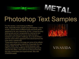
- 1. Photoshop Text Samples For this section, I was looking at different texts, especially those created using Photoshop. I came across various texts of different sizes and fonts which appeared to be very interesting. At first, I chose the easy looking texts and as I progressed by making the text from what I had learnt (on how to make the text), I wanted to give myself a challenge. As a result of that, I went for some which appeared more advanced than the ones which I started with. These texts shown on this page are some of the effects which I was particularly inspired by. Especially the one entitled „KING TUTZ‟. This is mainly because I was willing to accept the challenge of experiencing how to achieve this effect. I then went on to find out how this text was manipulated and experimented. Also with VIVAVIDA aswell.
- 2. This is the first text which I experimented on using Photoshop. I learnt how to make this text on Photoshop from a source website online. It was quite straightforward and involved a few procedures. What inspired me about this text is the contrasting colours of black and gold and to me, these two colours together are very complementary.
- 6. The next text which I was willing to try is the KINGS text’s fiery effect.
- 7. The first step was to create a document with certain dpi and dimensions, in this case I used a document with 300dpi and dimensions of 17 x 11 with a black background. Using the Type tool, I selected the font „ Billboard‟ and typed KING TUTZ as my text. I separated these two words into different layers then I flattened the image. This image shows a sample of the result.
- 8. For the next step, I used the marquee tool (M) to cut up the flattened text layer to enable me to apply different flame effects to each letter of the text. I achieved this effect (shown in the image) by selecting the marquee tool (M), the dragging the box around the letter „K‟, right clicked and selected the layer via cut. I did this to every letter. The letters are on their own layers. In order to make the „K‟ look as though it is on fire, I right clicked on the flattened K type layer in the layers palette and chose Blending Options by selecting Drop Shadow, I keyed in the following settings illustrated by the image (left).
- 12. This is the stage when I flattened the type layers. Also using the Eraser tool with varying sizes and opacity fade off the top portion of each letter.
- 13. At this stage, I selected the Go to Filter > Liquefy. I Selected the Forward Warp Tool and keyed in the settings illustrated above. Using the Forward Warp tool, I created some waves on the border of the type.
- 14. To achieve the real fiery effect on the text used the following steps: .Using the Layers tab I used the Move Tool to drag any part of the selected area into the document with the “K”. I placed the fire above the type. .Using the Eraser tool with 15px, I erased all the excessive fire, leaving only those parts that is waving around the type. .I Duplicate the fire layer. Then I set the Opacity of the original fire to 30%, and setting the Blend Mode of duplicated fire to Overlay. . I repeat the processes to cover the type with more flames.
- 16. I started off by creating a new document in Photoshop at 1920px wide x 1200px high, and with the Gradient Tool (G), I drew in a radial gradient of browns (#5c3d09 to #1f1409) in order to achieve something like this. The gradient is not centred vertically but sits toward the top
- 17. A Closer view of the first step
- 18. I aim to have a textured background. But rather than starting from scratch, I just copied the background from another tutorial which I was looking at. I then merged all the layers and desaturated to achieve this result.
- 19. I then set the layer to Overlay and blended the texture into the background
- 20. To add a bit more texture, I ran the Texturizer filter. To do this, I created a new layer and filled it with a brown/beige colour—#66500f.
- 21. I then went to Filter > Texture > Texturizer and used the Canvas texture with 80% Scaling and Relief set to 4. This created what is shown above.
- 22. I set that to Overlay. This adds some extra fine detail to the texture.
- 23. After doing the background, I placed the ‘FIRE’ text in a Trajan font to create a really dramatic looking font. Here I've placed the text in the colour #cb9328, then set it to Linear Dodge with an Opacity of 8%.
- 24. At this stage, I set the newest text layer to Overlay and 70% Opacity, to create this reddish effect on the text.
- 25. At this stage I duplicated the text again and set the latest duplicate to a yellowish colour— #cb9328. Then set this to Linear Dodge (Add) and Opacity 30%. I then added a layer mask and drew a gradient so the latest text layer fades.
- 26. The aim at this stage was to create a glowing effect on the. In order to do this, I first of all, duplicated the text layer again and placed this layer at the very top, and set it to a yellow colour—#dc9a08. Then ran a Filter > Blur > Gaussian Blur over it with Radius of 8px. I grabbed a large soft eraser brush and erased away parts which I did not want.
- 27. There are a few stages where I faced a few struggles, but I managed to get away with missing stages, although this does not look particularly as effective as I intended it o be. this is the stage where I starting adding the fiery effect. I did this by grabbing the Smudge Tool and ran over the text, smudging it up to look like heat waves coming off the text. The image above shows what the effect is actually meant to look like.
- 28. Experimenting on these texts on Photoshop has allowed me to be a lot more skillful in creating certain effects on Photoshop. This has inspired me for the in terms of preparing me to make use of certain effects when creating my own text. Especially skills such as adding certain effects to the text such as fire, and also to the background. Such an effect allows the text to look a lot dramatic than a plain and simple font. Some stages of these Photoshop text experimentation are all about problem solving, where I had to figure out where each tool is, and how to do certain things which I did not fully understand whilst I was learning from tutorials.