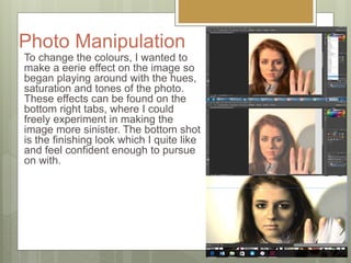
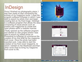
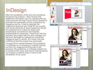
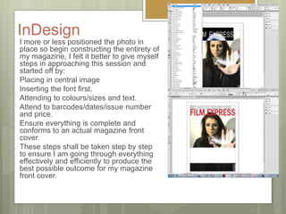
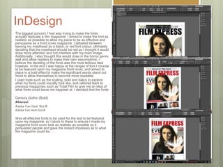
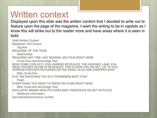
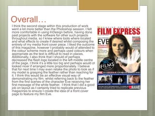
Post Production
Diary
Grace Crawford, Yr13, A2
Media, Ancillary Tasks
Photo Manipulation
Session Adobe
Photoshop
This power Point focuses upon
the creation of my photograph. I
have chosen my final image and
now aim to edit over this for the
creation of the front cover
magazine. Throughout this
PowerPoint, it shall show my
evidence of how I came to edit
and manipulate my phot to my
desired look to feature on my
magazine.
Photo
Manipulation
Session
16/01/2017: I decided to start
manipulating my image on Photoshop for
the creation of my magazine front cover.
With my plans and drawings now
complete and evaluated, I know what I
want to work towards to make my photo
as best it can to be featured upon my
magazine.
I used the program software Adobe
Photoshop which allows my chosen
image to be editing and manipulated to
the way and effect I want it in order to
progress further onto Indesign software
program.
This slide share will demonstrate my
evidence for the work I placed in for the
creation of my first draft for the magazine
front cover.
Photo
Manipulation
Starting off editing my raw image, I began
getting rid of any unwanted imperfections. I
wanted to make my magazine replicate those
within the market so I know I need to make
her face skin perfect before proceeding onto
making any horror elements within the photo
itself. I think this was a good start as it
introduced to me to Photoshop as I was still
a beginner and knowing how to start to
introduce me to the tools remained a mystery
to me so by doing these basic image
fixations allowed me to become more
confident on Photoshop.
I used tools such as the lasso, soften and
dodge tools to prefect my models skin and
make it blemished in appearance to give her
a natural appearance and look.
Photo
Manipulation
I decided to leave my subjects background
blank as I quite liked the shadowy effect it
had, and I was already aiming for a lightest
background so I didn’t think I needed to
edited it and instead move on to the next
effect I wanted to create for my photo. Which
was to make my subject more dark and quite
eerie looking, for this I explore a wide range
of options available to me as I was still quite
new to me. So this part was merely exploring
what I could do and place on my photo to
gain that desired effect I was after.
I aspired to give my image quite a light look
to it so it can draw my readers eye inwards
and glaze upon the magazine front cover,
making it more easy to read but to also
promote the films name itself.
Photo Manipulation
To change the colours, I wanted to
make a eerie effect on the image so
began playing around with the hues,
saturation and tones of the photo.
These effects can be found on the
bottom right tabs, where I could
freely experiment in making the
image more sinister. The bottom shot
is the finishing look which I quite like
and feel confident enough to pursue
on with.
Strengths of Photoshop
I think that despite myself not being exposed to this specific software
program as much as Primere pro. I think that for a beginning I did not
do as bad. I think that I managed to look up tutorials to create the
desired effect I was after to create a visual piece of imagery on photo
shop that I can use to reflect the teaser trailer. I did struggle in areas,
however I was able to easily enhance my models face as well as set
up a creepy ambiance to create a scary atmosphere within my photo, I
think looking at the final finish, I think it would have been better if I was
too incorporate some kind of background to set up a scene. Perhaps a
drop back of the woods or park perhaps, however these are all things
to consider for the creation of my second draft.
Weaknesses on Photoshop
I think because I'm not as used to Photoshop, it took me a while to get
my head around the basic tools as well as following tutorials to help
me create simple effects upon my photo. I think I would of liked to
have been a lot more adventurous on Photoshop and perhaps
incorporated blood maybe to signify the horror genre and make it
more dark. Taking into consideration of the previous photoshoot the
use of the blood was effective however I was aiming to keep my photo
more clean and sophisticated, however with further thinking the use of
the blood and scarring perhaps could of drawn readers in more as it is
an eye catching, which could of added a bonus in drawing attention.
Yet I think keeping things simple would of also been effective for
myself.
To Improve…
Giving myself targets, I think that I would benefit from actually cutting out my
model and placing her in front of the masthead. Meaning I could of cut the model
out and left her without a background at all and perhaps used this to place over
the original image to lap over the title of my magazine, which is usually quite
conventional for magazines to do. However upon trying this skill out. I realised I
created too many layers for the one photo, so began to get confused on what
areas to delete over to get rid of the background. However this could be a
potential route path for me to go down for the creation of my second draft for the
magazine front cover, so its defiantly an element to consider.
I also think that I could have been a little bit more adventurous with Photoshop
and perhaps edited over to make the model appear more sinister and creeped
out. However, I did kind of want that natural pose as magazine front cover imagery
is not too in your face and most importantly it leaves readers guessing,
persuading them to read the featured content.
I think I may of also be persuaded to perhaps darken the background around her
but blend her out with the smoothing tool so dark atmosphere encircle around her.
I think this could be quite effective as well and ideas to consider for the second
draft of the magazine.
InDesign
Once I finished my photography piece, I
was than ready to start composing the
entirety of my magazine cover. I used the
program software InDesign in which I was
able to export my photo over and begin
creating text on my final image. InDesign
is a software program that allows the easy
composing of visual pieces such as
posters and magazines to create text
upon photos within a realistic manner.
I firstly opened up the software program
and started on new project where I was
able to export my edited photo on
Photoshop to InDesign to commence the
creation of my first draft for the magazine
front cover. Once the photo had been
exported over, I was able to start the
creation of my front cover magazine, to
which I started on the Masthead and than
other cover lines to bring my magazine
front cover to life.
InDesign
After the completion of the text and everything
all placed into position. I than moved onto
additional information such as including the bar
code and even the logo Future Group reviews to
promote the awareness of how successful my
magazine can be. I tried to replicate the
magazines featured upon Total film as a guide
and visual reference to what magazines should
be presented as to make the layout and
presentation conventional and instantly
recognisable to audiences. I liked how I did this
and was very happy with the work created, as I
felt like it did begin to replicate an actual film
magazine seen in stores. So I knew, and had
confidence that the project was going well.
I ensured that I stayed between the guidelines
on InDesign so no cropping or cutting is taking
out from my magazine and the look is still
exposed, the guidelines on InDesign helped me
to construct the cover and ensure nothing seems
out of place or odd for when I come to the
completion of my cover.
InDesign
I more or less positioned the photo in
place so begin constructing the entirety of
my magazine, I felt it better to give myself
steps in approaching this session and
started off by:
Placing in central image
Inserting the font first.
Attending to colours/sizes and text.
Attend to barcodes/dates/issue number
and price.
Ensure everything is complete and
conforms to an actual magazine front
cover.
These steps shall be taken step by step
to ensure I am going through everything
effectively and efficiently to produce the
best possible outcome for my magazine
front cover.
InDesign
The biggest concern I had was trying to make the fonts
actually replicate a film magazine. I aimed to make the font as
realistic as possible to allow my piece to be as effective and
persuasive as a front cover magazine. I debated between
leaving my masthead as a black, or red font colour, ultimately
deciding that the masthead should be red as I thought it would
draw more attention and not interfere with my main image.
Additionally, I also thought this would draw in the horror genre
well and allow readers to make their own assumptions. I
believe the deciding of the fonts was the most tedious task
however, in the end I was happy at the ranges of font I choose
to be featured upon my magazine front cover, and aimed to
place in a bold effect to make the significant words stand out
more to allow themselves to become more readable.
I used tools such as the scaling, bold and italics to explore
what my fonts could visually look like, and referred back to
previous magazines such as Total Film to give me an idea of
what fonts could leave me happiest at. I decided that the fonts:
Century Gothic (Bold)
Aharoni
Adobe Fan Heiti Std B
Was all effective fonts to be used for the text to be featured
upon my magazine, so I stuck to these to ensure I made my
magazine front cover look as realistic as possible so it
persuaded people and gave the instant impressio as to what
the magazine could be.
Written context
Draft Written Content
Masthead- Film Empire
• Tag-line-
MAGAZINE OF THE YEAR
• Skyline/strip-
MAGAZINE ANY TIME, ANY SEASON, ANY FILM RIGHT HERE
• Cover-lines and Anchorage Text:
MCM COMIC CON 2017, END GAMERS REVEALED, THE HIGHWAY LANE, EVIL
DEAD, RICHIES SECRETS REVEALED, THIS IS NOW YOU ON SET, LIE TO YOU,
HORROR PREVIEW FEATURING ON THE ROAD, ALIVE AND SWAPPED NOW
• Main Cover-line-
EVE “ON SURVIVING THE 2017 PHONEMON BEST FILM”
• Flash-
EVERYTHING YOU NEED TO KNOW ON FILMS RIGHT HERE
• Main Cover-line Anchorage Text-
EXCLUSIVE BRAND NEW PICTURES AND ITNERVIEWS ON SET WITH EVE
• Additional Information-
barcode/date/price/issue number
Displayed upon this slide was the written content that I decided to write out to
feature upon the page of the magazine, I want the writing to be in capitols as I
know this will strike out to the reader more and have areas where it is seen in
bold.
Film Express-Typography
FILM EXPRESS
FILM EXPRESS
FILM EXPRESS
FILM EXPRESS
FILM EXPRESS
FILM EXPRESS
FILM EXPRESS
FILM EXPRESS
FILM EXPRESS
FILM EXPRESS
FILM EXPRESS
FILM EXPRESS
FILM EXPRESS
FILM EXPRESS
FILM EXPRESS
FILM EXPRESS
FILM EXPRESS
FILM EXPRESS
FILM EXPRESS
FILM EXPRESS
FILM EXPRESS
FILM EXPRESS
FILM EXPRESS
FILM EXPRESS
FILM EXPRESS
FILM EXPRESS
FILM EXPRESS
FILM EXPRESS
FILM EXPRESS
FILM EXPRESS
FILM EXPRESS
FILM EXPRESS
FILM EXPRESS
FILM EXPRESS
FILM EXPRES
FILM EXPRESS
FILM EXPRESS
FILM EXPRESS
FILM EXPRESS
FILM EXPRESS
FILM EXPRESS
FILM EXPRESS
FILM EXPRESS
FILM EXPRESS
FILM EXPRESS
FILM EXPRESS
FILM EXPRESS
FILM EXPRESS
FILM EXPRESS
FILM EXPRESS
FILM EXPRESS
FILM EXPRESS
FILM EXPRESS
FILM EXPRESS
FILM EXPRESS
FILM EXPRESS
What went well…I think that I had the upper advantage with this software program as I was able to actually
become familiar with the tools as I have had some previous experience with the specific
program from past projects consisting within Media. Tools such as scale, spacing, effects
were consistently used throughout especially to border up my font and ensure that each line
conforms to the intended expectation of cover lines, masthead, strip lines to present itself as
more identifiable to audiences.
I liked how I was able to appropriately seek out the different texts to ensure that each one
fits on my magazine and conforms to the look of what a front cover is expected to be like. I
believe that the style relates back well and is readable at a distance for readers to see and
become drawn towards.
This session also allowed me to explore how to make successful thumbnail images and
present them along my cover to make additional storylines to direct audiences inwards. With
the use of colours and shapes available to me I was able to easily be able to construct my
own thumbnail layout, incorporate the photos and feature a strip of featured lines that would
entice audiences out well.
I
like the central image and felt that the composition and balance fits in well and conforms to
the look of what a front cover feature is though to be presented as. I think the imagery is
quite strong and links back to the narrative theme of messages and doesn't focus more on
the gory blood side of things which is effective as it somewhat challenges the horror genre,
piping audiences interest more as they wish to discover as to what makes this film a horror.
The edited Photoshop image was opened up and positioned well within the program
InDesign and allowed me to immediately start working on constructing a magazine ready for
my audience feedback.
Even Better If…
I think that in some areas, there are places where the text is difficult to
read in places, which could pose a problem if my readers struggle to
read significant parts of my front cover.
Additionally, the colour scheme for me doesn't really conform well to
the horror genre, which is rather annoying as it could stump readers
regarding what genre it could possible be. I personally believe perhaps
more darker colours for the background with lighter colours used for
the font to make it more easy to read but perhaps shows off the genre
a little more.
I would of also liked to position my models head over the masthead, I
think this could of looked good but throughout the photo shop session,
I did attempt this but due to me creating more layers, it was tricky to
work out what areas needed deleting for the back, resulting in myself
being unable to actually perform this desire. However upon
recognising my problem, could perhaps try this out for the second
draft?
Overall…
I think the second stage within this production of work
went a lot more better than the Photoshop session. I felt
more comfortable in using InDesign before, having done
past projects with the software for other such projects
throughout media, so I knew where tools where located
and what effects to create if desired whilst composing the
entirety of my media front cover piece. I liked the outcome
of this magazine, however I probably would of attended to
the colour scheme more and perhaps used colours when
appropriate as the text is difficult to read in places.
Additionally, I also think that I should of perhaps
decreased the flash logo located in the left middle centre
of the page, I think it’s a little too big and perhaps would of
looked nicer if arranged more proportionately. I believe
that for next time I may even retake the photo to look as if
my model is grasping the feather rather than reaching for
it. I think this would be an effective visual way of
demonstrating my film, whilst referring back to the feather
from the first scenes of the character Eve receiving her
first message of the white feather. I think that I did a good
job on layout as I certainly tried to replicate previous
magazines to ensure I create the idea of a front cover
page to feature my film Eve.

Post production diary magazine

  • 1.
    Post Production Diary Grace Crawford,Yr13, A2 Media, Ancillary Tasks
  • 2.
    Photo Manipulation Session Adobe Photoshop Thispower Point focuses upon the creation of my photograph. I have chosen my final image and now aim to edit over this for the creation of the front cover magazine. Throughout this PowerPoint, it shall show my evidence of how I came to edit and manipulate my phot to my desired look to feature on my magazine.
  • 3.
    Photo Manipulation Session 16/01/2017: I decidedto start manipulating my image on Photoshop for the creation of my magazine front cover. With my plans and drawings now complete and evaluated, I know what I want to work towards to make my photo as best it can to be featured upon my magazine. I used the program software Adobe Photoshop which allows my chosen image to be editing and manipulated to the way and effect I want it in order to progress further onto Indesign software program. This slide share will demonstrate my evidence for the work I placed in for the creation of my first draft for the magazine front cover.
  • 4.
    Photo Manipulation Starting off editingmy raw image, I began getting rid of any unwanted imperfections. I wanted to make my magazine replicate those within the market so I know I need to make her face skin perfect before proceeding onto making any horror elements within the photo itself. I think this was a good start as it introduced to me to Photoshop as I was still a beginner and knowing how to start to introduce me to the tools remained a mystery to me so by doing these basic image fixations allowed me to become more confident on Photoshop. I used tools such as the lasso, soften and dodge tools to prefect my models skin and make it blemished in appearance to give her a natural appearance and look.
  • 5.
    Photo Manipulation I decided toleave my subjects background blank as I quite liked the shadowy effect it had, and I was already aiming for a lightest background so I didn’t think I needed to edited it and instead move on to the next effect I wanted to create for my photo. Which was to make my subject more dark and quite eerie looking, for this I explore a wide range of options available to me as I was still quite new to me. So this part was merely exploring what I could do and place on my photo to gain that desired effect I was after. I aspired to give my image quite a light look to it so it can draw my readers eye inwards and glaze upon the magazine front cover, making it more easy to read but to also promote the films name itself.
  • 6.
    Photo Manipulation To changethe colours, I wanted to make a eerie effect on the image so began playing around with the hues, saturation and tones of the photo. These effects can be found on the bottom right tabs, where I could freely experiment in making the image more sinister. The bottom shot is the finishing look which I quite like and feel confident enough to pursue on with.
  • 7.
    Strengths of Photoshop Ithink that despite myself not being exposed to this specific software program as much as Primere pro. I think that for a beginning I did not do as bad. I think that I managed to look up tutorials to create the desired effect I was after to create a visual piece of imagery on photo shop that I can use to reflect the teaser trailer. I did struggle in areas, however I was able to easily enhance my models face as well as set up a creepy ambiance to create a scary atmosphere within my photo, I think looking at the final finish, I think it would have been better if I was too incorporate some kind of background to set up a scene. Perhaps a drop back of the woods or park perhaps, however these are all things to consider for the creation of my second draft.
  • 8.
    Weaknesses on Photoshop Ithink because I'm not as used to Photoshop, it took me a while to get my head around the basic tools as well as following tutorials to help me create simple effects upon my photo. I think I would of liked to have been a lot more adventurous on Photoshop and perhaps incorporated blood maybe to signify the horror genre and make it more dark. Taking into consideration of the previous photoshoot the use of the blood was effective however I was aiming to keep my photo more clean and sophisticated, however with further thinking the use of the blood and scarring perhaps could of drawn readers in more as it is an eye catching, which could of added a bonus in drawing attention. Yet I think keeping things simple would of also been effective for myself.
  • 9.
    To Improve… Giving myselftargets, I think that I would benefit from actually cutting out my model and placing her in front of the masthead. Meaning I could of cut the model out and left her without a background at all and perhaps used this to place over the original image to lap over the title of my magazine, which is usually quite conventional for magazines to do. However upon trying this skill out. I realised I created too many layers for the one photo, so began to get confused on what areas to delete over to get rid of the background. However this could be a potential route path for me to go down for the creation of my second draft for the magazine front cover, so its defiantly an element to consider. I also think that I could have been a little bit more adventurous with Photoshop and perhaps edited over to make the model appear more sinister and creeped out. However, I did kind of want that natural pose as magazine front cover imagery is not too in your face and most importantly it leaves readers guessing, persuading them to read the featured content. I think I may of also be persuaded to perhaps darken the background around her but blend her out with the smoothing tool so dark atmosphere encircle around her. I think this could be quite effective as well and ideas to consider for the second draft of the magazine.
  • 10.
    InDesign Once I finishedmy photography piece, I was than ready to start composing the entirety of my magazine cover. I used the program software InDesign in which I was able to export my photo over and begin creating text on my final image. InDesign is a software program that allows the easy composing of visual pieces such as posters and magazines to create text upon photos within a realistic manner. I firstly opened up the software program and started on new project where I was able to export my edited photo on Photoshop to InDesign to commence the creation of my first draft for the magazine front cover. Once the photo had been exported over, I was able to start the creation of my front cover magazine, to which I started on the Masthead and than other cover lines to bring my magazine front cover to life.
  • 11.
    InDesign After the completionof the text and everything all placed into position. I than moved onto additional information such as including the bar code and even the logo Future Group reviews to promote the awareness of how successful my magazine can be. I tried to replicate the magazines featured upon Total film as a guide and visual reference to what magazines should be presented as to make the layout and presentation conventional and instantly recognisable to audiences. I liked how I did this and was very happy with the work created, as I felt like it did begin to replicate an actual film magazine seen in stores. So I knew, and had confidence that the project was going well. I ensured that I stayed between the guidelines on InDesign so no cropping or cutting is taking out from my magazine and the look is still exposed, the guidelines on InDesign helped me to construct the cover and ensure nothing seems out of place or odd for when I come to the completion of my cover.
  • 12.
    InDesign I more orless positioned the photo in place so begin constructing the entirety of my magazine, I felt it better to give myself steps in approaching this session and started off by: Placing in central image Inserting the font first. Attending to colours/sizes and text. Attend to barcodes/dates/issue number and price. Ensure everything is complete and conforms to an actual magazine front cover. These steps shall be taken step by step to ensure I am going through everything effectively and efficiently to produce the best possible outcome for my magazine front cover.
  • 13.
    InDesign The biggest concernI had was trying to make the fonts actually replicate a film magazine. I aimed to make the font as realistic as possible to allow my piece to be as effective and persuasive as a front cover magazine. I debated between leaving my masthead as a black, or red font colour, ultimately deciding that the masthead should be red as I thought it would draw more attention and not interfere with my main image. Additionally, I also thought this would draw in the horror genre well and allow readers to make their own assumptions. I believe the deciding of the fonts was the most tedious task however, in the end I was happy at the ranges of font I choose to be featured upon my magazine front cover, and aimed to place in a bold effect to make the significant words stand out more to allow themselves to become more readable. I used tools such as the scaling, bold and italics to explore what my fonts could visually look like, and referred back to previous magazines such as Total Film to give me an idea of what fonts could leave me happiest at. I decided that the fonts: Century Gothic (Bold) Aharoni Adobe Fan Heiti Std B Adobe Fan Heiti Std B Was all effective fonts to be used for the text to be featured upon my magazine, so I stuck to these to ensure I made my magazine front cover look as realistic as possible so it persuaded people and gave the instant impressio as to what the magazine could be.
  • 14.
    Written context Draft WrittenContent Masthead- Film Empire • Tag-line- MAGAZINE OF THE YEAR • Skyline/strip- MAGAZINE ANY TIME, ANY SEASON, ANY FILM RIGHT HERE • Cover-lines and Anchorage Text: MCM COMIC CON 2017, END GAMERS REVEALED, THE HIGHWAY LANE, EVIL DEAD, RICHIES SECRETS REVEALED, THIS IS NOW YOU ON SET, LIE TO YOU, HORROR PREVIEW FEATURING ON THE ROAD, ALIVE AND SWAPPED NOW • Main Cover-line- EVE “ON SURVIVING THE 2017 PHONEMON BEST FILM” • Flash- EVERYTHING YOU NEED TO KNOW ON FILMS RIGHT HERE • Main Cover-line Anchorage Text- EXCLUSIVE BRAND NEW PICTURES AND ITNERVIEWS ON SET WITH EVE • Additional Information- barcode/date/price/issue number Displayed upon this slide was the written content that I decided to write out to feature upon the page of the magazine, I want the writing to be in capitols as I know this will strike out to the reader more and have areas where it is seen in bold.
  • 15.
    Film Express-Typography FILM EXPRESS FILMEXPRESS FILM EXPRESS FILM EXPRESS FILM EXPRESS FILM EXPRESS FILM EXPRESS FILM EXPRESS FILM EXPRESS FILM EXPRESS FILM EXPRESS FILM EXPRESS FILM EXPRESS FILM EXPRESS FILM EXPRESS FILM EXPRESS FILM EXPRESS FILM EXPRESS FILM EXPRESS FILM EXPRESS FILM EXPRESS FILM EXPRESS FILM EXPRESS FILM EXPRESS FILM EXPRESS FILM EXPRESS FILM EXPRESS FILM EXPRESS FILM EXPRESS FILM EXPRESS FILM EXPRESS FILM EXPRESS FILM EXPRESS FILM EXPRESS FILM EXPRES FILM EXPRESS FILM EXPRESS FILM EXPRESS FILM EXPRESS FILM EXPRESS FILM EXPRESS FILM EXPRESS FILM EXPRESS FILM EXPRESS FILM EXPRESS FILM EXPRESS FILM EXPRESS FILM EXPRESS FILM EXPRESS FILM EXPRESS FILM EXPRESS FILM EXPRESS FILM EXPRESS FILM EXPRESS FILM EXPRESS FILM EXPRESS
  • 16.
    What went well…Ithink that I had the upper advantage with this software program as I was able to actually become familiar with the tools as I have had some previous experience with the specific program from past projects consisting within Media. Tools such as scale, spacing, effects were consistently used throughout especially to border up my font and ensure that each line conforms to the intended expectation of cover lines, masthead, strip lines to present itself as more identifiable to audiences. I liked how I was able to appropriately seek out the different texts to ensure that each one fits on my magazine and conforms to the look of what a front cover is expected to be like. I believe that the style relates back well and is readable at a distance for readers to see and become drawn towards. This session also allowed me to explore how to make successful thumbnail images and present them along my cover to make additional storylines to direct audiences inwards. With the use of colours and shapes available to me I was able to easily be able to construct my own thumbnail layout, incorporate the photos and feature a strip of featured lines that would entice audiences out well. I like the central image and felt that the composition and balance fits in well and conforms to the look of what a front cover feature is though to be presented as. I think the imagery is quite strong and links back to the narrative theme of messages and doesn't focus more on the gory blood side of things which is effective as it somewhat challenges the horror genre, piping audiences interest more as they wish to discover as to what makes this film a horror. The edited Photoshop image was opened up and positioned well within the program InDesign and allowed me to immediately start working on constructing a magazine ready for my audience feedback.
  • 17.
    Even Better If… Ithink that in some areas, there are places where the text is difficult to read in places, which could pose a problem if my readers struggle to read significant parts of my front cover. Additionally, the colour scheme for me doesn't really conform well to the horror genre, which is rather annoying as it could stump readers regarding what genre it could possible be. I personally believe perhaps more darker colours for the background with lighter colours used for the font to make it more easy to read but perhaps shows off the genre a little more. I would of also liked to position my models head over the masthead, I think this could of looked good but throughout the photo shop session, I did attempt this but due to me creating more layers, it was tricky to work out what areas needed deleting for the back, resulting in myself being unable to actually perform this desire. However upon recognising my problem, could perhaps try this out for the second draft?
  • 18.
    Overall… I think thesecond stage within this production of work went a lot more better than the Photoshop session. I felt more comfortable in using InDesign before, having done past projects with the software for other such projects throughout media, so I knew where tools where located and what effects to create if desired whilst composing the entirety of my media front cover piece. I liked the outcome of this magazine, however I probably would of attended to the colour scheme more and perhaps used colours when appropriate as the text is difficult to read in places. Additionally, I also think that I should of perhaps decreased the flash logo located in the left middle centre of the page, I think it’s a little too big and perhaps would of looked nicer if arranged more proportionately. I believe that for next time I may even retake the photo to look as if my model is grasping the feather rather than reaching for it. I think this would be an effective visual way of demonstrating my film, whilst referring back to the feather from the first scenes of the character Eve receiving her first message of the white feather. I think that I did a good job on layout as I certainly tried to replicate previous magazines to ensure I create the idea of a front cover page to feature my film Eve.