SlideShare a Scribd company logo
Production Diary
6.4.22- Production Day 1
For the first day of production, I started working on the concert visuals as stated in my schedule. Today I created a light beam
animation, I followed a tutorial by ‘Mobox Graphics’ on YouTube and made my own version of this animation that fits the style of
what I am planning to make.
First, I started out by creating a new composition of 1000px x 1000px and 25fps for the base of my animation. This loaded up as a
transparent layer so I created a new solid layer of black for the background. I also created a second white solid layer on top for
when I make the light beams. Next, I went to Effects and Presets and added the ‘CC Star Burst’ effect and changed some of the
settings within this to slow down the speed and make less stars appear. This effect created a look of stars zooming towards the
viewer. To make these stars blur and also look more like beams, I added the ‘CC Light Burst’ effect. ‘Matte Choker’ effect made the
effects look more like solid beams of light by adding more definition and brightening the colour.
Before making any more changes, I fixed the scale to make the animation look smoother and loop better. Now that the animation
is fixed, I added an adjustment layer ready for more layering effects, glow, and recolouring. Starting out with ‘CC Flow Motion’
added a ‘black hole’ look to the animation, but I adjusted the setting to be lower so I could have a more subtle warped look to the
animation that still pulls the audience in. On a second adjustment layer, I added a ‘CC Lens’ which mimics a camera lens. It pulls
the animation to be more zoomed in to make the audience feel like they’re in the immersive animation, and also fixing a cropping
issue that occurred when I added the flow motion effect (which warped all the layers). To recolour the animation, I added the
‘Channel Blur’ effect which allowed me to adjust the RGB scale to create a colour that works best for my animation. I used these
settings to create a yellow-gold type colour as shown in the screenshots. I added the ‘Glow’ effect to brighten up the light beam
animation, and increased the settings. This glow effect throughout made it appear as if I had two different gold shades flowing
through which helped add more dimension to the animation. To make it look more realistic, I added a ‘Noise’ effect which created
this subtle static around the light beams. Finally, I added a hue/saturation layer and adjusted the settings for the background, this
added more depth and realism as it looks like there is light radiating off the glowy light beams.
Now that the animation is done, at the end of the day I tried to download the mp3 song ‘Heartless’ before making any more
animations so that as I am creating the other animations I can line them up and time them alongside the song but it was
unavailable on the college computers meaning that I will have to do it from home and email it to myself for college tomorrow.
I think today went quite successful and I was able to make a start on my first animation. Although I would have liked to have been
more productive, I had issues with After Effects taking longer to load or crashing in between but I luckily didn’t lose any work.
Tomorrow I plan to make the rest of the animations for my first visual and will hopefully have the song downloaded so I can piece
it altogether too.
7.4.22- Production Day 2
Today started off with a few challenges. I was unable to bring the downloaded mp3 as I couldn’t upload it or email
myself. After Effects also wasn’t working at the start of this morning. To resolve this, I decided I would change how my
schedule is and work on my print products and leave my concert visuals until last when I am better organised with it all.
So today I decided to create my album cover as I have lots of inspiration for it and was eager to learn about the 3D tools.
At first, I started off with this picture of The Weeknd where he is facing off to the side, but I realised that to create my
desired effect I would need a front facing image. I decided on this picture as shown in the screenshots, which also looks
similar to the original After Hours album cover so it would be consistent with the existing visuals. Both photos were
taken from a photoshoot with Anton Tammi, but I have edited and added my own effects to create my own visual.
To start off, I wanted to edit the photo in preparation for the 3D effect. The original image is quite bright and glowy and I
want my image to look darker and grainier. First, I expanded the image to fit the darker background, I used the quick
selection tool to cut The Weeknd out of the image so he could be in front of a plain black background. Then, I used the
Camera Raw filter and focused on adding grain and contrast to the image, I also increased the luminance of the green
and red shades to bring out the vibrance of those colours over his face. Now that the image is fixed, I am ready to create
the main effect. Using the rectangular marquee tool, I placed it on the centre of his face covering his nose and some of
his eyes, I created a mask and inverted it to cut this out. To create the curtains I had to split this mask into four. I
duplicated the layer and converted this to a smart object and used the rectangular marquee tool to cut a quarter of the
layer out. I repeated each step, along with duplicating the layers for each quarter. To create the curtain effect, I used the
transform warp tool and pulled each layer back from the centre. I adjusted all of these individually so it didn’t look too
neat to give an effect that it had almost been ripped open. Adding a brightness/contrast adjustment layer as a clipping
mask to each curtain, along with a noise filter for texture makes the effect look more realistic. To make the curtains look
even more realistic and 3D, I used the burn tool on and around each layer to create shadow ‘underneath’ the curtain
and towards the inside of the face to add depth. Near the end of the day I was ready to create the 3D eye effect, but it
wasn’t loading well on the college computers and was causing it to glitch so to resolve this, I am going to make the eyes
at home tonight and then add the effect on to the image tomorrow.
Overall, today was successful and I am eager to see the finished product of my album cover. Although there were
setbacks, I was still able to be productive and focus on another part of my production. Tomorrow I plan on finishing the
album cover off and creating mock-ups to present how it would be sold.
8.4.22- Production Day 3
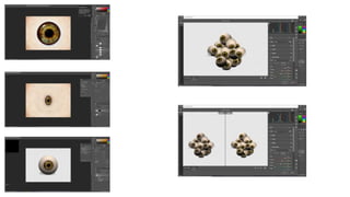
Once I arrived home yesterday evening, I created the 3D eye on my own computer in preparation for today (see
screenshots of process on next slide). I started out with a 2D map of an eye that is flattened so it can be made as
3D, using a mix of the level adjustment layer and solid colour overlay I recoloured this eye to brown as I wanted it
to match the artists eye colour more accurately. I also selected the actual eye colour and warped it so that it
would be spherical once put into the 3D tools. Now that it was prepped, I selected: 3D; new mesh from layer;
mesh preset; sphere to put it into the 3D tools menu and create a 3D spherical eye. After that, I dragged the layer
into a separate for document to make it a smart object, duplicated the layers, and rotated so I could create a
group of the eyes all facing at different angles. Once I had made enough together to add to my main image, I
merged all the layers and used the Camera Raw filter to add more yellow to the eyes so they weren’t so pure-
white and looked unrealistic, along with some texture and uploaded the document to OneDrive ready to be
added today.
Starting out, I dragged my eye effect straight onto the main image to be revealed underneath the curtain effect I
made yesterday. To add shadows for realism, I selected the smart object of the eyes, and added a drop shadow
into most of the eyes, rotating the angle with the direction of the eye. After that I went back into the Camera Raw
filter again and darkened it to match the lighting of the main image. On a separate layer, I used the brush tool at a
low opacity to add the subtle green and red overlay over the eyes to also match the lighting in the image. Now
that the main image is complete, I can add all the additional conventions that are needed for an album cover. I
placed the ‘After Hours’ text in the top left corner that I had made previously. To create this defined look, I used
the bevel and emboss blending mode and a subtle stroke outline to make it stand out in front of the image. At the
bottom of the image, I added a png of his ‘XO’ logo and a parental advisory sticker and used a solid colour
adjustment layer on each to recolour these to the same red shade as the album title. To finish it off, I merged all
the layers into a group and went to Camera Raw filter once again. I brightened the image as a whole as it was
looking very dimly lit, and increased the luminance of the red and green which also brightened up the text and XO
logo along with the image. I placed a stars' texture over the top of this and set the blending mode to screen and
53% opacity to add more texture to the image and some subtle stars in the background and exported.
Today was very productive, I was able to complete my album cover in time for the Easter holidays. All I have left
to do to complete this section of my print products is create the mock-ups and then I can focus on my zine and
tour poster.
27.4.22- Production Day 4
After returning from Easter break, I had to create the inner cover and back cover for my mock-ups. At first, I started out
with this image of The Weeknd facing the side, I added a gradient map layer to make the lighting over him a more
orange tone instead of a bright green. Originally, I intended for this image to be used for the CD back cover, but after
experimenting with placements I decided the image wasn’t fit for the back cover alongside the track list.
For the back cover, I used the same After Hours logo that I have placed on my front cover but placed it side by side to
go across the top. For the track list, I added a bevel and emboss effect on the text to make it look more 3D and defined.
Then, I used a solid colour adjustment layer to recolour the Republic Records logo and Parental Advisory sticker green
so it can contrast with the otherwise red back cover and be consistent with my colour scheme. Finally, to finish it off, I
added that same stars’ texture as my front cover to add more detail to the background, and then exported ready to be
placed on the mock-up.
For the inside cover, I decided to create a mini poster including the lyrics from Escape From L.A, which is what helped
inspire my design for my album cover. I used the same image that I previously added the gradient overlay to and placed
it to the left of the cover. For the first part of the text, ‘if you seen what I seen’, I added an inner glow blending mode,
and finished it off with a black stroke layer to outline the glowy text and make it stand out even more. For the text ‘you
wouldn’t’, I added a green stroke outline, and then reduced the fill to 0% to create this green outline style text. For the
‘sleep’ text, I started out by duplicating the layers twice and then adjusting the RGB settings. I moved each of the layers
slightly to each side of the main text and this is what created the glitch text effect.
Finally, I had to make a CD design, for this I decided that I would re-use the eyes I made from the front cover. I
duplicated several layers and combined them on a separate document. To finish it off, I added a gradient overlay
adjustment layer of red to green to look similar to the lighting gradient on my album cover.
Lastly, I added all these pieces onto my mock-ups. At first they looked quite faint and was hard to see on the lighting. To
resolve this, I used the camera raw filter to increase the brightness/contrast and bring out the red/green colours in the
images.
This day was very productive, I have finished off the album cover section of my production. Tomorrow, I plan to start
working on my magazine and complete my front and back cover by the end of the week.
28.4.22- Production Day 5
Today, I started off by making my zine front cover. I was inspired by a collage image that I saw online and wanted to
incorporate that style with my own to make the cover. I started off with a photo of The Weeknd from a previous photoshoot. I
used the quick selection tool to cut out the main subject and then copied the layer and added a halftone pattern from the
filter gallery to give a comic style look to it. After that, I added a gradient map to appear over the pattern. To finish off the
main cover image, I merged and copied the layer and added a motion blur effect over the top. Then I changed the blending
mode to lighten so the image had a subtle blur effect. For the background, I created a new layer and added the halftone
pattern again which added a more checkered look to the image. Using the smudge tool, I warped the image for more of an
illusion effect and finished it off by adding a red and black overlay over the top.
29.4.22- Production Day 6
To create my back cover, which will be an advertisement teasing his latest release ‘Dawn FM’, I started out with one of the promotional images for this album and cut it out
with the quick selection tool so it could be placed on a plain background. Then, I got two photos from a separate promotional photoshoot and cut out each one to scale next to
my central image. Next, I added a motion blur filter to each in a horizontal direction to add more movement to the image and so it fits the glowing central image better. Also, I
had to add a curves adjustment layer to each of these images to match the colouring of the centre image to a more blueish shade. Then I changed each of these blending
modes to ‘Linear Dodge (Add)’ which allowed them to blend with my original image perfectly. Since my centre image looked quite harsh amongst the other blended images, I
also slightly decreased the opacity to create this final triple exposure effect. For the text, I decided on the slogan ‘The Dawn Is Coming’ as this is what he used previously to
tease his upcoming album. I added a bevel and emboss text style and decreased the settings to create a slight 3D effect for this text. Next, I added a gradient overlay which
went from blue, to white, to blue, to create a glowy highlight over the text, then I finished off with a stroke outline to make it stand out. Once I had my text placed in the right
position, I duplicated and merged the layers. On the duplicate layer, I added a motion blur filter and an outer glow blending style to create this glowing futuristic style text. To
finish off the back cover, I added a space background texture and changed the layer style to ‘Exclusion’. I then combined all the layers and used the Camera Raw filter to further
blend and increase the luminance of the blue shades.
Today and this week has been positive as I have reached my goal of completing my front and back cover for my zine. Next week, I aim to finish off my zine. However, there is a
lot to work on as he has multiple albums so I may have to do half of the double pages from home and over the weekend.
4.5.22- Production Day 7
This week, I decided to work on my mini zine as I am concerned about it taking too much time up and would prefer to finish that first. Over the weekend, I have also written out my
articles in preparation for this week. Starting out with the first album by The Weeknd, and my first page of the zine is Trilogy. For each double page, I decided that I wanted one page
to feature the article and another page to have a creative design based around that album release so I could still demonstrate my skills and make my zine visually appealing alongside
its articles. For my first page design, I wanted to showcase each of the albums and also display it in a similar style to the mixtape covers. In the centre of the page, using the rectangle
shape tool I added three rectangles of the same size. Within these, I added two images from the time of the release and blending them using the ‘colour dodge’ layer style to create
this double exposure/collage type effect. Then, I changed the outline of each rectangle for the corresponding tape: house of balloons was black/monochrome; thursday was yellow;
echoes of silence was red. Once I was happy with each rectangle, I added a ‘vintage paper’ texture over the three and changed the layer style to screen so it gave a subtle grainy
overlay. Because I was unsure that my entire article would fit on the article page never, I placed the introduction in white text beneath the images. At the top of the page, along with
the other text, for the Trilogy title I started out by creating the RGB effect. But I only used the colours red and yellow so that they corresponded with the tape colour schemes and the
central image on the page. I added a stroke outline to the title text and this ended up creating a comic pop out style effect. To finish off this page, I added a paper overlay for a more
crinkled effect, and increased the noise on my background so there was more texture.
For the article page, I started out by adding a dust texture to the background. Throughout the making of these pages, I wanted to give the gritty old film look that is nostalgic to the
time it was released and its homemade style. Next, I inserted these film frames and duplicated them so the three fit the centre of the page. Mimicking the style of the left side of the
page, I proceeded to insert images from each of these tape releases whilst adjusting the layer style to make them blend and overlap each other seamlessly. After that, I placed my text
referring to each tape in their corresponding frames so it was easy for the reader to navigate. I also added an outer glow to each text box with the matching colour scheme in each
frame (either monochrome, yellow, or red). To make the film style frames look more realistic, I placed a print overlay with the layer style as ‘multiply’ to add that printed film photo
texture that is often seen and reminiscent to other images from this album era. To finish it off, I combined the two pages into one double pages and placed it onto PowerPoint ready
to convert it to a pdf file for Issuu.
5.5.22- Production Day 8
I spent the day working on creating my Kiss Land double page spread. To start with the Kiss Land article page, I added a space and stars overlay to my background so it had some
texture but also contrasted from the previous page. Then on a separate layer, I applied a noise filter and then motion blur to warp the texture and add more movement. I brought
the opacity to 61% and the fill to 59% to add an extra subtle texture to the background. Using the font ‘Towards’ I created the title ‘Kiss Land’, this font replicated the original logo as
close as I could find. To make this stand out more I added an array of effects such as bevel and emboss, stroke, and inner and outer glow. This gave the text a glowing 3D look that
looked similar to a neon street sign. Next, I duplicated the text layer and converted to smart object. I placed a motion blur filter and set the layer style to lighten so it added
movement to the title alongside the background. After that, I was able to place my article using the same ‘Towards’ font and displayed this in a traditional magazine article style. I
wanted to include a quote from the artist, so using the rectangle shape tool, I placed a box with no fill but a green outline. After rounding the corners off, I added an inner and outer
glow to replicate a neon sign similar to the article title and then placed the quote in the centre of it in bold text so it differed from my article text. I finished it off by exporting and
adding to the PowerPoint and immediately starting the second half of this double page.
For this page, I wanted to do something creative that also fit with the album aesthetic. I was inspired by images on Pinterest of a selection of objects that look like they had been
scanned so I wanted to replicate something of a similar style. I started out with a photo strip frame and used the pen tool to cut out the rectangles where the photos would be
placed. I replaced these rectangles with images from his music video or promotional shots and added a Kodak grain camera texture over each of these images to make them look
more accurate to a photo strip style. After I had finished the main part of this image, I was able to add other aspects around it. Using google translate, I translated ‘Kiss Land’ and
‘The Weeknd’ into Japanese (because a lot of this album aesthetic was Japanese inspired), and followed the same steps as my ‘Kiss Land’ title recreation time make this replicate a
neon sign. Additionally, I placed a list of some songs featured on the album and added an outer glow to this text to ensure it stood out amongst the other bold aspects of this image.
Further down on the image, I replicated another sign style, once again I placed The Weeknd text in Japanese, along with 2013 which was the year of the Kiss Land release. Then, I
added the ‘Paradox!’ text to tell the audience that the cheesy title name is contradictory to the songs within. Finally, I placed a screenshot I had taken of a Tokyo street map, I
desaturated it and inverted it to create this monochrome presentation of one of the streets. To help or stand out more, I added a white stroke outline and outer glow. For the
background, I added some coloured stars to help add to the glowing look of the image. As I still felt like there was a lot of negative space, I placed a custom shape I downloaded for a
previous project and placed this alongside the tracklist. To finish it off and truly create that scanned look I added two different paper overlays. The first texture adds shadow to
different areas and presents a subtly crumpled look, the second texture adds the grain and slight grey overlay. These two pages were combined for a double pages.
6.5.22- Production Day 9
Today, I completed my Beauty Behind The Madness page, and also made a start on my Starboy double page. Because a common aspect in his visuals for this album era is a
collage/ripped paper style, I wanted to incorporate that as much as possibly within this double page. For my creative page, I started out with a bunch of pictures of The Weeknd from
this time of release and desaturated them (this album era also had a monochrome style). After moving the images around and deciding on placements, I used the pen tool to roughly
trace around the edges. I didn’t have to be too specific with this as I want to replicate the paper collage effect. Next, I placed a variation of paper torn edges to the collage and used
the puppet warp tool to fit these around different images or corners of the page, I then combined all the layers and merged into one layer. To contrast with the monochrome collage,
I used the pen tool and cut out a variation of magazine letters and combined them in the centre of the page to create the title ‘King of the Fall’. Finishing this page off, I added a
scratch paper texture overlay to make the paper collage style look more authentic, and then exported.
For my article page, I started out by adding a halftone filter over a yellow background. I then added this warped overlay to create this bright yellow trippy effect. After that, I found a
paper texture effect that had transparent tears through the middle which revealed the warped yellow background. Next, I added a curves adjustment layer to darken the background
and flipped the canvas so most of the tears were near the bottom instead, leaving room for the title and articles. Using the spot healing tool, I had to patch over some of the tears so
I could allow more room for my article without the page looking too busy and unreadable. I feel like this style with the paper texture captures the feeling of this album how I envision
it whilst also combining aspects of existing visuals. Now that the background was repaired, I added my text- which I presented in a yellow font and used the font ‘MS Gothic’ along
with a drop shadow. For the title, I replicated the album text as close as possible. Using png images of torn paper, I added a solid colour adjustment layer to make it match the yellow
text. Incorporating this into the title helps keep that collage style consistent throughout both pages.
On the article page, I started out with the background of a space scenery. I wanted to give a futuristic spacey feel that is relevant to the title ‘Starboy’. On a seperate layer, I created a
radial gradient of blue, purple and pink shades to create a black hole type effect. I set the blending mode to Screen so this blended into the space scenery. Next, I created my page
title ‘Starboy: Legend of the Fall’, using the font ‘Cut from Ebony’ for both parts of the text. I made the Starboy text in white, then added a bevel and emboss, and inner and outer
glow of neon pink to give this bold, pop out style of text. Alternatively, I followed these same steps for ‘Legend of the Fall’ but instead had the text as neon pink and the outer glow as
white. Directly below this, I placed the article introduction using the font ‘Myriad Pro’ and a drop shadow effect, this is consistently used amongst the rest of the article text on this
page.
As this zine is taking more time and is more detailed than I originally planned out, I am going to have to work on completing this over days to ensure that I don't run out of time to
make everything else.
Production Week 3 - Weekend
Completing Starboy Page:
After placing my article, I decided that I wanted to incorporate more of the Starboy features to my page. I placed an image of the cross that The Weeknd carries in his music videos
and placed it across my title. To give the effect that it was going through the text, I used the eraser tool and removed parts of the cross to give the appearance that it was weaving in
between the text. To add to the bottom of the page, I created another glowing, bevel and emboss style text of song lyrics from his album. I inserted star shapes in between some of
the letters to somewhat censor the profanity in the lyrics, and then added a pink outer glow to each of these.
For the second half, I wanted to make what looked like a slideshow of photos from the Starboy era, but with a grainier, film style overlay. I was also inspired by Skepta’s album cover to
create the iridescent heatmap over the images. I started out by drawing out 9 rounded rectangles that I placed in 3 rows. I made these using the rectangle shape tool. On each of
these, I added a pink outer glow with noise to match my article page. Next, I placed all my images in the desired rectangles, applying as clipping masks to each shape. After that, I
added a gradient map adjustment layer of purple to pink on each of these images. However, I switched four images' gradients to a pink to purple gradient instead to subtly refer back
to that cross shape once again that is featured on the article page. To finish it off, I added a film scratches overlay to the entire page in the ‘lighten’ layer style, and the coloured print
overlay in ‘soft light’ to give it a fuzzier grain texture overall.
My Dear Melancholy:
For the creative page, I decided to do references to the song lyrics on the EP. I started out by inserting three film style frames, similar to my Trilogy page but with alternate frames, and
placed images from the ‘Call Out My Name’ music video into each. For the lyrics text, I used the font ‘Sitka’, which looks similar to the original font, in orange text and then placed an
additional orange glow and drop shadow effect. I duplicated this text layer and added a motion blur filter to add movement to the image, but also add to the frantic, upset emotions
that this album and it’s lyricism is based around. I finished off this top frame with a film scratches overlay in which I lowered the opacity to only give a subtle effect. I followed these
same steps for the centre and bottom frame. However, on the centre frame, I kept each word on a separate layer and had each layer fade our slightly by lowering each of their opacity
to give a literal sense to the lyrics ‘he was gone in thin air’. I combined all these layers into one to create the final look.
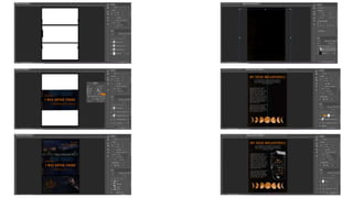
On the article page, I added an orange dirt texture for the background that I thought matched the album colour scheme well. For the article title, I followed the same steps as
previous. Using the same font, I added an outer glow and stroke effect, and then duplicated and added the motion blur filter. I added my article in white text using the same ‘Sitka’
font. At the bottom of the page, I placed an image of the moon phases and used a solid colour adjustment layer to change them to orange. I placed this because I was inspired by lots
of fan art for this album that incorporated the moon within their work. After placing everything I needed, I saw that there was too much empty space next to where my article is
placed. To fill this, I decided to create a handwritten note style piece with more song lyrics from this album. I started out with a ripped paper png and inverted the colours to make the
paper black, I also added a transparent piece of tape to give the appearance that this note was stuck separately into the magazine. For the text, I used the font ‘Handwritten’ to make
it look like it was written in some kind of sharpie pen. Using the crows from the previous page, I inverted their colour so they stood out as white and placed them on the paper with
the ‘difference’ layer style to make them look like they were part of the torn out paper. These two pages were combined to create one of my final double pages.
Production Week 3 - Weekend
After Hours:
For my final double page, on the article side I wanted to incorporate the ceiling lights at the casino from the Heartless and Blinding Lights music video. So, along with lowering the
opacity and setting the layer style to colour dodge, i incorporated this image into the background for my article page. I already had my ‘After Hours’ title made for my tour poster so I
placed this at the top of the page. However, this looked too busy alongside the background and like the colour were clashing. To resolve this, on a separate layer I added a black to
transparent gradient that I placed beneath the title text to fade out into the background. I used the font ‘Myriad Pro’ for the articles and added drop shadow effects on all of the text
so that it would stand out amongst the light beam background. On my introduction, I duplicated the text layer once and adjusted my RGB settings to just B. Then, I moved that layer
slightly to the side to give a subtle hint of that blue glitch similar to my title text. At the bottom corner of this article page, I placed another image of The Weeknd where he is looking
up at the lights featured in the background. I then duplicated the layers and created the RGB effect, changing the layer style to Screen on each to match the colour scheme once again
to my title text.
For my final creative style page, I wanted to make reference back to my alternate album cover, along with song lyrics, without directly copying the image over. I found this image of
The Weeknd where it was a drawing of him as a skeleton and was smoking a cigar. Using the spot healing tool, I covered over and removed that part of the image. Then, I decided I
could incorporate the eyes aspect of the album cover to this image. So, where the open mouth of the skeleton is, I placed the 3D eye effect from my album cover and erased sections
of it so that it fit the skeleton image. Once this fit well, I merged the items into one layer. Then, I duplicated the layer twice and moved them to each side ready to create the RGB
glitch effect I’ve created throughout my project. I switched the settings on each, then I erased the hair from these layers as there was too much overlap covering the main subject.
Next, I went back to my main subject layer and made a duplicate. Placing it above the RGB effect, I added a motion blur filter in a horizontal direction which helped brighten the
central image, as well as add movement throughout the layers. Now that the main image is complete, I am able to work on the text. In the font ‘OptimusPrinceps’ and in a green
shade, I typed ‘This Place Is’ and then added a green outer glow. I decided to also duplicate this layer and create a green/blue glitch effect. On the top layer, I added a black stroke
outline to ensure that the text is still readable. Next, in the same font and red text, I wrote the lyrics ‘Never What It Seems’ and added a wave effect to add more direction to the
image. Similar to my After Hours album logo, I added a bevel/emboss, stroke, inner and outer glow effect which made the overall text look more chiselled and 3D.
After exporting all the double pages and placing them onto PowerPoint, I had to download this presentation as a pdf in order for me to upload it onto Issuu. Once I had uploaded it to
Issuu, I have now completed the zine part of my project.
11.5.22- Production Day 10
To start off my tour poster, I made the design on a separate document. I decided to make a triple exposure
effect so I recreated the steps from my zine back cover but using alternative photos from the After Hours
to keep it relevant to the tour advertised. After that, instead of combining the layers, I first duplicated each
and adjusted the RGB settings. I shifted these layers to the left or right slightly which is what created this
glitch effect to the image. Once I had made the desired effect I combine the layers into one layer.
Originally, I had planned to solely use this image for my tour poster as I was struggling for ideas, but I was
inspired by a photographer on TikTok who created this image as shown on the right. I found an image of
The Weeknd holding his arm out and cut out that section and desaturated it. Next, I placed the arm and
duplicated layers so they surrounded him. Using the puppet warp tool, I moved the arms around slightly
so they were all angled towards the central glitch image. When I was happy with the image, I added this
same RGB glitch effect to the arms so they would match better with the central image. To create the
fisheye effect, I used the ellipse shape tool and held shift to draw a circle surrounding the image and then
made a selection. Using the spherise and pinch filter, I was able to warp the image to create this fisheye
effect. To make it look more realistic to a fisheye lense, I added a subtle blue outer glow as that is a
common aspect when looking at other fisheye lense photographs, I also added a subtle noise filter to add
a slight grainy texture to the overall image.
Starting off the day, I continued straight away with finishing my tour poster. Now that the fisheye effect has been
created, it is ready to place onto the tour poster, I copied the image over and placed it at the top centre of the
poster so it can be one of the main aspects the audience will see. To create the text effect, I wrote out the ‘After
Hours’ text and added the same RGB glitch effect as I used previously. This made the other colours match
consistently with the main image. To finish it off, I added a red outer glow to make the text further stand out.
For the ‘The’ and ‘Tour’ text, I made sure to use the same font but didn’t add the same glitch effect as it would
make the ‘After Hours’ text not stand out as much, and the title album is one of the most important aspects. I
added the dates and cities in a list in red text so it will stand out and also be easy for the audience to read an
navigate. For the texts listing the months, I added a red to grey gradient over it to make sure it stood out
alongside the tour dates and so all the text was easily distinguishable. Now that the key aspects of the tour
poster was made, I was able to add different textures and effects to make the poster all blend together and
stand out more. I added a space texture with light leak similar to my other textures used and adjusted the
blending mode to screen so it mainly added texture and brightness to the plain background. To finish it off, I
added a brightness/contrast adjustment layer to the fisheye image to bring out the vibrance of the glitch effect.
Towards the end of the day, I made a start on creating my ticket design. For the ticket design, it isn't going to be
as time consuming as my other products as I am using most aspects from my tour poster. I decided to add the
glitchy triple exposure image without the fisheye effect as it would appear to small on a ticket sized image. The
After Hours logo was also placed from the tour poster. However, for the other text, I also added a subtle RGB
effect but lowered the opacity so it was less bold than its title text.
12.5.22- Production Day 11
13.5.22- Production Day 12
Today I finished off my ticket design and also created a hoodie for my concert merchandise. Continuing on, using the
rectangular shape tool, I added the text box which included ticket details along with seat number and date of concert.
After placing the barcode on the right side of the ticket, I placed a png logo for Ticketmaster. To make this stand out
more, I created a glitch effect so it was consistent with the main ticket design, but I also added a stroke outline to the
centre text to ensure that the logo is still readable.
To create the hoodie merchandise design. I started out with an image of The Weeknd that had a plain black background
so I didn’t need to cut it out and it would blend well with the hoodie mock-up. I started out by adding a motion blur
filter and angled it in the direction his head was titled so it would flow well. After that, I duplicated the layers as I was
undecided on colour choices. On each I added a gradient map adjustment layer- one mostly green whilst the other was
red. The placement of the shades across the gradient map helped create this outer glow effect to the subject, as well as
the heatmap style gradient. Next, I exported each design of the red and green and placed it on the correct spot at the
centre of the hoodie mock-up. Both of the colour hoodies fit well, but I decided to stick with the green since I already
had a lot of red throughout my print products and wanted to bring more of the green in my colour scheme back to my
products. For the front of the hoodie, I decided to create another logo for the tour. Using the ellipse tool with the path
setting, I created a circle shape. Then, I used the same font as my other text logo and wrote out ‘After Hours 2022 Tour’
along the path and added the bevel and emboss effect just like other logos. This text is coloured a bright green to match
the design on the back of the hoodie, I also added the ‘XO’ logo to the centre of this circle and placed a green solid
colour adjustment layer to also match this. For extra detail, on the sleeves I added green hearts that are often printed
with the ‘XO’ logo, and if I made this hoodie in real life, I would plan to have those hearts embroidered instead of
printed.

More Related Content

Similar to Production Diary.pptx

Factual Project Production Log
Factual Project Production LogFactual Project Production Log
Factual Project Production Log
ShaniceYates
 
Fmp2 production reflectionss
Fmp2 production reflectionssFmp2 production reflectionss
Fmp2 production reflectionss
bronparsons
 
Fmp2 production reflection
Fmp2 production reflectionFmp2 production reflection
Fmp2 production reflection
bronparsons
 
Evaluation Q4 by Laura Vaabel
Evaluation Q4 by Laura VaabelEvaluation Q4 by Laura Vaabel
Evaluation Q4 by Laura Vaabel
Silent Sound Productions
 
5.2 Production Reflection.pptx
5.2 Production Reflection.pptx5.2 Production Reflection.pptx
5.2 Production Reflection.pptx
VirtualScourge2
 
Ha2 production log_template_141014
Ha2 production log_template_141014Ha2 production log_template_141014
Ha2 production log_template_141014amybrockbank
 
Evaluation Question 4
Evaluation Question 4Evaluation Question 4
Evaluation Question 4gemmarobyn
 
Editing of ancillary images
Editing of ancillary images Editing of ancillary images
Editing of ancillary images
felicityputman
 
FMP Y2: Daily Production Diary
FMP Y2: Daily Production DiaryFMP Y2: Daily Production Diary
FMP Y2: Daily Production Diary
EwanWild
 
Image manipulation 2
Image manipulation 2Image manipulation 2
Image manipulation 2
Elliezambakides
 
2.2 [pro forma] experimental photography planning
2.2 [pro forma] experimental photography planning 2.2 [pro forma] experimental photography planning
2.2 [pro forma] experimental photography planning
Jamie Mellors
 
Evalution question 4
Evalution question 4Evalution question 4
Evalution question 4AmazonRose
 
Final poster creation
Final poster creationFinal poster creation
Final poster creation
omar2099
 
5.2 Production Reflection.pptx
5.2 Production Reflection.pptx5.2 Production Reflection.pptx
5.2 Production Reflection.pptx
VirtualScourge2
 
Production Experiments
Production ExperimentsProduction Experiments
Production Experiments
ShaniceYates
 
6. production reflection real1
6. production reflection real16. production reflection real1
6. production reflection real1
Jack Henderson
 
Production Experiments
Production ExperimentsProduction Experiments
Production Experiments
ShaniceYates
 
Chosen i mages one
Chosen i mages oneChosen i mages one
Chosen i mages onearnellgrace
 

Similar to Production Diary.pptx (20)

Factual Project Production Log
Factual Project Production LogFactual Project Production Log
Factual Project Production Log
 
Fmp2 production reflectionss
Fmp2 production reflectionssFmp2 production reflectionss
Fmp2 production reflectionss
 
Fmp2 production reflection
Fmp2 production reflectionFmp2 production reflection
Fmp2 production reflection
 
diary pt 1.docx
diary pt 1.docxdiary pt 1.docx
diary pt 1.docx
 
Evaluation Q4 by Laura Vaabel
Evaluation Q4 by Laura VaabelEvaluation Q4 by Laura Vaabel
Evaluation Q4 by Laura Vaabel
 
5.2 Production Reflection.pptx
5.2 Production Reflection.pptx5.2 Production Reflection.pptx
5.2 Production Reflection.pptx
 
Ha2 production log_template_141014
Ha2 production log_template_141014Ha2 production log_template_141014
Ha2 production log_template_141014
 
Evaluation Question 4
Evaluation Question 4Evaluation Question 4
Evaluation Question 4
 
Editing of ancillary images
Editing of ancillary images Editing of ancillary images
Editing of ancillary images
 
FMP Y2: Daily Production Diary
FMP Y2: Daily Production DiaryFMP Y2: Daily Production Diary
FMP Y2: Daily Production Diary
 
Image manipulation 2
Image manipulation 2Image manipulation 2
Image manipulation 2
 
2.2 [pro forma] experimental photography planning
2.2 [pro forma] experimental photography planning 2.2 [pro forma] experimental photography planning
2.2 [pro forma] experimental photography planning
 
Evalution question 4
Evalution question 4Evalution question 4
Evalution question 4
 
Final poster creation
Final poster creationFinal poster creation
Final poster creation
 
5.2 Production Reflection.pptx
5.2 Production Reflection.pptx5.2 Production Reflection.pptx
5.2 Production Reflection.pptx
 
Production Experiments
Production ExperimentsProduction Experiments
Production Experiments
 
6. production reflection real1
6. production reflection real16. production reflection real1
6. production reflection real1
 
Production Experiments
Production ExperimentsProduction Experiments
Production Experiments
 
Evaluation q4
Evaluation   q4Evaluation   q4
Evaluation q4
 
Chosen i mages one
Chosen i mages oneChosen i mages one
Chosen i mages one
 

More from ShaniceYates

FMP Presentation Research.pptx
FMP Presentation Research.pptxFMP Presentation Research.pptx
FMP Presentation Research.pptx
ShaniceYates
 
FMP Reflections.pptx
FMP Reflections.pptxFMP Reflections.pptx
FMP Reflections.pptx
ShaniceYates
 
Presentation Script and Layout.pptx
Presentation Script and Layout.pptxPresentation Script and Layout.pptx
Presentation Script and Layout.pptx
ShaniceYates
 
FMP Evaluation.pptx
FMP Evaluation.pptxFMP Evaluation.pptx
FMP Evaluation.pptx
ShaniceYates
 
FMP Planning.pptx
FMP Planning.pptxFMP Planning.pptx
FMP Planning.pptx
ShaniceYates
 
FMP Research.pptx
FMP Research.pptxFMP Research.pptx
FMP Research.pptx
ShaniceYates
 
FMP Problem Solving + Experiments.pptx
FMP Problem Solving + Experiments.pptxFMP Problem Solving + Experiments.pptx
FMP Problem Solving + Experiments.pptx
ShaniceYates
 
Y2 FMP Pre Proposal
Y2 FMP Pre ProposalY2 FMP Pre Proposal
Y2 FMP Pre Proposal
ShaniceYates
 
Y2 FMP Contextual Research
Y2 FMP Contextual ResearchY2 FMP Contextual Research
Y2 FMP Contextual Research
ShaniceYates
 
Y2 FMP Contextual Statement
Y2 FMP Contextual StatementY2 FMP Contextual Statement
Y2 FMP Contextual Statement
ShaniceYates
 
Y2 FMP Proposal
Y2 FMP ProposalY2 FMP Proposal
Y2 FMP Proposal
ShaniceYates
 
The Grid Reflections
The Grid ReflectionsThe Grid Reflections
The Grid Reflections
ShaniceYates
 
The Grid Evaluation
The Grid EvaluationThe Grid Evaluation
The Grid Evaluation
ShaniceYates
 
The Grid Research and Planning
The Grid Research and PlanningThe Grid Research and Planning
The Grid Research and Planning
ShaniceYates
 
The Grid Audience Proposal
The Grid Audience ProposalThe Grid Audience Proposal
The Grid Audience Proposal
ShaniceYates
 
Male Gaze Essay
Male Gaze EssayMale Gaze Essay
Male Gaze Essay
ShaniceYates
 
Factual Evaluation
Factual EvaluationFactual Evaluation
Factual Evaluation
ShaniceYates
 
Factual Project Interview
Factual Project InterviewFactual Project Interview
Factual Project Interview
ShaniceYates
 
Factual Development and Planning Pro Forma
Factual Development and Planning Pro FormaFactual Development and Planning Pro Forma
Factual Development and Planning Pro Forma
ShaniceYates
 
The Male Gaze Research
The Male Gaze ResearchThe Male Gaze Research
The Male Gaze Research
ShaniceYates
 

More from ShaniceYates (20)

FMP Presentation Research.pptx
FMP Presentation Research.pptxFMP Presentation Research.pptx
FMP Presentation Research.pptx
 
FMP Reflections.pptx
FMP Reflections.pptxFMP Reflections.pptx
FMP Reflections.pptx
 
Presentation Script and Layout.pptx
Presentation Script and Layout.pptxPresentation Script and Layout.pptx
Presentation Script and Layout.pptx
 
FMP Evaluation.pptx
FMP Evaluation.pptxFMP Evaluation.pptx
FMP Evaluation.pptx
 
FMP Planning.pptx
FMP Planning.pptxFMP Planning.pptx
FMP Planning.pptx
 
FMP Research.pptx
FMP Research.pptxFMP Research.pptx
FMP Research.pptx
 
FMP Problem Solving + Experiments.pptx
FMP Problem Solving + Experiments.pptxFMP Problem Solving + Experiments.pptx
FMP Problem Solving + Experiments.pptx
 
Y2 FMP Pre Proposal
Y2 FMP Pre ProposalY2 FMP Pre Proposal
Y2 FMP Pre Proposal
 
Y2 FMP Contextual Research
Y2 FMP Contextual ResearchY2 FMP Contextual Research
Y2 FMP Contextual Research
 
Y2 FMP Contextual Statement
Y2 FMP Contextual StatementY2 FMP Contextual Statement
Y2 FMP Contextual Statement
 
Y2 FMP Proposal
Y2 FMP ProposalY2 FMP Proposal
Y2 FMP Proposal
 
The Grid Reflections
The Grid ReflectionsThe Grid Reflections
The Grid Reflections
 
The Grid Evaluation
The Grid EvaluationThe Grid Evaluation
The Grid Evaluation
 
The Grid Research and Planning
The Grid Research and PlanningThe Grid Research and Planning
The Grid Research and Planning
 
The Grid Audience Proposal
The Grid Audience ProposalThe Grid Audience Proposal
The Grid Audience Proposal
 
Male Gaze Essay
Male Gaze EssayMale Gaze Essay
Male Gaze Essay
 
Factual Evaluation
Factual EvaluationFactual Evaluation
Factual Evaluation
 
Factual Project Interview
Factual Project InterviewFactual Project Interview
Factual Project Interview
 
Factual Development and Planning Pro Forma
Factual Development and Planning Pro FormaFactual Development and Planning Pro Forma
Factual Development and Planning Pro Forma
 
The Male Gaze Research
The Male Gaze ResearchThe Male Gaze Research
The Male Gaze Research
 

Recently uploaded

Overview on Edible Vaccine: Pros & Cons with Mechanism
Overview on Edible Vaccine: Pros & Cons with MechanismOverview on Edible Vaccine: Pros & Cons with Mechanism
Overview on Edible Vaccine: Pros & Cons with Mechanism
DeeptiGupta154
 
special B.ed 2nd year old paper_20240531.pdf
special B.ed 2nd year old paper_20240531.pdfspecial B.ed 2nd year old paper_20240531.pdf
special B.ed 2nd year old paper_20240531.pdf
Special education needs
 
Digital Tools and AI for Teaching Learning and Research
Digital Tools and AI for Teaching Learning and ResearchDigital Tools and AI for Teaching Learning and Research
Digital Tools and AI for Teaching Learning and Research
Vikramjit Singh
 
aaaaaaaaaaaaaaaaaaaaaaaaaaaaaaaaaaaaaaaaa
aaaaaaaaaaaaaaaaaaaaaaaaaaaaaaaaaaaaaaaaaaaaaaaaaaaaaaaaaaaaaaaaaaaaaaaaaaaaaaaaaa
aaaaaaaaaaaaaaaaaaaaaaaaaaaaaaaaaaaaaaaaa
siemaillard
 
CACJapan - GROUP Presentation 1- Wk 4.pdf
CACJapan - GROUP Presentation 1- Wk 4.pdfCACJapan - GROUP Presentation 1- Wk 4.pdf
CACJapan - GROUP Presentation 1- Wk 4.pdf
camakaiclarkmusic
 
Mule 4.6 & Java 17 Upgrade | MuleSoft Mysore Meetup #46
Mule 4.6 & Java 17 Upgrade | MuleSoft Mysore Meetup #46Mule 4.6 & Java 17 Upgrade | MuleSoft Mysore Meetup #46
Mule 4.6 & Java 17 Upgrade | MuleSoft Mysore Meetup #46
MysoreMuleSoftMeetup
 
Synthetic Fiber Construction in lab .pptx
Synthetic Fiber Construction in lab .pptxSynthetic Fiber Construction in lab .pptx
Synthetic Fiber Construction in lab .pptx
Pavel ( NSTU)
 
Guidance_and_Counselling.pdf B.Ed. 4th Semester
Guidance_and_Counselling.pdf B.Ed. 4th SemesterGuidance_and_Counselling.pdf B.Ed. 4th Semester
Guidance_and_Counselling.pdf B.Ed. 4th Semester
Atul Kumar Singh
 
Acetabularia Information For Class 9 .docx
Acetabularia Information For Class 9  .docxAcetabularia Information For Class 9  .docx
Acetabularia Information For Class 9 .docx
vaibhavrinwa19
 
BÀI TẬP BỔ TRỢ TIẾNG ANH GLOBAL SUCCESS LỚP 3 - CẢ NĂM (CÓ FILE NGHE VÀ ĐÁP Á...
BÀI TẬP BỔ TRỢ TIẾNG ANH GLOBAL SUCCESS LỚP 3 - CẢ NĂM (CÓ FILE NGHE VÀ ĐÁP Á...BÀI TẬP BỔ TRỢ TIẾNG ANH GLOBAL SUCCESS LỚP 3 - CẢ NĂM (CÓ FILE NGHE VÀ ĐÁP Á...
BÀI TẬP BỔ TRỢ TIẾNG ANH GLOBAL SUCCESS LỚP 3 - CẢ NĂM (CÓ FILE NGHE VÀ ĐÁP Á...
Nguyen Thanh Tu Collection
 
The Challenger.pdf DNHS Official Publication
The Challenger.pdf DNHS Official PublicationThe Challenger.pdf DNHS Official Publication
The Challenger.pdf DNHS Official Publication
Delapenabediema
 
Introduction to AI for Nonprofits with Tapp Network
Introduction to AI for Nonprofits with Tapp NetworkIntroduction to AI for Nonprofits with Tapp Network
Introduction to AI for Nonprofits with Tapp Network
TechSoup
 
June 3, 2024 Anti-Semitism Letter Sent to MIT President Kornbluth and MIT Cor...
June 3, 2024 Anti-Semitism Letter Sent to MIT President Kornbluth and MIT Cor...June 3, 2024 Anti-Semitism Letter Sent to MIT President Kornbluth and MIT Cor...
June 3, 2024 Anti-Semitism Letter Sent to MIT President Kornbluth and MIT Cor...
Levi Shapiro
 
The geography of Taylor Swift - some ideas
The geography of Taylor Swift - some ideasThe geography of Taylor Swift - some ideas
The geography of Taylor Swift - some ideas
GeoBlogs
 
Home assignment II on Spectroscopy 2024 Answers.pdf
Home assignment II on Spectroscopy 2024 Answers.pdfHome assignment II on Spectroscopy 2024 Answers.pdf
Home assignment II on Spectroscopy 2024 Answers.pdf
Tamralipta Mahavidyalaya
 
How to Make a Field invisible in Odoo 17
How to Make a Field invisible in Odoo 17How to Make a Field invisible in Odoo 17
How to Make a Field invisible in Odoo 17
Celine George
 
Instructions for Submissions thorugh G- Classroom.pptx
Instructions for Submissions thorugh G- Classroom.pptxInstructions for Submissions thorugh G- Classroom.pptx
Instructions for Submissions thorugh G- Classroom.pptx
Jheel Barad
 
Adversarial Attention Modeling for Multi-dimensional Emotion Regression.pdf
Adversarial Attention Modeling for Multi-dimensional Emotion Regression.pdfAdversarial Attention Modeling for Multi-dimensional Emotion Regression.pdf
Adversarial Attention Modeling for Multi-dimensional Emotion Regression.pdf
Po-Chuan Chen
 
A Strategic Approach: GenAI in Education
A Strategic Approach: GenAI in EducationA Strategic Approach: GenAI in Education
A Strategic Approach: GenAI in Education
Peter Windle
 
678020731-Sumas-y-Restas-Para-Colorear.pdf
678020731-Sumas-y-Restas-Para-Colorear.pdf678020731-Sumas-y-Restas-Para-Colorear.pdf
678020731-Sumas-y-Restas-Para-Colorear.pdf
CarlosHernanMontoyab2
 

Recently uploaded (20)

Overview on Edible Vaccine: Pros & Cons with Mechanism
Overview on Edible Vaccine: Pros & Cons with MechanismOverview on Edible Vaccine: Pros & Cons with Mechanism
Overview on Edible Vaccine: Pros & Cons with Mechanism
 
special B.ed 2nd year old paper_20240531.pdf
special B.ed 2nd year old paper_20240531.pdfspecial B.ed 2nd year old paper_20240531.pdf
special B.ed 2nd year old paper_20240531.pdf
 
Digital Tools and AI for Teaching Learning and Research
Digital Tools and AI for Teaching Learning and ResearchDigital Tools and AI for Teaching Learning and Research
Digital Tools and AI for Teaching Learning and Research
 
aaaaaaaaaaaaaaaaaaaaaaaaaaaaaaaaaaaaaaaaa
aaaaaaaaaaaaaaaaaaaaaaaaaaaaaaaaaaaaaaaaaaaaaaaaaaaaaaaaaaaaaaaaaaaaaaaaaaaaaaaaaa
aaaaaaaaaaaaaaaaaaaaaaaaaaaaaaaaaaaaaaaaa
 
CACJapan - GROUP Presentation 1- Wk 4.pdf
CACJapan - GROUP Presentation 1- Wk 4.pdfCACJapan - GROUP Presentation 1- Wk 4.pdf
CACJapan - GROUP Presentation 1- Wk 4.pdf
 
Mule 4.6 & Java 17 Upgrade | MuleSoft Mysore Meetup #46
Mule 4.6 & Java 17 Upgrade | MuleSoft Mysore Meetup #46Mule 4.6 & Java 17 Upgrade | MuleSoft Mysore Meetup #46
Mule 4.6 & Java 17 Upgrade | MuleSoft Mysore Meetup #46
 
Synthetic Fiber Construction in lab .pptx
Synthetic Fiber Construction in lab .pptxSynthetic Fiber Construction in lab .pptx
Synthetic Fiber Construction in lab .pptx
 
Guidance_and_Counselling.pdf B.Ed. 4th Semester
Guidance_and_Counselling.pdf B.Ed. 4th SemesterGuidance_and_Counselling.pdf B.Ed. 4th Semester
Guidance_and_Counselling.pdf B.Ed. 4th Semester
 
Acetabularia Information For Class 9 .docx
Acetabularia Information For Class 9  .docxAcetabularia Information For Class 9  .docx
Acetabularia Information For Class 9 .docx
 
BÀI TẬP BỔ TRỢ TIẾNG ANH GLOBAL SUCCESS LỚP 3 - CẢ NĂM (CÓ FILE NGHE VÀ ĐÁP Á...
BÀI TẬP BỔ TRỢ TIẾNG ANH GLOBAL SUCCESS LỚP 3 - CẢ NĂM (CÓ FILE NGHE VÀ ĐÁP Á...BÀI TẬP BỔ TRỢ TIẾNG ANH GLOBAL SUCCESS LỚP 3 - CẢ NĂM (CÓ FILE NGHE VÀ ĐÁP Á...
BÀI TẬP BỔ TRỢ TIẾNG ANH GLOBAL SUCCESS LỚP 3 - CẢ NĂM (CÓ FILE NGHE VÀ ĐÁP Á...
 
The Challenger.pdf DNHS Official Publication
The Challenger.pdf DNHS Official PublicationThe Challenger.pdf DNHS Official Publication
The Challenger.pdf DNHS Official Publication
 
Introduction to AI for Nonprofits with Tapp Network
Introduction to AI for Nonprofits with Tapp NetworkIntroduction to AI for Nonprofits with Tapp Network
Introduction to AI for Nonprofits with Tapp Network
 
June 3, 2024 Anti-Semitism Letter Sent to MIT President Kornbluth and MIT Cor...
June 3, 2024 Anti-Semitism Letter Sent to MIT President Kornbluth and MIT Cor...June 3, 2024 Anti-Semitism Letter Sent to MIT President Kornbluth and MIT Cor...
June 3, 2024 Anti-Semitism Letter Sent to MIT President Kornbluth and MIT Cor...
 
The geography of Taylor Swift - some ideas
The geography of Taylor Swift - some ideasThe geography of Taylor Swift - some ideas
The geography of Taylor Swift - some ideas
 
Home assignment II on Spectroscopy 2024 Answers.pdf
Home assignment II on Spectroscopy 2024 Answers.pdfHome assignment II on Spectroscopy 2024 Answers.pdf
Home assignment II on Spectroscopy 2024 Answers.pdf
 
How to Make a Field invisible in Odoo 17
How to Make a Field invisible in Odoo 17How to Make a Field invisible in Odoo 17
How to Make a Field invisible in Odoo 17
 
Instructions for Submissions thorugh G- Classroom.pptx
Instructions for Submissions thorugh G- Classroom.pptxInstructions for Submissions thorugh G- Classroom.pptx
Instructions for Submissions thorugh G- Classroom.pptx
 
Adversarial Attention Modeling for Multi-dimensional Emotion Regression.pdf
Adversarial Attention Modeling for Multi-dimensional Emotion Regression.pdfAdversarial Attention Modeling for Multi-dimensional Emotion Regression.pdf
Adversarial Attention Modeling for Multi-dimensional Emotion Regression.pdf
 
A Strategic Approach: GenAI in Education
A Strategic Approach: GenAI in EducationA Strategic Approach: GenAI in Education
A Strategic Approach: GenAI in Education
 
678020731-Sumas-y-Restas-Para-Colorear.pdf
678020731-Sumas-y-Restas-Para-Colorear.pdf678020731-Sumas-y-Restas-Para-Colorear.pdf
678020731-Sumas-y-Restas-Para-Colorear.pdf
 

Production Diary.pptx

  • 2. 6.4.22- Production Day 1 For the first day of production, I started working on the concert visuals as stated in my schedule. Today I created a light beam animation, I followed a tutorial by ‘Mobox Graphics’ on YouTube and made my own version of this animation that fits the style of what I am planning to make. First, I started out by creating a new composition of 1000px x 1000px and 25fps for the base of my animation. This loaded up as a transparent layer so I created a new solid layer of black for the background. I also created a second white solid layer on top for when I make the light beams. Next, I went to Effects and Presets and added the ‘CC Star Burst’ effect and changed some of the settings within this to slow down the speed and make less stars appear. This effect created a look of stars zooming towards the viewer. To make these stars blur and also look more like beams, I added the ‘CC Light Burst’ effect. ‘Matte Choker’ effect made the effects look more like solid beams of light by adding more definition and brightening the colour. Before making any more changes, I fixed the scale to make the animation look smoother and loop better. Now that the animation is fixed, I added an adjustment layer ready for more layering effects, glow, and recolouring. Starting out with ‘CC Flow Motion’ added a ‘black hole’ look to the animation, but I adjusted the setting to be lower so I could have a more subtle warped look to the animation that still pulls the audience in. On a second adjustment layer, I added a ‘CC Lens’ which mimics a camera lens. It pulls the animation to be more zoomed in to make the audience feel like they’re in the immersive animation, and also fixing a cropping issue that occurred when I added the flow motion effect (which warped all the layers). To recolour the animation, I added the ‘Channel Blur’ effect which allowed me to adjust the RGB scale to create a colour that works best for my animation. I used these settings to create a yellow-gold type colour as shown in the screenshots. I added the ‘Glow’ effect to brighten up the light beam animation, and increased the settings. This glow effect throughout made it appear as if I had two different gold shades flowing through which helped add more dimension to the animation. To make it look more realistic, I added a ‘Noise’ effect which created this subtle static around the light beams. Finally, I added a hue/saturation layer and adjusted the settings for the background, this added more depth and realism as it looks like there is light radiating off the glowy light beams. Now that the animation is done, at the end of the day I tried to download the mp3 song ‘Heartless’ before making any more animations so that as I am creating the other animations I can line them up and time them alongside the song but it was unavailable on the college computers meaning that I will have to do it from home and email it to myself for college tomorrow. I think today went quite successful and I was able to make a start on my first animation. Although I would have liked to have been more productive, I had issues with After Effects taking longer to load or crashing in between but I luckily didn’t lose any work. Tomorrow I plan to make the rest of the animations for my first visual and will hopefully have the song downloaded so I can piece it altogether too.
  • 3. 7.4.22- Production Day 2 Today started off with a few challenges. I was unable to bring the downloaded mp3 as I couldn’t upload it or email myself. After Effects also wasn’t working at the start of this morning. To resolve this, I decided I would change how my schedule is and work on my print products and leave my concert visuals until last when I am better organised with it all. So today I decided to create my album cover as I have lots of inspiration for it and was eager to learn about the 3D tools. At first, I started off with this picture of The Weeknd where he is facing off to the side, but I realised that to create my desired effect I would need a front facing image. I decided on this picture as shown in the screenshots, which also looks similar to the original After Hours album cover so it would be consistent with the existing visuals. Both photos were taken from a photoshoot with Anton Tammi, but I have edited and added my own effects to create my own visual. To start off, I wanted to edit the photo in preparation for the 3D effect. The original image is quite bright and glowy and I want my image to look darker and grainier. First, I expanded the image to fit the darker background, I used the quick selection tool to cut The Weeknd out of the image so he could be in front of a plain black background. Then, I used the Camera Raw filter and focused on adding grain and contrast to the image, I also increased the luminance of the green and red shades to bring out the vibrance of those colours over his face. Now that the image is fixed, I am ready to create the main effect. Using the rectangular marquee tool, I placed it on the centre of his face covering his nose and some of his eyes, I created a mask and inverted it to cut this out. To create the curtains I had to split this mask into four. I duplicated the layer and converted this to a smart object and used the rectangular marquee tool to cut a quarter of the layer out. I repeated each step, along with duplicating the layers for each quarter. To create the curtain effect, I used the transform warp tool and pulled each layer back from the centre. I adjusted all of these individually so it didn’t look too neat to give an effect that it had almost been ripped open. Adding a brightness/contrast adjustment layer as a clipping mask to each curtain, along with a noise filter for texture makes the effect look more realistic. To make the curtains look even more realistic and 3D, I used the burn tool on and around each layer to create shadow ‘underneath’ the curtain and towards the inside of the face to add depth. Near the end of the day I was ready to create the 3D eye effect, but it wasn’t loading well on the college computers and was causing it to glitch so to resolve this, I am going to make the eyes at home tonight and then add the effect on to the image tomorrow. Overall, today was successful and I am eager to see the finished product of my album cover. Although there were setbacks, I was still able to be productive and focus on another part of my production. Tomorrow I plan on finishing the album cover off and creating mock-ups to present how it would be sold.
  • 4. 8.4.22- Production Day 3 Once I arrived home yesterday evening, I created the 3D eye on my own computer in preparation for today (see screenshots of process on next slide). I started out with a 2D map of an eye that is flattened so it can be made as 3D, using a mix of the level adjustment layer and solid colour overlay I recoloured this eye to brown as I wanted it to match the artists eye colour more accurately. I also selected the actual eye colour and warped it so that it would be spherical once put into the 3D tools. Now that it was prepped, I selected: 3D; new mesh from layer; mesh preset; sphere to put it into the 3D tools menu and create a 3D spherical eye. After that, I dragged the layer into a separate for document to make it a smart object, duplicated the layers, and rotated so I could create a group of the eyes all facing at different angles. Once I had made enough together to add to my main image, I merged all the layers and used the Camera Raw filter to add more yellow to the eyes so they weren’t so pure- white and looked unrealistic, along with some texture and uploaded the document to OneDrive ready to be added today. Starting out, I dragged my eye effect straight onto the main image to be revealed underneath the curtain effect I made yesterday. To add shadows for realism, I selected the smart object of the eyes, and added a drop shadow into most of the eyes, rotating the angle with the direction of the eye. After that I went back into the Camera Raw filter again and darkened it to match the lighting of the main image. On a separate layer, I used the brush tool at a low opacity to add the subtle green and red overlay over the eyes to also match the lighting in the image. Now that the main image is complete, I can add all the additional conventions that are needed for an album cover. I placed the ‘After Hours’ text in the top left corner that I had made previously. To create this defined look, I used the bevel and emboss blending mode and a subtle stroke outline to make it stand out in front of the image. At the bottom of the image, I added a png of his ‘XO’ logo and a parental advisory sticker and used a solid colour adjustment layer on each to recolour these to the same red shade as the album title. To finish it off, I merged all the layers into a group and went to Camera Raw filter once again. I brightened the image as a whole as it was looking very dimly lit, and increased the luminance of the red and green which also brightened up the text and XO logo along with the image. I placed a stars' texture over the top of this and set the blending mode to screen and 53% opacity to add more texture to the image and some subtle stars in the background and exported. Today was very productive, I was able to complete my album cover in time for the Easter holidays. All I have left to do to complete this section of my print products is create the mock-ups and then I can focus on my zine and tour poster.
  • 5.
  • 6. 27.4.22- Production Day 4 After returning from Easter break, I had to create the inner cover and back cover for my mock-ups. At first, I started out with this image of The Weeknd facing the side, I added a gradient map layer to make the lighting over him a more orange tone instead of a bright green. Originally, I intended for this image to be used for the CD back cover, but after experimenting with placements I decided the image wasn’t fit for the back cover alongside the track list. For the back cover, I used the same After Hours logo that I have placed on my front cover but placed it side by side to go across the top. For the track list, I added a bevel and emboss effect on the text to make it look more 3D and defined. Then, I used a solid colour adjustment layer to recolour the Republic Records logo and Parental Advisory sticker green so it can contrast with the otherwise red back cover and be consistent with my colour scheme. Finally, to finish it off, I added that same stars’ texture as my front cover to add more detail to the background, and then exported ready to be placed on the mock-up. For the inside cover, I decided to create a mini poster including the lyrics from Escape From L.A, which is what helped inspire my design for my album cover. I used the same image that I previously added the gradient overlay to and placed it to the left of the cover. For the first part of the text, ‘if you seen what I seen’, I added an inner glow blending mode, and finished it off with a black stroke layer to outline the glowy text and make it stand out even more. For the text ‘you wouldn’t’, I added a green stroke outline, and then reduced the fill to 0% to create this green outline style text. For the ‘sleep’ text, I started out by duplicating the layers twice and then adjusting the RGB settings. I moved each of the layers slightly to each side of the main text and this is what created the glitch text effect. Finally, I had to make a CD design, for this I decided that I would re-use the eyes I made from the front cover. I duplicated several layers and combined them on a separate document. To finish it off, I added a gradient overlay adjustment layer of red to green to look similar to the lighting gradient on my album cover. Lastly, I added all these pieces onto my mock-ups. At first they looked quite faint and was hard to see on the lighting. To resolve this, I used the camera raw filter to increase the brightness/contrast and bring out the red/green colours in the images. This day was very productive, I have finished off the album cover section of my production. Tomorrow, I plan to start working on my magazine and complete my front and back cover by the end of the week.
  • 7.
  • 8. 28.4.22- Production Day 5 Today, I started off by making my zine front cover. I was inspired by a collage image that I saw online and wanted to incorporate that style with my own to make the cover. I started off with a photo of The Weeknd from a previous photoshoot. I used the quick selection tool to cut out the main subject and then copied the layer and added a halftone pattern from the filter gallery to give a comic style look to it. After that, I added a gradient map to appear over the pattern. To finish off the main cover image, I merged and copied the layer and added a motion blur effect over the top. Then I changed the blending mode to lighten so the image had a subtle blur effect. For the background, I created a new layer and added the halftone pattern again which added a more checkered look to the image. Using the smudge tool, I warped the image for more of an illusion effect and finished it off by adding a red and black overlay over the top. 29.4.22- Production Day 6 To create my back cover, which will be an advertisement teasing his latest release ‘Dawn FM’, I started out with one of the promotional images for this album and cut it out with the quick selection tool so it could be placed on a plain background. Then, I got two photos from a separate promotional photoshoot and cut out each one to scale next to my central image. Next, I added a motion blur filter to each in a horizontal direction to add more movement to the image and so it fits the glowing central image better. Also, I had to add a curves adjustment layer to each of these images to match the colouring of the centre image to a more blueish shade. Then I changed each of these blending modes to ‘Linear Dodge (Add)’ which allowed them to blend with my original image perfectly. Since my centre image looked quite harsh amongst the other blended images, I also slightly decreased the opacity to create this final triple exposure effect. For the text, I decided on the slogan ‘The Dawn Is Coming’ as this is what he used previously to tease his upcoming album. I added a bevel and emboss text style and decreased the settings to create a slight 3D effect for this text. Next, I added a gradient overlay which went from blue, to white, to blue, to create a glowy highlight over the text, then I finished off with a stroke outline to make it stand out. Once I had my text placed in the right position, I duplicated and merged the layers. On the duplicate layer, I added a motion blur filter and an outer glow blending style to create this glowing futuristic style text. To finish off the back cover, I added a space background texture and changed the layer style to ‘Exclusion’. I then combined all the layers and used the Camera Raw filter to further blend and increase the luminance of the blue shades. Today and this week has been positive as I have reached my goal of completing my front and back cover for my zine. Next week, I aim to finish off my zine. However, there is a lot to work on as he has multiple albums so I may have to do half of the double pages from home and over the weekend.
  • 9.
  • 10.
  • 11. 4.5.22- Production Day 7 This week, I decided to work on my mini zine as I am concerned about it taking too much time up and would prefer to finish that first. Over the weekend, I have also written out my articles in preparation for this week. Starting out with the first album by The Weeknd, and my first page of the zine is Trilogy. For each double page, I decided that I wanted one page to feature the article and another page to have a creative design based around that album release so I could still demonstrate my skills and make my zine visually appealing alongside its articles. For my first page design, I wanted to showcase each of the albums and also display it in a similar style to the mixtape covers. In the centre of the page, using the rectangle shape tool I added three rectangles of the same size. Within these, I added two images from the time of the release and blending them using the ‘colour dodge’ layer style to create this double exposure/collage type effect. Then, I changed the outline of each rectangle for the corresponding tape: house of balloons was black/monochrome; thursday was yellow; echoes of silence was red. Once I was happy with each rectangle, I added a ‘vintage paper’ texture over the three and changed the layer style to screen so it gave a subtle grainy overlay. Because I was unsure that my entire article would fit on the article page never, I placed the introduction in white text beneath the images. At the top of the page, along with the other text, for the Trilogy title I started out by creating the RGB effect. But I only used the colours red and yellow so that they corresponded with the tape colour schemes and the central image on the page. I added a stroke outline to the title text and this ended up creating a comic pop out style effect. To finish off this page, I added a paper overlay for a more crinkled effect, and increased the noise on my background so there was more texture. For the article page, I started out by adding a dust texture to the background. Throughout the making of these pages, I wanted to give the gritty old film look that is nostalgic to the time it was released and its homemade style. Next, I inserted these film frames and duplicated them so the three fit the centre of the page. Mimicking the style of the left side of the page, I proceeded to insert images from each of these tape releases whilst adjusting the layer style to make them blend and overlap each other seamlessly. After that, I placed my text referring to each tape in their corresponding frames so it was easy for the reader to navigate. I also added an outer glow to each text box with the matching colour scheme in each frame (either monochrome, yellow, or red). To make the film style frames look more realistic, I placed a print overlay with the layer style as ‘multiply’ to add that printed film photo texture that is often seen and reminiscent to other images from this album era. To finish it off, I combined the two pages into one double pages and placed it onto PowerPoint ready to convert it to a pdf file for Issuu.
  • 12.
  • 13. 5.5.22- Production Day 8 I spent the day working on creating my Kiss Land double page spread. To start with the Kiss Land article page, I added a space and stars overlay to my background so it had some texture but also contrasted from the previous page. Then on a separate layer, I applied a noise filter and then motion blur to warp the texture and add more movement. I brought the opacity to 61% and the fill to 59% to add an extra subtle texture to the background. Using the font ‘Towards’ I created the title ‘Kiss Land’, this font replicated the original logo as close as I could find. To make this stand out more I added an array of effects such as bevel and emboss, stroke, and inner and outer glow. This gave the text a glowing 3D look that looked similar to a neon street sign. Next, I duplicated the text layer and converted to smart object. I placed a motion blur filter and set the layer style to lighten so it added movement to the title alongside the background. After that, I was able to place my article using the same ‘Towards’ font and displayed this in a traditional magazine article style. I wanted to include a quote from the artist, so using the rectangle shape tool, I placed a box with no fill but a green outline. After rounding the corners off, I added an inner and outer glow to replicate a neon sign similar to the article title and then placed the quote in the centre of it in bold text so it differed from my article text. I finished it off by exporting and adding to the PowerPoint and immediately starting the second half of this double page. For this page, I wanted to do something creative that also fit with the album aesthetic. I was inspired by images on Pinterest of a selection of objects that look like they had been scanned so I wanted to replicate something of a similar style. I started out with a photo strip frame and used the pen tool to cut out the rectangles where the photos would be placed. I replaced these rectangles with images from his music video or promotional shots and added a Kodak grain camera texture over each of these images to make them look more accurate to a photo strip style. After I had finished the main part of this image, I was able to add other aspects around it. Using google translate, I translated ‘Kiss Land’ and ‘The Weeknd’ into Japanese (because a lot of this album aesthetic was Japanese inspired), and followed the same steps as my ‘Kiss Land’ title recreation time make this replicate a neon sign. Additionally, I placed a list of some songs featured on the album and added an outer glow to this text to ensure it stood out amongst the other bold aspects of this image. Further down on the image, I replicated another sign style, once again I placed The Weeknd text in Japanese, along with 2013 which was the year of the Kiss Land release. Then, I added the ‘Paradox!’ text to tell the audience that the cheesy title name is contradictory to the songs within. Finally, I placed a screenshot I had taken of a Tokyo street map, I desaturated it and inverted it to create this monochrome presentation of one of the streets. To help or stand out more, I added a white stroke outline and outer glow. For the background, I added some coloured stars to help add to the glowing look of the image. As I still felt like there was a lot of negative space, I placed a custom shape I downloaded for a previous project and placed this alongside the tracklist. To finish it off and truly create that scanned look I added two different paper overlays. The first texture adds shadow to different areas and presents a subtly crumpled look, the second texture adds the grain and slight grey overlay. These two pages were combined for a double pages.
  • 14.
  • 15. 6.5.22- Production Day 9 Today, I completed my Beauty Behind The Madness page, and also made a start on my Starboy double page. Because a common aspect in his visuals for this album era is a collage/ripped paper style, I wanted to incorporate that as much as possibly within this double page. For my creative page, I started out with a bunch of pictures of The Weeknd from this time of release and desaturated them (this album era also had a monochrome style). After moving the images around and deciding on placements, I used the pen tool to roughly trace around the edges. I didn’t have to be too specific with this as I want to replicate the paper collage effect. Next, I placed a variation of paper torn edges to the collage and used the puppet warp tool to fit these around different images or corners of the page, I then combined all the layers and merged into one layer. To contrast with the monochrome collage, I used the pen tool and cut out a variation of magazine letters and combined them in the centre of the page to create the title ‘King of the Fall’. Finishing this page off, I added a scratch paper texture overlay to make the paper collage style look more authentic, and then exported. For my article page, I started out by adding a halftone filter over a yellow background. I then added this warped overlay to create this bright yellow trippy effect. After that, I found a paper texture effect that had transparent tears through the middle which revealed the warped yellow background. Next, I added a curves adjustment layer to darken the background and flipped the canvas so most of the tears were near the bottom instead, leaving room for the title and articles. Using the spot healing tool, I had to patch over some of the tears so I could allow more room for my article without the page looking too busy and unreadable. I feel like this style with the paper texture captures the feeling of this album how I envision it whilst also combining aspects of existing visuals. Now that the background was repaired, I added my text- which I presented in a yellow font and used the font ‘MS Gothic’ along with a drop shadow. For the title, I replicated the album text as close as possible. Using png images of torn paper, I added a solid colour adjustment layer to make it match the yellow text. Incorporating this into the title helps keep that collage style consistent throughout both pages. On the article page, I started out with the background of a space scenery. I wanted to give a futuristic spacey feel that is relevant to the title ‘Starboy’. On a seperate layer, I created a radial gradient of blue, purple and pink shades to create a black hole type effect. I set the blending mode to Screen so this blended into the space scenery. Next, I created my page title ‘Starboy: Legend of the Fall’, using the font ‘Cut from Ebony’ for both parts of the text. I made the Starboy text in white, then added a bevel and emboss, and inner and outer glow of neon pink to give this bold, pop out style of text. Alternatively, I followed these same steps for ‘Legend of the Fall’ but instead had the text as neon pink and the outer glow as white. Directly below this, I placed the article introduction using the font ‘Myriad Pro’ and a drop shadow effect, this is consistently used amongst the rest of the article text on this page. As this zine is taking more time and is more detailed than I originally planned out, I am going to have to work on completing this over days to ensure that I don't run out of time to make everything else.
  • 16.
  • 17.
  • 18. Production Week 3 - Weekend Completing Starboy Page: After placing my article, I decided that I wanted to incorporate more of the Starboy features to my page. I placed an image of the cross that The Weeknd carries in his music videos and placed it across my title. To give the effect that it was going through the text, I used the eraser tool and removed parts of the cross to give the appearance that it was weaving in between the text. To add to the bottom of the page, I created another glowing, bevel and emboss style text of song lyrics from his album. I inserted star shapes in between some of the letters to somewhat censor the profanity in the lyrics, and then added a pink outer glow to each of these. For the second half, I wanted to make what looked like a slideshow of photos from the Starboy era, but with a grainier, film style overlay. I was also inspired by Skepta’s album cover to create the iridescent heatmap over the images. I started out by drawing out 9 rounded rectangles that I placed in 3 rows. I made these using the rectangle shape tool. On each of these, I added a pink outer glow with noise to match my article page. Next, I placed all my images in the desired rectangles, applying as clipping masks to each shape. After that, I added a gradient map adjustment layer of purple to pink on each of these images. However, I switched four images' gradients to a pink to purple gradient instead to subtly refer back to that cross shape once again that is featured on the article page. To finish it off, I added a film scratches overlay to the entire page in the ‘lighten’ layer style, and the coloured print overlay in ‘soft light’ to give it a fuzzier grain texture overall. My Dear Melancholy: For the creative page, I decided to do references to the song lyrics on the EP. I started out by inserting three film style frames, similar to my Trilogy page but with alternate frames, and placed images from the ‘Call Out My Name’ music video into each. For the lyrics text, I used the font ‘Sitka’, which looks similar to the original font, in orange text and then placed an additional orange glow and drop shadow effect. I duplicated this text layer and added a motion blur filter to add movement to the image, but also add to the frantic, upset emotions that this album and it’s lyricism is based around. I finished off this top frame with a film scratches overlay in which I lowered the opacity to only give a subtle effect. I followed these same steps for the centre and bottom frame. However, on the centre frame, I kept each word on a separate layer and had each layer fade our slightly by lowering each of their opacity to give a literal sense to the lyrics ‘he was gone in thin air’. I combined all these layers into one to create the final look. On the article page, I added an orange dirt texture for the background that I thought matched the album colour scheme well. For the article title, I followed the same steps as previous. Using the same font, I added an outer glow and stroke effect, and then duplicated and added the motion blur filter. I added my article in white text using the same ‘Sitka’ font. At the bottom of the page, I placed an image of the moon phases and used a solid colour adjustment layer to change them to orange. I placed this because I was inspired by lots of fan art for this album that incorporated the moon within their work. After placing everything I needed, I saw that there was too much empty space next to where my article is placed. To fill this, I decided to create a handwritten note style piece with more song lyrics from this album. I started out with a ripped paper png and inverted the colours to make the paper black, I also added a transparent piece of tape to give the appearance that this note was stuck separately into the magazine. For the text, I used the font ‘Handwritten’ to make it look like it was written in some kind of sharpie pen. Using the crows from the previous page, I inverted their colour so they stood out as white and placed them on the paper with the ‘difference’ layer style to make them look like they were part of the torn out paper. These two pages were combined to create one of my final double pages.
  • 19.
  • 20.
  • 21. Production Week 3 - Weekend After Hours: For my final double page, on the article side I wanted to incorporate the ceiling lights at the casino from the Heartless and Blinding Lights music video. So, along with lowering the opacity and setting the layer style to colour dodge, i incorporated this image into the background for my article page. I already had my ‘After Hours’ title made for my tour poster so I placed this at the top of the page. However, this looked too busy alongside the background and like the colour were clashing. To resolve this, on a separate layer I added a black to transparent gradient that I placed beneath the title text to fade out into the background. I used the font ‘Myriad Pro’ for the articles and added drop shadow effects on all of the text so that it would stand out amongst the light beam background. On my introduction, I duplicated the text layer once and adjusted my RGB settings to just B. Then, I moved that layer slightly to the side to give a subtle hint of that blue glitch similar to my title text. At the bottom corner of this article page, I placed another image of The Weeknd where he is looking up at the lights featured in the background. I then duplicated the layers and created the RGB effect, changing the layer style to Screen on each to match the colour scheme once again to my title text. For my final creative style page, I wanted to make reference back to my alternate album cover, along with song lyrics, without directly copying the image over. I found this image of The Weeknd where it was a drawing of him as a skeleton and was smoking a cigar. Using the spot healing tool, I covered over and removed that part of the image. Then, I decided I could incorporate the eyes aspect of the album cover to this image. So, where the open mouth of the skeleton is, I placed the 3D eye effect from my album cover and erased sections of it so that it fit the skeleton image. Once this fit well, I merged the items into one layer. Then, I duplicated the layer twice and moved them to each side ready to create the RGB glitch effect I’ve created throughout my project. I switched the settings on each, then I erased the hair from these layers as there was too much overlap covering the main subject. Next, I went back to my main subject layer and made a duplicate. Placing it above the RGB effect, I added a motion blur filter in a horizontal direction which helped brighten the central image, as well as add movement throughout the layers. Now that the main image is complete, I am able to work on the text. In the font ‘OptimusPrinceps’ and in a green shade, I typed ‘This Place Is’ and then added a green outer glow. I decided to also duplicate this layer and create a green/blue glitch effect. On the top layer, I added a black stroke outline to ensure that the text is still readable. Next, in the same font and red text, I wrote the lyrics ‘Never What It Seems’ and added a wave effect to add more direction to the image. Similar to my After Hours album logo, I added a bevel/emboss, stroke, inner and outer glow effect which made the overall text look more chiselled and 3D. After exporting all the double pages and placing them onto PowerPoint, I had to download this presentation as a pdf in order for me to upload it onto Issuu. Once I had uploaded it to Issuu, I have now completed the zine part of my project.
  • 22.
  • 23.
  • 24. 11.5.22- Production Day 10 To start off my tour poster, I made the design on a separate document. I decided to make a triple exposure effect so I recreated the steps from my zine back cover but using alternative photos from the After Hours to keep it relevant to the tour advertised. After that, instead of combining the layers, I first duplicated each and adjusted the RGB settings. I shifted these layers to the left or right slightly which is what created this glitch effect to the image. Once I had made the desired effect I combine the layers into one layer. Originally, I had planned to solely use this image for my tour poster as I was struggling for ideas, but I was inspired by a photographer on TikTok who created this image as shown on the right. I found an image of The Weeknd holding his arm out and cut out that section and desaturated it. Next, I placed the arm and duplicated layers so they surrounded him. Using the puppet warp tool, I moved the arms around slightly so they were all angled towards the central glitch image. When I was happy with the image, I added this same RGB glitch effect to the arms so they would match better with the central image. To create the fisheye effect, I used the ellipse shape tool and held shift to draw a circle surrounding the image and then made a selection. Using the spherise and pinch filter, I was able to warp the image to create this fisheye effect. To make it look more realistic to a fisheye lense, I added a subtle blue outer glow as that is a common aspect when looking at other fisheye lense photographs, I also added a subtle noise filter to add a slight grainy texture to the overall image.
  • 25. Starting off the day, I continued straight away with finishing my tour poster. Now that the fisheye effect has been created, it is ready to place onto the tour poster, I copied the image over and placed it at the top centre of the poster so it can be one of the main aspects the audience will see. To create the text effect, I wrote out the ‘After Hours’ text and added the same RGB glitch effect as I used previously. This made the other colours match consistently with the main image. To finish it off, I added a red outer glow to make the text further stand out. For the ‘The’ and ‘Tour’ text, I made sure to use the same font but didn’t add the same glitch effect as it would make the ‘After Hours’ text not stand out as much, and the title album is one of the most important aspects. I added the dates and cities in a list in red text so it will stand out and also be easy for the audience to read an navigate. For the texts listing the months, I added a red to grey gradient over it to make sure it stood out alongside the tour dates and so all the text was easily distinguishable. Now that the key aspects of the tour poster was made, I was able to add different textures and effects to make the poster all blend together and stand out more. I added a space texture with light leak similar to my other textures used and adjusted the blending mode to screen so it mainly added texture and brightness to the plain background. To finish it off, I added a brightness/contrast adjustment layer to the fisheye image to bring out the vibrance of the glitch effect. Towards the end of the day, I made a start on creating my ticket design. For the ticket design, it isn't going to be as time consuming as my other products as I am using most aspects from my tour poster. I decided to add the glitchy triple exposure image without the fisheye effect as it would appear to small on a ticket sized image. The After Hours logo was also placed from the tour poster. However, for the other text, I also added a subtle RGB effect but lowered the opacity so it was less bold than its title text. 12.5.22- Production Day 11
  • 26. 13.5.22- Production Day 12 Today I finished off my ticket design and also created a hoodie for my concert merchandise. Continuing on, using the rectangular shape tool, I added the text box which included ticket details along with seat number and date of concert. After placing the barcode on the right side of the ticket, I placed a png logo for Ticketmaster. To make this stand out more, I created a glitch effect so it was consistent with the main ticket design, but I also added a stroke outline to the centre text to ensure that the logo is still readable. To create the hoodie merchandise design. I started out with an image of The Weeknd that had a plain black background so I didn’t need to cut it out and it would blend well with the hoodie mock-up. I started out by adding a motion blur filter and angled it in the direction his head was titled so it would flow well. After that, I duplicated the layers as I was undecided on colour choices. On each I added a gradient map adjustment layer- one mostly green whilst the other was red. The placement of the shades across the gradient map helped create this outer glow effect to the subject, as well as the heatmap style gradient. Next, I exported each design of the red and green and placed it on the correct spot at the centre of the hoodie mock-up. Both of the colour hoodies fit well, but I decided to stick with the green since I already had a lot of red throughout my print products and wanted to bring more of the green in my colour scheme back to my products. For the front of the hoodie, I decided to create another logo for the tour. Using the ellipse tool with the path setting, I created a circle shape. Then, I used the same font as my other text logo and wrote out ‘After Hours 2022 Tour’ along the path and added the bevel and emboss effect just like other logos. This text is coloured a bright green to match the design on the back of the hoodie, I also added the ‘XO’ logo to the centre of this circle and placed a green solid colour adjustment layer to also match this. For extra detail, on the sleeves I added green hearts that are often printed with the ‘XO’ logo, and if I made this hoodie in real life, I would plan to have those hearts embroidered instead of printed.