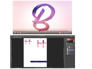
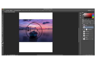
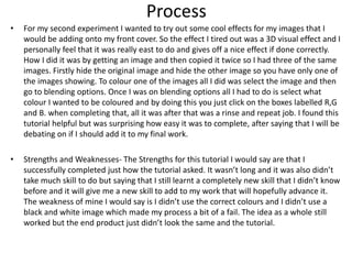
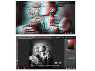
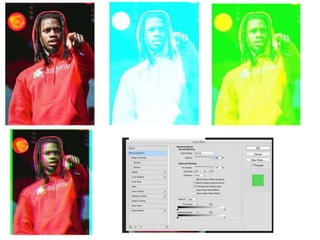
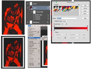
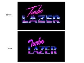
SlideShare a Scribd company logo
Experiments
Tom Batty
Process
• For my first experiment, I have firstly focussed on creating a good design for my
masthead. I looked up a quick tutorial to see what I could play around with and I found a
paint text effect. It basically makes the text you're using like it has been painted and
looks like its dripping. To do this I needed to select a font that looked like it had been
hand written and after that just type in a single letter to make it easier to edit. After that
I needed to find a picture with multiple colours, such as a sunset. When pasting the
image into photo shop, I needed to make a mask around the letter I had typed in. I did
this by doing command and clicking in the image of the layer. Once doing that it will have
selected the letter and then I had to select the image and click on the layer mask icon.
That now selects the image into the letter and by clicking on and selecting the image you
can move it around to find the best colours. Once doing that click on that layer and make
it apply mask layer to make it one image. When completing all that, I went up at the top
to filter then selected liquefy. Whilst in liquefy, I had to make sure my pressure was at
100 and make sure that my size was the correct width of the letters. Select the forward
warp tool and begin the click and almost just follow the lines of the letters making it look
painted. After completing one letter just rinse and repeat the same process. When
following this tutorial I found it a bit difficult to follow a long so I re watched the same
clip a few times to get the hang of it but I feel confident that I can now replicate this task
for my final project.
Strengths and Weaknesses
• The strengths of the process for this experiment would be that through out each stage it was
very easy to follow along and really get a feel of creating something new. When trying this
tutorial I used tools that had already used before but also found out new tools and new
techniques that give off really good effect that I didn’t even know were a thing. After learning
this I know I can use a lot of the techniques from this tutorial in the future for multiple other
products. I would say that the weakness of me creating this is that I didn’t really use the
correct font that suited the look I was going for so my end product didn’t look exactly like the
tutorial. So all in one the thing that I would do to improve my tutorial is to change the font I
used to one that was recommended. One I would change to is a font that looks for like its
been hand written to give off that nice paint look.
Process
• For my second experiment I wanted to try out some cool effects for my images that I
would be adding onto my front cover. So the effect I tired out was a 3D visual effect and I
personally feel that it was really east to do and gives off a nice effect if done correctly.
How I did it was by getting an image and then copied it twice so I had three of the same
images. Firstly hide the original image and hide the other image so you have only one of
the images showing. To colour one of the images all I did was select the image and then
go to blending options. Once I was on blending options all I had to do is select what
colour I wanted to be coloured and by doing this you just click on the boxes labelled R,G
and B. when completing that, all it was after that was a rinse and repeat job. I found this
tutorial helpful but was surprising how easy it was to complete, after saying that I will be
debating on if I should add it to my final work.
• Strengths and Weaknesses- The Strengths for this tutorial I would say are that I
successfully completed just how the tutorial asked. It wasn’t long and it was also didn’t
take much skill to do but saying that I still learnt a completely new skill that I didn’t know
before and it will give me a new skill to add to my work that will hopefully advance it.
The weakness of mine I would say is I didn’t use the correct colours and I didn’t use a
black and white image which made my process a bit of a fail. The idea as a whole still
worked but the end product just didn’t look the same and the tutorial.
Process
• For my third experiment, I wanted to try out another image tutorial to see if I could get
some more skills to have a skills that would fit my front cover the best. For this
experiment, you had to first make the image that I was using to a smart image. By doing
this it allows you to add multiple effects to it. Once doing that I went and selected
image, adjustment and then threshold. When I selected the threshold, I messed around
with the threshold level to make sure I got most of the nice details. After completing
that, it was onto the using the gradient map. Using this lets you make the image two
different colours and all this does it colour in the shape. When I picked the two colours I
thought went well together, it was time to move on and go to layer, new fill layer and
pattern. With this, you're just given loads of different patterns of your choice to choose.
After I picked my favourite design, I had to set the texture to a multiply and then made
sure that the opacity was not as strong so that the texture began to fade in nicely with
the original image. When completing this I thought it probably wouldn’t suit my
magazine style but I can take elements from this tutorial and implement them in my own
way. So again it has become another useful asset I can use for my final product.
Strengths and Weaknesses
• The strengths of this tutorial personally weren't that beneficially in terms of when I
would any of these skills. I learnt new skills and it helped me try out new things. I
wouldn’t say I see where I would use this in other bits of work in the future but I
could stand corrected. I think my only weakness for this tutorial is that I left out a
step add the end that to me really didn’t add anything in to the whole image and
wasn’t very important.
Process• For my fourth experiment, I chose to do another font tutorial because I wanted to find a really good one that I
could take a lot from to use in my work. This final tutorial was the hardest one out of the other three. There were a
lot of steps and techniques I can practice and work on for next time. The tutorial was an 80s style chrome title, for
this I had to firstly make the background black to get the full effect of the 80s style. I chose different fonts to the
tutorial but the font I chose was more of a retro style to fit in with the theme. After picking that, I had to type in
‘turbo’ and ‘lazer’. What I had to do with both of the words was firstly click on convert to shape, after doing so I
had to make another copy of the word ‘lazer’ and rename one centre and the other outline. Clicking and selecting
the outline layer, I went over to the tool bar and selected the selection tool. At the top of the page I went into the
fill and selected no fill, then selected red for the outline colour and the size to 10. an important part of this next
part was to change the alignment to outside and what is good about that is that it keeps the square edges. Now I
moved onto the centre layer of the word and what I had to do was double click to open the options for design. I
began with the gradient overlay. The colours I used were black, mid blue, pink and white and I had to shuffle them
along making them look equal. After that I made the gradient ration 90 degrees which made the colours all sit
nicely in the middle going across the word. Next was to add an inner glow. The colour glow to a darker blue and set
the opacity to 100% and have a size around 13. Once doing that I added and stroke and then an outer glow which
gives off a very nice aluminate look to the word. Going back to the outline layer, I added in a gradient overlay. With
this I added on six handles and had the colour blue and white alternating which ended up adding to the metallic
look. Another add on when finishing that was to go around the edges of the letters by using the polygon lasso tool
and the gradient tool. Make sure it is on a colour burn which gives it more texture to the metallic look. For the top
word, it was basically a rinse and repeat with some of the steps left out and a colour change.
• I found this the hardest to follow and ended up messing it up a bit. My final version of the tutorial doesn’t look
exactly the same but is near enough. It doesn’t look exactly the same due to small factors but I'm glad I had done
this one because there are some good skills involved.
Strengths and Weaknesses
• I would say that this tutorial was one of the more helpful and beneficial towards
learning new skills and techniques. That’s helps sum up this in strengths due to the
fact it had a lot of steps and in those steps were many little techniques that helps
give off really good looks and style to my future work. It was a lot different to what
I had done before. But with a lot of steps made me mess up and my end product
didn’t look exactly how the tutorial looked, I ended up pressing the wrong things
when editing and also didn't exactly use the exact same fonts. So obviously what I
need to do to improve my work is to go back through my steps and correct them
and use the same style font to get that full retro effect.
Before
Mine
Reflection
• What elements of your experiments will you
include in your final product?
• The elements that I'm going to use in my final product are a wider range of things from
each experiment. Such as from the first experiment I was gong to use the element of
placing the image into the letters giving it a unique style. But I can always mess around
with liquefy and the forward warp tool. I feel with my second experiment I could see
myself adding an image like that to develop my front cover to greater heights. For my third
experiment, I can take a few features from this experiment and have another mess around
with to see what would work best for my front cover. For example I can combine the
second and the third tutorials to maybe create something likable and different.
• I have ended up adding on another tutorial because I felt I was lacking some skills that I
need to improve my final product. My fourth and final tutorial was another one on fonts. I
am happy I did this fourth experiment because I have found out some nice skills on how I
can make my masthead look cleaner and more professional such as the inner and outa
glow. Makes the masthead look more attractive and inviting. Then another one, using the
polygon lasso tool and the gradient tool giving the edges of my letters look cleaner and
adding cool effects.

More Related Content

What's hot

Production Experiments FMP
Production Experiments FMPProduction Experiments FMP
Production Experiments FMP
Tommy Lister
 
3. production experiments
3. production experiments3. production experiments
3. production experiments
jessicacrosland
 
3. production experiments (fmp)
3. production experiments (fmp)3. production experiments (fmp)
3. production experiments (fmp)
jessicacrosland
 
6. production reflection (1)
6. production reflection (1)6. production reflection (1)
6. production reflection (1)
amy foster
 
Problem Solving
Problem SolvingProblem Solving
Problem Solving
Thomas Haase
 
Problem solving
Problem solvingProblem solving
Problem solving
Thomas Haase
 
6. production reflection
6. production reflection6. production reflection
6. production reflection
fin sedgwick
 
6. production reflection
6. production reflection6. production reflection
6. production reflection
fin sedgwick
 
6. production reflection
6. production reflection6. production reflection
6. production reflection
fin sedgwick
 
4. production experiments(1)
4. production experiments(1)4. production experiments(1)
4. production experiments(1)
Jude McMichan
 
Print experiments
Print experimentsPrint experiments
Print experiments
Jack Hickman
 
On Going Evaluations (unfinished)
On Going Evaluations (unfinished)On Going Evaluations (unfinished)
On Going Evaluations (unfinished)cloestead
 
Production Reflection FMP
Production Reflection FMPProduction Reflection FMP
Production Reflection FMP
Harry Taylor
 
Experiments reflection
Experiments reflectionExperiments reflection
Experiments reflection
ShaniceYates
 
Manipulation on front cover and contents page
Manipulation on front cover and contents pageManipulation on front cover and contents page
Manipulation on front cover and contents page
AS Media Column E
 
Portfolio
PortfolioPortfolio
Portfolio
samg67
 
Portfolio
PortfolioPortfolio
Portfolio
samg67
 
Product reflection (1)
Product reflection  (1)Product reflection  (1)
Product reflection (1)
JoshuaMeredith2
 

What's hot (20)

Production Experiments FMP
Production Experiments FMPProduction Experiments FMP
Production Experiments FMP
 
3. production experiments
3. production experiments3. production experiments
3. production experiments
 
3. production experiments (fmp)
3. production experiments (fmp)3. production experiments (fmp)
3. production experiments (fmp)
 
6. production reflection (1)
6. production reflection (1)6. production reflection (1)
6. production reflection (1)
 
Problem Solving
Problem SolvingProblem Solving
Problem Solving
 
Problem solving
Problem solvingProblem solving
Problem solving
 
6. production reflection
6. production reflection6. production reflection
6. production reflection
 
6. production reflection
6. production reflection6. production reflection
6. production reflection
 
6. production reflection
6. production reflection6. production reflection
6. production reflection
 
4. production experiments(1)
4. production experiments(1)4. production experiments(1)
4. production experiments(1)
 
Print experiments
Print experimentsPrint experiments
Print experiments
 
Production
ProductionProduction
Production
 
On Going Evaluations (unfinished)
On Going Evaluations (unfinished)On Going Evaluations (unfinished)
On Going Evaluations (unfinished)
 
Production Reflection FMP
Production Reflection FMPProduction Reflection FMP
Production Reflection FMP
 
Experiments reflection
Experiments reflectionExperiments reflection
Experiments reflection
 
Manipulation on front cover and contents page
Manipulation on front cover and contents pageManipulation on front cover and contents page
Manipulation on front cover and contents page
 
Portfolio
PortfolioPortfolio
Portfolio
 
Portfolio
PortfolioPortfolio
Portfolio
 
Product reflection (1)
Product reflection  (1)Product reflection  (1)
Product reflection (1)
 
Evaluation 7
Evaluation 7Evaluation 7
Evaluation 7
 

Similar to Production experiments final

2.2 Production Experiments.pptx
2.2 Production Experiments.pptx2.2 Production Experiments.pptx
2.2 Production Experiments.pptx
alilyajaib
 
Production Experiments
Production ExperimentsProduction Experiments
Production Experiments
ShaniceYates
 
production reflection
production reflectionproduction reflection
production reflection
Tom Batty
 
i Question 7 evaluation abbey
i Question 7 evaluation abbeyi Question 7 evaluation abbey
i Question 7 evaluation abbey
08WaittA
 
4. production experiments powerpoint
4. production experiments powerpoint4. production experiments powerpoint
4. production experiments powerpoint
thomasmoore143
 
Production Experiments.
Production Experiments.Production Experiments.
Production Experiments.
Leon Boyce
 
4. production experiments(1)
4. production experiments(1)4. production experiments(1)
4. production experiments(1)
fin sedgwick
 
4. production experiments(1)
4. production experiments(1)4. production experiments(1)
4. production experiments(1)
fin sedgwick
 
4. production experiments(1)
4. production experiments(1)4. production experiments(1)
4. production experiments(1)
louis harman
 
Experiments reflections
Experiments reflectionsExperiments reflections
Experiments reflections
DodohMoatshe
 
Fmp production reflection
Fmp production reflectionFmp production reflection
Fmp production reflection
Ben Harris
 
Production Experiments
Production ExperimentsProduction Experiments
Production Experiments
Alexander Sullivan-Cree
 
1. production experiments (1)
1. production experiments (1)1. production experiments (1)
1. production experiments (1)
amy foster
 
Production Experiments
Production ExperimentsProduction Experiments
Production Experiments
Hannah Palfreeman
 
Presentation2
Presentation2Presentation2
Presentation2
zainyc4
 
4. production experiments
4. production experiments4. production experiments
4. production experiments
GraceGilbert5
 
Developmentproforma(wasbroken)
Developmentproforma(wasbroken)Developmentproforma(wasbroken)
Developmentproforma(wasbroken)
Seb Webster
 
Developmentproforma new
Developmentproforma newDevelopmentproforma new
Developmentproforma new
Seb Webster
 

Similar to Production experiments final (20)

2.2 Production Experiments.pptx
2.2 Production Experiments.pptx2.2 Production Experiments.pptx
2.2 Production Experiments.pptx
 
Production Experiments
Production ExperimentsProduction Experiments
Production Experiments
 
Fmp ps
Fmp psFmp ps
Fmp ps
 
production reflection
production reflectionproduction reflection
production reflection
 
i Question 7 evaluation abbey
i Question 7 evaluation abbeyi Question 7 evaluation abbey
i Question 7 evaluation abbey
 
4. production experiments powerpoint
4. production experiments powerpoint4. production experiments powerpoint
4. production experiments powerpoint
 
Production Experiments.
Production Experiments.Production Experiments.
Production Experiments.
 
4. production experiments(1)
4. production experiments(1)4. production experiments(1)
4. production experiments(1)
 
4. production experiments(1)
4. production experiments(1)4. production experiments(1)
4. production experiments(1)
 
4. production experiments(1)
4. production experiments(1)4. production experiments(1)
4. production experiments(1)
 
Experiments reflections
Experiments reflectionsExperiments reflections
Experiments reflections
 
Fmp production reflection
Fmp production reflectionFmp production reflection
Fmp production reflection
 
Production Experiments
Production ExperimentsProduction Experiments
Production Experiments
 
1. production experiments (1)
1. production experiments (1)1. production experiments (1)
1. production experiments (1)
 
Production Experiments
Production ExperimentsProduction Experiments
Production Experiments
 
Presentation2
Presentation2Presentation2
Presentation2
 
4. production experiments
4. production experiments4. production experiments
4. production experiments
 
Question six
Question sixQuestion six
Question six
 
Developmentproforma(wasbroken)
Developmentproforma(wasbroken)Developmentproforma(wasbroken)
Developmentproforma(wasbroken)
 
Developmentproforma new
Developmentproforma newDevelopmentproforma new
Developmentproforma new
 

More from Tom Batty

Presentation diary
Presentation diaryPresentation diary
Presentation diary
Tom Batty
 
Fmp development diary
Fmp development diary Fmp development diary
Fmp development diary
Tom Batty
 
Fmp evaluation
Fmp evaluationFmp evaluation
Fmp evaluation
Tom Batty
 
Fmp proposal
Fmp proposal Fmp proposal
Fmp proposal
Tom Batty
 
Pro Forma
Pro FormaPro Forma
Pro Forma
Tom Batty
 
Fmp research
Fmp researchFmp research
Fmp research
Tom Batty
 
Fmp research
Fmp researchFmp research
Fmp research
Tom Batty
 
Fmp graphic designers
Fmp graphic designersFmp graphic designers
Fmp graphic designers
Tom Batty
 
Fmp proposal
Fmp proposal Fmp proposal
Fmp proposal
Tom Batty
 
Fmp proposal
Fmp proposal Fmp proposal
Fmp proposal
Tom Batty
 
Fmp proposal
Fmp proposal Fmp proposal
Fmp proposal
Tom Batty
 
Fmp graphic designers
Fmp graphic designers Fmp graphic designers
Fmp graphic designers
Tom Batty
 
Fmp pre proposal
Fmp pre proposalFmp pre proposal
Fmp pre proposal
Tom Batty
 
Evaluation
Evaluation Evaluation
Evaluation
Tom Batty
 
American sniper
American sniperAmerican sniper
American sniper
Tom Batty
 
Client evaluation
 Client evaluation  Client evaluation
Client evaluation
Tom Batty
 
Client, development diary
Client, development diary Client, development diary
Client, development diary
Tom Batty
 
Client, ideas and planning
Client, ideas and planning Client, ideas and planning
Client, ideas and planning
Tom Batty
 

More from Tom Batty (20)

Presentation diary
Presentation diaryPresentation diary
Presentation diary
 
Fmp development diary
Fmp development diary Fmp development diary
Fmp development diary
 
Fmp evaluation
Fmp evaluationFmp evaluation
Fmp evaluation
 
Fmp pap
Fmp papFmp pap
Fmp pap
 
Fmp proposal
Fmp proposal Fmp proposal
Fmp proposal
 
Pro Forma
Pro FormaPro Forma
Pro Forma
 
Fmp pap
Fmp papFmp pap
Fmp pap
 
Fmp research
Fmp researchFmp research
Fmp research
 
Fmp research
Fmp researchFmp research
Fmp research
 
Fmp graphic designers
Fmp graphic designersFmp graphic designers
Fmp graphic designers
 
Fmp proposal
Fmp proposal Fmp proposal
Fmp proposal
 
Fmp proposal
Fmp proposal Fmp proposal
Fmp proposal
 
Fmp proposal
Fmp proposal Fmp proposal
Fmp proposal
 
Fmp graphic designers
Fmp graphic designers Fmp graphic designers
Fmp graphic designers
 
Fmp pre proposal
Fmp pre proposalFmp pre proposal
Fmp pre proposal
 
Evaluation
Evaluation Evaluation
Evaluation
 
American sniper
American sniperAmerican sniper
American sniper
 
Client evaluation
 Client evaluation  Client evaluation
Client evaluation
 
Client, development diary
Client, development diary Client, development diary
Client, development diary
 
Client, ideas and planning
Client, ideas and planning Client, ideas and planning
Client, ideas and planning
 

Recently uploaded

special B.ed 2nd year old paper_20240531.pdf
special B.ed 2nd year old paper_20240531.pdfspecial B.ed 2nd year old paper_20240531.pdf
special B.ed 2nd year old paper_20240531.pdf
Special education needs
 
Supporting (UKRI) OA monographs at Salford.pptx
Supporting (UKRI) OA monographs at Salford.pptxSupporting (UKRI) OA monographs at Salford.pptx
Supporting (UKRI) OA monographs at Salford.pptx
Jisc
 
The approach at University of Liverpool.pptx
The approach at University of Liverpool.pptxThe approach at University of Liverpool.pptx
The approach at University of Liverpool.pptx
Jisc
 
Unit 8 - Information and Communication Technology (Paper I).pdf
Unit 8 - Information and Communication Technology (Paper I).pdfUnit 8 - Information and Communication Technology (Paper I).pdf
Unit 8 - Information and Communication Technology (Paper I).pdf
Thiyagu K
 
A Strategic Approach: GenAI in Education
A Strategic Approach: GenAI in EducationA Strategic Approach: GenAI in Education
A Strategic Approach: GenAI in Education
Peter Windle
 
Guidance_and_Counselling.pdf B.Ed. 4th Semester
Guidance_and_Counselling.pdf B.Ed. 4th SemesterGuidance_and_Counselling.pdf B.Ed. 4th Semester
Guidance_and_Counselling.pdf B.Ed. 4th Semester
Atul Kumar Singh
 
The Accursed House by Émile Gaboriau.pptx
The Accursed House by Émile Gaboriau.pptxThe Accursed House by Émile Gaboriau.pptx
The Accursed House by Émile Gaboriau.pptx
DhatriParmar
 
Honest Reviews of Tim Han LMA Course Program.pptx
Honest Reviews of Tim Han LMA Course Program.pptxHonest Reviews of Tim Han LMA Course Program.pptx
Honest Reviews of Tim Han LMA Course Program.pptx
timhan337
 
2024.06.01 Introducing a competency framework for languag learning materials ...
2024.06.01 Introducing a competency framework for languag learning materials ...2024.06.01 Introducing a competency framework for languag learning materials ...
2024.06.01 Introducing a competency framework for languag learning materials ...
Sandy Millin
 
Introduction to AI for Nonprofits with Tapp Network
Introduction to AI for Nonprofits with Tapp NetworkIntroduction to AI for Nonprofits with Tapp Network
Introduction to AI for Nonprofits with Tapp Network
TechSoup
 
Digital Artifact 2 - Investigating Pavilion Designs
Digital Artifact 2 - Investigating Pavilion DesignsDigital Artifact 2 - Investigating Pavilion Designs
Digital Artifact 2 - Investigating Pavilion Designs
chanes7
 
The basics of sentences session 5pptx.pptx
The basics of sentences session 5pptx.pptxThe basics of sentences session 5pptx.pptx
The basics of sentences session 5pptx.pptx
heathfieldcps1
 
Lapbook sobre os Regimes Totalitários.pdf
Lapbook sobre os Regimes Totalitários.pdfLapbook sobre os Regimes Totalitários.pdf
Lapbook sobre os Regimes Totalitários.pdf
Jean Carlos Nunes Paixão
 
Home assignment II on Spectroscopy 2024 Answers.pdf
Home assignment II on Spectroscopy 2024 Answers.pdfHome assignment II on Spectroscopy 2024 Answers.pdf
Home assignment II on Spectroscopy 2024 Answers.pdf
Tamralipta Mahavidyalaya
 
How libraries can support authors with open access requirements for UKRI fund...
How libraries can support authors with open access requirements for UKRI fund...How libraries can support authors with open access requirements for UKRI fund...
How libraries can support authors with open access requirements for UKRI fund...
Jisc
 
Group Presentation 2 Economics.Ariana Buscigliopptx
Group Presentation 2 Economics.Ariana BuscigliopptxGroup Presentation 2 Economics.Ariana Buscigliopptx
Group Presentation 2 Economics.Ariana Buscigliopptx
ArianaBusciglio
 
Azure Interview Questions and Answers PDF By ScholarHat
Azure Interview Questions and Answers PDF By ScholarHatAzure Interview Questions and Answers PDF By ScholarHat
Azure Interview Questions and Answers PDF By ScholarHat
Scholarhat
 
Biological Screening of Herbal Drugs in detailed.
Biological Screening of Herbal Drugs in detailed.Biological Screening of Herbal Drugs in detailed.
Biological Screening of Herbal Drugs in detailed.
Ashokrao Mane college of Pharmacy Peth-Vadgaon
 
TESDA TM1 REVIEWER FOR NATIONAL ASSESSMENT WRITTEN AND ORAL QUESTIONS WITH A...
TESDA TM1 REVIEWER  FOR NATIONAL ASSESSMENT WRITTEN AND ORAL QUESTIONS WITH A...TESDA TM1 REVIEWER  FOR NATIONAL ASSESSMENT WRITTEN AND ORAL QUESTIONS WITH A...
TESDA TM1 REVIEWER FOR NATIONAL ASSESSMENT WRITTEN AND ORAL QUESTIONS WITH A...
EugeneSaldivar
 
"Protectable subject matters, Protection in biotechnology, Protection of othe...
"Protectable subject matters, Protection in biotechnology, Protection of othe..."Protectable subject matters, Protection in biotechnology, Protection of othe...
"Protectable subject matters, Protection in biotechnology, Protection of othe...
SACHIN R KONDAGURI
 

Recently uploaded (20)

special B.ed 2nd year old paper_20240531.pdf
special B.ed 2nd year old paper_20240531.pdfspecial B.ed 2nd year old paper_20240531.pdf
special B.ed 2nd year old paper_20240531.pdf
 
Supporting (UKRI) OA monographs at Salford.pptx
Supporting (UKRI) OA monographs at Salford.pptxSupporting (UKRI) OA monographs at Salford.pptx
Supporting (UKRI) OA monographs at Salford.pptx
 
The approach at University of Liverpool.pptx
The approach at University of Liverpool.pptxThe approach at University of Liverpool.pptx
The approach at University of Liverpool.pptx
 
Unit 8 - Information and Communication Technology (Paper I).pdf
Unit 8 - Information and Communication Technology (Paper I).pdfUnit 8 - Information and Communication Technology (Paper I).pdf
Unit 8 - Information and Communication Technology (Paper I).pdf
 
A Strategic Approach: GenAI in Education
A Strategic Approach: GenAI in EducationA Strategic Approach: GenAI in Education
A Strategic Approach: GenAI in Education
 
Guidance_and_Counselling.pdf B.Ed. 4th Semester
Guidance_and_Counselling.pdf B.Ed. 4th SemesterGuidance_and_Counselling.pdf B.Ed. 4th Semester
Guidance_and_Counselling.pdf B.Ed. 4th Semester
 
The Accursed House by Émile Gaboriau.pptx
The Accursed House by Émile Gaboriau.pptxThe Accursed House by Émile Gaboriau.pptx
The Accursed House by Émile Gaboriau.pptx
 
Honest Reviews of Tim Han LMA Course Program.pptx
Honest Reviews of Tim Han LMA Course Program.pptxHonest Reviews of Tim Han LMA Course Program.pptx
Honest Reviews of Tim Han LMA Course Program.pptx
 
2024.06.01 Introducing a competency framework for languag learning materials ...
2024.06.01 Introducing a competency framework for languag learning materials ...2024.06.01 Introducing a competency framework for languag learning materials ...
2024.06.01 Introducing a competency framework for languag learning materials ...
 
Introduction to AI for Nonprofits with Tapp Network
Introduction to AI for Nonprofits with Tapp NetworkIntroduction to AI for Nonprofits with Tapp Network
Introduction to AI for Nonprofits with Tapp Network
 
Digital Artifact 2 - Investigating Pavilion Designs
Digital Artifact 2 - Investigating Pavilion DesignsDigital Artifact 2 - Investigating Pavilion Designs
Digital Artifact 2 - Investigating Pavilion Designs
 
The basics of sentences session 5pptx.pptx
The basics of sentences session 5pptx.pptxThe basics of sentences session 5pptx.pptx
The basics of sentences session 5pptx.pptx
 
Lapbook sobre os Regimes Totalitários.pdf
Lapbook sobre os Regimes Totalitários.pdfLapbook sobre os Regimes Totalitários.pdf
Lapbook sobre os Regimes Totalitários.pdf
 
Home assignment II on Spectroscopy 2024 Answers.pdf
Home assignment II on Spectroscopy 2024 Answers.pdfHome assignment II on Spectroscopy 2024 Answers.pdf
Home assignment II on Spectroscopy 2024 Answers.pdf
 
How libraries can support authors with open access requirements for UKRI fund...
How libraries can support authors with open access requirements for UKRI fund...How libraries can support authors with open access requirements for UKRI fund...
How libraries can support authors with open access requirements for UKRI fund...
 
Group Presentation 2 Economics.Ariana Buscigliopptx
Group Presentation 2 Economics.Ariana BuscigliopptxGroup Presentation 2 Economics.Ariana Buscigliopptx
Group Presentation 2 Economics.Ariana Buscigliopptx
 
Azure Interview Questions and Answers PDF By ScholarHat
Azure Interview Questions and Answers PDF By ScholarHatAzure Interview Questions and Answers PDF By ScholarHat
Azure Interview Questions and Answers PDF By ScholarHat
 
Biological Screening of Herbal Drugs in detailed.
Biological Screening of Herbal Drugs in detailed.Biological Screening of Herbal Drugs in detailed.
Biological Screening of Herbal Drugs in detailed.
 
TESDA TM1 REVIEWER FOR NATIONAL ASSESSMENT WRITTEN AND ORAL QUESTIONS WITH A...
TESDA TM1 REVIEWER  FOR NATIONAL ASSESSMENT WRITTEN AND ORAL QUESTIONS WITH A...TESDA TM1 REVIEWER  FOR NATIONAL ASSESSMENT WRITTEN AND ORAL QUESTIONS WITH A...
TESDA TM1 REVIEWER FOR NATIONAL ASSESSMENT WRITTEN AND ORAL QUESTIONS WITH A...
 
"Protectable subject matters, Protection in biotechnology, Protection of othe...
"Protectable subject matters, Protection in biotechnology, Protection of othe..."Protectable subject matters, Protection in biotechnology, Protection of othe...
"Protectable subject matters, Protection in biotechnology, Protection of othe...
 

Production experiments final

  • 2. Process • For my first experiment, I have firstly focussed on creating a good design for my masthead. I looked up a quick tutorial to see what I could play around with and I found a paint text effect. It basically makes the text you're using like it has been painted and looks like its dripping. To do this I needed to select a font that looked like it had been hand written and after that just type in a single letter to make it easier to edit. After that I needed to find a picture with multiple colours, such as a sunset. When pasting the image into photo shop, I needed to make a mask around the letter I had typed in. I did this by doing command and clicking in the image of the layer. Once doing that it will have selected the letter and then I had to select the image and click on the layer mask icon. That now selects the image into the letter and by clicking on and selecting the image you can move it around to find the best colours. Once doing that click on that layer and make it apply mask layer to make it one image. When completing all that, I went up at the top to filter then selected liquefy. Whilst in liquefy, I had to make sure my pressure was at 100 and make sure that my size was the correct width of the letters. Select the forward warp tool and begin the click and almost just follow the lines of the letters making it look painted. After completing one letter just rinse and repeat the same process. When following this tutorial I found it a bit difficult to follow a long so I re watched the same clip a few times to get the hang of it but I feel confident that I can now replicate this task for my final project.
  • 3. Strengths and Weaknesses • The strengths of the process for this experiment would be that through out each stage it was very easy to follow along and really get a feel of creating something new. When trying this tutorial I used tools that had already used before but also found out new tools and new techniques that give off really good effect that I didn’t even know were a thing. After learning this I know I can use a lot of the techniques from this tutorial in the future for multiple other products. I would say that the weakness of me creating this is that I didn’t really use the correct font that suited the look I was going for so my end product didn’t look exactly like the tutorial. So all in one the thing that I would do to improve my tutorial is to change the font I used to one that was recommended. One I would change to is a font that looks for like its been hand written to give off that nice paint look.
  • 4.
  • 5.
  • 6. Process • For my second experiment I wanted to try out some cool effects for my images that I would be adding onto my front cover. So the effect I tired out was a 3D visual effect and I personally feel that it was really east to do and gives off a nice effect if done correctly. How I did it was by getting an image and then copied it twice so I had three of the same images. Firstly hide the original image and hide the other image so you have only one of the images showing. To colour one of the images all I did was select the image and then go to blending options. Once I was on blending options all I had to do is select what colour I wanted to be coloured and by doing this you just click on the boxes labelled R,G and B. when completing that, all it was after that was a rinse and repeat job. I found this tutorial helpful but was surprising how easy it was to complete, after saying that I will be debating on if I should add it to my final work. • Strengths and Weaknesses- The Strengths for this tutorial I would say are that I successfully completed just how the tutorial asked. It wasn’t long and it was also didn’t take much skill to do but saying that I still learnt a completely new skill that I didn’t know before and it will give me a new skill to add to my work that will hopefully advance it. The weakness of mine I would say is I didn’t use the correct colours and I didn’t use a black and white image which made my process a bit of a fail. The idea as a whole still worked but the end product just didn’t look the same and the tutorial.
  • 7.
  • 8.
  • 9. Process • For my third experiment, I wanted to try out another image tutorial to see if I could get some more skills to have a skills that would fit my front cover the best. For this experiment, you had to first make the image that I was using to a smart image. By doing this it allows you to add multiple effects to it. Once doing that I went and selected image, adjustment and then threshold. When I selected the threshold, I messed around with the threshold level to make sure I got most of the nice details. After completing that, it was onto the using the gradient map. Using this lets you make the image two different colours and all this does it colour in the shape. When I picked the two colours I thought went well together, it was time to move on and go to layer, new fill layer and pattern. With this, you're just given loads of different patterns of your choice to choose. After I picked my favourite design, I had to set the texture to a multiply and then made sure that the opacity was not as strong so that the texture began to fade in nicely with the original image. When completing this I thought it probably wouldn’t suit my magazine style but I can take elements from this tutorial and implement them in my own way. So again it has become another useful asset I can use for my final product.
  • 10.
  • 11. Strengths and Weaknesses • The strengths of this tutorial personally weren't that beneficially in terms of when I would any of these skills. I learnt new skills and it helped me try out new things. I wouldn’t say I see where I would use this in other bits of work in the future but I could stand corrected. I think my only weakness for this tutorial is that I left out a step add the end that to me really didn’t add anything in to the whole image and wasn’t very important.
  • 12. Process• For my fourth experiment, I chose to do another font tutorial because I wanted to find a really good one that I could take a lot from to use in my work. This final tutorial was the hardest one out of the other three. There were a lot of steps and techniques I can practice and work on for next time. The tutorial was an 80s style chrome title, for this I had to firstly make the background black to get the full effect of the 80s style. I chose different fonts to the tutorial but the font I chose was more of a retro style to fit in with the theme. After picking that, I had to type in ‘turbo’ and ‘lazer’. What I had to do with both of the words was firstly click on convert to shape, after doing so I had to make another copy of the word ‘lazer’ and rename one centre and the other outline. Clicking and selecting the outline layer, I went over to the tool bar and selected the selection tool. At the top of the page I went into the fill and selected no fill, then selected red for the outline colour and the size to 10. an important part of this next part was to change the alignment to outside and what is good about that is that it keeps the square edges. Now I moved onto the centre layer of the word and what I had to do was double click to open the options for design. I began with the gradient overlay. The colours I used were black, mid blue, pink and white and I had to shuffle them along making them look equal. After that I made the gradient ration 90 degrees which made the colours all sit nicely in the middle going across the word. Next was to add an inner glow. The colour glow to a darker blue and set the opacity to 100% and have a size around 13. Once doing that I added and stroke and then an outer glow which gives off a very nice aluminate look to the word. Going back to the outline layer, I added in a gradient overlay. With this I added on six handles and had the colour blue and white alternating which ended up adding to the metallic look. Another add on when finishing that was to go around the edges of the letters by using the polygon lasso tool and the gradient tool. Make sure it is on a colour burn which gives it more texture to the metallic look. For the top word, it was basically a rinse and repeat with some of the steps left out and a colour change. • I found this the hardest to follow and ended up messing it up a bit. My final version of the tutorial doesn’t look exactly the same but is near enough. It doesn’t look exactly the same due to small factors but I'm glad I had done this one because there are some good skills involved.
  • 13. Strengths and Weaknesses • I would say that this tutorial was one of the more helpful and beneficial towards learning new skills and techniques. That’s helps sum up this in strengths due to the fact it had a lot of steps and in those steps were many little techniques that helps give off really good looks and style to my future work. It was a lot different to what I had done before. But with a lot of steps made me mess up and my end product didn’t look exactly how the tutorial looked, I ended up pressing the wrong things when editing and also didn't exactly use the exact same fonts. So obviously what I need to do to improve my work is to go back through my steps and correct them and use the same style font to get that full retro effect.
  • 15. Reflection • What elements of your experiments will you include in your final product? • The elements that I'm going to use in my final product are a wider range of things from each experiment. Such as from the first experiment I was gong to use the element of placing the image into the letters giving it a unique style. But I can always mess around with liquefy and the forward warp tool. I feel with my second experiment I could see myself adding an image like that to develop my front cover to greater heights. For my third experiment, I can take a few features from this experiment and have another mess around with to see what would work best for my front cover. For example I can combine the second and the third tutorials to maybe create something likable and different. • I have ended up adding on another tutorial because I felt I was lacking some skills that I need to improve my final product. My fourth and final tutorial was another one on fonts. I am happy I did this fourth experiment because I have found out some nice skills on how I can make my masthead look cleaner and more professional such as the inner and outa glow. Makes the masthead look more attractive and inviting. Then another one, using the polygon lasso tool and the gradient tool giving the edges of my letters look cleaner and adding cool effects.

Editor's Notes

  1. Discuss the tools and processes used in your experiments
  2. Discuss the tools and processes used in your experiments
  3. Discuss the tools and processes used in your experiments
  4. Discuss the tools and processes used in your experiments