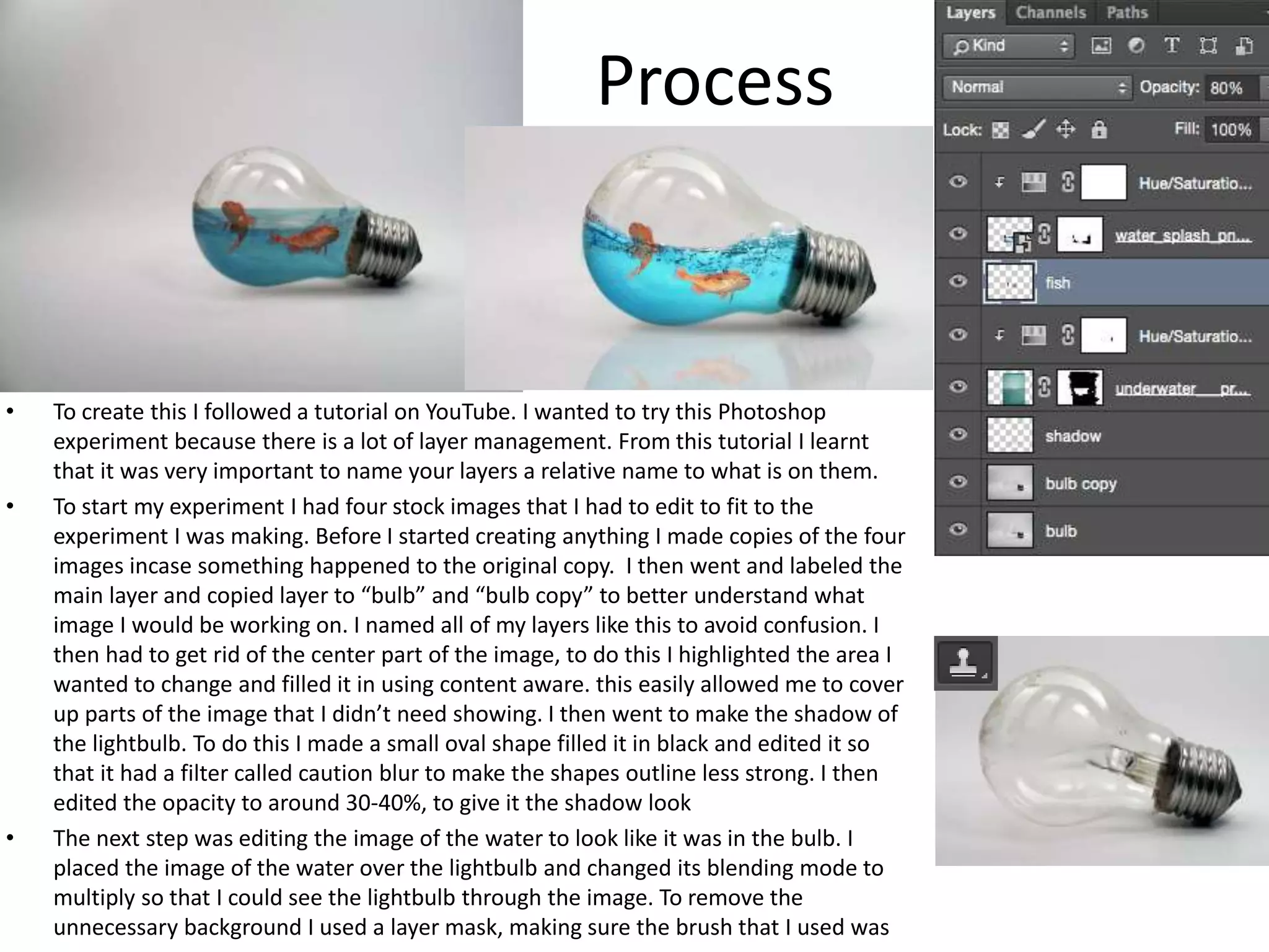
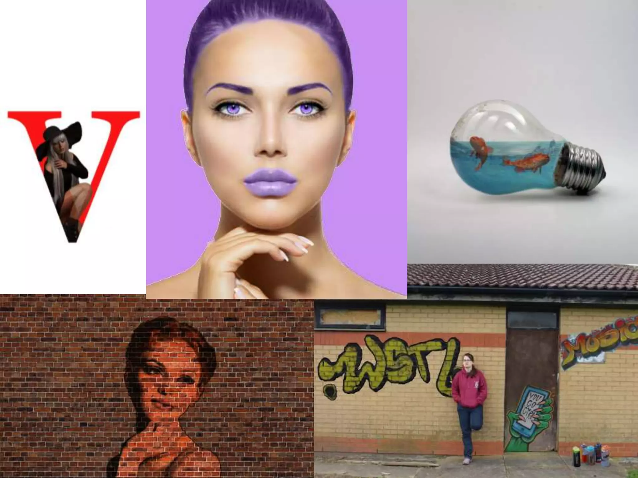
The document describes experiments the author conducted in Photoshop. It details the processes taken for each experiment, including following tutorials, managing layers, editing images, and adding elements like text. Strengths included learning and practicing skills, while weaknesses were a lack of tutorials specific to the author's goals and not conducting more experiments. The author reflects that elements from most experiments could be useful for their final product, such as organizing layers, including a lettering experiment to look professional, and using color correction tools on photos.
Acetabularia Information For Class 9 .docxvaibhavrinwa19
Acetabularia acetabulum is a single-celled green alga that in its vegetative state is morphologically differentiated into a basal rhizoid and an axially elongated stalk, which bears whorls of branching hairs. The single diploid nucleus resides in the rhizoid.
Unit 8 - Information and Communication Technology (Paper I).pdfThiyagu K
This slides describes the basic concepts of ICT, basics of Email, Emerging Technology and Digital Initiatives in Education. This presentations aligns with the UGC Paper I syllabus.
Honest Reviews of Tim Han LMA Course Program.pptxtimhan337
Personal development courses are widely available today, with each one promising life-changing outcomes. Tim Han’s Life Mastery Achievers (LMA) Course has drawn a lot of interest. In addition to offering my frank assessment of Success Insider’s LMA Course, this piece examines the course’s effects via a variety of Tim Han LMA course reviews and Success Insider comments.
The French Revolution, which began in 1789, was a period of radical social and political upheaval in France. It marked the decline of absolute monarchies, the rise of secular and democratic republics, and the eventual rise of Napoleon Bonaparte. This revolutionary period is crucial in understanding the transition from feudalism to modernity in Europe.
For more information, visit-www.vavaclasses.com
A Strategic Approach: GenAI in EducationPeter Windle
Artificial Intelligence (AI) technologies such as Generative AI, Image Generators and Large Language Models have had a dramatic impact on teaching, learning and assessment over the past 18 months. The most immediate threat AI posed was to Academic Integrity with Higher Education Institutes (HEIs) focusing their efforts on combating the use of GenAI in assessment. Guidelines were developed for staff and students, policies put in place too. Innovative educators have forged paths in the use of Generative AI for teaching, learning and assessments leading to pockets of transformation springing up across HEIs, often with little or no top-down guidance, support or direction.
This Gasta posits a strategic approach to integrating AI into HEIs to prepare staff, students and the curriculum for an evolving world and workplace. We will highlight the advantages of working with these technologies beyond the realm of teaching, learning and assessment by considering prompt engineering skills, industry impact, curriculum changes, and the need for staff upskilling. In contrast, not engaging strategically with Generative AI poses risks, including falling behind peers, missed opportunities and failing to ensure our graduates remain employable. The rapid evolution of AI technologies necessitates a proactive and strategic approach if we are to remain relevant.
Palestine last event orientationfvgnh .pptxRaedMohamed3
An EFL lesson about the current events in Palestine. It is intended to be for intermediate students who wish to increase their listening skills through a short lesson in power point.
June 3, 2024 Anti-Semitism Letter Sent to MIT President Kornbluth and MIT Cor...Levi Shapiro
Letter from the Congress of the United States regarding Anti-Semitism sent June 3rd to MIT President Sally Kornbluth, MIT Corp Chair, Mark Gorenberg
Dear Dr. Kornbluth and Mr. Gorenberg,
The US House of Representatives is deeply concerned by ongoing and pervasive acts of antisemitic
harassment and intimidation at the Massachusetts Institute of Technology (MIT). Failing to act decisively to ensure a safe learning environment for all students would be a grave dereliction of your responsibilities as President of MIT and Chair of the MIT Corporation.
This Congress will not stand idly by and allow an environment hostile to Jewish students to persist. The House believes that your institution is in violation of Title VI of the Civil Rights Act, and the inability or
unwillingness to rectify this violation through action requires accountability.
Postsecondary education is a unique opportunity for students to learn and have their ideas and beliefs challenged. However, universities receiving hundreds of millions of federal funds annually have denied
students that opportunity and have been hijacked to become venues for the promotion of terrorism, antisemitic harassment and intimidation, unlawful encampments, and in some cases, assaults and riots.
The House of Representatives will not countenance the use of federal funds to indoctrinate students into hateful, antisemitic, anti-American supporters of terrorism. Investigations into campus antisemitism by the Committee on Education and the Workforce and the Committee on Ways and Means have been expanded into a Congress-wide probe across all relevant jurisdictions to address this national crisis. The undersigned Committees will conduct oversight into the use of federal funds at MIT and its learning environment under authorities granted to each Committee.
• The Committee on Education and the Workforce has been investigating your institution since December 7, 2023. The Committee has broad jurisdiction over postsecondary education, including its compliance with Title VI of the Civil Rights Act, campus safety concerns over disruptions to the learning environment, and the awarding of federal student aid under the Higher Education Act.
• The Committee on Oversight and Accountability is investigating the sources of funding and other support flowing to groups espousing pro-Hamas propaganda and engaged in antisemitic harassment and intimidation of students. The Committee on Oversight and Accountability is the principal oversight committee of the US House of Representatives and has broad authority to investigate “any matter” at “any time” under House Rule X.
• The Committee on Ways and Means has been investigating several universities since November 15, 2023, when the Committee held a hearing entitled From Ivory Towers to Dark Corners: Investigating the Nexus Between Antisemitism, Tax-Exempt Universities, and Terror Financing. The Committee followed the hearing with letters to those institutions on January 10, 202
2. Process
• To create this I followed a tutorial on YouTube. I wanted to try this Photoshop
experiment because there is a lot of layer management. From this tutorial I learnt
that it was very important to name your layers a relative name to what is on them.
• To start my experiment I had four stock images that I had to edit to fit to the
experiment I was making. Before I started creating anything I made copies of the four
images incase something happened to the original copy. I then went and labeled the
main layer and copied layer to “bulb” and “bulb copy” to better understand what
image I would be working on. I named all of my layers like this to avoid confusion. I
then had to get rid of the center part of the image, to do this I highlighted the area I
wanted to change and filled it in using content aware. this easily allowed me to cover
up parts of the image that I didn’t need showing. I then went to make the shadow of
the lightbulb. To do this I made a small oval shape filled it in black and edited it so
that it had a filter called caution blur to make the shapes outline less strong. I then
edited the opacity to around 30-40%, to give it the shadow look
• The next step was editing the image of the water to look like it was in the bulb. I
placed the image of the water over the lightbulb and changed its blending mode to
multiply so that I could see the lightbulb through the image. To remove the
unnecessary background I used a layer mask, making sure the brush that I used was
3. • black I was able to remove the background without using an eraser. When I had edited the
water to how I wanted it to look within the blub I needed to edit it to look a lot more
brighter and appealing. To do this I selected hue and saturation (making sure it was only on
my water layer) and changed the color to look a lot more appealing.
• The next step was to add the fish within the bulb. The image that I had chose to use had
around 10 different types of fish so I had to crop the photo so that I only had the ones I
needed visible. I then changed the opacity of the fish to around 70-80% to look like they are
in the water.
• To finish the edit I added in a splash image to give the water more detail. To make it look like
both images of water I changed the splash layers opacity to around 80% to blend in better
with the rest of the image. Using the same method as before I deleted the unnecessary
background. To finish up the edit I went round the edges with a normal eraser to clean them
up.
• When making this experiment I had to take into consideration on how many layers I was
using so they didn’t get confused during the process of making it. To overcome this issue, I
labelled all of layers with specific names catering to them.
• When I finished the experiment I went back and looked to see how well my final out come
was compared to the original edit. I think that mine could have been edited better because
comparing the overall brightness of the images shows that they are completely different. I
also didn't add a shadow to mine because when I would it didn’t make the edit look right.
• One of the things I could of done better is managing the colour overlay. Comparing my
finished product to the original my colouring isn’t as good, to fix this I could of either
changed the colouring or made the water specifically brighter.
4. Process
• To create this I followed a tutorial on YouTube, it showed me how to use text and an image
to create something really professional looking. I found this quite easy because there was
only a few steps in creating it. I think that I most likely use this production experiment in my
final product.
• To create this edit I needed only one stock image. I started of the edit by importing the
image and removing the background using the quick selection tool and a layer mask to
remove the background.
• Next I needed a plain white background so that the image would stand out, so I created a
new blank layer making sure the layer was under the image and set the color to white.
• For the next step I used the text tool to add in the letter. I chose to stick with the letter V
because I thought it would be best to follow the tutorial exactly. The font that was being
used was Georgia, I think this is because it is a font that is seen on a lot of fashion magazines
5. • which this tutorial is catered towards. I changed the font color to red so that it would stand
out if it was on a magazine and increased the size making it asier to read.
• I then edited the photo to the size and position I wanted it to be and placed it correctly over
the letter. I changed the opacity of the model layer to about 60% so that I could see the V
through the image and so that I could place the image where I wanted it and I would know a
brief idea of what it would look like once completed.
• I next edited the image of the model to get rid of the extra part of the image I didn’t need. I
did this by selecting the V and making sure it was on select inverse I used to eraser to neatly
rub out what I didn’t need of the image, doing this will mean I wont have to rub out any left
over image once its been complete.
• Finally I put the model image back up to full opacity.
• I think out of all the experiments I did, this one was my favourite because it gave off a really
good professional fashion magazine vibe.
• Comparing my work to the original I found that the original had a more solid color as the
background which makes the featured image stand out a lot. With my take on the photo I
found that it didn’t turn out as well as it could of done because the image ended up being
more transparent than expected.
• Because this experiment is fashion themed, this is most likely the experiment that I will use
in my final production. I like this experiment because I think that it was easy to make and
looks professional. I plan on using this in my own production, either for the magazine title or
for a sub heading. When I do create my own I will have to try out different techniques due to
the image that I will be using will be different images
6. Process
• For this experiment I tried out different pencil and brush tools. To
create what's above, I used the color replacement tool.
• When creating the experiment to make sure that only the specific
part of the face that I wanted changing did change, I used the quick
selection tool to ensure that. It also gave me a neater edge so I didn’t
have to worry about having to clean up the edges once I had finished
the experiment.
7. • When creating this experiment I found that it was easy to use and would come in handy
if I wanted to change the color of something in my final product.
• For this experiment I mostly wanted to try out the different brush tools, I ended up
trying the color replacement brush. I found that the brush is easy to used and
understand. I wanted to try that type of brush out because it could be possible when
coming to editing my own photos I may have edit the coloring in the photos to fit in
with my color scheme.
8.
9. Strengths and Weaknesses
The strengths of my experiments was that whilst creating them I got to
learn, and/ or strengthen the skills that I already had. I got to
experiment with different styles of photography, whether that being
inside the studio or not. When doing the experiments, the things that
went well was finding the different styles of editing tutorials, this will
help when it comes to editing my own photos in my final product. if I
wasn't following a tutorial I was trying out the different brushes, doing
this I found different tools that I haven't used before and tried them
out.
The weaknesses of my experiments was that there weren't that many
tutorials that fit to what I specifically wanted to try out before starting
my production. Other things that could have been improved was the
amount of experiments I did. If I had more time I would of done more
experiments where I could try out other techniques or getting better
at ones I already know.
10. Reflection
• What elements of your experiments will you
include in your final product?
• With all the experiments I've done I found that the majority of
them I would like to use them in my final product.
• The first experiment will not likely be helpful to my final product,
though during the experiment I learnt the importance of organising
your layers such as having them names, in a group or in a specific
order to what is being made.
• The lettering experiment would look quite good with what my final
product because it would make my fashion magazine look a lot
more professional.
• The colour correction experiment will help if I want to change or
edit my photos colours, either because the colours didn’t match to
the theme of the page or because the original colours could be to
light or dark.
Editor's Notes
Discuss the tools and processes used in your experiments