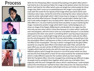
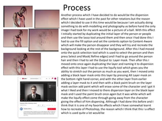
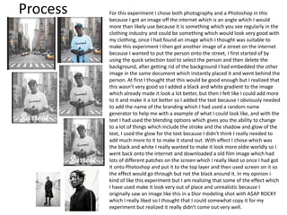
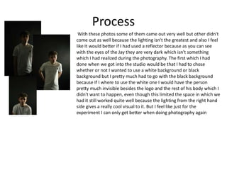
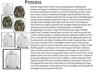
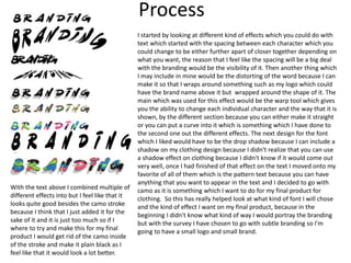
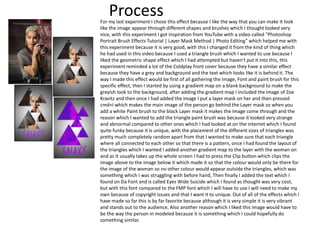
Experiments
Fin Sedgwick
Process With this first Photoshop effect I started off by looking at the glitch effect which I
had tried to do in the past but failed, the image at the bottom where the first ones
which I had tried for this effect which came out alright but unfortunately for those
images they didn't come out as wanted because the image is very bright which
came with the screen for the opacity of the image which you had to do for each
individual colour layer, and by the end of the screening the colour stood out but it
made the white really bright which I didn't know how to change so I tried to add a
black and white effect because I thought that it would make it darker but in the
end it only really changed it very narrowly which I didn't think it would have such a
little effect on it. So once I had found that there would be no way in darkening the
image I moved onto another image which didn't have a white background, so I
chose an image of the Rapper XXXtentacion and decided to try it again but this
time only use one colour which I chose blue because it is colour which I preferred
over red and green, with this time it came out a lot better because it is a lot darker
compared to the other ones which is something which I was focusing on because I
didn't want to have a really bright image which you couldn't really see the effect,
but the only thing which I feel like the first ones where better at would have to be
the actual glitch effect it self because as there is only one colour you don’t get the
full effect of the moved glitch. The way in which I managed to do the glitch effect
would be via using the wave effect in the distort tab under Filter, and with the
wave effect you can pick variety of different kind of waves from the normal lines to
triangles which look very funky, also with the wave you can select a bunch of
different options which change the amount or size of the waves which are there
and also the final thing which is there for the wave would be the randomize button
which is make different waves for the numbers which you have inputted.
With the final glitch effect I this time changed it by combining two different images
of people and try and glitch them together which came out a lot better than I
expected, with this one I changed the colours which I used because I used multiple
colours this time because I wanted to have a few colours but not 3 because that is
the point in which the white goes really bright and you cant really see anything.
Process
Another process which I have decided to do would be the dispersion
effect which I have used in the past for other rotations but the reason
which I decided to use it this time would be because I am actually doing
something to do with modelling and photography as before hand the only
image I had took for my work would be a picture of a ball. With this effect
I initially started by duplicating the initial layer of the person or people
and then use the lasso tool around them and then once I had done this I
had to use the fill option and set the contents option to Content-Aware
which will make the person disappear and they will try and recreate the
background looking at the rest of the background. After this I had moved
onto the quick selection tool which is used to select the person and then
press Select and Mask( Refine edges) and I had to go around the person
hair and then I had to set the Output to: Layer mask. Then after this I
moved onto once again duplicating the layer and naming it to dispersion
effect with this layer I had to use the liquify tool which gives you the
ability to stretch out the person as much as you want, then I moved onto
adding a black layer mask onto this layer by pressing Alt Layer mask on
the bottom right hand corner, and with the other layer from earlier
adding a layer mask to it and then with a black paint brush on the layer
mask section add paint which will erase some of the character and I got it
what I liked and then I moved to there dispersion layer on the black layer
mask and I used the paint brush once again but it was white which will
make the liquify effect come through going away from the character
giving the effect of him dispersing. Although I had done this before and I
think that it is one of my favorite effects which I have somewhat learnt
how to recreate of Photoshop, the reason which I think that this I a effect
which is used quite a lot would be
Process For this experiment I chose both photography and a Photoshop in this
because I got an image off the internet which is an angle which I would
more than likely use because it is something which you see regularly in the
clothing industry and could be something which would look very good with
my clothing, once I had found an image which I thought was suitable to
make this experiment I then got another image of a street on the internet
because I wanted to put the person onto the street, I first started of by
using the quick selection tool to select the person and then delete the
background, after getting rid of the background I had embedded the other
image in the same document which instantly placed it and went behind the
person. At first I thought that this would be good enough but I realized that
this wasn’t very good so I added a black and white gradient to the image
which already made it look a lot better, but then I felt like I could add more
to it and make it a lot better so I added the text because I obviously needed
to add the name of the branding which I had used a random name
generator to help me with a example of what I could look like, and with the
text I had used the blending options which gives you the ability to change
to a lot of things which include the stroke and the shadow and glow of the
text, I used the glow for the text because I didn't think I really needed to
add much more to it to make it stand out. With effect I chose which was
the black and white I really wanted to make it look more oldie worldly so I
went back onto the internet and downloaded a old film image which had
lots of different patches on the screen which I really liked so once I had got
it onto Photoshop and put it to the top layer and then used screen on it so
the effect would go through but not the black around it. In my opinion i
kind of like this experiment but I am realizing that some of the effect which
I have used make it look very out of place and unrealistic because I
originally saw an image like this in a Dior modeling shot with A$AP ROCKY
which I really liked so I thought that I could somewhat copy it for my
experiment but realized it really didn't come out very well.
Process
With these photos some of them came out very well but other didn't
come out as well because the lighting isn't the greatest and also I feel
like It would better if I had used a reflector because as you can see
with the eyes of the Jay they are very dark which isn't something
which I had realized during the photography. The first which I had
done when we got into the studio would be that I had to chose
whether or not I wanted to use a white background or black
background but I pretty much had to go with the black background
because If I where to use the white one I would have the person
pretty much invisible besides the logo and the rest of his body which I
didn't want to happen, even though this limited the space in which we
had it still worked quite well because the lighting from the right hand
side gives a really cool visual to it. But I feel like just for the
experiment I can only get better when doing photography again
Process
Another experiment which I have started would be adding both
patterns and logos to clothing on Photoshop as a part to help me find
out what would look the best on an article of clothing, by this I mean
that I want to look at what kind of designs would look best with the
results which I had gotten back from the survey which had talked about
having small branding compared to large so I first of all started off by
having small branding on the right hand side of the t-shirt because
thats what the audience wanted and I thought looked very good, but I
wanted to try out the obvious branding before I completely
disregarding it and when I made the branding very large It looked
better than I thought it would have, but over all I want to go with the
smaller subtle branding. I initially started by adding the pattern to the t-
shirt in the top left hand side which I did this by adding the pattern to
the document and make it multiply which made its opacity lower, and
then once I had done this I had added a layer mask to it but during
doing this I had cut some of the layer mask out because I makes it look
like the pattern is actually on the t-shirt because the layer mask was
there but the section which I had gotten rid has gone on top of the t-
shirt at the same time as keeping the texture of the actual t-shirt so the
pattern looks a lot more realistic, then once I had done this I moved on
to actually adding text do first of all I added a a white rectangle to the
right hand side of the shirt and then added the text which I wanted in
the desired font and then I had made it so the text deleted the shape
out of the rectangle so the pattern of the camouflage came through the
rectangle and you could see the text.
Process
I started by looking at different kind of effects which you could do with
text which started with the spacing between each character which you
could change to be either further apart of closer together depending on
what you want, the reason that I feel like the spacing will be a big deal
with the branding would be the visibility of it. Then another thing which
I may include in mine would be the distorting of the word because I can
make it so that I wraps around something such as my logo which could
have the brand name above it but wrapped around the shape of it. The
main which was used for this effect would be the warp tool which gives
you the ability to change each individual character and the way that it is
shown, by the different section because you can either make it straight
or you can put a curve into it which is something which I have done to
the second one out the different effects. The next design for the font
which I liked would have to be the drop shadow because I can include a
shadow on my clothing design because I didn't realize that you can use
a shadow effect on clothing because I didn't know if it would come out
very well, once I had finished of that effect on the text I moved onto my
favorite of all of them which is the pattern text because you can have
anything that you want to appear in the text and I decided to go with
camo as it is something which I want to do for my final product for
clothing. So this has really helped look at what kind of font I will chose
and the kind of effect I want on my final product, because in the
beginning I didn't know what kind of way I would portray the branding
but with the survey I have chosen to go with subtle branding so I'm
going to have a small logo and small brand.
With the text above I combined multiple of
different effects into but I feel like that it
looks quite good besides the camo stroke
because I think that I just added it for the
sake of it and it is just too much so if I
where to try and make this for my final
product I would get rid of the camo inside
of the stroke and make it plain black as I
feel like that it would look a lot better.
ProcessFor my last experiment I chose this effect because I like the way that you can make it look
like the image appear through different shapes and brushes which I thought looked very
nice, with this experiment I got inspiration from YouTube with a video called “Photoshop
Portrait Brush Effects Tutorial | Layer Mask Method | Photo Editing” which helped me with
this experiment because it is very good, with this I changed it from the kind of thing which
he had used in this video because I used a triangle brush which I wanted to use because I
liked the geometric shape effect which I had attempted but haven't put it into this, this
experiment reminded a lot of the Coldplay front cover because they have a similar effect
because they have a grey and background and the text which looks like it is behind it. The
way I made this effect would be first of all gathering the image, Font and paint brush for this
specific effect, then I started by using a gradient map on a blank background to make the
greyish look to the background, after adding the gradient map I included the image of Zoe
Kravitz and then once I had added the image I put a layer mask on her and then pressed
cmd+I which makes the main image of the person go behind the Layer mask so when you
add a white Paint brush to the black Layer mask it makes the image come through and the
reason which I wanted to add the triangle paint brush was because it looked very strange
and abnormal compared to other ones which I had looked at on the internet which I found
quite funky because it is unique, with the placement of the different sizes of triangles was
pretty much completely random apart from that I wanted to make sure that each triangle
where all connected to each other so that there is a pattern, once I had found the layout of
the triangles which I wanted I added another gradient map to the layer with the woman on
and as It usually takes up the whole screen I had to press the Clip button which clips the
image above to the image below it which made it so that the colour would only be there for
the image of the woman so no other colour would appear outside the triangles, which was
something which I was struggling with before hand, Then finally I added the text which I
found on Da Font and is called Eyes Wide Suicide which I found as thought was very cool,
but with this font compared to the FMP font which I will have to use I will need to make my
own because of copyright issues and that I want it to unique. Out of all of the effects which I
have made so far this is by far favorite because although it is very simple it is very vibrant
and stands out to the audience, Also another reason which I liked this image would have to
be the way the person in modeled because it is something which I could hopefully do
something similar.
Reflection
• What elements of your experiments will you
include in your final product?
Bibliography
• Nemanja Sekulic. (Jan 19, 2017). How to Change Clothing Texture in Photoshop. Available:
https://www.youtube.com/watch?v=ycJiApJ3tVw. Last accessed 24th april 2018.
• CALISTA K. (Jul 2, 2016). Modify Clothing in Photoshop. Available:
https://www.youtube.com/watch?v=mbhJ298H2K8&t=13s. Last accessed 24th april 2018.
• anon. (.). Gildan Ultra Cotton Youth Long-Sleeve T-Shirt. Available: https://www.amazon.com/Gildan-
Ultra-Cotton-Long-Sleeve-T-Shirt/dp/B014WDEMRC. Last accessed 24th april 2018.
• Daniel Pearson . (Jan 10 2017). A$AP Rocky, Rami Malek & More Star in Dior Homme’s SS17 Ad
Campaign. Available: https://www.highsnobiety.com/2017/01/10/asap-rocky-dior-ss17-ad-campaign/.
Last accessed 27th April 2018.
• Anon. (May 18 2017). ZOË KRAVITZ × CANON. Available:
https://www.wonderlandmagazine.com/2017/05/18/zoe-kravitz-x-canon/. Last accessed 27th April
2018.
• Matt Welty. (May 25 2017). Exclusive: Travis Scott Talks About Being the Face of the Nike VaporMax.
Available: http://www.complex.com/sneakers/2017/05/travis-scott-nike-vapormax-interview. Last
accessed 27th April 2018.
• J'na Jefferson. (March 29 2018). Woman Who Was Reportedly Punched By XXXTentacion On Camera
Speaks Out. Available: https://www.billboard.com/biz/articles/8268801/woman-who-was-reportedly-
punched-by-xxxtentacion-on-camera-speaks-out. Last accessed 27th April 2018.
• Inspiring Bee. (March 9 2017). Photoshop Portrait Brush Effects Tutorial | Layer Mask Method | Photo
Editing. Available: https://www.youtube.com/watch?v=QdYOwlX6010. Last accessed 27th April 2018.
• Photoshop tuturial. (Oct 6 2016). vDispersion Effect: Photoshop Tutorial. Available:
https://www.youtube.com/watch?v=4xgOWWfurpU&t=416s. Last accessed 27th April 2018.

4. production experiments(1)

  • 1.
  • 2.
    Process With thisfirst Photoshop effect I started off by looking at the glitch effect which I had tried to do in the past but failed, the image at the bottom where the first ones which I had tried for this effect which came out alright but unfortunately for those images they didn't come out as wanted because the image is very bright which came with the screen for the opacity of the image which you had to do for each individual colour layer, and by the end of the screening the colour stood out but it made the white really bright which I didn't know how to change so I tried to add a black and white effect because I thought that it would make it darker but in the end it only really changed it very narrowly which I didn't think it would have such a little effect on it. So once I had found that there would be no way in darkening the image I moved onto another image which didn't have a white background, so I chose an image of the Rapper XXXtentacion and decided to try it again but this time only use one colour which I chose blue because it is colour which I preferred over red and green, with this time it came out a lot better because it is a lot darker compared to the other ones which is something which I was focusing on because I didn't want to have a really bright image which you couldn't really see the effect, but the only thing which I feel like the first ones where better at would have to be the actual glitch effect it self because as there is only one colour you don’t get the full effect of the moved glitch. The way in which I managed to do the glitch effect would be via using the wave effect in the distort tab under Filter, and with the wave effect you can pick variety of different kind of waves from the normal lines to triangles which look very funky, also with the wave you can select a bunch of different options which change the amount or size of the waves which are there and also the final thing which is there for the wave would be the randomize button which is make different waves for the numbers which you have inputted. With the final glitch effect I this time changed it by combining two different images of people and try and glitch them together which came out a lot better than I expected, with this one I changed the colours which I used because I used multiple colours this time because I wanted to have a few colours but not 3 because that is the point in which the white goes really bright and you cant really see anything.
  • 3.
    Process Another process whichI have decided to do would be the dispersion effect which I have used in the past for other rotations but the reason which I decided to use it this time would be because I am actually doing something to do with modelling and photography as before hand the only image I had took for my work would be a picture of a ball. With this effect I initially started by duplicating the initial layer of the person or people and then use the lasso tool around them and then once I had done this I had to use the fill option and set the contents option to Content-Aware which will make the person disappear and they will try and recreate the background looking at the rest of the background. After this I had moved onto the quick selection tool which is used to select the person and then press Select and Mask( Refine edges) and I had to go around the person hair and then I had to set the Output to: Layer mask. Then after this I moved onto once again duplicating the layer and naming it to dispersion effect with this layer I had to use the liquify tool which gives you the ability to stretch out the person as much as you want, then I moved onto adding a black layer mask onto this layer by pressing Alt Layer mask on the bottom right hand corner, and with the other layer from earlier adding a layer mask to it and then with a black paint brush on the layer mask section add paint which will erase some of the character and I got it what I liked and then I moved to there dispersion layer on the black layer mask and I used the paint brush once again but it was white which will make the liquify effect come through going away from the character giving the effect of him dispersing. Although I had done this before and I think that it is one of my favorite effects which I have somewhat learnt how to recreate of Photoshop, the reason which I think that this I a effect which is used quite a lot would be
  • 4.
    Process For thisexperiment I chose both photography and a Photoshop in this because I got an image off the internet which is an angle which I would more than likely use because it is something which you see regularly in the clothing industry and could be something which would look very good with my clothing, once I had found an image which I thought was suitable to make this experiment I then got another image of a street on the internet because I wanted to put the person onto the street, I first started of by using the quick selection tool to select the person and then delete the background, after getting rid of the background I had embedded the other image in the same document which instantly placed it and went behind the person. At first I thought that this would be good enough but I realized that this wasn’t very good so I added a black and white gradient to the image which already made it look a lot better, but then I felt like I could add more to it and make it a lot better so I added the text because I obviously needed to add the name of the branding which I had used a random name generator to help me with a example of what I could look like, and with the text I had used the blending options which gives you the ability to change to a lot of things which include the stroke and the shadow and glow of the text, I used the glow for the text because I didn't think I really needed to add much more to it to make it stand out. With effect I chose which was the black and white I really wanted to make it look more oldie worldly so I went back onto the internet and downloaded a old film image which had lots of different patches on the screen which I really liked so once I had got it onto Photoshop and put it to the top layer and then used screen on it so the effect would go through but not the black around it. In my opinion i kind of like this experiment but I am realizing that some of the effect which I have used make it look very out of place and unrealistic because I originally saw an image like this in a Dior modeling shot with A$AP ROCKY which I really liked so I thought that I could somewhat copy it for my experiment but realized it really didn't come out very well.
  • 5.
    Process With these photossome of them came out very well but other didn't come out as well because the lighting isn't the greatest and also I feel like It would better if I had used a reflector because as you can see with the eyes of the Jay they are very dark which isn't something which I had realized during the photography. The first which I had done when we got into the studio would be that I had to chose whether or not I wanted to use a white background or black background but I pretty much had to go with the black background because If I where to use the white one I would have the person pretty much invisible besides the logo and the rest of his body which I didn't want to happen, even though this limited the space in which we had it still worked quite well because the lighting from the right hand side gives a really cool visual to it. But I feel like just for the experiment I can only get better when doing photography again
  • 6.
    Process Another experiment whichI have started would be adding both patterns and logos to clothing on Photoshop as a part to help me find out what would look the best on an article of clothing, by this I mean that I want to look at what kind of designs would look best with the results which I had gotten back from the survey which had talked about having small branding compared to large so I first of all started off by having small branding on the right hand side of the t-shirt because thats what the audience wanted and I thought looked very good, but I wanted to try out the obvious branding before I completely disregarding it and when I made the branding very large It looked better than I thought it would have, but over all I want to go with the smaller subtle branding. I initially started by adding the pattern to the t- shirt in the top left hand side which I did this by adding the pattern to the document and make it multiply which made its opacity lower, and then once I had done this I had added a layer mask to it but during doing this I had cut some of the layer mask out because I makes it look like the pattern is actually on the t-shirt because the layer mask was there but the section which I had gotten rid has gone on top of the t- shirt at the same time as keeping the texture of the actual t-shirt so the pattern looks a lot more realistic, then once I had done this I moved on to actually adding text do first of all I added a a white rectangle to the right hand side of the shirt and then added the text which I wanted in the desired font and then I had made it so the text deleted the shape out of the rectangle so the pattern of the camouflage came through the rectangle and you could see the text.
  • 7.
    Process I started bylooking at different kind of effects which you could do with text which started with the spacing between each character which you could change to be either further apart of closer together depending on what you want, the reason that I feel like the spacing will be a big deal with the branding would be the visibility of it. Then another thing which I may include in mine would be the distorting of the word because I can make it so that I wraps around something such as my logo which could have the brand name above it but wrapped around the shape of it. The main which was used for this effect would be the warp tool which gives you the ability to change each individual character and the way that it is shown, by the different section because you can either make it straight or you can put a curve into it which is something which I have done to the second one out the different effects. The next design for the font which I liked would have to be the drop shadow because I can include a shadow on my clothing design because I didn't realize that you can use a shadow effect on clothing because I didn't know if it would come out very well, once I had finished of that effect on the text I moved onto my favorite of all of them which is the pattern text because you can have anything that you want to appear in the text and I decided to go with camo as it is something which I want to do for my final product for clothing. So this has really helped look at what kind of font I will chose and the kind of effect I want on my final product, because in the beginning I didn't know what kind of way I would portray the branding but with the survey I have chosen to go with subtle branding so I'm going to have a small logo and small brand. With the text above I combined multiple of different effects into but I feel like that it looks quite good besides the camo stroke because I think that I just added it for the sake of it and it is just too much so if I where to try and make this for my final product I would get rid of the camo inside of the stroke and make it plain black as I feel like that it would look a lot better.
  • 8.
    ProcessFor my lastexperiment I chose this effect because I like the way that you can make it look like the image appear through different shapes and brushes which I thought looked very nice, with this experiment I got inspiration from YouTube with a video called “Photoshop Portrait Brush Effects Tutorial | Layer Mask Method | Photo Editing” which helped me with this experiment because it is very good, with this I changed it from the kind of thing which he had used in this video because I used a triangle brush which I wanted to use because I liked the geometric shape effect which I had attempted but haven't put it into this, this experiment reminded a lot of the Coldplay front cover because they have a similar effect because they have a grey and background and the text which looks like it is behind it. The way I made this effect would be first of all gathering the image, Font and paint brush for this specific effect, then I started by using a gradient map on a blank background to make the greyish look to the background, after adding the gradient map I included the image of Zoe Kravitz and then once I had added the image I put a layer mask on her and then pressed cmd+I which makes the main image of the person go behind the Layer mask so when you add a white Paint brush to the black Layer mask it makes the image come through and the reason which I wanted to add the triangle paint brush was because it looked very strange and abnormal compared to other ones which I had looked at on the internet which I found quite funky because it is unique, with the placement of the different sizes of triangles was pretty much completely random apart from that I wanted to make sure that each triangle where all connected to each other so that there is a pattern, once I had found the layout of the triangles which I wanted I added another gradient map to the layer with the woman on and as It usually takes up the whole screen I had to press the Clip button which clips the image above to the image below it which made it so that the colour would only be there for the image of the woman so no other colour would appear outside the triangles, which was something which I was struggling with before hand, Then finally I added the text which I found on Da Font and is called Eyes Wide Suicide which I found as thought was very cool, but with this font compared to the FMP font which I will have to use I will need to make my own because of copyright issues and that I want it to unique. Out of all of the effects which I have made so far this is by far favorite because although it is very simple it is very vibrant and stands out to the audience, Also another reason which I liked this image would have to be the way the person in modeled because it is something which I could hopefully do something similar.
  • 9.
    Reflection • What elementsof your experiments will you include in your final product?
  • 10.
    Bibliography • Nemanja Sekulic.(Jan 19, 2017). How to Change Clothing Texture in Photoshop. Available: https://www.youtube.com/watch?v=ycJiApJ3tVw. Last accessed 24th april 2018. • CALISTA K. (Jul 2, 2016). Modify Clothing in Photoshop. Available: https://www.youtube.com/watch?v=mbhJ298H2K8&t=13s. Last accessed 24th april 2018. • anon. (.). Gildan Ultra Cotton Youth Long-Sleeve T-Shirt. Available: https://www.amazon.com/Gildan- Ultra-Cotton-Long-Sleeve-T-Shirt/dp/B014WDEMRC. Last accessed 24th april 2018. • Daniel Pearson . (Jan 10 2017). A$AP Rocky, Rami Malek & More Star in Dior Homme’s SS17 Ad Campaign. Available: https://www.highsnobiety.com/2017/01/10/asap-rocky-dior-ss17-ad-campaign/. Last accessed 27th April 2018. • Anon. (May 18 2017). ZOË KRAVITZ × CANON. Available: https://www.wonderlandmagazine.com/2017/05/18/zoe-kravitz-x-canon/. Last accessed 27th April 2018. • Matt Welty. (May 25 2017). Exclusive: Travis Scott Talks About Being the Face of the Nike VaporMax. Available: http://www.complex.com/sneakers/2017/05/travis-scott-nike-vapormax-interview. Last accessed 27th April 2018. • J'na Jefferson. (March 29 2018). Woman Who Was Reportedly Punched By XXXTentacion On Camera Speaks Out. Available: https://www.billboard.com/biz/articles/8268801/woman-who-was-reportedly- punched-by-xxxtentacion-on-camera-speaks-out. Last accessed 27th April 2018. • Inspiring Bee. (March 9 2017). Photoshop Portrait Brush Effects Tutorial | Layer Mask Method | Photo Editing. Available: https://www.youtube.com/watch?v=QdYOwlX6010. Last accessed 27th April 2018. • Photoshop tuturial. (Oct 6 2016). vDispersion Effect: Photoshop Tutorial. Available: https://www.youtube.com/watch?v=4xgOWWfurpU&t=416s. Last accessed 27th April 2018.

Editor's Notes

  • #3 Discuss the tools and processes used in your experiments
  • #4 Discuss the tools and processes used in your experiments
  • #11 Discuss the tools and processes used in your experiments