Histogram
•Download as PPT, PDF•
26 likes•16,493 views

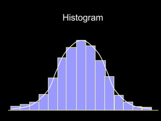
A histogram is a graphical display of data using bars of different heights. It organizes and displays the distribution of data values or ranges of data. The document discusses what a histogram is, why there is variation in data, how to construct a histogram, and key elements to study like location, spread, and shape of the data distribution. To construct a histogram, you need the minimum and maximum values, number of cells, class width, and lower boundaries of each class. This allows plotting the frequency distribution in a visual way.

Recommended
More Related Content
What's hot
What's hot (20)
Viewers also liked
Viewers also liked (20)
Similar to Histogram
Similar to Histogram (20)
More from Mohit Singla
More from Mohit Singla (20)
Histogram
- 1. Histogram
- 2. What is a Histogram? Histogram is a visual tool for presenting variable data . It organises data to describe the process performance. Additionally histogram shows the amount and pattern of the variation from the process. Histogram offers a snapshot in time of the process performance.
- 3. Why do We Get Variation? Variation is essentially law of nature. Output quality characteristics depends upon the input parameters. It is impossible to keep input parameters constant. There will be always variation in the input parameters. Since there is variation in the input parameters, there is also variation in the output characteristics
- 4. Law of Nature In nature there is always variation. Take case measurement of the following: height of adult male in a city. weight of 15 years old boy in a town. weight of bars 5 meter long 25 mm dia. volume in 300 cc soft drink bottle. number of minutes required to fill an invoice.
- 5. Case when Data Does Not Show Variation There could be two reasons when data do not show variation: a) Measuring devices are insensitive to spot variation. b) Too much rounding off the data while recording.
- 6. Insensitive Measuring Device If the measuring device is not sensitive, enough to respond to small changes in value of the quality characteristics, variation will not be reflected in the data. For example: Weighing gold chains by using weighing scale used for vegetables.
- 7. Too Much Rounding Off During Recording It could also be possible that too much rounding off might have been carried while recording the measurements. This normally happens when the column in data recording sheet is not wide enough to record all the decimal places of measurements. Because of paucity of the space, workmen round off observations on their own.
- 8. Definition of Histogram A histogram is a graphical summary of variation in a set of data. The pictorial nature of the histogram enables us to see patterns that are difficult to see in a table of numbers.
- 9. Data Table - Weight of Bars in kg. 476 513 480 486 508 502 542 489 490 500 507 469 514 537 500 500 479 523 491 500 509 520 474 498 500 478 524 483 503 502 516 489 496 500 487 520 497 490 492 513 500 504 526 502 508 501 528 503 510 512
- 10. Picturisation of Data N=50 Bar Weight 16 14 12 Frequency 10 8 6 4 2 0 470 480 490 500 510 520 530 540 kg
- 11. Key Concept of Histogram Data always have variation Variation have pattern Patterns can be seen easily when summarized pictorially
- 12. Presentation of Distribution Histogram is represented by a curve. The curve is known ‘Frequency Distribution’
- 13. Study of Histogram While studying histogram look for its Location of mean of the process Spread of the process Shape of the process
- 14. Location of the Process Process A Process B Location of Location of process A Process B Quality Characteristics
- 15. Spread of the Process Process B Process A Spread of process B Spread of Process A
- 16. Shape of the Process Normal Distribution Skewed Distribution Quality Characteristics
- 18. Basic Elements for Construction of Histogram For constructing the histogram we need to know the following: Lowest value of the data set Highest value of the data set Approximate number of cells histogram have Cell width Lower cell boundary of first cell
- 19. Finding Lowest & Largest Value in Data Set If the number of observations in the data set is small, then finding smallest and largest value is not a problem. However, if the number of observations is large, then we require an easier way to get smallest value and largest value in the data set. This can be achieved by grouping the data in rows, columns and then scanning.
- 20. Organizing Data in Rows & Columns Step - 1 Organise the data in a group of 5 or 10 1 2 3 4 5 3.56 3.46 3.48 3.42 3.43 3.48 3.56 3.50 3.52 3.47 3.48 3.46 3.50 3.56 3.38 3.41 3.37 3.49 3.45 3.44 3.50 3.49 3.46 3.46 3.42
- 21. Construction of Histogram Step - 2 Generate 2 more columns to record Smallest value in each row in column ‘S’ Largest value in each row in column ‘L’
- 22. Addition of Column ‘S’ & Column ‘L’ 1 2 3 4 5 S L 3.56 3.46 3.48 3.50 3.42 3.42 3.56 3.43 3.53 3.49 3.44 3.50 3.43 3.53 3.48 3.56 3.50 3.52 3.47 3.47 3.56 3.48 3.46 3.50 3.56 3.38 3.38 3.56 3.41 3.37 3.49 3.45 3.44 3.37 3.49
- 23. Construction of Histogram Step-3 Scan column ‘S’ to find smallest value in that column, S. S is overall smallest value in the data set. Scan column ‘L’ to find largest value in that column, L. L is overall largest value in the data set
- 24. Scanning of Columns ‘S’ & ‘L’ 1 2 3 4 5 S L 3.56 3.46 3.48 3.50 3.42 3.42 3.56 3.43 3.53 3.49 3.44 3.50 3.43 3.53 3.48 3.56 3.50 3.52 3.47 3.47 3.56 3.48 3.46 3.50 3.56 3.38 3.38 3.56 3.41 3.37 3.49 3.45 3.44 3.37 3.49 Overall smallest reading = 3.37 Overall largest reading = 3.56
- 25. Range of the Data Set Step-4 Find range of the data Range of data = Largest value - smallest value In our case Range R = L - S = 3.56 - 3.37 = 0.19
- 26. Initial Number of Cells in Histogram Step-5 Decide the initial number of cells, say K, a histogram shall have. Number of cells a histogram can have, depends upon the number of observations N, histogram is representing. There are three methods to decide initial number of cells. Note: The number of cells, K initially chosen may change when histogram is finally made
- 27. Table for Choosing Number of Cells Method No. 1 Number of observation Number of cells (N) (K) Under 50 5 to 7 50 - 100 6 to 10 101 - 250 7 to 12 More than 250 10 to 20
- 28. Alternative Methods for Deciding No. of Cells Method No. 2 Number of cells, K = 1 + 2.33 Log 10 N Method No 3 Number of cells, K = N
- 29. Temporary Cell Width Step-6 Find temporary cell width, TCW Range (R) TCW = Number of cells chosen (K) 0.19 = 7 = 0.0271423
- 30. Rounding of Temporary Cell Width Temporary cell width, TCW needs rounding off. For ease of plotting For getting distinct cell boundary
- 31. Construction of Histogram Step - 6 Round off TCW to get class width Rounding off of TCW, should be in the multiple of 1 or 3 or 5 of least count. The multiple should be nearer to TCW
- 32. Least Count of the Data 1 2 3 4 5 3.56 3.46 3.48 3.42 3.43 3.48 3.56 3.50 3.52 3.47 3.48 3.46 3.50 3.56 3.38 3.41 3.37 3.49 3.45 3.44 3.50 3.49 3.46 3.46 3.42 Least count of the data is 0.01
- 33. Procedure for Getting Class Width In our case least count of the data, LC is 0.01 and TCW = 0.0271428 If multiple factor, M is 1 then we have M × LC = 1 x 0.01 = 0.01 This multiple is not nearer to TCW If multiple factor is 3 then we have M x LC = 3 x 0.01 = 0.03 This multiple is nearer to TCW Hence class width, CW = 0.03
- 34. Class Boundaries Step - 7 Determine class boundaries Class boundaries are necessary for making tally sheet. Frequency obtained in tally sheet is utilised for making histogram. Class boundaries should be distinct
- 35. Distinct Class Boundaries Distinct class boundaries are the one, on which no individual data lies. With the distinct class boundary the data will enter in a particular cell only.
- 36. Nomenclature of Cell Boundaries Let LCB(1), LCB(2), … are the lower cell boundaries of cell no.1, cell No. 2…. respectively. Let UCB(1), UCB(2), … are the upper cell boundaries of cell no.1, cell No. 2…. respectively.
- 37. Elements of Histogram Upper Lower cell boundary cell boundary of cell no. 2 of cell no. 2 Upper Lower cell boundary cell boundary of cell no. 1 of cell no. 3 Cell No. 2 Lower Cell Upper cell boundary Cell No. 3 cell boundary of cell no. 1 No. 1 of cell no. 3 CW CW CW Continuous Scale
- 38. Calculation of Cell Boundaries If we know the lower cell boundary of cell No.1, LCB(1), and class width, CW we can find other cell boundaries as follows: UCB(1) = LCB(1) + CW LCB(2) = UCB(1) UCB(2) = LCB(2) + CW LCB(3) = UCB(2) and so on
- 39. Getting Lower Cell Boundary of Cell No.1 Choose a starting value A, which is slightly lower or equal to smallest value, S. Value of S in our case is 3.37 We can take A = 3.37 LCB = A - ( CW / 2 ) = 3.37 - ( 0.03 / 2 ) = 3.355
- 40. Getting Cell Boundaries UCB(1) = LCB(1) + CW = 3.355 + 0.03 = 3.385 LCB(2) = UCB (1) = 3.385 UCB(2) = LCB(2) + CW = 3.385 + 0.03 = 3.415 Continue finding cell boundaries, till a particular upper cell boundary is greater than the largest value of data set.
- 41. Filling of Frequency Column Count the number of tally marks in each cell and enter the count in ‘Frequency’ column Mid Tally SN Cell Boundary Frequency Value Marks 1 3.355 - 3.385 3.37 2 2 3.385 - 3.415 3.40 2 3 3.415 - 3.444 3.43 3 4 3.445 - 3.475 3.46 4 5 3.475 - 3.505 3.49 8 6 3.505 – 3.535 3.52 4 7 3.535 - 3.565 3.55 2
- 42. Drawing Histogram Draw vertical axis Draw horizontal axis
- 43. Drawing Histogram 9 8 Label vertical axis from zero to a multiple of 1, 2 or 5 to accommodate the largest frequency 7 Frequency 6 5 4 3 Label horizontal axis with mid values of the cells, and indicate the dimension of quality characteristics 2 1 0 3.37 3.40 3.43 3.46 3.49 3.52 3.55 mm
- 44. Drawing Histogram 9 8 7 Frequency 6 5 Leave one cell 4 width space from 3 vertical axis 2 1 0 3.37 3.40 3.43 3.46 3.49 3.52 3.55 mm
- 45. Drawing Histogram Draw bars to represent frequency in each cell. Height of bars is equal to number of data in each cell. Title the chart. Indicate total number of observations
- 46. Drawing Histogram 9 Metal Thickness 8 N=25 7 Frequency 6 5 4 3 2 1 0 3.37 3.40 3.43 3.46 3.49 3.52 3.55 mm
- 48. Design Tolerance VS Process Spread LSL USL 16 Design Tolerance 14 Process Spread Frequency 12 10 8 6 4 2 0 47 48 49 50 51 52 53 54 kg
- 49. Assessing Process Capability Process capability is a comparison between design tolerance and spread of the process. Whenever design tolerance is more than process spread, then the process is capable. Whenever design tolerance is less than the spread of the process, then the process is not capable.
- 50. Assessing Process Capability LSL USL 47 48 49 50 51 52 53 54 kg Process is not capable
- 51. Assessing Process Capability USL LSL 47 48 49 50 51 52 53 54 kg Process is just capable
- 52. Assessing Process Capability LSL USL 46 47 48 49 50 51 52 53 54 55 kg Process is capable
- 53. Assessing Process Capability LSL USL 47 48 49 50 51 52 53 54 kg At the moment process is not capable
- 54. 54