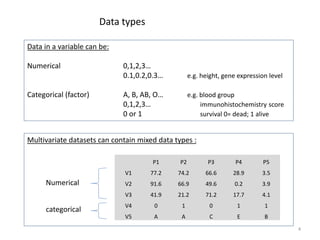
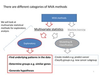
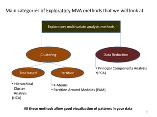
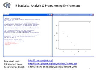
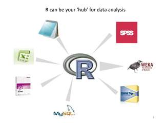
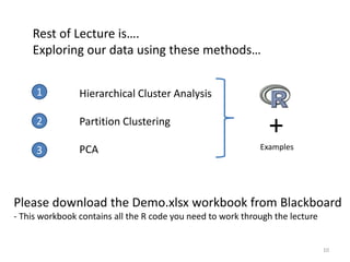
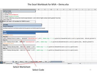
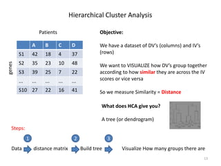
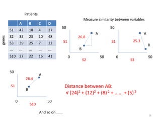
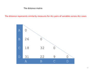
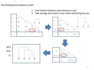
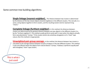
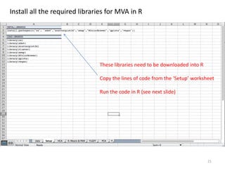
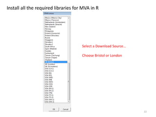
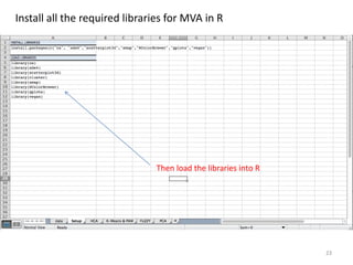
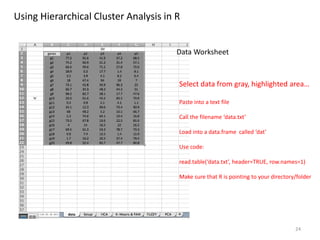
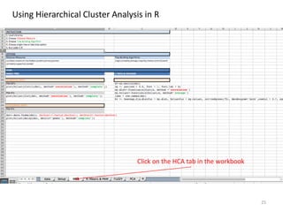
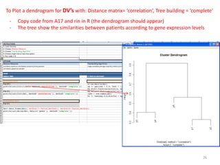
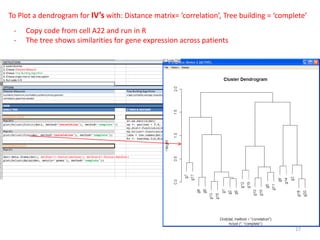
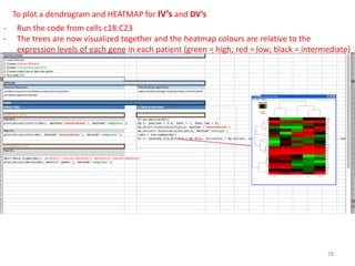
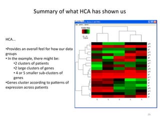
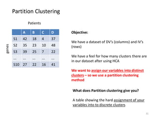
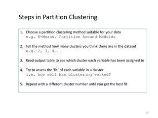
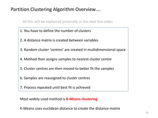
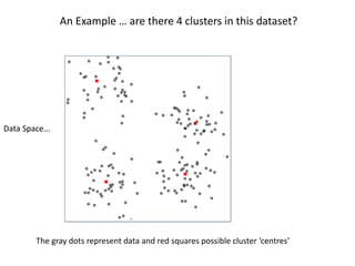
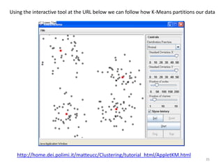
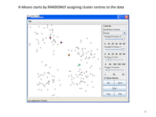
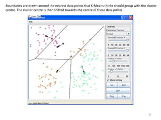
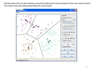
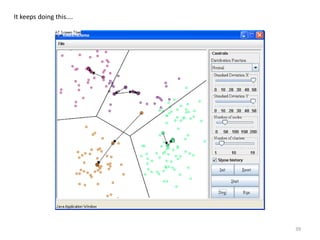
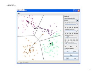
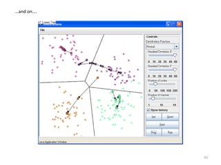
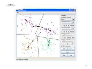
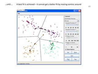
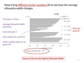
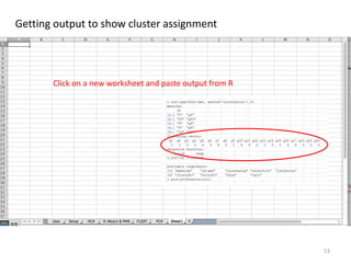
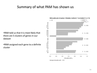
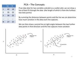
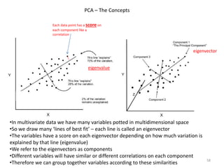
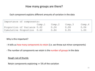
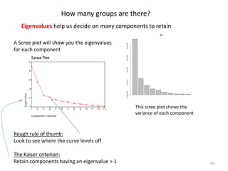
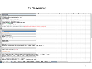
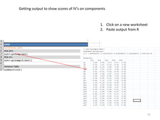
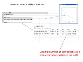
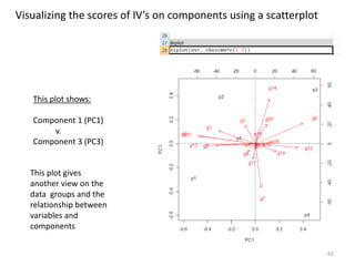
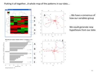
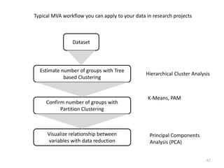
Cluster analysis is a major tool in a number of applications in many fields of Business, Engineering & etc.(The odoridis and Koutroubas, 1999):
Data reduction.
Hypothesis generation.
Hypothesis testing.
Prediction based on groups.
Cluster analysis of classification is often called the 'non-supervised technique'.
It is a multivariate technique used to determine group membership for cases or variables.
A NEW PERSPECTIVE OF PARAMODULATION COMPLEXITY BY SOLVING 100 SLIDING BLOCK P...ijaia
This paper gives complete guidelines for authors submitting papers for the AIRCC Journals. A sliding puzzle is a combination puzzle where a player slides pieces along specific routes on a board to reach a certain end configuration. In this paper, we propose a novel measurement of the complexity of 100 sliding puzzles with paramodulation, which is an inference method of automated reasoning. It turned out that by counting the number of clauses yielded with paramodulation, we can evaluate the difficulty of each puzzle. In the experiment, we have generated 100 * 8 puzzles that passed the solvability checking by countering inversions. By doing this, we can distinguish the complexity of 8 puzzles with the number generated with paramodulation. For example, board [2,3,6,1,7,8,5,4, hole] is the easiest with score 3008 and board [6,5,8,7,4,3,2,1, hole] is the most difficult with score 48653.Besides, we have succeeded in obverse several layers of complexity (the number of clauses generated) in 100 puzzles. We can conclude that the proposed method can provide a new perspective of paramodulation complexity concerning sliding block puzzles.
CATEGORY TREES – CLASSIFIERS THAT BRANCH ON CATEGORYijaia
This paper presents a batch classifier that splits a dataset into tree branches depending on the category type. It has been improved from the earlier version and fixed a mistake in the earlier paper. Two important changes have been made. The first is to represent each category with a separate classifier. Each classifier then classifies its own subset of data rows, using batch input values to create the centroid and also represent the category itself. If the classifier contains data from more than one category however, it needs to create new classifiers for the incorrect data. The second change therefore is to allow the classifier to branch to new layers when there is a split in the data, and create new classifiers there for the data rows that are incorrectly classified. Each layer can therefore branch like a tree - not for distinguishing features, but for distinguishing categories. The paper then suggests a further innovation, which is to represent some data columns with fixed value ranges, or bands. When considering features, it is shown that some of the data can be classified directly through fixed value ranges, while the rest must be classified using a classifier technique and the idea allows the paper to discuss a biological analogy with neurons and neuron links. Tests show that the method can successfully classify a diverse set of benchmark datasets to better than the state-of-the-art.
Please Subscribe to this Channel for more solutions and lectures
http://www.youtube.com/onlineteaching
Chapter 3: Describing, Exploring, and Comparing Data
3.2: Measures of Variation
This presentation discusses in detail about the procedure involved in two-factor MANOVA. Both the analysis i.e. multivariate as well as univariate has been shown in this design by solving an illustration using SPSS software.
Comparative study of ksvdd and fsvm for classification of mislabeled dataeSAT Journals
Abstract Outlier detection is the important concept in data mining. These outliers are the data that differ from the normal data. Noise in the
application may cause the misclassification of data. Data are more likely to be mislabeled in presence of noise leading to
performance degradation. The proposed work focuses on these issues. Data before classifying is given a value that represents its
willingness towards the class. This data with likelihood value is then given to classifier to predict the data. SVDD algorithm is
used for classification of data with likelihood values.
Keywords: Confusion Matrix, FSVM, Outlier, Outlier Detection, SVDD
This presentation is on using repeated measures design in the area of social sciences, behavioural sciences, management, sports, physical education etc.
Watch this with a 10-15 minute audiotrack at http://vimeo.com/novusprogram/excel3
This lesson builds upon the concepts that were learned in the previous Excel lesson. The topics covered include using Excel’s powerful formulas to help perform data analysis on both large and small amounts of data. The objective of the lesson is for the user to be comfortable with calculating data variance, making informational comments, using advanced filtering techniques, and combining multiple sources of data. The lesson teaches concepts through a combination of image-based slides and video tutorials.
The Novus project is a combination of video tutorials designed to be used in conjunction with a free business simulation software program. The Novus Business and IT Program contains 36 business and IT training videos, covering basic finance, accounting, marketing, economics, business strategy, Word, Excel, and PowerPoint. Users will have an opportunity to apply the lessons in the Novus Business Simulator. Over six rounds, the user or teams will have to make decisions on capital purchases, financing, production, financing, and human resources for a microbrewery. This channel has arranged the 36 video lessons into the order in which they are meant to be used with the simulator. To watch this slideshow as a video, please go to our Vimeo page at: https://vimeo.com/novusprogram. To download our free business simulation software, please go to our SourceForge page at: http://sourceforge.net/projects/novus/.
May 2015 talk to SW Data Meetup by Professor Hendrik Blockeel from KU Leuven & Leiden University.
With increasing amounts of ever more complex forms of digital data becoming available, the methods for analyzing these data have also become more diverse and sophisticated. With this comes an increased risk of incorrect use of these methods, and a greater burden on the user to be knowledgeable about their assumptions. In addition, the user needs to know about a wide variety of methods to be able to apply the most suitable one to a particular problem. This combination of broad and deep knowledge is not sustainable.
The idea behind declarative data analysis is that the burden of choosing the right statistical methodology for answering a research question should no longer lie with the user, but with the system. The user should be able to simply describe the problem, formulate a question, and let the system take it from there. To achieve this, we need to find answers to questions such as: what languages are suitable for formulating these questions, and what execution mechanisms can we develop for them? In this talk, I will discuss recent and ongoing research in this direction. The talk will touch upon query languages for data mining and for statistical inference, declarative modeling for data mining, meta-learning, and constraint-based data mining. What connects these research threads is that they all strive to put intelligence about data analysis into the system, instead of assuming it resides in the user.
Hendrik Blockeel is a professor of computer science at KU Leuven, Belgium, and part-time associate professor at Leiden University, The Netherlands. His research interests lie mostly in machine learning and data mining. He has made a variety of research contributions in these fields, including work on decision tree learning, inductive logic programming, predictive clustering, probabilistic-logical models, inductive databases, constraint-based data mining, and declarative data analysis. He is an action editor for Machine Learning and serves on the editorial board of several other journals. He has chaired or organized multiple conferences, workshops, and summer schools, including ILP, ECMLPKDD, IDA and ACAI, and he has been vice-chair, area chair, or senior PC member for ECAI, IJCAI, ICML, KDD, ICDM. He was a member of the board of the European Coordinating Committee for Artificial Intelligence from 2004 to 2010, and currently serves as publications chair for the ECMLPKDD steering committee.
KNN CLASSIFIER, INTRODUCTION TO K-NEAREST NEIGHBOR ALGORITHM.pptx
Pm m23 & pmnm06 week 3 lectures 2015
1. Introduction to Multivariate Data Analysis (MVA)
1
o Introduction to exploring data with MVA
o Tutorial on using R to perform multivariate analysis
2. What is Multivariate analysis?
•‘Multivariate’ means data represented by two or more variables
e.g. height, weight and gender of a person
• Majority of datasets collected in biomedical research are multivariate
• These datasets nearly always contain ‘noise’
• Aim of exploratory MVA is to discover patterns that exist within the data
despite noise
e.g. patterns maybe subgroups of patients with a
certain disease
• When we apply MV methods we study:
• Variation in each of these variables
• Similarity or distance between variables
• in MVA we work in multidimensional space
2
4. Multivariate datasets can contain mixed data types :
Data in a variable can be:
Numerical 0,1,2,3…
0.1,0.2,0.3… e.g. height, gene expression level
Categorical (factor) A, B, AB, O… e.g. blood group
0,1,2,3… immunohistochemistry score
0 or 1 survival 0= dead; 1 alive
Data types
P1 P2 P3 P4 P5
V1 77.2 74.2 66.6 28.9 3.5
V2 91.6 66.9 49.6 0.2 3.9
V3 41.9 21.2 71.2 17.7 4.1
V4 0 1 0 1 1
V5 A A C E B
4
Numerical
categorical
5. There are different categories of MVA methods
Multivariate statistics Machine learning
Exploratory
Modelling &
Classification
-Find underlying patterns in the data
-Determine groups e.g. similar genes
-Generate hypotheses
-Create models e.g. predict cancer
-Classify groups e.g. new cancer subgroup
5
MVA methods
We will look at
multivariate statistical
methods for exploratory
analysis
6. • Hierarchical
Cluster
Analysis
(HCA)
All these methods allow good visualization of patterns in your data
Exploratory multivariate analysis methods
Clustering Data Reduction
Tree based Partition
• K-Means
• Partition Around Medoids (PAM)
• Principal Components Analysis
•(PCA)
Main categories of Exploratory MVA methods that we will look at
6
7. Commonly used software for multivariate analysis in academia
Commercial:
SPSS - Limited
Minitab - Limited
Matlab - Comprehensive
Free & open source:
R - Comprehensive
Octave - Comprehensive
WEKA - Comprehensive
Many other (more limited) free software packages available here:
http://www.freestatistics.info/en/stat.php
7
This lecture focuses on how we can use R directly from within Microsoft Excel
8. R Statistical Analysis & Programming Environment
http://cran.r-project.org/
http://cran.r-project.org/doc/manuals/R-intro.pdf
Download here:
Introductory book:
Recommended book: R for Medicine and Biology, Jones & Bartlett, 2009
8
10. Rest of Lecture is….
Exploring our data using these methods…
Hierarchical Cluster Analysis
Partition Clustering
PCA
1
2
3
+
Examples
10
Please download the Demo.xlsx workbook from Blackboard
- This workbook contains all the R code you need to work through the lecture
13. Hierarchical Cluster Analysis
Objective:
We have a dataset of DV’s (columns) and IV’s
(rows)
We want to VISUALIZE how DV’s group together
according to how similar they are across the IV
scores or vice versa
So we measure Similarity = Distance
What does HCA give you?
A tree (or dendrogram)
A B C D
S1 42 18 4 37
S2 35 23 10 48
S3 39 25 7 22
... ... ... ... ...
S10 27 22 16 41
Patients
genes
13
Data distance matrix Build tree Visualize How many groups there are
Steps:
1 2 3
14. The distance between two points is the length of the path connecting them.
The closer together two points (i.e. your variables) are the more similar
they are in what is being measured
What do we mean by distance?
14
Point B
Point A
Think of your data as being points in multidimensional space
15. 1. Create a distance matrix Measure similarity between column variables
S1
S2
A
B
0
50
50
How similar are variables A & B
Across all cases S1....Sn?
26.8
24
12
AB = √ (24)2 + (12)2 = 26.8
A B C D
S1 42 18 4 37
S2 35 23 10 48
S3 39 25 7 22
... ... ... ... ...
S10 27 22 16 41
Patients
genes
15
16. S1
S10
A
B
0
50
50
26.4
Measure similarity between variables
S1
S2
A
B
0
50
50
S1
S3
A
B
0
50
50
25.3
And so on ......
26.8
Distance between AB:
√ (24)2 + (12)2 + (8)2 + ...... + (5)2
A B C D
S1 42 18 4 37
S2 35 23 10 48
S3 39 25 7 22
... ... ... ... ...
S10 27 22 16 41
Patients
genes
16
17. The distance represents similarity measures for ALL pairs of variables across ALL cases
A 0
B 26 0
C 18 32 0
D 31 22 9 0
A B C D
17
The distance matrix
18. Tree Building from distance matrix
A 0
B 26 0
C 18 32 0
D 31 22 9 0
A B C D
A 0
B 26 0
C&D 24.5 27 0
A B C&D
B 0
A&C&D 26.5 0
B A&C&D
C DAB
1. Find smallest distance value between a pair
2. Take average and create a new matrix combining the pair
24.5
9
26.5
18
19. Euclidean distance. This is probably the most commonly chosen type of distance. It simply is the geometric distance
in the multidimensional space.
Squared Euclidean distance. You may want to square the standard Euclidean distance in order to place
progressively greater weight on objects that are further apart.
City-block (Manhattan) distance. This distance is simply the average difference across dimensions. In most
cases, this distance measure yields results similar to the simple Euclidean distance. However, note that in this measure, the
effect of single large differences (outliers) is dampened (since they are not squared).
Correlation
Gower's distance – allows you to use mixed numerical and categorical data
Some common distance measures
19
This is what I
just used
20. Single linkage (nearest neighbor). The distance between two clusters is determined
by the distance of the two closest objects (nearest neighbors) in the different clusters. This rule will, in a
sense, string objects together to form clusters, and the resulting clusters tend to represent long
"chains.“
Complete linkage (furthest neighbor). In this method, the distances between
clusters are determined by the greatest distance between any two objects in the different clusters (i.e.,
by the "furthest neighbors"). This method usually performs quite well in cases when the objects actually
form naturally distinct "clumps." If the clusters tend to be somehow elongated or of a "chain" type
nature, then this method is inappropriate.
Unweighted pair-group average. In this method, the distance between two clusters is
calculated as the average distance between all pairs of objects in the two different clusters. This method
is also very efficient when the objects form natural distinct "clumps," however, it performs equally well
with elongated, "chain" type clusters.
Some common tree building algorithms
20
This is what I
just used
21. 21
Install all the required libraries for MVA in R
These libraries need to be downloaded into R
Copy the lines of code from the ‘Setup’ worksheet
Run the code in R (see next slide)
22. 22
Select a Download Source…
Choose Bristol or London
Install all the required libraries for MVA in R
23. 23
Install all the required libraries for MVA in R
Then load the libraries into R
24. Select data from gray, highlighted area…
Paste into a text file
Call the filename ‘data.txt’
Load into a data.frame called ‘dat’
Use code:
read.table(‘data.txt’, header=TRUE, row.names=1)
Make sure that R is pointing to your directory/folder
24
Data Worksheet
Using Hierarchical Cluster Analysis in R
26. To Plot a dendrogram for DV’s with: Distance matrix= ‘correlation’, Tree building = ‘complete’
26
- Copy code from A17 and rin in R (the dendrogram should appear)
- The tree show the similarities between patients according to gene expression levels
27. 27
To Plot a dendrogram for IV’s with: Distance matrix= ‘correlation’, Tree building = ‘complete’
- Copy code from cell A22 and run in R
- The tree shows similarities for gene expression across patients
28. To plot a dendrogram and HEATMAP for IV’s and DV’s
28
- Run the code from cells c18:C23
- The trees are now visualized together and the heatmap colours are relative to the
expression levels of each gene in each patient (green = high; red = low; black = intermediate)
29. Summary of what HCA has shown us
HCA...
•Provides an overall feel for how our data
groups
• In the example, there might be:
•2 clusters of patients
•2 large clusters of genes
• 4 or 5 smaller sub-clusters of
genes
•Genes cluster according to patterns of
expression across patients
29
30. Confirm the number of groups in our data using
Partition Clustering
2
30
31. Partition Clustering
Objective:
We have a dataset of DV’s (columns) and IV’s
(rows)
We have a feel for how many clusters there are
in our dataset after using HCA
We want to assign our variables into distinct
clusters – so we use a partition clustering
method
What does Partition clustering give you?
A table showing the hard assignment of your
variables into to discrete clusters
A B C D
S1 42 18 4 37
S2 35 23 10 48
S3 39 25 7 22
... ... ... ... ...
S10 27 22 16 41
Patients
genes
31
32. Steps in Partition Clustering
1. Choose a partition clustering method suitable for your data
e.g. K-Means, Partition Around Medoids
2. Tell the method how many clusters you think there are in the dataset
e.g. 2, 3, 4…..
3. Read output table to see which cluster each variable has been assigned to
4. Try to assess the ‘fit’ of each variable in a cluster
i.e. how well has clustering worked?
5. Repeat with a different cluster number until you get the best fit
32
33. Most widely used method is K-Means clustering
K-Means uses euclidean distance to create the distance matrix
Partition Clustering Algorithm Overview….
1. You have to define the number of clusters
2. A distance matrix is created between variables
3. Random cluster ‘centres’ are created in multidimensional space
4. Method then assigns samples to nearest cluster centre
5. Cluster centres are then moved to better fit the samples
6. Samples are reassigned to cluster centres
7. Process repeated until best fit is achieved
33
All this will be explained pictorially in the next few slides
34. An Example … are there 4 clusters in this dataset?
Data Space...
The gray dots represent data and red squares possible cluster ‘centres’
37. Boundaries are drawn around the nearest data points that K-Means thinks should group with the cluster
centre. The cluster centre is then shifted towards the centre of these data points
37
38. The boundary lines are then redrawn around the data points that are closest to the new cluster centres
This means that some data points better fit a new cluster
38
46. Can Partition Clustering methods be used on categorical data?
•You just need to use a different method to create the distance matrix
•Do not use K-Means!
•Use Partition Around Medoids (PAM) instead of K-Means with
Gower’s Distance measure.
Yes!
46
47. PAM is more robust than K-Means as…
• It gives a better approximation of the centre of a cluster
• It can use any type of distance matrix (not just euclidean distance)
• It uses a novel visualization tool, the silhouette plot, to help you decide the
optimal number of clusters
An alternative method to K-Means is…K-Medoids Clustering
The most common K-Medoids method is:
Partition Around Medoids (PAM)
Pam measures the average DISSIMILARITY between variables in a cluster
Why use PAM?
47
48. Evaluating how well our clustering has worked
How good is fit of clusters across variables?
What is the optimal number of clusters?
The silhouette plot provides these answers
Clusters = 4
N = 75
Bars = fit of sample in cluster
Bar Length = goodness of fit
Each cluster has an average
length (Si)
Average Silhouette
Width = 0.74
Rough rule of thumb:
Average Silhouette
Width > 0.4 is good
48
Anything greater than 0.5
is a decent fit
49. If Clusters = 5 then:
Average Silhouette Width
decreases
Look at cluster 3
One sample has a poor fit
Other samples have not so
good a fit
Choose K that has the highest Silhouette Width
Keep trying different cluster numbers (k) to see how the average
silhouette width changes
Not very
good fit
49
52. Change the value of K (no. clusters) and observe the average silhouette width
Average
Silhouette = 0.45
Width
Average
Silhouette = 0.49
Width
Average
Silhouette = 0.59
Width
K=3 K=4 K=5
52
53. Getting output to show cluster assignment
Click on a new worksheet and paste output from R
53
54. Summary of what PAM has shown us
•PAM told us that it is most likely that
there are 5 clusters of genes in our
dataset
•PAM assigned each gene to a definite
cluster
54
56. Principal Components Analysis (PCA)
What does it do…
• It is a data reduction technique
•It seeks a linear combination of variables such that the maximum variance is extracted
from the variables.
• PCA produces uncorrelated factors (components).
What does it give you…
• The components might represent underlying groups within the data
• By finding a small number of components you have reduced the dimensionality of
your data
56
57. X Y
1 42 18
2 35 23
3 39 25
... ... ...
N 27 22
PCA – The Concepts
If we take data for two variables and plot as a scatter plot, we can draw a
line of best fit through the data (the length of which is from the furthest
two data points)
By summing the distances between points and the line we can determine
how much variation in the data each line captures.
We can then draw a second line at right angles between the two further
data points in that direction and this line captures more variation
57
58. •In multivariate data we have many variables potted in multidimensional space
•So we draw many ‘lines of best fit’ – each line is called an eigenvector
•The variables have a score on each eigenvector depending on how much variation is
explained by that line (eigenvalue)
•We refer to the eigenvectors as components
•Different variables will have similar or different correlations on each component
•Therefore we can group together variables according to these similarities
Each data point has a score on
each component like a
correlation
eigenvalue
eigenvector
PCA – The Concepts
58
59. Importance of components:
Comp.1 Comp.2 Comp.3 Comp.4
Proportion of Variance 0.62 0.24 0.08 0.04
Cumulative Proportion 0.62 0.86 0.95 1.00
How many groups are there?
Why is this important?
- It tells us how many components to retain (i.e. we throw out minor components)
- The number of components we retain is the number of groups in the data
Rough rule of thumb:
Retain components explaining >= 5% of the variation
59
Each component explains different amounts of variation in the data
60. Eigenvalues help us decide on many components to retain
A Scree plot will show you the eigenvalues
for each component
This scree plot shows the
variance of each component
Rough rule of thumb:
Look to see where the curve levels off
The Kaiser criterion:
Retain components having an eigenvalue > 1 60
How many groups are there?
62. 1. Click on a new worksheet
2. Paste output from R
Getting output to show scores of IV’s on components
62
63. Optimal number of components is 4
where variance explained is > =5%
Generate a Variance Table & a Scree Plot
63
64. Visualizing the scores of IV’s on components using a scatterplot
This plot shows:
Component 1 (PC1)
v.
Component 2 (PC2)
• PC1 & PC2 separate groups
of genes and patients
64
You can see that
P1 and P2 are
similar due to
levels of gene g9
P3 and P4 are similar
P5 is clearly different to the other
patients according to gene expression
levels
65. This plot shows:
Component 1 (PC1)
v.
Component 3 (PC3)
This plot gives
another view on the
data groups and the
relationship between
variables and
components
65
Visualizing the scores of IV’s on components using a scatterplot
66. Putting it all together…A whole map of the patterns in our data….
A
B
C
D
E
A
B
C
D
E
A
E
…We have a consensus of
how our variables group
We could generate new
hypotheses from our data
66
67. Typical MVA workflow you can apply to your data in research projects
Estimate number of groups with Tree
based Clustering
Confirm number of groups with
Partition Clustering
Visualize relationship between
variables with data reduction
Dataset
Hierarchical Cluster Analysis
K-Means, PAM
Principal Components
Analysis (PCA)
67