Downloaded 47 times

![OBJECTIVE
:
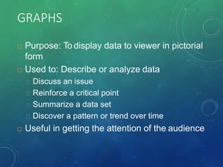
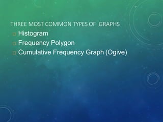
To represent data in frequency distributions
graphically using histograms, frequency
polygons, and ogives.
a] What % of Americans find life dull?
b] What % of Americans are color blind?
c] How many gallons of soda does the average
American drink during a year?](https://image.slidesharecdn.com/28-kubrafrequencypolygon-190510212627/85/Frequency-Polygon-2-320.jpg)
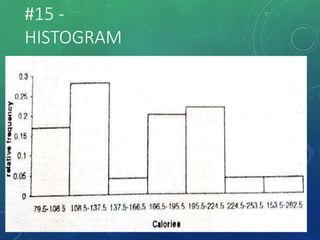
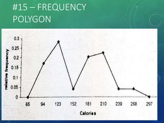
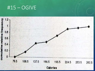


The document provides an overview of graphical representations of frequency distributions, including histograms, frequency polygons, and ogives. It outlines the construction methods for each type of graph, their purposes, and various distribution shapes. The objective is to effectively analyze and summarize data while engaging the audience visually.