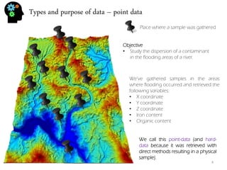
The document provides an index and overview of topics related to geostatistics including:
- Types of data (point data and grid data), file formats, and viewing data
- Statistical parameters like mean, variance, and percentiles
- Univariate analysis methods like histograms and boxplots
- Bivariate analysis like scatterplots and correlation
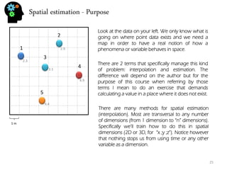
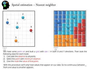
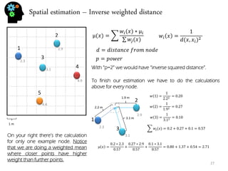
- Spatial estimation techniques including kriging and sequential simulation
- Variography and building variograms
- Stochastic modeling procedures like sequential Gaussian simulation

![Types and purpose of data – viewing point data
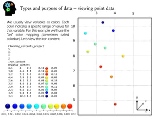
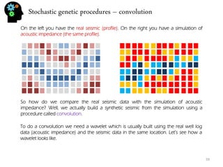
There are many kinds of colorbar. Many have been developed to achieve some specific purpose like display a colored image in black and white or getting the best contrast between positive values, negative values and zero values in a seismic cube. Like this:
min.
max.
This color map is usually called “Seismic” colormap or “RdBu” (for red to blue or blue to red). Notice that in the seismic cube this colormap will show negatives in blue colors, positives in red colors and near zero values in whites. It gets very simple to retrieve the strength of the seismic signal.
min.
max.
The “Jet’ color map (sometimes called “rainbow”) on the other hand was made to show easily a wider range of values although there is still the felling of continuity.
RGB triplets from blue to red “Jet” [ 0 0 143] [ 0 0 239] [ 0 79 255] [ 0 175 255] [ 15 255 255] [111 255 159] [207 255 63] [255 223 0] [255 127 0] [255 31 0] [191 0 0]
8](https://image.slidesharecdn.com/b21cf962-ca56-4cdc-abeb-523ba81cfc44-141213211241-conversion-gate01/85/Student_Garden_geostatistics_course-8-320.jpg)
![Univariate analysis - histogram
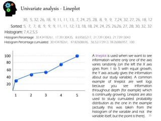
30, 5, 32, 26, 18, 9, 11, 11, 13, 7, 24, 25, 28, 8, 9, 9, 7,24, 32, 27, 26, 18, 12
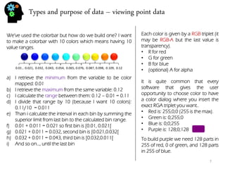
Let’s use the sample values from the previous section:
Univariate analysis means that you’re studying the variable by itself. In fact the previous section (about mean, variance and so on) was already univariate analysis. Now we’re going to plot our data. The most typical univariate plot is the histogram. To do an histogram I must:
•Calculate the maximum (32) and minimum (5) and calculate the difference (32-5=27).
•Now we calculate the bin (for 7 bins) size which is 27/5=5.4.
•Now we build de limits of our bins: 1º:[5,10.4[, 2º:[10.4,15.8[, 3º:[15.8,21.2[, 4º:[21.2,26.6[, 5º:[26.6,32]
•And see how many values are inside each bin: 1º:7 , 2º:4, 3º:2, 4º:5, 5º:5
•Finally we plot the intervals on the X-axis, and the frequency (number of values per bin) in the Y- axis.
Sorted: 5, 7, 7, 8, 9, 9, 9, 11, 11, 12, 13, 18, 18, 24, 24, 25, 26,26, 27, 28, 30, 32, 32
5
10.4
15.8
21.2
26.6
32
2
4
6
8
18](https://image.slidesharecdn.com/b21cf962-ca56-4cdc-abeb-523ba81cfc44-141213211241-conversion-gate01/85/Student_Garden_geostatistics_course-18-320.jpg)

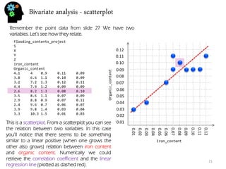
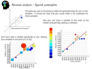
![Bivariate analysis – correlation and regression
22
There are many methods to measure relation and dependence between two or more variables. In fact there are quite a few correlation coefficient. The most usual is the Pearson correlation coefficient.
ρ= 퐸[푋−μ푥푌−μ푦] σ푋σ푌
The Pearson coefficient is between -1 and 1. Numbers closer to 1 (or -1) indicate stronger correlation being positive if close to 1, and negative (one variable increases, the other decreases) if closer to -1. Numbers around 0 mean no Pearson correlation exists (normally they appear as clouds with little to no shape).
To do linear regression means to find a line that represents the general relation of your data (if it is at all linear or similar). That means discovering this:
푌=푚∗푋+푏
“Y” and “X” are know to us. They’re the variable data that stands on the Y-axis and X-axis. The only problem is how to discover both “m” and “b”. The formulas are:
푏= 푌−푚∗ 푋 푛
푋= 푥푖 ,푌=푌푖
푚= 푛∗ 푋푌− 푋 푌 푛∗ 푋2−( 푋)2](https://image.slidesharecdn.com/b21cf962-ca56-4cdc-abeb-523ba81cfc44-141213211241-conversion-gate01/85/Student_Garden_geostatistics_course-22-320.jpg)
![Sequential simulation - uncertainty
39
Time (x)
Distance (y)
1
2
3
4
1
2
3
4
5
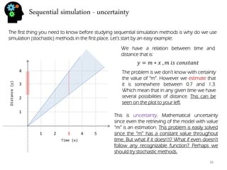
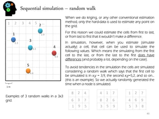
I’ve done 3 simulations, each with it’s own color. To do this simulation I’ve randomly generated a distance(y) for time=1 that followed the given formula (m = [0.7,1.3]).
푦=푚∗푥 ,푚 푖푠 푛표푡 푐표푛푠푡푎푛푡
Than for time =2 I’ve randomly generated a distance that depends on time=1 (otherwise we could have points outside of “m” value).
I’ve followed this procedure for all time steps and done 3 stochastic simulations.
With three simulations we got a much better sense of uncertainty range for time step 3. In fact if we would want to decrease all this uncertainty we could introduce new data like with time = 3, distance = 2.9. This way the distances that preceded and the ones that followed are going to be conditioned to the distance value of time=3. In fact we could call it hard-data.
Stochastic simulation follows the same concept. Let’s see what parameters are randomized for these procedures.](https://image.slidesharecdn.com/b21cf962-ca56-4cdc-abeb-523ba81cfc44-141213211241-conversion-gate01/85/Student_Garden_geostatistics_course-39-320.jpg)


![Stochastic genetic procedures – convolution
61
0
1
2
3
4
-1
-2
-3
-4
=
+
.
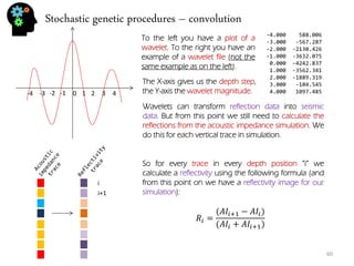
wavelet
Using the reflectivity image, for every trace, in every depth position “i“, we calculate a value which is the result of convolution. Notice however that if I start in position i=0 (first value in trace) the calculation will be done not only in position “i“ but also in the interval [i-wavelet up size, i+wavelet down size]. So the same point is going to get involved in multiple operations. For instance if the wavelet up size =3 than i=0 will be transformed when calculating on position i=0, i=1,i=2,i=3 because the interval for that trace is [i-3,i+3] = [0,6] if i=3. If i=4 the interval is [1,7] and i=0 is no longer considered. So we can say that the calculation of each position happens following this procedure:
푆푖= 푅푖+푅푖∗푊푖
Notice however that, although I’m saying Si is a seismic value, that can only be true when the trace is fully convolved. Ri would be reflectivity, Wi is wavelet value for position i.](https://image.slidesharecdn.com/b21cf962-ca56-4cdc-abeb-523ba81cfc44-141213211241-conversion-gate01/85/Student_Garden_geostatistics_course-61-320.jpg)
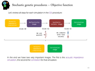
![Stochastic genetic procedures – Objective function
62
So now that we have a synthetic seismic and the real seismic we can compare both by doing the correlation between them (the following is Pearson correlation, others can be used).
ρ= 퐸[푋−μ푥푌−μ푦] σ푋σ푌
푋= 푥푖 ,푌=푌푖
The correlation is done using something we call layer map. The layer map is a instruction (stochastically generated for each generation) for the series used in the correlation so for instance:
=
Layer 1 with a series of 3 values
Correlation trace
Layer 2 with a series of 5 values
The correlation is done for each trace using the series defined in the layer map. In the end we have a correlation image for the acoustic impedance simulation.](https://image.slidesharecdn.com/b21cf962-ca56-4cdc-abeb-523ba81cfc44-141213211241-conversion-gate01/85/Student_Garden_geostatistics_course-62-320.jpg)