Download to read offline

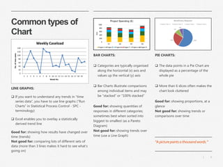
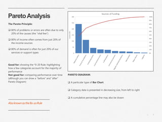
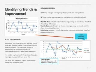


This document provides guidance on making sense of data and effectively communicating insights through visualizations. It discusses challenges organizations face in analyzing large amounts of data and offers tips for selecting appropriate chart types to analyze and present different types of data. Examples include using histograms to show variation, Pareto charts for identifying priorities, and line and moving average charts for trends over time. The goal is to help organizations and individuals at all levels better understand and make decisions based on data.