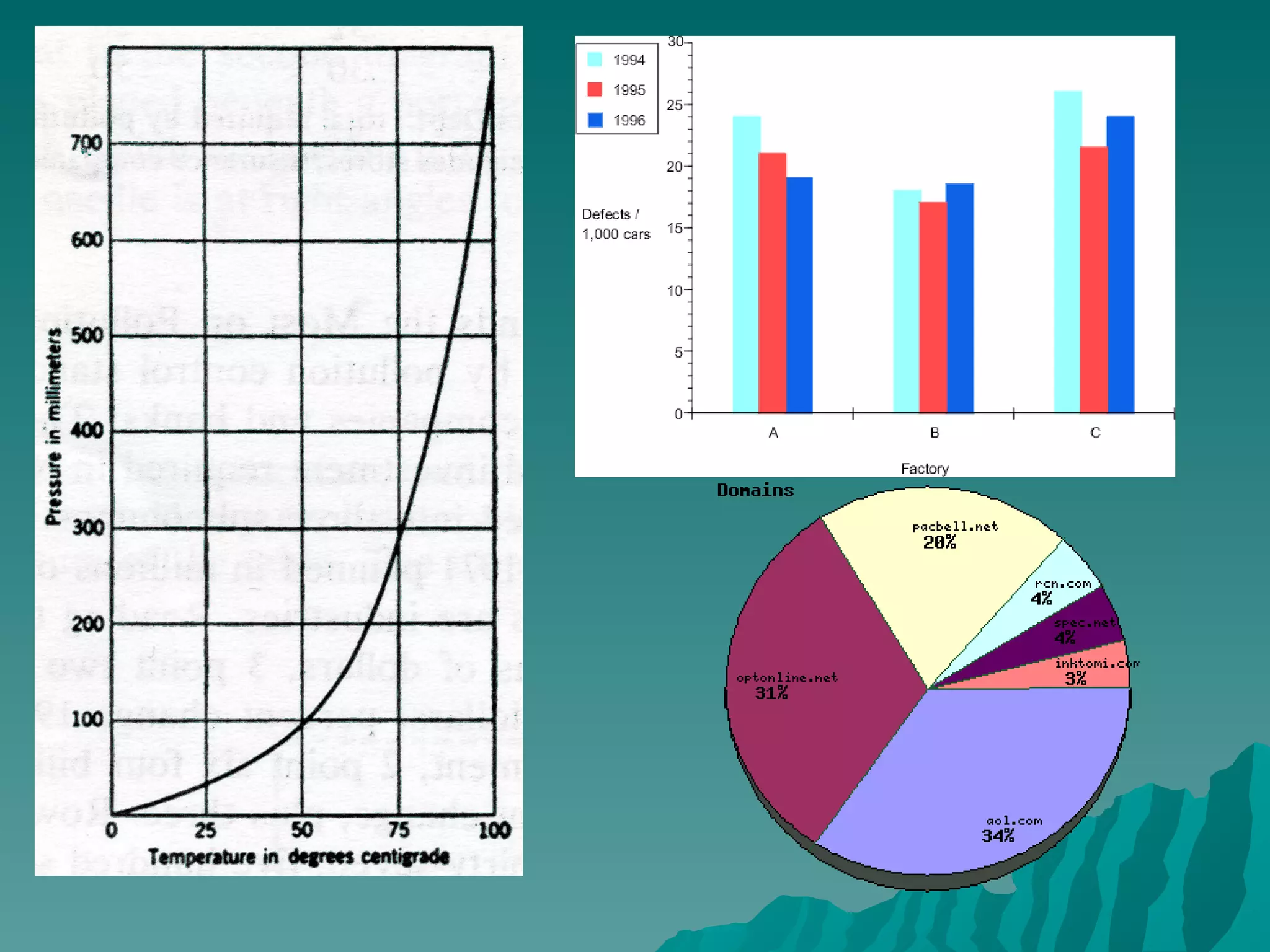
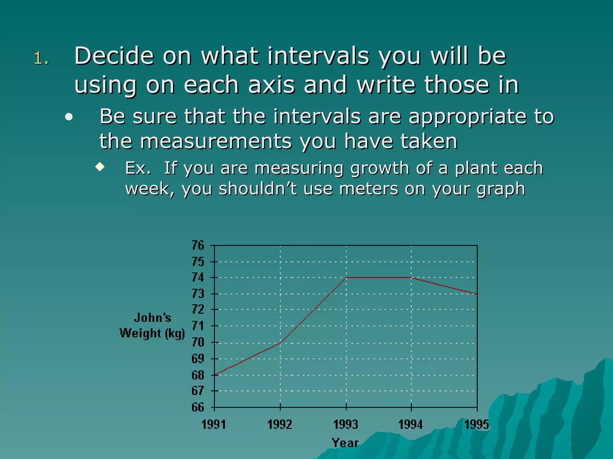
Graphing
Make a Table Data Table A chart used to organize sets of data Usually a T-chart
Graph A  graph  is a way in which to visually show information.  Graphs allow for easy comparison of multiple variables. There are many different types of graphs but the 3 most common are line graphs, bar graphs and pie charts.  In this class we will primarily be using line graphs and bar graphs
 
Creating a graph Draw and label the x and y axis.  The y axis is the vertical axis and the x axis is the horizontal one Label what variable is on each of the axis The IV should always be on the x-axis The DV should be on the Y-axis.
Variables Variable A factor that can cause a change  in the results of an experiment. Independent Variable   Factor, that as it changes,  affects the measure of another  variable. Goes on left side of data table  Horizontal axis of graph Dependent Variable   Factor that changes as the  independent variable changes. Goes on right side of data table  Vertical axis of graph Control Variable   The standard used for comparison  of test results in a lab activity.
Decide on what intervals you will be using on each axis and write those in Be sure that the intervals are appropriate to the measurements you have taken  Ex.  If you are measuring growth of a plant each week, you shouldn’t use meters on your graph
Plot the data points that you collected on the graph. Data=The “stuff” collected in a lab activity If it is a line graph, connect the points with as smooth a line as possible.  If it is a double line graph you need to make each line a different color.
SULTAN Method Scale -make sure that the data is spaced out equally  so it covers the entire space of the graph. Do not use the line break. Use tic marks to represent where your numbers are on your axis. Always start numbering with zero and Count consecutively. Units  these are represented by what you measured in (inches, pounds, number of students). Label  this tells what the variable measured (height, weight, class size) Title  This tells what the two variables that were measured.  Typically  How does X affect Y ? Easier is  X vs. Y Axis -put the independent on the X and Dependent on the Y Neatness -is your line connected neatly and connects to the dots? Is the   writing legible?
Bar graphs Bar graphs are primarily used to show  comparisons  such as individual student scores, costs at stores, densities of different materials. They still follow the SULTAN setup You must include a key to help the reader see what the difference is the bars are.

02graphing

  • 1.
  • 2.
    Make a TableData Table A chart used to organize sets of data Usually a T-chart
  • 3.
    Graph A graph is a way in which to visually show information. Graphs allow for easy comparison of multiple variables. There are many different types of graphs but the 3 most common are line graphs, bar graphs and pie charts. In this class we will primarily be using line graphs and bar graphs
  • 4.
  • 5.
    Creating a graphDraw and label the x and y axis. The y axis is the vertical axis and the x axis is the horizontal one Label what variable is on each of the axis The IV should always be on the x-axis The DV should be on the Y-axis.
  • 6.
    Variables Variable Afactor that can cause a change in the results of an experiment. Independent Variable Factor, that as it changes, affects the measure of another variable. Goes on left side of data table Horizontal axis of graph Dependent Variable Factor that changes as the independent variable changes. Goes on right side of data table Vertical axis of graph Control Variable The standard used for comparison of test results in a lab activity.
  • 7.
    Decide on whatintervals you will be using on each axis and write those in Be sure that the intervals are appropriate to the measurements you have taken Ex. If you are measuring growth of a plant each week, you shouldn’t use meters on your graph
  • 8.
    Plot the datapoints that you collected on the graph. Data=The “stuff” collected in a lab activity If it is a line graph, connect the points with as smooth a line as possible. If it is a double line graph you need to make each line a different color.
  • 9.
    SULTAN Method Scale-make sure that the data is spaced out equally so it covers the entire space of the graph. Do not use the line break. Use tic marks to represent where your numbers are on your axis. Always start numbering with zero and Count consecutively. Units these are represented by what you measured in (inches, pounds, number of students). Label this tells what the variable measured (height, weight, class size) Title This tells what the two variables that were measured. Typically How does X affect Y ? Easier is X vs. Y Axis -put the independent on the X and Dependent on the Y Neatness -is your line connected neatly and connects to the dots? Is the writing legible?
  • 10.
    Bar graphs Bargraphs are primarily used to show comparisons such as individual student scores, costs at stores, densities of different materials. They still follow the SULTAN setup You must include a key to help the reader see what the difference is the bars are.