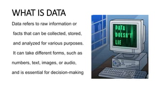
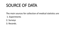
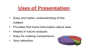
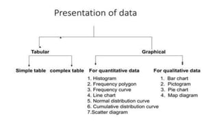
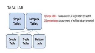
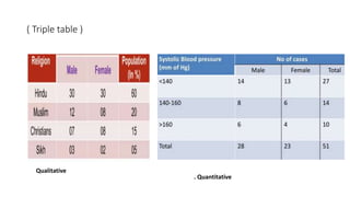
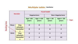
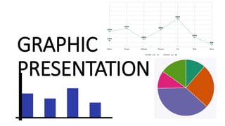
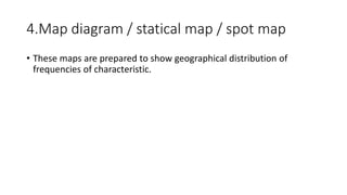
PRESENTATION
OF
DATA NISHITA PATEL
( FY. MPT )
OUTLINE
• WHAT IS DATA
• USE AND PRINCIPLE
OF PRESENTATION
• METHODS OF
PRESENTATION OF DATA
WHAT IS DATA
Data refers to raw information or
facts that can be collected, stored,
and analyzed for various purposes.
It can take different forms, such as
numbers, text, images, or audio,
and is essential for decision-making
SOURCE OF DATA
The main sources for collection of medical statistics are
1. Experiments
2. Surveys
3. Records.
STATISTICAL DATA
The data collected may be for profile or prospective studies at local,
state, national or international level. They are analyzed to assess
changes in health or disease situations in the community or population
by standard parameters. The statistical data obtained from the above
sources can be divided into two broad categories
1. Qualitative
2. Quantitative
TABULAR
.
SIMPLE TABLES
1. Qualitative 2. Quantitative
COMPLEX TABELE
(double table )
Qualitative . Quantitative
( Triple table )
. Quantitative
Qualitative
Qualitative
Multiple table
Quantitative
GRAPHIC
PRESENTATION
QUANTITATIVE DATA
1. HISTOGRAM
2. Frequency polygon
3. Frequency curve
4. Line chart / graph
5. Normal distribution curve / ogives
6. Scatter diagram
Qualitative
1. bar chart
2. Pictogram
• It is a popular method to impress the frequency of the occurrence of
events to common man such as attacks, deaths, number operated,
admitted, discharged, accidents, etc. in a population.
3. Pie chart / sector diagram
4.Map diagram / statical map / spot map
• These maps are prepared to show geographical distribution of
frequencies of characteristic.
Reference
Mahajan's Methods in Biostatistics for Medical Students and Research
Workers , Eighth Edition
PRESENTATION OF DATA ( TABULAR AND GRAPHICAL METHOD )

PRESENTATION OF DATA ( TABULAR AND GRAPHICAL METHOD )

Editor's Notes

  • #5 The experiment data collected with specific objective by one or more workers are compiled and analyzed. Survey form or scale Recodes from medical report or hospital reports
  • #34 Single bar charts show values for individual categories. Multiple bar charts compare values across different categories. Proportional bar charts illustrate the proportion of each category within a whole.
  • #38 6 / 40 into 360 = use of protector