This document provides instructions for organizing data in an Excel table, creating a scatter plot graph from that table, and using the graph to predict values. It describes how to:
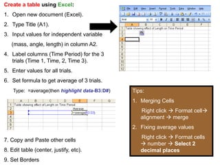
1) Create an Excel table with an independent variable in column A and dependent variable trials in columns B-D, and add an average formula.
2) Select the independent variable and average columns to insert an XY scatter graph, apply a layout and label axes.
3) Add a trendline to the graph and use it to make forward and backward predictions by entering values.
4) Adjust the axis scales and mark the predicted length for a given time period.