Excel Graph Steps
•Download as PPTX, PDF•
1 like•279 views
The document describes creating a graph in Excel by typing data into Excel, selecting an appropriate bar graph chart, and formatting the graph with an appealing color style.
Report
Share
Report
Share

Recommended
Creating a graph in excel
The stock price per month graph shows stock price ranging from $4.50 to $6.50 over 12 months. Stock price was highest at $6.50 in month 4 and lowest at $4.50 in month 0. The graph provides a simple visualization of how stock price changed over the period measured.
Creating Graphs in Excel
Getting survey information from surveymonkey.com and using it to create graphs in Excel to illustrate the information.
How to Insert a Graph into Microsoft Excel 2007
This document provides instructions for inserting a graph into Microsoft Excel 2007. It includes 7 steps: 1) Open a new Excel document, 2) Enter category data into columns for the x and y axes, 3) Enter values into cells below the category headings, 4) Highlight the selected cells, 5) Insert a graph from the options, 6) Select a graph type such as a line graph, 7) Use the chart tools to add titles, labels, and format the graph. The chart tools allow customizing the graph layout, format, and design. When complete, the graph remains editable on the Excel spreadsheet.
Creating tables and graphs (excel) 2011 2012
This document provides instructions for organizing data in an Excel table, creating a scatter plot graph from that table, and using the graph to predict values. It describes how to:
1) Create an Excel table with an independent variable in column A and dependent variable trials in columns B-D, and add an average formula.
2) Select the independent variable and average columns to insert an XY scatter graph, apply a layout and label axes.
3) Add a trendline to the graph and use it to make forward and backward predictions by entering values.
4) Adjust the axis scales and mark the predicted length for a given time period.
Charts And Graphs
This document discusses different types of charts and graphs that can be used to visually represent data. It provides examples of pie charts, bar charts, column charts, line charts, area charts, and scatter plots. Reasons for creating charts include making trends easily recognizable, allowing quick perception of information, and aiding data interpretation. Charts can be incorporated into business reports, web pages, posters, and other documents. Proper selection of charts is important to illustrate different types of data, such as time series data displayed in line graphs or comparisons shown in bar charts.
Types of graphs
This document discusses different types of graphs and tables used to represent data. It introduces bar graphs, line graphs, circle graphs, and pictographs for visualizing data, as well as frequency tables and line plots for organizing raw numbers. Bar graphs compare data using bar lengths. Line graphs show changes over time by connecting points. Circle graphs represent parts of data as percentages of a whole circle. Pictographs use pictures to compare amounts of data, similar to bar graphs. Frequency tables list how often each item occurs, while line plots show frequencies using X marks.
Graphs ppt
The document provides guidance on recording and presenting data from scientific experiments. It emphasizes planning data collection before starting an experiment, organizing raw data in tables with independent variables on the left and dependent variables on the right, and processing the data to present it clearly in graphs and conclusions. Key points covered include choosing appropriate graph types based on continuous or discrete data, using titles, labels, and scales correctly in graphs, and identifying patterns in the data.
Graph In Excel
Step 1: Open Microsoft Excel. Step 2: Enter X-axis data in row 1 and Y-axis data in row 2 as an example. Step 3: Select a cell with data, then use the Chart Wizard to create a chart on a new sheet using the row data. Adjust column colors by double clicking on a column.
Excel graphs & charts final narration
This document provides information about creating basic charts and graphs in Microsoft Excel, including a pre-assessment quiz, a link to a video tutorial on charts and graphs in Excel, an example chart with labels explaining the different parts, and a post-assessment survey to test knowledge gained.
$5 COUPON LINK - Excel Udemy Course: Excel with Excel Dynamic Graphs, Dashboa...
Learn everything about Charts with Excel 2013
Create Interactive Advanced Excel Charts, Pivot Charts and Dashboards - with Microsoft Excel 2013 + Free Excel Templates
******************************************************************************************************
GET THE COURSE FOR $5 WITH THE COUPON LINK:
https://www.udemy.com/excel-charts-learn-everything-about-charts-with-excel-2013/?couponCode=STUDENT5
05 Excel Charts
Charts are a graphic representation of data that make large datasets more easily understandable at a glance. Different chart types depict data in various ways depending on the nature of the information. Excel allows users to select the cells containing their data, choose a chart type from the Insert tab, and customize every aspect of the chart using options and styles to best represent their data.
Chapter10
This document discusses techniques for creating and manipulating 3D objects in Illustrator, including:
- Extruding and revolving 2D objects to add depth and manipulate surfaces
- Controlling lighting, shading, and mapping artwork onto 3D objects
- Using perspective grids to draw and manipulate objects in 1, 2, or 3-point perspective
The key 3D effects - extrude, revolve, surface shading, and mapping - are demonstrated along with options for precise control of 3D properties and perspective grids.
Chapter9
This document provides instructions for creating and customizing graphs in Adobe Illustrator. It discusses the different types of graphs available and how to enter and edit data using the Graph Data window. Users can customize graphs by applying predefined or custom designs, adjusting properties in the Graph Type dialog box, and creating combination or sliding-scale graphs. Custom designs allow replacing default columns or bars with vector graphics, and various scaling options control how designs adapt to data values.
Excel graphs & charts
The document provides information about creating basic charts and graphs in Microsoft Excel, including a pre-assessment quiz, a link to a video tutorial on charts and graphs in Excel, labels for an example Excel chart, and links to post-assessment and additional reference materials.
Chicken Hypnosis & Bad Presentations #PresentationTips
The document discusses the benefits of exercise for mental health. Regular physical activity can help reduce anxiety and depression and improve mood and cognitive functioning. Exercise causes chemical changes in the brain that may help protect against mental illness and improve symptoms.
If Function In Excel
This document explains how to use the IF function in Excel to calculate VAT based on product category, with different VAT rates applied depending on whether the product is electronic (4% VAT) or electrical (12.5% VAT). The IF function syntax allows you to specify an logical test (category in cell B2), a value if true (multiply price by 4%), and a value if false (multiply price by 12.5%). Quotes must be used for text but not for numbers. Practice is needed to properly use quotes, commas and brackets in the IF function syntax.
Show, Don't (Just) Tell: The Visual Proposal That Landed Me a Dream Gig! #Pre...
We spend so much time hunting for prospective opportunities that can take our careers or businesses to the next level but so little time is spent crafting unique proposals that will help us stand out and blow the competition out of the water. The solution? Don’t TELL them what you can do; SHOW them what you’ve got.
How to graph in excel
Using Excel to Make a Graph
1) Open Excel and create a new workbook. Type "Temperature" in cell A1 and "Time" in cell B1.
2) Type in average temperatures for cold, room temp., and hot water collected from class data.
3) Select the cells with text (A1-B4) and create a column chart under "Charts".
Graphical representation of data in excel
This document discusses graphical representations used in data visualization. It covers bar charts, line diagrams, histograms, and pie diagrams as common types of diagrams. Line graphs are defined as using line segments to connect data points and show changes over time. The document was written by Anum Maqsood, a 7th semester student at GCET FSd.
Pie Chart In Excel
A picture is worth a thousand words. You can create lovely charts from your Excel data for presentation purposes.
Tally
The document provides information about accounting fundamentals and Tally 9 accounting software. It discusses key accounting concepts like journal entries, ledger accounts, trial balance and financial statements. It also summarizes the features and benefits of Tally 9 such as speed, real-time access to information, accurate reporting and better decision making. Tally 9 allows users to create companies, alter company information, delete companies and consolidate financial reports of multiple companies into a group.
Charts in excel 2007
The document provides instructions for creating and formatting a pie chart in Excel 2007. It discusses entering the chart data, selecting the data range, choosing a pie chart type, formatting the chart, adding a title, removing the legend, adding data labels, changing colors and styles. The steps include exploding a pie slice, applying gradients, shadows, and beveling to further enhance the visual presentation of the pie chart.
Overview of Tally presentation
This Presentation is based on the basic of Tally i.e Tally topic in Information Technology Subject in 11th and 12th Commerce.
Pie charts
This document provides instructions to create a pie chart in Excel in 4 steps:
1. Enter category labels and values in a table. Select the data range for the chart.
2. Insert a pie chart and select the 2-D pie chart type.
3. Add data labels and format them to include category name and percent.
4. Rename the chart title to complete the pie chart.
Decision tree powerpoint ppt slides.
The document describes a decision tree that can be used to analyze different options and outcomes. The decision tree has decision nodes, event nodes, and outcome nodes. The tree can be built and analyzed to evaluate different directions.
Learn excel
This document provides an introduction to entering text, numbers, and formulas in Microsoft Excel. It discusses the Excel window and components such as the ribbon, worksheet, cells, and formula bar. It then demonstrates how to enter values into cells, perform basic math calculations with formulas using operators like addition and subtraction, and format text. The document aims to teach Excel basics to new users through step-by-step exercises on navigating the interface and performing essential tasks.
Sample (1)learn how to steps powerpoint
This document provides an overview of commonly used features in PowerPoint. It demonstrates how to add and format slides, apply themes, vary text formatting, insert images from clipart or files, add animated and timed text, apply slide transitions and sounds, use shapes and diagrams, embed videos, add action buttons for navigation, and link to web content and email addresses. The goal is to serve as both a user guide and example presentation to learn PowerPoint features.
Choosing the Right Graph
The document describes choosing the right graph type to display iTunes song download frequency data. It uses a column graph to show the number of downloads for each song, making it easy to see which songs were most and least popular. A column graph was chosen because it effectively displays frequency data by using bar lengths proportional to the values. In summary, the document discusses using a column graph to visualize song download counts from iTunes and effectively compare the popularity of different songs.
Executive Directors Chat Leveraging AI for Diversity, Equity, and Inclusion
Let’s explore the intersection of technology and equity in the final session of our DEI series. Discover how AI tools, like ChatGPT, can be used to support and enhance your nonprofit's DEI initiatives. Participants will gain insights into practical AI applications and get tips for leveraging technology to advance their DEI goals.
How to Fix the Import Error in the Odoo 17
An import error occurs when a program fails to import a module or library, disrupting its execution. In languages like Python, this issue arises when the specified module cannot be found or accessed, hindering the program's functionality. Resolving import errors is crucial for maintaining smooth software operation and uninterrupted development processes.
More Related Content
Viewers also liked
Excel graphs & charts final narration
This document provides information about creating basic charts and graphs in Microsoft Excel, including a pre-assessment quiz, a link to a video tutorial on charts and graphs in Excel, an example chart with labels explaining the different parts, and a post-assessment survey to test knowledge gained.
$5 COUPON LINK - Excel Udemy Course: Excel with Excel Dynamic Graphs, Dashboa...
Learn everything about Charts with Excel 2013
Create Interactive Advanced Excel Charts, Pivot Charts and Dashboards - with Microsoft Excel 2013 + Free Excel Templates
******************************************************************************************************
GET THE COURSE FOR $5 WITH THE COUPON LINK:
https://www.udemy.com/excel-charts-learn-everything-about-charts-with-excel-2013/?couponCode=STUDENT5
05 Excel Charts
Charts are a graphic representation of data that make large datasets more easily understandable at a glance. Different chart types depict data in various ways depending on the nature of the information. Excel allows users to select the cells containing their data, choose a chart type from the Insert tab, and customize every aspect of the chart using options and styles to best represent their data.
Chapter10
This document discusses techniques for creating and manipulating 3D objects in Illustrator, including:
- Extruding and revolving 2D objects to add depth and manipulate surfaces
- Controlling lighting, shading, and mapping artwork onto 3D objects
- Using perspective grids to draw and manipulate objects in 1, 2, or 3-point perspective
The key 3D effects - extrude, revolve, surface shading, and mapping - are demonstrated along with options for precise control of 3D properties and perspective grids.
Chapter9
This document provides instructions for creating and customizing graphs in Adobe Illustrator. It discusses the different types of graphs available and how to enter and edit data using the Graph Data window. Users can customize graphs by applying predefined or custom designs, adjusting properties in the Graph Type dialog box, and creating combination or sliding-scale graphs. Custom designs allow replacing default columns or bars with vector graphics, and various scaling options control how designs adapt to data values.
Excel graphs & charts
The document provides information about creating basic charts and graphs in Microsoft Excel, including a pre-assessment quiz, a link to a video tutorial on charts and graphs in Excel, labels for an example Excel chart, and links to post-assessment and additional reference materials.
Chicken Hypnosis & Bad Presentations #PresentationTips
The document discusses the benefits of exercise for mental health. Regular physical activity can help reduce anxiety and depression and improve mood and cognitive functioning. Exercise causes chemical changes in the brain that may help protect against mental illness and improve symptoms.
If Function In Excel
This document explains how to use the IF function in Excel to calculate VAT based on product category, with different VAT rates applied depending on whether the product is electronic (4% VAT) or electrical (12.5% VAT). The IF function syntax allows you to specify an logical test (category in cell B2), a value if true (multiply price by 4%), and a value if false (multiply price by 12.5%). Quotes must be used for text but not for numbers. Practice is needed to properly use quotes, commas and brackets in the IF function syntax.
Show, Don't (Just) Tell: The Visual Proposal That Landed Me a Dream Gig! #Pre...
We spend so much time hunting for prospective opportunities that can take our careers or businesses to the next level but so little time is spent crafting unique proposals that will help us stand out and blow the competition out of the water. The solution? Don’t TELL them what you can do; SHOW them what you’ve got.
How to graph in excel
Using Excel to Make a Graph
1) Open Excel and create a new workbook. Type "Temperature" in cell A1 and "Time" in cell B1.
2) Type in average temperatures for cold, room temp., and hot water collected from class data.
3) Select the cells with text (A1-B4) and create a column chart under "Charts".
Graphical representation of data in excel
This document discusses graphical representations used in data visualization. It covers bar charts, line diagrams, histograms, and pie diagrams as common types of diagrams. Line graphs are defined as using line segments to connect data points and show changes over time. The document was written by Anum Maqsood, a 7th semester student at GCET FSd.
Pie Chart In Excel
A picture is worth a thousand words. You can create lovely charts from your Excel data for presentation purposes.
Tally
The document provides information about accounting fundamentals and Tally 9 accounting software. It discusses key accounting concepts like journal entries, ledger accounts, trial balance and financial statements. It also summarizes the features and benefits of Tally 9 such as speed, real-time access to information, accurate reporting and better decision making. Tally 9 allows users to create companies, alter company information, delete companies and consolidate financial reports of multiple companies into a group.
Charts in excel 2007
The document provides instructions for creating and formatting a pie chart in Excel 2007. It discusses entering the chart data, selecting the data range, choosing a pie chart type, formatting the chart, adding a title, removing the legend, adding data labels, changing colors and styles. The steps include exploding a pie slice, applying gradients, shadows, and beveling to further enhance the visual presentation of the pie chart.
Overview of Tally presentation
This Presentation is based on the basic of Tally i.e Tally topic in Information Technology Subject in 11th and 12th Commerce.
Pie charts
This document provides instructions to create a pie chart in Excel in 4 steps:
1. Enter category labels and values in a table. Select the data range for the chart.
2. Insert a pie chart and select the 2-D pie chart type.
3. Add data labels and format them to include category name and percent.
4. Rename the chart title to complete the pie chart.
Decision tree powerpoint ppt slides.
The document describes a decision tree that can be used to analyze different options and outcomes. The decision tree has decision nodes, event nodes, and outcome nodes. The tree can be built and analyzed to evaluate different directions.
Learn excel
This document provides an introduction to entering text, numbers, and formulas in Microsoft Excel. It discusses the Excel window and components such as the ribbon, worksheet, cells, and formula bar. It then demonstrates how to enter values into cells, perform basic math calculations with formulas using operators like addition and subtraction, and format text. The document aims to teach Excel basics to new users through step-by-step exercises on navigating the interface and performing essential tasks.
Sample (1)learn how to steps powerpoint
This document provides an overview of commonly used features in PowerPoint. It demonstrates how to add and format slides, apply themes, vary text formatting, insert images from clipart or files, add animated and timed text, apply slide transitions and sounds, use shapes and diagrams, embed videos, add action buttons for navigation, and link to web content and email addresses. The goal is to serve as both a user guide and example presentation to learn PowerPoint features.
Choosing the Right Graph
The document describes choosing the right graph type to display iTunes song download frequency data. It uses a column graph to show the number of downloads for each song, making it easy to see which songs were most and least popular. A column graph was chosen because it effectively displays frequency data by using bar lengths proportional to the values. In summary, the document discusses using a column graph to visualize song download counts from iTunes and effectively compare the popularity of different songs.
Viewers also liked (20)
$5 COUPON LINK - Excel Udemy Course: Excel with Excel Dynamic Graphs, Dashboa...
$5 COUPON LINK - Excel Udemy Course: Excel with Excel Dynamic Graphs, Dashboa...
Chicken Hypnosis & Bad Presentations #PresentationTips
Chicken Hypnosis & Bad Presentations #PresentationTips
Show, Don't (Just) Tell: The Visual Proposal That Landed Me a Dream Gig! #Pre...
Show, Don't (Just) Tell: The Visual Proposal That Landed Me a Dream Gig! #Pre...
Recently uploaded
Executive Directors Chat Leveraging AI for Diversity, Equity, and Inclusion
Let’s explore the intersection of technology and equity in the final session of our DEI series. Discover how AI tools, like ChatGPT, can be used to support and enhance your nonprofit's DEI initiatives. Participants will gain insights into practical AI applications and get tips for leveraging technology to advance their DEI goals.
How to Fix the Import Error in the Odoo 17
An import error occurs when a program fails to import a module or library, disrupting its execution. In languages like Python, this issue arises when the specified module cannot be found or accessed, hindering the program's functionality. Resolving import errors is crucial for maintaining smooth software operation and uninterrupted development processes.
How to Add Chatter in the odoo 17 ERP Module
In Odoo, the chatter is like a chat tool that helps you work together on records. You can leave notes and track things, making it easier to talk with your team and partners. Inside chatter, all communication history, activity, and changes will be displayed.
Community pharmacy- Social and preventive pharmacy UNIT 5
Covered community pharmacy topic of the subject Social and preventive pharmacy for Diploma and Bachelor of pharmacy
RPMS TEMPLATE FOR SCHOOL YEAR 2023-2024 FOR TEACHER 1 TO TEACHER 3
RPMS Template 2023-2024 by: Irene S. Rueco
How to Build a Module in Odoo 17 Using the Scaffold Method
Odoo provides an option for creating a module by using a single line command. By using this command the user can make a whole structure of a module. It is very easy for a beginner to make a module. There is no need to make each file manually. This slide will show how to create a module using the scaffold method.
South African Journal of Science: Writing with integrity workshop (2024)
South African Journal of Science: Writing with integrity workshop (2024)Academy of Science of South Africa
A workshop hosted by the South African Journal of Science aimed at postgraduate students and early career researchers with little or no experience in writing and publishing journal articles.Pengantar Penggunaan Flutter - Dart programming language1.pptx
Pengantar Penggunaan Flutter - Dart programming language1.pptx
BÀI TẬP BỔ TRỢ TIẾNG ANH 8 CẢ NĂM - GLOBAL SUCCESS - NĂM HỌC 2023-2024 (CÓ FI...
BÀI TẬP BỔ TRỢ TIẾNG ANH 8 CẢ NĂM - GLOBAL SUCCESS - NĂM HỌC 2023-2024 (CÓ FI...Nguyen Thanh Tu Collection
https://app.box.com/s/y977uz6bpd3af4qsebv7r9b7s21935vdবাংলাদেশ অর্থনৈতিক সমীক্ষা (Economic Review) ২০২৪ UJS App.pdf
বাংলাদেশের অর্থনৈতিক সমীক্ষা ২০২৪ [Bangladesh Economic Review 2024 Bangla.pdf] কম্পিউটার , ট্যাব ও স্মার্ট ফোন ভার্সন সহ সম্পূর্ণ বাংলা ই-বুক বা pdf বই " সুচিপত্র ...বুকমার্ক মেনু 🔖 ও হাইপার লিংক মেনু 📝👆 যুক্ত ..
আমাদের সবার জন্য খুব খুব গুরুত্বপূর্ণ একটি বই ..বিসিএস, ব্যাংক, ইউনিভার্সিটি ভর্তি ও যে কোন প্রতিযোগিতা মূলক পরীক্ষার জন্য এর খুব ইম্পরট্যান্ট একটি বিষয় ...তাছাড়া বাংলাদেশের সাম্প্রতিক যে কোন ডাটা বা তথ্য এই বইতে পাবেন ...
তাই একজন নাগরিক হিসাবে এই তথ্য গুলো আপনার জানা প্রয়োজন ...।
বিসিএস ও ব্যাংক এর লিখিত পরীক্ষা ...+এছাড়া মাধ্যমিক ও উচ্চমাধ্যমিকের স্টুডেন্টদের জন্য অনেক কাজে আসবে ...
Digital Artifact 1 - 10VCD Environments Unit
Digital Artifact 1 - 10VCD Environments Unit - NGV Pavilion Concept Design
The simplified electron and muon model, Oscillating Spacetime: The Foundation...
Discover the Simplified Electron and Muon Model: A New Wave-Based Approach to Understanding Particles delves into a groundbreaking theory that presents electrons and muons as rotating soliton waves within oscillating spacetime. Geared towards students, researchers, and science buffs, this book breaks down complex ideas into simple explanations. It covers topics such as electron waves, temporal dynamics, and the implications of this model on particle physics. With clear illustrations and easy-to-follow explanations, readers will gain a new outlook on the universe's fundamental nature.
Recently uploaded (20)
Executive Directors Chat Leveraging AI for Diversity, Equity, and Inclusion
Executive Directors Chat Leveraging AI for Diversity, Equity, and Inclusion
Community pharmacy- Social and preventive pharmacy UNIT 5
Community pharmacy- Social and preventive pharmacy UNIT 5
RPMS TEMPLATE FOR SCHOOL YEAR 2023-2024 FOR TEACHER 1 TO TEACHER 3
RPMS TEMPLATE FOR SCHOOL YEAR 2023-2024 FOR TEACHER 1 TO TEACHER 3
How to Build a Module in Odoo 17 Using the Scaffold Method
How to Build a Module in Odoo 17 Using the Scaffold Method
South African Journal of Science: Writing with integrity workshop (2024)
South African Journal of Science: Writing with integrity workshop (2024)
Pengantar Penggunaan Flutter - Dart programming language1.pptx
Pengantar Penggunaan Flutter - Dart programming language1.pptx
BÀI TẬP BỔ TRỢ TIẾNG ANH 8 CẢ NĂM - GLOBAL SUCCESS - NĂM HỌC 2023-2024 (CÓ FI...
BÀI TẬP BỔ TRỢ TIẾNG ANH 8 CẢ NĂM - GLOBAL SUCCESS - NĂM HỌC 2023-2024 (CÓ FI...
Digital Artefact 1 - Tiny Home Environmental Design
Digital Artefact 1 - Tiny Home Environmental Design
বাংলাদেশ অর্থনৈতিক সমীক্ষা (Economic Review) ২০২৪ UJS App.pdf
বাংলাদেশ অর্থনৈতিক সমীক্ষা (Economic Review) ২০২৪ UJS App.pdf
The simplified electron and muon model, Oscillating Spacetime: The Foundation...
The simplified electron and muon model, Oscillating Spacetime: The Foundation...
Excel Graph Steps
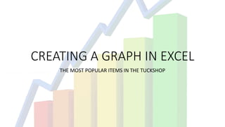
- 1. CREATING A GRAPH IN EXCEL THE MOST POPULAR ITEMS IN THE TUCKSHOP
- 2. THE DATA IS TYPED INTO EXCEL
- 3. RECOMMENDED CHARTS IS USED TO SELECT APPROPRIATE GRAPH
- 4. A BAR GRAPH IS CHOSEN
- 5. A FORMATTING STYLE IS CHOSEN
- 6. CHANGED TO AN APPEALING COLOUR