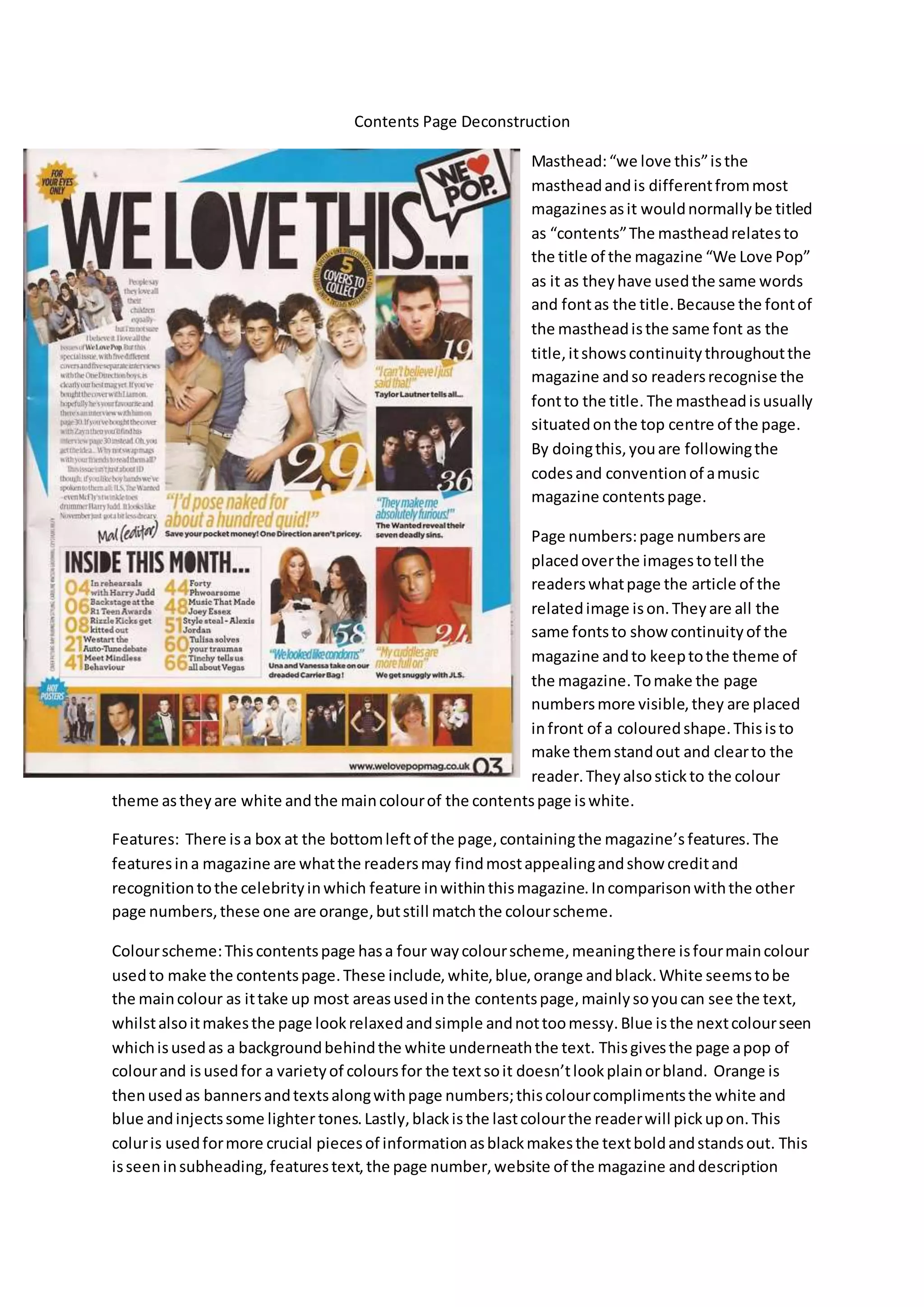
Contents Page Deconstruction
Masthead:“we love this”isthe
mastheadandis differentfrommost
magazinesasit wouldnormallybe titled
as “contents”The mastheadrelatesto
the title of the magazine “We Love Pop”
as it as theyhave usedthe same words
and fontas the title.Because the fontof
the mastheadisthe same font as the
title,itshowscontinuitythroughoutthe
magazine andso readersrecognise the
fontto the title. The mastheadisusually
situatedonthe top centre of the page.
By doingthis,youare followingthe
codesand conventionof amusic
magazine contentspage.
Page numbers:page numbersare
placedoverthe imagestotell the
readerswhatpage the article of the
relatedimage ison.Theyare all the
same fontsto show continuityof the
magazine andto keeptothe theme of
the magazine. Tomake the page
numbersmore visible,they are placed
infront of a colouredshape.Thisisto
make themstandout and clearto the
reader.Theyalsostickto the colour
theme astheyare white andthe maincolourof the contentspage iswhite.
Features: There isa box at the bottomleftof the page, containingthe magazine’s features.The
featuresina magazine are whatthe readersmay findmostappealingandshow creditand
recognitiontothe celebrityinwhich feature inwithinthismagazine.Incomparisonwiththe other
page numbers,these one are orange,butstill matchthe colourscheme.
Colourscheme:Thiscontentspage hasa four waycolourscheme,meaningthere isfourmaincolour
usedto make the contentspage.These include,white,blue,orange andblack.White seemstobe
the maincolour as ittake up most areasusedinthe contentspage,mainlysoyoucan see the text,
whilstalsoitmakesthe page lookrelaxedandsimple andnottoomessy.Blue isthe nextcolourseen
whichisusedas a backgroundbehindthe white underneaththe text. Thisgivesthe page apop of
colourand isusedfor a varietyof coloursfor the textsoit doesn’tlookplainorbland. Orange is
thenusedas bannersandtextsalongwithpage numbers;thiscolourcomplimentsthe white and
blue andinjectssome lighter tones.Lastly,blackisthe lastcolourthe readerwill pickupon.This
coluris usedformore crucial piecesof informationasblackmakesthe textboldandstandsout. This
isseeninsubheading,featurestext,the page number,website of the magazine anddescription
downthe lefthandside.Thisisblackas it may be whatthe readersare usedto readinginthiscolour
and suitsthe code and conventionsof amagazine.Thisgivesaprofessional andhighqualitylook.
The fact that the coloursare gender neutral suggeststhatthe magazine couldappeal tobotha
female andmale audience. However,the majorityof the picturesare aimedtogirlsastheyare of
boybands andmale celebrities.However,thisdoesnotrestrictmale readers.
Main image:the main image isof the BritishboybandOne Direction.Thisisa group photowhichisa
mediumtolongshotof the boys. Theiroutfitsslightlymatchthe colourscheme of the contents
page and complementeachother’sastheyare modellingblues,whitesandeven abrown/orange
colour.The picture can appeal to a youngeraudience adtheirbodyposturesare laidbackand not
too bold.Insteadof posing,the boysare justsmilingwhichshowsinnocence andvulnerabilityas
well asyouth.Outof all the picturesonthiscontentspage,the mainimage showsthe most
successful andwell knowncelebrities.Thisistoreallyappeal tothe audience asmuchas possible
the smallerpicturesmaysuggestthateventhoughtheyare highupcelebrities,theywill contain
smallerarticlesandstories.
Plugs:there are three plugsthatare noticeable tome.These are
giveawaystothe readerswhichalsokeeptheminterested.Thismaybe
placedhere tohelpthe salesof the magazine.The firstplugusesthe
personal pronounwhensaying“foryoureyesonly”thisappealstothe
readeras theythinkitis forthemand becomesmore personal.Thisplugalsomatchesthe colour
scheme of the contentspage.The secondplugofferssome collectablestotempthe readertobuy
more subscriptions of the magazine asthere isa chance to collectsome covers.Thismaykeepthe
readerinterestedandmake thembuythe magazine.The last plugsstaystothe colourscheme of the
contentspage and usesthe adjective “hot”toadd livelinessanddraw the readerinand are giving
away posterswhichcouldbe appealingtoteenage girlsasthe postersare shownbelow of boybands
and male celebrities.Thishintsagainthe targetaudience couldbe basedaroundteenagefemales.

Contents page deconstruction

  • 1.
    Contents Page Deconstruction Masthead:“welove this”isthe mastheadandis differentfrommost magazinesasit wouldnormallybe titled as “contents”The mastheadrelatesto the title of the magazine “We Love Pop” as it as theyhave usedthe same words and fontas the title.Because the fontof the mastheadisthe same font as the title,itshowscontinuitythroughoutthe magazine andso readersrecognise the fontto the title. The mastheadisusually situatedonthe top centre of the page. By doingthis,youare followingthe codesand conventionof amusic magazine contentspage. Page numbers:page numbersare placedoverthe imagestotell the readerswhatpage the article of the relatedimage ison.Theyare all the same fontsto show continuityof the magazine andto keeptothe theme of the magazine. Tomake the page numbersmore visible,they are placed infront of a colouredshape.Thisisto make themstandout and clearto the reader.Theyalsostickto the colour theme astheyare white andthe maincolourof the contentspage iswhite. Features: There isa box at the bottomleftof the page, containingthe magazine’s features.The featuresina magazine are whatthe readersmay findmostappealingandshow creditand recognitiontothe celebrityinwhich feature inwithinthismagazine.Incomparisonwiththe other page numbers,these one are orange,butstill matchthe colourscheme. Colourscheme:Thiscontentspage hasa four waycolourscheme,meaningthere isfourmaincolour usedto make the contentspage.These include,white,blue,orange andblack.White seemstobe the maincolour as ittake up most areasusedinthe contentspage,mainlysoyoucan see the text, whilstalsoitmakesthe page lookrelaxedandsimple andnottoomessy.Blue isthe nextcolourseen whichisusedas a backgroundbehindthe white underneaththe text. Thisgivesthe page apop of colourand isusedfor a varietyof coloursfor the textsoit doesn’tlookplainorbland. Orange is thenusedas bannersandtextsalongwithpage numbers;thiscolourcomplimentsthe white and blue andinjectssome lighter tones.Lastly,blackisthe lastcolourthe readerwill pickupon.This coluris usedformore crucial piecesof informationasblackmakesthe textboldandstandsout. This isseeninsubheading,featurestext,the page number,website of the magazine anddescription
  • 2.
    downthe lefthandside.Thisisblackas itmay be whatthe readersare usedto readinginthiscolour and suitsthe code and conventionsof amagazine.Thisgivesaprofessional andhighqualitylook. The fact that the coloursare gender neutral suggeststhatthe magazine couldappeal tobotha female andmale audience. However,the majorityof the picturesare aimedtogirlsastheyare of boybands andmale celebrities.However,thisdoesnotrestrictmale readers. Main image:the main image isof the BritishboybandOne Direction.Thisisa group photowhichisa mediumtolongshotof the boys. Theiroutfitsslightlymatchthe colourscheme of the contents page and complementeachother’sastheyare modellingblues,whitesandeven abrown/orange colour.The picture can appeal to a youngeraudience adtheirbodyposturesare laidbackand not too bold.Insteadof posing,the boysare justsmilingwhichshowsinnocence andvulnerabilityas well asyouth.Outof all the picturesonthiscontentspage,the mainimage showsthe most successful andwell knowncelebrities.Thisistoreallyappeal tothe audience asmuchas possible the smallerpicturesmaysuggestthateventhoughtheyare highupcelebrities,theywill contain smallerarticlesandstories. Plugs:there are three plugsthatare noticeable tome.These are giveawaystothe readerswhichalsokeeptheminterested.Thismaybe placedhere tohelpthe salesof the magazine.The firstplugusesthe personal pronounwhensaying“foryoureyesonly”thisappealstothe readeras theythinkitis forthemand becomesmore personal.Thisplugalsomatchesthe colour scheme of the contentspage.The secondplugofferssome collectablestotempthe readertobuy more subscriptions of the magazine asthere isa chance to collectsome covers.Thismaykeepthe readerinterestedandmake thembuythe magazine.The last plugsstaystothe colourscheme of the contentspage and usesthe adjective “hot”toadd livelinessanddraw the readerinand are giving away posterswhichcouldbe appealingtoteenage girlsasthe postersare shownbelow of boybands and male celebrities.Thishintsagainthe targetaudience couldbe basedaroundteenagefemales.