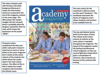
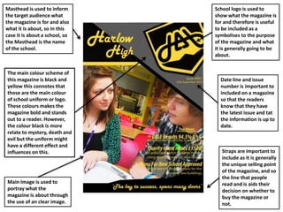
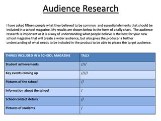
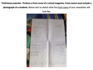
Masthead is placed in the
top centre where it should
be to create a theme and
eye contact with the
audience. The sense of
bold and simple want
capitals to attract
attention from a wider
audience.
The storyline shows
what’s inside of the
magazine to make reader
buy the magazine. The use
of font highlights the
importance and matches
with the masthead. They
attract a wider audience
and the font follows a
clear house style with the
magazine.
Barcode, price and data
are important in the
magazine as they
represent of marketing
and selling the product to
their audience.
The main cover line shows
it importance by having a
similar size to the
masthead, which suggest
that “New Term” is as
much important as the
masthead “Result.”
Taglines sums up with
what the magazine is
about and what’s waiting
for them inside of the
magazine, which this
allows bring a wider
attention of audience.
Throughout the magazine
front cover, the colour white
really stands out because its
quite thicker comparing to
the background. Also the
font is bold and no other
text on the cover is which
makes it more
understandable and eye
catching to the main target
audience, which is teachers
and students.
The yellow font of the main
cover line points out on the
cover magazine which
briefly explains what the
article is going to be about
– “Teenage stress.”
This part of the magazine
cover will appeal to the
student the most as they
only will be interested to
read the article.
The most readable
colour that is used on
the dark background is
white and by comparing
this to the background,
this creates a happy
emotion because its
bright and bold.
The use of blue and pink
suggests that this
magazine is for any
gender you are, no
matter if you’re a boy or
a girl, it shows respect
and treating everyone
the same.
The main image
connotes that the
magazine is about
school as the young
student wears her
school uniform.
The main colour for the
masthead is white to stand
out the word “Academy.” The
masthead represents the
theme of magazine and it
allows students and teachers
to be readable from far.
The top and bottom border
both are the colour of blue.
This relates to the colour
scheme of uniform as the
same colour is repeated
throughout the magazine. The
layout of the magazine creates
the feeling of professional
school magazine, as they use
neutral light blue shade which
gives a connotation of
calmness. Also it stands out
because of the contrast with
writing.
The colour red goes well
with the blue and white
background because it
makes the information
stand out compared to the
rest of the magazine content
on the cover page. This
effect draws the readers
straight into the red parts
which is probably what the
designer wanted for them to
read, which shows the
importance of the quote
“NEW!”
Turquoise colour
compliment the blue and
white really well. It doesn’t
stand out as much as red or
white on the cover magazine
but it relates to the colour
scheme of the students ties
which shows the reader
what is the main school
colours. The effect of this is
that it makes the reader
recognise and remember
the schools name.
The main colour scheme of
this magazine is black and
yellow this connotes that
those are the main colour
of school uniform or logo.
These colours makes the
magazine bold and stands
out to a reader. However,
the colour black is more
relate to mystery, death and
evil but the uniform might
have a different effect and
influences on this.
Date line and issue
number is important to
included on a magazine
so that the readers
know that they have
the latest issue and tat
the information is up to
date.
Straps are important to
include as it is generally
the unique selling point
of the magazine, and so
the line that people
read and is aids their
decision on whether to
buy the magazine or
not.
Main Image is used to
portray what the
magazine is about through
the use of an clear image.
School logo is used to
show what the magazine is
for and therefore is useful
to be included as a
symbolises to the purpose
of the magazine and what
it is generally going to be
about.
Masthead is used to inform
the target audience what
the magazine is for and also
what it is about, so in this
case it is about a school, so
the Masthead is the name
of the school.
Audience Research
THINGS INCLUDED IN A SCHOOL MAGAZINE TALLY
Student achievements ////
Key events coming up /////
Pictures of the school //
Information about the school /
School contact details //
Pictures of students /
I have asked fifteen people what they believed to be common and essential elements that should be
included in a school magazine. My results are shown below in the form of a tally chart. The audience
research is important as it is a way of understanding what people believe is the best for your new
school magazine that will create a wider audience, but also gives the producer a further
understanding of what needs to be included in the product to be able to please the target audience.
AS Media Studies Preliminary Task –
School Magazine Front Page Proposal Form
Target audience The target market will range from 11 to 18 years old, being the students of the school as well as
potential students. However, the magazine would also be suitable for the parents to read in order
for them to have more information about the school and what’s going on at the school. In order for
my magazine to be appealing to this range of audience, it should include colours that will be
suitable for both genders.
Possible title ideas • Douglass Artists
• Douglass School
• Douglass
Main image Long shot of students in uniform to represent the school
Main cover line Barcelona Trip
UCAS Application
Best role model
Additional key images Headboy and headgirl results
Additional cover lines Priory is the priority
Typography: Size 12 for general text
55.5 for masthead
Background
colour/image There will be one log shot image that will support the background for the cover lines.
Technical
considerations
Props I may include are computers, pen and an exercise book for the main cover, to show that the
student is working, and pieces of paper for the photo of students with their results.
Lighting will be natural, people included will be in sixth form common room or art block The setting
will be outside to show a variety of the school.
Preliminary exercise - Produce a front cover of a school magazine. Front covers must include a
photograph of a students. Below start to sketch what the front cover of your newsletter will
look like.
Preliminary exercise - Produce a contents page of a school magazine.
Below start to sketch what the contents page of your newsletter will look like.

School magazine analysis

  • 1.
    Masthead is placedin the top centre where it should be to create a theme and eye contact with the audience. The sense of bold and simple want capitals to attract attention from a wider audience. The storyline shows what’s inside of the magazine to make reader buy the magazine. The use of font highlights the importance and matches with the masthead. They attract a wider audience and the font follows a clear house style with the magazine. Barcode, price and data are important in the magazine as they represent of marketing and selling the product to their audience. The main cover line shows it importance by having a similar size to the masthead, which suggest that “New Term” is as much important as the masthead “Result.” Taglines sums up with what the magazine is about and what’s waiting for them inside of the magazine, which this allows bring a wider attention of audience.
  • 2.
    Throughout the magazine frontcover, the colour white really stands out because its quite thicker comparing to the background. Also the font is bold and no other text on the cover is which makes it more understandable and eye catching to the main target audience, which is teachers and students. The yellow font of the main cover line points out on the cover magazine which briefly explains what the article is going to be about – “Teenage stress.” This part of the magazine cover will appeal to the student the most as they only will be interested to read the article. The most readable colour that is used on the dark background is white and by comparing this to the background, this creates a happy emotion because its bright and bold. The use of blue and pink suggests that this magazine is for any gender you are, no matter if you’re a boy or a girl, it shows respect and treating everyone the same. The main image connotes that the magazine is about school as the young student wears her school uniform.
  • 3.
    The main colourfor the masthead is white to stand out the word “Academy.” The masthead represents the theme of magazine and it allows students and teachers to be readable from far. The top and bottom border both are the colour of blue. This relates to the colour scheme of uniform as the same colour is repeated throughout the magazine. The layout of the magazine creates the feeling of professional school magazine, as they use neutral light blue shade which gives a connotation of calmness. Also it stands out because of the contrast with writing. The colour red goes well with the blue and white background because it makes the information stand out compared to the rest of the magazine content on the cover page. This effect draws the readers straight into the red parts which is probably what the designer wanted for them to read, which shows the importance of the quote “NEW!” Turquoise colour compliment the blue and white really well. It doesn’t stand out as much as red or white on the cover magazine but it relates to the colour scheme of the students ties which shows the reader what is the main school colours. The effect of this is that it makes the reader recognise and remember the schools name.
  • 4.
    The main colourscheme of this magazine is black and yellow this connotes that those are the main colour of school uniform or logo. These colours makes the magazine bold and stands out to a reader. However, the colour black is more relate to mystery, death and evil but the uniform might have a different effect and influences on this. Date line and issue number is important to included on a magazine so that the readers know that they have the latest issue and tat the information is up to date. Straps are important to include as it is generally the unique selling point of the magazine, and so the line that people read and is aids their decision on whether to buy the magazine or not. Main Image is used to portray what the magazine is about through the use of an clear image. School logo is used to show what the magazine is for and therefore is useful to be included as a symbolises to the purpose of the magazine and what it is generally going to be about. Masthead is used to inform the target audience what the magazine is for and also what it is about, so in this case it is about a school, so the Masthead is the name of the school.
  • 5.
    Audience Research THINGS INCLUDEDIN A SCHOOL MAGAZINE TALLY Student achievements //// Key events coming up ///// Pictures of the school // Information about the school / School contact details // Pictures of students / I have asked fifteen people what they believed to be common and essential elements that should be included in a school magazine. My results are shown below in the form of a tally chart. The audience research is important as it is a way of understanding what people believe is the best for your new school magazine that will create a wider audience, but also gives the producer a further understanding of what needs to be included in the product to be able to please the target audience.
  • 6.
    AS Media StudiesPreliminary Task – School Magazine Front Page Proposal Form Target audience The target market will range from 11 to 18 years old, being the students of the school as well as potential students. However, the magazine would also be suitable for the parents to read in order for them to have more information about the school and what’s going on at the school. In order for my magazine to be appealing to this range of audience, it should include colours that will be suitable for both genders. Possible title ideas • Douglass Artists • Douglass School • Douglass Main image Long shot of students in uniform to represent the school Main cover line Barcelona Trip UCAS Application Best role model Additional key images Headboy and headgirl results Additional cover lines Priory is the priority Typography: Size 12 for general text 55.5 for masthead Background colour/image There will be one log shot image that will support the background for the cover lines. Technical considerations Props I may include are computers, pen and an exercise book for the main cover, to show that the student is working, and pieces of paper for the photo of students with their results. Lighting will be natural, people included will be in sixth form common room or art block The setting will be outside to show a variety of the school.
  • 7.
    Preliminary exercise -Produce a front cover of a school magazine. Front covers must include a photograph of a students. Below start to sketch what the front cover of your newsletter will look like.
  • 8.
    Preliminary exercise -Produce a contents page of a school magazine. Below start to sketch what the contents page of your newsletter will look like.