This contents page features a central image of a rapper posing with bling and tattoos. The contents are divided into two main sections, Fashion and Features, with subsections in bold capitals. The color scheme is black, red, and white. The page uses gold for the heading "ICONS" to symbolize importance and wealth. The layout and images are meant to attract the target audience of teenagers interested in hip hop and R&B.
This double page spread from a magazine analyzes Nicki Minaj. The main heading presents Nicki Minaj as a religious figure. The article uses a predominantly pink color scheme. The main image features Nicki Minaj cut out and placed on the pink background. Subheadings frame Nicki Minaj as a queen and superior to readers. The layout includes the image in an unconventional central placement with text wrapping around it.
This document contains an analysis of the front cover of a music magazine. It discusses various design elements of the cover including the prominent image of Mariah Carey in a revealing bikini posing in a confident manner. The colors and fonts used are described as being summery and youthful to match the target demographic. Through the image and design, the magazine aims to portray Carey as a role model and fantasy figure to attract young readers.
This document analyzes the front cover of a magazine featuring Mariah Carey. It discusses various design elements of the cover and how they target a young, urban audience interested in hip hop and R&B. Elements like Carey's revealing outfit, sexy facial expression, and the summery colors are meant to draw in this key demographic. The minimal text and bold font also give the magazine a fast-paced feel aligned with the music industry.
This document provides a summary of magazine articles about various artists such as Ed Sheeran, Lily Allen, and Adele. Key details include:
- The Ed Sheeran article discusses his recent chart-topping success and portrays him as a down-to-earth musician.
- Elements like layout, fonts, colors, and images are analyzed across the magazines to understand how they portray the artists and engage the target audiences.
- Adele's black and white photo depicts her as a reserved but strong musician focused on her passion for music rather than fame.
- Magazine elements like mastheads, page numbers, and fonts aim to look professional while engaging readers and promoting the magazine brands.
The document summarizes and analyzes various signs and signifiers used in magazine covers and contents pages for music magazines Billboard, Q, and Vibe. It examines the mastheads, skylines, main images, cover lines, and layouts on the front covers and contents pages, identifying whether they represent indexical, iconic, or symbolic signs. Across the magazines, different design elements aim to appeal to different target audiences, with Billboard appearing more formal and aimed at older readers, while Q and Vibe use more casual, youthful designs.
The document summarizes the ways in which the student's media product uses and is similar to or different from the conventions of real media products like VIBE magazine. The student discusses similarities and differences in the front cover, contents page, and a double page spread layout between their magazine and VIBE. The student aims to attract both male and female audiences who enjoy R&B, hip hop, and pop music. IPC Media is proposed as an organization that might distribute the magazine because of their experience in music genres. The target audience is described as people interested in music, fashion, and attending concerts between the ages of 17-25.
The document analyzes conventions and design elements of hip hop and R&B magazines. It identifies several key elements including mastheads to identify the magazine brand, use of bright colors and images of popular artists on covers to attract readers. Inside pages typically include article headlines, photos of artists, and a contents listing to guide readers through topics. Magazines aim to attract target audiences through provocative language and images that align with hip hop and R&B music styles.
The magazine uses a red, white, and black color scheme throughout to look simple yet stand out. The bold red masthead draws immediate attention. The front cover features a medium close-up shot of Dizzee Rascal, breaking conventions. The informal, conversational language aims to engage a young, student target audience.
The document describes the design elements and conventions used in a mock student-created magazine covering hip hop music. Key design elements include a masthead referencing a Jamaican reggae song, the use of direct eye contact in a portrait on the cover, main cover lines, placement of images and text following design principles. Color schemes, fonts and layouts are used to create visual interest and appeal while maintaining the style of other hip hop magazines. Both conventional design elements and some unconventional touches like mock Polaroids are incorporated.
The document provides details about the contents pages of four different magazines: Q Magazine, Billboard, Vibe, and NME. Some key points:
- Q Magazine uses columns, photo placements, and font sizes to grab attention and highlight important stories. Color schemes and short headings make articles easy to browse.
- Billboard breaks conventions by placing the issue number discreetly and using non-traditional layouts. Photos feature a range of people to appeal to wide audiences.
- Vibe has a minimalist single-page design that goes against typical formats. Modern mastheads promote the brand in an original way.
- NME also takes an unconventional approach with its simple presentation and limited details about
This double page spread features an interview with artist Lily Allen. A large photo of Allen dominates one page, showing her in casual clothing relating to indie music. The title of the article, a quote from the interview, spans both pages in an uneven font possibly representing the article's unusual topics. The center fold has been limited by having just the title and photo overlap slightly.
Magazine research really official [recovered]Karis Hays
The document provides an analysis of the front covers of two magazines: Q magazine and Mixmag.
For Q magazine, the summary discusses the feature photo of Cheryl Cole looking straight at the camera to create a connection with audiences. It also notes the unusual styling of Cheryl in the photo that suggests a different side to her persona.
For Mixmag, the summary discusses the feature photo of David Guetta, noting that he would appeal to the target audience interested in dance/club music. It also comments on David Guetta's sunglasses and the bright color scheme relating to the atmosphere of clubs.
In both summaries, the key elements of the front covers are hit upon like the mastheads, dates
1. This double page spread from a music magazine focuses on Nicki Minaj to emphasize femininity. She is pictured wearing pink clothing with bold patterns that draws attention.
2. The page design uses pink as the main color which is repeated in the background and text. Fonts with curls emphasize femininity contrasting with typical rock magazine styles.
3. Nicki is pictured looking directly at the camera, inviting readers to focus on her as the central figure breaking past the text boxes. Headlines bring sexual attraction and discuss her toned down persona.
The contents page uses a large image of famous rapper Kanye West to attract readers. His serious facial expression reflects his public image. Small text lists article topics. Sections include "Features" and "Fashion", reflecting the magazine's focus on both music and the fashion Kanye is involved in. A bit of red on Kanye's chest hints he may discuss personal matters. Overall the page emphasizes Kanye's celebrity to promote the magazine's content.
This double page spread features an interview with artist Lily Allen. A large photo of Allen dominates one page, showing her in casual clothing reflecting her indie music style. The title of the interview takes up most of the other page in an unusual font, perhaps representing the strange topics discussed. The subtitle further describes the unconventional nature of the article. Overall, the layout draws readers in with the photo of Allen and intriguing title and subtitle of the unconventional interview.
The document analyzes various elements of an issue of NME magazine. It summarizes that the magazine targets a male audience aged 13-25 from working class backgrounds. Elements like the bright red masthead and cover featuring rapper Dizzee Rascal signal this target demographic. The analysis also notes the magazine maintains consistency through its color scheme, fonts, and inclusion of the masthead on most pages to clearly establish its brand identity in each section.
Magazine research really official [recovered]eleanorwaring1
The document provides an analysis of the front covers of two magazines: Q magazine and Mixmag.
For Q magazine, the summary discusses the feature photo of Cheryl Cole looking straight at the camera to create a connection with audiences. It also notes the unusual styling of Cheryl in the photo that suggests a different side to her persona.
For Mixmag, the summary discusses the feature photo of David Guetta, noting that he would appeal to the target audience interested in dance/club music. It also comments on the bright, summery color scheme despite it being a winter issue, implying an international audience.
The document provides an analysis of the front covers of two magazines: Q magazine and Mixmag.
For Q magazine, the summary discusses the feature photo of Cheryl Cole looking straight at the camera to create a connection with audiences. It also notes the unusual styling of Cheryl in the photo that suggests a different side to her persona.
For Mixmag, the summary discusses the feature photo of David Guetta, noting that he is well-known for dance/club music and his sunglasses imply an international audience. It also mentions the colorful design appeals to those who enjoy dance/club culture.
In both summaries, the key elements of the magazine covers are hit upon in under 3 sentences to give a
The contents page of a rock music magazine uses a cluttered and bold layout to attract their target audience. Large bold fonts are used for section headings to emphasize the magazine's angsty style. Images of rockers in rebellious poses provide a taste of the magazine's content without revealing too much. A short note from the informal editor builds rapport with readers by relating to the target market.
The document provides an analysis of the covers of several magazines, including Q Magazine, Billboard, Vibe, and Rolling Stone. Some key points summarized:
1) The Q Magazine cover features British musician Liam Gallagher and uses bold colors and fonts to draw attention to interviews and stories about Gallagher and his former band Oasis.
2) The Billboard cover focuses on Katy Perry, with her image overlapping the masthead to emphasize her prominence. It uses floral imagery and fonts to portray Perry as feminine but still edgy.
3) The Vibe cover features Alicia Keys in a dark, cool aesthetic that aims to appeal to younger audiences. It promotes Keys' first interview in the magazine.
4
The document is an evaluation of a student's media magazine project. The student analyzed existing music magazines to inform the design of their magazine covers, contents page, and double-page article spread. Throughout the project, the student conducted research through questionnaires to understand their target audience of 14-22 year olds and ensure the magazine appealed to and represented this group. Key elements included a focus on indie music, images of bands and artists, and articles on new and unsigned acts. The student distributed the magazine to the intended audience of teenagers and young adults interested in indie music.
This document provides analysis and feedback on various magazine front covers, contents pages, and spreads. It discusses the effectiveness of design elements like layout, images, colors, and fonts in engaging the target audience for each magazine's genre. Both positive and negative aspects are considered for how elements appeal to readers, convey necessary information clearly, and could be improved. Market research into audience preferences is also mentioned.
The document outlines Leila's plans for developing a music magazine targeted towards female teenagers aged 15-18 who enjoy R&B and pop music. Some key points include:
- The magazine will be called "Turn It Up" based on feedback from a poll of target readers.
- Features will focus on interviews, artist profiles, and gossip/news based on another poll of readers.
- Example story ideas were presented focusing on new artists, awards, and music events.
- Marketing strategies like social media, billboards, and posters were proposed to promote awareness of the magazine among the target audience.
- Sample front cover and contents page layouts incorporating magazine design conventions were displayed.
The document discusses the branding and design elements used on the front covers of several music magazines, including Q Magazine, Billboard, and Rolling Stone. Some key points made include:
1) Q Magazine uses a bold red masthead and the image of Ed Sheeran to signal its focus on rock/alternative music. Billboard features Katy Perry prominently to appeal to female readers and highlight her as the main selling point.
2) Rolling Stone uses a large red masthead and image of Rihanna to convey its reputation as a respected publication while still appealing to its target demographic of middle-aged readers.
3) Across all magazines, font size, placement, and use of color are employed strategically to
This document analyzes magazine covers and contents pages from different publications. It discusses design elements like colors, images, logos, and text placement and how they appeal to target audiences. Prima magazine uses feminine colors and celebrity images to attract women ages 20-55. Match! focuses on football content and language to engage teenage boys. Billboard features colorful logos and young celebrity images to appeal to music fans ages 16-26. I-D magazine employs minimalist designs and catchy text to seem modern and attract younger readers.
The document provides analysis of magazine covers and contents pages. Key points analyzed include layout, images, fonts, colors and how they are used to attract readers. Specific elements summarized include how bold images draw attention, inclusion of famous artists and relationships, and use of colors, fonts and positioning to suggest qualities about the music genre featured.
The document provides an analysis of magazine covers and contents pages, summarizing the design elements used and how they appeal to target audiences. Various magazines are examined, from music magazines like Kerrang and Q targeting teenagers, to magazines for young girls aged 6-13. Design elements like images, colors, fonts, and written elements are discussed in terms of conveying brand identity, attracting readers, and representing the interests of the target demographic through rebellion, femininity, or innocence.
The document analyzes and compares three music magazines: Kerrang, DJ, and Top of the Pops. It summarizes the target audiences of each magazine based on visual elements like colors, images, and topics covered. Kerrang targets older audiences interested in heavy metal based on scruffy images and swear words. DJ targets those in their 20s-30s with a focus on art and music, shown through colorful, informative spreads. Top of the Pops targets teenage girls with pink colors, young celebrities, and relationship topics. Research results show most people buy 1 magazine monthly for under £2 and are attracted by covers and titles. The analyzed magazines effectively convey their distinct target demographics.
The document summarizes the results of a survey about music magazine preferences. Key findings include that most respondents would prefer magazines be available near where they live to avoid long travel. The majority get music through illegal downloads online. Most go to concerts since fewer buy CDs now. Respondents typically buy magazines twice a week and enjoy relaxing to music. R&B is the most popular genre. The target audience has employed parents and would spend £2-3 on magazines. A blue color scheme and chance to win concert tickets should attract buyers.
This short document contains a front cover and contents page but no other substantive information. The front cover and contents page introduce the document but do not provide any details about its topics or contents.
This document discusses a band and includes quotes from an interview, text about the band, and pictures of the band members. It provides the title of the band as well as other information about the band in three repetitive paragraphs.
This short document contains a front cover and contents page but no other substantive information. The front cover and contents page introduce the document but do not provide any details about its topics or contents.
This document appears to be the front cover of another work. However, no other context or information is provided on this single page. The front cover alone does not contain enough substantive information to summarize beyond stating that it is simply the front cover of an unspecified work.
This document summarizes upcoming CSS features like Box Alignment Level 3, CSS Grid Layout, CSS Shapes, CSS Feature Queries, and CSS Custom Properties. It explains what each feature does at a high level and provides example code snippets. The document also encourages developers to get involved by filing issues on browser bug trackers, requesting new features, and creating blog posts/demos to help drive adoption of these new CSS specifications.
My books- Hacking Digital Learning Strategies http://hackingdls.com & Learning to Go https://gum.co/learn2go
Resources at http://shellyterrell.com/classmanagement
The reality for companies that are trying to figure out their blogging or content strategy is that there's a lot of content to write beyond just the "buy now" page.
The document discusses the benefits of exercise for mental health. Regular physical activity can help reduce anxiety and depression and improve mood and cognitive functioning. Exercise causes chemical changes in the brain that may help protect against mental illness and improve symptoms.
This document discusses the design and conventions used in a mock magazine called "Feature" focused on the R&B music genre. Key elements included on the cover and throughout the magazine are the masthead, skyline, sell lines, main image, secondary image, hook, barcode, date, price, and main cover line. The target audience is males and females aged 15-26 interested in keeping up with the latest R&B artists, news, and style trends. Social media is integrated to engage younger readers who may prefer accessing the magazine online rather than in print. The color scheme used is black, white, and yellow to match the edgy nature of the R&B genre.
The document discusses conventions used in real media products and how the author's media product challenges or develops these conventions. Specifically:
- The magazine uses conventions like mastheads, skylines, sell lines, images, barcodes and dates found in other magazines.
- However, it challenges conventions by using unusual color schemes, separating letters in headings, and placing page numbers at the top rather than bottom.
- The target audience of 15-26 year olds is reached through a focus on R&B music news, trends and artists, as well as using social media to engage younger readers online.
The document provides an analysis of magazine design elements for "The Source" magazine, including the front cover, content pages, and double page spreads. Some key points:
- "The Source" is a monthly hip-hop magazine founded in 1988 covering music, politics, and culture.
- The front cover features a large image of Jay-Z with the magazine masthead obscured, along with the issue date, price, and website below.
- Content pages typically feature a large artist image on the left with red text highlighting story titles on a white background.
- Double page spreads follow conventions like a large lead image on the left page with columns of text on the right.
- Design elements
The document analyzes the branding, design, and messaging techniques used in a Billboard magazine cover featuring Rihanna. It discusses how the serious portrait of Rihanna, her red hair and outfit, and mysterious pull quote establish a sophisticated yet engaging tone. The sans-serif typography, masthead, and use of colors create a modern aesthetic that appeals to Billboard's target demographic of teenagers and young adults across multiple music genres.
This document provides an analysis of the British music publication NME (New Musical Express). Some key details include:
- NME started as a music newspaper in 1952 and transitioned to a magazine format in the 1980s.
- It was the first British paper to include a singles chart. In the 1970s it became the best-selling British music newspaper.
- Today it focuses on indie/rock genres and has an online presence with 5 million users per month.
- The typical readership is men aged 15-30 who enjoy those genres of music. Visual elements like imagery and a band index are used to attract this target audience.
This magazine article uses a double page spread with a large sepia toned photograph taking up most of the pages. The photograph and its vintage style represents the musician's classic rock style. There is minimal use of color with black text on one side of the page. The informal language and inclusion of a lighter in the photograph help provide context about the musician's rock and roll lifestyle. Overall, the simple yet effective layout and design inspire the creator to consider simplicity in their own magazine spreads.
The document provides an in-depth evaluation of a media magazine product. It summarizes how the magazine front cover, contents page, and double page spread use conventions of real magazines, such as including a masthead, strap line, cover lines and images. It also discusses how the magazine represents its target audience of males aged 15-35 through the images and language used. Major music distributors could publish the magazine due to its mainstream music genre. Audience feedback indicated the magazine pages were easy to read but the front cover was most successful at achieving its goals.
This document summarizes and analyzes aspects of a Rolling Stones music magazine issue. It discusses the magazine's masthead, which is typically printed in red to catch readers' attention. It also analyzes the cover story about artist Lorde, her image on the cover, and additional cover lines. The document then examines the content page of a different magazine issue, noting its layout and use of images. Finally, it summarizes a double-page spread from NME magazine, highlighting the article heading, band image, and unconventional two-column format.
The contents page uses stylish typography and bold fonts to appeal to younger audiences. A large image of a woman is used to grab attention and represent the magazine's ideology. Key information like articles and sections are highlighted through spacing, fonts, and positioning to easily direct the reader.
The document provides an analysis of the front cover and contents page of two music magazines - "Q" magazine and "Top of the Pops" magazine.
The analysis of the "Q" magazine front cover notes the masthead, banner, cover lines, images, colors and fonts used. It summarizes the target audience and purpose of design elements.
The analysis of the "Top of the Pops" magazine front cover describes similar design elements - masthead, banner, cover lines, images, colors and fonts. It also analyzes the target audience and messages conveyed.
The document compares the similarities and differences between the two magazine covers in terms of target audiences, layouts, languages and styles.
The document provides information on the typical conventions and elements found on magazine covers and inside pages such as mastheads, barcodes, images, headlines, and columns of text. It also shows examples of a preliminary magazine cover and contents page created by the author and discusses what they learned about improving their magazine through the process of research and development.
The interview discusses Mia McClune's rise to fame as a newcomer in the music industry. Mia talks about how music has always been a big part of her life and how surprised she was by her success, including having her single "Number One" reach the top of the charts. She also discusses enjoying performing live for her fans at venues like Wembley Arena and dealing with increased public attention from paparazzi. When asked for advice, Mia encourages others interested in singing to pursue their dreams and not have any regrets.
This document provides a detailed analysis of the typography, layout, color, images, language, and conventions used in a music magazine cover and contents page. For the cover: the typography uses different font sizes to highlight the main story; the layout follows the eye's path and leaves space; bright colors attract readers, especially younger ones; the main image is of popular artist Justin Bieber. For the contents page: the typography is small to fit more but uses serif and sans serif fonts; the layout also follows the eye's path and uses the left column for charts; color contrasts but links to the cover; images showcase artists in the issue. Both follow conventions like using the left column and masthead prominently.
This magazine contents page uses visual hierarchy and positioning to guide readers. Larger white text on the left identifies main sections, while smaller pink text below lists subsections. Consistent font style creates a house style. Images are also used to depict artists and genres discussed. Numbering helps readers navigate between pages of interest.
The document analyzes the contents page of a Vibe magazine issue. It discusses the color scheme, layout, images, and other design elements used. The main colors are red, white, and black. Jay-Z's image takes up most space, suggesting his article is the most exclusive. The page numbers indicate where to find articles. Different font sizes emphasize important artists. Overall, the contents page effectively highlights key pieces and maintains the magazine's brand identity.
- The first music magazine was founded in 1894 called Billboard which was devoted to the music industry. Music magazines became popular in the 1950s-1960s with magazines like NME and Rolling Stone.
- Some of the biggest music magazine publishers today include Rolling Stone, NME, Smash Hits, Kerrang, and Billboard. They cover various genres of music and have large international readerships.
- Music magazine covers use visual elements like photos and minimal text to attract readers' attention. Colors, layouts, and logos are consistent to help readers recognize the magazine. Covers aim to appeal to the target demographic for each publication.
This document analyzes the magazine cover and contents pages of various music magazines to understand their target audiences and house styles.
The Kerrang magazine cover features the band 30 Seconds to Mars with the masthead hidden behind to emphasize the image over the title. The contents page follows a yellow, black, and white color scheme and features a photo of a smiling man at a concert to appeal to the rock music fan target audience.
The Rock Sound magazine cover uses simple fonts and orange coloring in the masthead to define the rock genre. It features various band images and offers free posters to attract buyers. The contents page uses a blue, white, and black color scheme with a photo of a tattooed musician to represent mascul
The Q magazine cover uses a dominant image of Ed Sheeran to intrigue viewers. He is casually dressed with an acoustic guitar, suggesting a laid-back musician. The lighting suggests he has overcome a dark past. The masthead is in bold red behind Sheeran, showing he is most important. The coverlines advertise other articles in bold font. The plug stands out in red to attract attention. The target audience is ages 16-24 based on the organized layout and color scheme.
This document discusses the conventions used in various magazine covers, contents pages, and spreads. It analyzes how effective they are and whether they follow typical conventions. Key conventions highlighted include using bold colors and fonts, large images of famous artists, and advertising free items. The target audiences and music genres represented are also assessed. Overall, the document provides insights into magazine design conventions and ideas for layouts.
1) The document discusses the conventions and design elements of magazine covers, including mastheads, images, text, prices, and barcodes.
2) It then shows the covers, contents pages, and spreads created by the student for their electro-swing magazine covering jazz music.
3) The student reflects on what they have learned through the process, including learning design software, researching fonts and conventions, and improving their covers from a basic preliminary design.
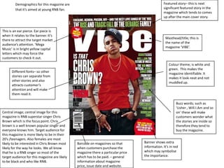
1. Featured story– this is next significant featured story in the magazine which tends to comes up after the main cover story. Demographics for this magazine are that it’s aimed at young RNB fan. This is an ear pierce. Ear piece is when it relates to the banner. It’s there to attract the target market audience’s attention. ‘Mega Music’ is in bright yellow capital letters which may force the customers to check it out. Masthead/title; this is the name of the magazine ‘VIBE’. Colour theme; is white and green. This makes the magazine identifiable. It makes it look neat and not muddled up. Different fonts– so other stories can separate from other stories and also attracts customer’s attention and will make them read it. Buzz words; such as ‘Usher , Will.I.Am and so on’ these will make customers wonder what the stories are inside so therefore they tend to buy the magazine. Central image; central image for this magazine is RNB superstar singer Chris Brown which is the focus point. Chris brown is a well known popular singer and everyone knows him. Target audience for this magazine is more likely to be in their 20’s /teenagers. Also females are most likely to be interested in Chris Brown most likely for the way he looks. We all know that he is a RNB singer so most of the target audience for this magazine are likely to be black and who like RNB. Banner shows extra information. It’s in red which may symbolise the importance. Barcode on magazines so that when customers purchase the magazine there a particular price which has to be paid.– general information about magazine price, issue date and website.
2. Vibe is a magazine which is mainly focused on hip hop and R n B genre. This type of magazine is targeted at young, urban followers of hip hop. Mast head The colour scheme of this magazine cover is yellow and blue. The name of the magazine ‘vibe’ is in yellow . The letter b from the vibe is covered by Ciara. She is the central image. The consumers will clearly know tat its a vibe magazine whether the letters are covered or not because its very popular with the target audience. Yellow is clearly a energetic colour its used for texts such as ‘Ciara’ , ‘Hot like me?’ the question asked may amplify the sex appeal . Central image; central image for this magazine is RNB singer Ciara which is the focus point. Ciarais a well known popular singer and everyone knows herand she is also asongwriter, record producer, dancer, actress, model. Target audience for this magazine is more likely to be in their 20’s /teenagers and mainly females.. The use of different colours (red, green, yellow and white) may attract the audience in to reading it. Also its a list of several contents inside the magazine. Back ground colour is blue wic is a nice calm colour. Barcode; Generalinformation about magazine price, issue date and website. Websites attract a wide range of audience. There is a list of peoples name. Which lets the target audience know that these people are involved in the magazine which may cause curiosity into reading the magazine.
3. This is an ear pierce. Ear piece is when it relates to the banner.usually for free give away’s to attract customers, and this magazine is giving away a free CD Masthead/title; this is the name of the magazine ‘ROCK’. Colour theme; it white and light brown which suits the rock theme for this magazine. Also back ground is black and white which gives a dull rock effect. These are the feature stories. The list of the other stories that will be in the magazine. Free give away; free CD give away which make customers think buying the magazine is worth the money given. Barcode on magazines so that when customers purchase the magazine there a particular price which has to be paid.– general information about magazine price, issue date and website.
4. The letter V used at the background of the contents page means that the targeted audience without looking at the front cover of the magazine would recognize that it is vibe magazine. Font style used for the masthead is swirly , this shows that the target audience if female. . I really like the whole layout of this page and I might use some of these ideas for my magazine. The colour scheme that has been used for this contents page is grey , white and black. The colours may symbolise a more calm and relaxed atmosphere. Also this contents page focuses on key point s which doesn't bore the target audience. As my target audience is aimed at teenagers and R N B fans I should make sure that the contents page is not all text. Should make it short and sweet. Also include a lot more picture as it will interest my target audience. For my magazine, I have chosen to take some of my ideas using this contents page. I like the way the heading contents have been set. Its very big and bold this makes it the main focus of the target audiences. It has a unique style which makes it look attractive. It also brings an interesting atmosphere to the page. The way lady is presented in this page shows a bit of male gaze. Shows how women are weak as the model is lying on the floor and tilting her head to a side and posing with her two legs in the air. The model has taken a large amount of space on this page and layout of the whole page . The idea of the texts put around the picture makes the model stand out even more. For my final magazine I will like to use a model related to R N B topic as my magazine is mainly focusing on R N B and in the middle and have texts flowing around.
5. The purpose of this content s shows the readers the top stories to be read. The colour scheme used for this contents page is red, white and black . This is clearly an R & B magazine as you can see the way the model is been presented. Also it has ‘vibe’ in the top right hand corner which is a magazine for R & B singers . There a big v in the background which is there for in every vibe magazine contents page . I have chose to get some ideas o this magazine contents page because it looks very interesting and people will want to read inside after seeing this page. I like the way how the model for this page has been presented with all the blings. It makes the magazine look cool. This type of magazine are mainly targeted at teenagers, The big photo of the guy who is posing is of a rapper names plies. He is posing in a way that shows of his wealth . He shows off his diamond necklaces, grills and his diamond bracelet. He is also showing off his tattoos . The features are mostly based on R&B and Hip-Hop artists in both main sections. Singers with tattoos shows that it is most focused in the R & B and Hip-Hop glamour world. The contents is divided into 2 main sections ; fashion and features. The sections fashion and features are presented in bold white letters while the page numbers are on the left rather than the right, whereas the sub dividers are in bold white capitals.
6. This contents page has a colour scheme of black, red, white and gold. The colour gold is used for the heading ‘ICONS’ . This may symbolise that gold is favourable colour it also links with fame and wealth. It also shows the target audience the importance of the name of the page as it is written in capital and big letters. Red is used mainly for the numbers and also other wordings on the page. Black is used for the writing next to each numbers provided. Black and red go well with each other. Back ground is white, this makes the writings stand out and brightens out all the other colours. This type of magazine looks like its targeted to posh people. The word departments, is a translation on the word contents. The titles very central which is very clear that its a contents page. Also the text ‘premiere issue’ tells us that the magazine is important. The model on this page looks very glamorous and modern and has been presented with the colours black and white, to go with the colour scheme of this magazine. the model has a very nice pose to it and it has clever ideas . Like the question being asked ‘who's you influence’? With the number page on it This may get the target audience thinking and they may want to read the magazine out of curiosity. I like the idea of the translation of contents into departments. I like the question that has been asked ‘who's your influence’? ,it makes the audience wonder. Therefore I would use that idea for my magazine. However I find the layout boring and it doesn't grab my attention. Also this contents page looks plain, which people may not want to read after seeing it. So for my magazine contents page I will include bold eye catching writing and also include many pictures so my target audience will read it.
7. This is a double page spread of a famous band ‘black eyed peas’. The image of the band takes up the nearly the whole page and it has been positioned on the left hand side with the texts on the right hand side which has a simple font to it and has been structured out well, so it prevents readers of getting mixed up. This make the double page look professional and has a nice simple style to it, also it wont confuse the readers. This double page spread is quite different to the other as you can see in the image , the three members of the group have been faded away , where WILL I AM hasn’t been faded away. This may show the power the WILL I AM has, and also it can highlight the fact that he is the lead singer of the band. The image also may give an idea for the readers that the article might be about him. The costumes that the ‘black eyed peas’ are wearing is different to what other bands would wear. This shows that they have a different style of music and this may attract the audience. The colour scheme used for this double page links to the costume being worn by the band. The colours used are black, gold and white, theses are complex colour which stops the page from looking complicated. Gold gives a bright/shiny effect , which glamour's up the page. The colour scheme goes well with each other as they don't clash at all. The article doesn’t look long to read, if the text was longer then people wouldn't bother reading it, they’ll feel lazy. The masthead is placed on the left hand side half way down the page. I gives a unique feel as it is unusual that the masthead is placed there. The font also has a unique style which suits the band and gives an electrical feel.
8. This is a double page from a magazine , Which has a simple layout of texts on one side and the picture on the other side. The picture contains Florence wearing a unique black dress which not many artist would wear and wearing heals on posing straight at the camera. She has red hair which is eye catching and also its a vibrant colour. She is sitting on a stage which is covered with a red and white silk cover. It has USA across the page as the background. Florence is over lapping a bit of this from the USA. Also it has ‘got the love’ this gives an effect to readers that the page isn't fully with text and the big image on the left hand side makes it interesting as the image is on a singer . Colours being used in the double page are grey, white, black and red. These colours are very complex. The audience will focus on the picture of Florence. The light colour of the background stands out well also red is the brightest colour on the page and it will bring audiences attention , the colour red on the silky cover matches with Florence's hair. Having red hair was not common once upon a time, but now a lot of females have red hair. Images like Florence may influence the female audience to have the self confidence to dye they’re hair red. The size of the font is small enough to fit onto the page. The text starts with a big bold capital letter and its in black, this makes it look professional and it stands out to let the audience know that this is the beginning of the article. This image of Florence is aimed at men, as the clothes that she is wearing brings attention straight to her legs and her breasts where it has been covered with cones. In the image Florence give a ‘sexy’ pose, and to give this effect she has purposely positioned her leg in a way that can grab peoples attention. She looks straight at the camera with a gaze this it the way she communicates with the audience. Florence is sitting on a stage which includes stairs and she's climbed to the top and sat on it this may symbolise her achievement in her music career. It is quite hard for a British artists to take part in the USA charts.
9. The band name stands out well as it has been written in capitals blocks. Also its big and bright so the audience will straight away look at the name ‘THE TEENAGERS’. On the double page spread there is a big picture of the band ‘ THE TEEENAGERS’ which shows all the members of the group as equal to each other. The target audience will obviously no that by looking at the page they would be more interested and will cause curiosity in what the article is about. The colour scheme for this page of the NME magazine is light blue, white, and black. The light blue brings the pages together and relates it together. Light blues is used in many parts in this pages and it stands out. Many of the target audience will focus on the bits where there are more blue because it catches your attention straight away. Magazine advertising other bands of the same type of genre. This gives an opportunity for audience to see more about the other bands aswell as ‘THE TEENAGERS’. There are blue highlights included which relates to the magazine. In the options of the bands, the audience would at least know one of them which will make them want to read more about it. At the bottom of the page there a websites which allows the buyers to go on the website and read for more information. Also there is a quote high lighted in the middle of the article, readers may not know what the articles about. So this way it makes the reader wanting to read the whole article. An article from a magazine is most likely to be set up in a column. And this double page spread has texts which have been set up in columns. Article begins with a big bold capital letter. NME website has been included. In the bottom left hand corner there is a small text box with the things you need to know about the member in the band, this will be useful for the people that do not know the band.