
Recommended
More Related Content
What's hot
What's hot (19)
Viewers also liked
Similar to Double Page Spread Deconstruction
Similar to Double Page Spread Deconstruction (20)
More from clarkelucy2051
More from clarkelucy2051 (20)
Recently uploaded
Recently uploaded (20)
Double Page Spread Deconstruction
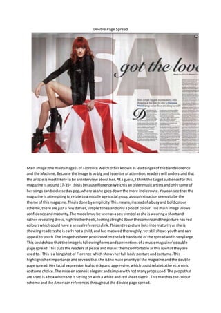
- 1. Double Page Spread Main image:the mainimage isof Florence Welch otherknownasleadsingerof the bandFlorence and the Machine.Because the image isso bigand iscentre of attention,readerswill understandthat the article ismost likelytobe an interview abouther.Ataguess,I thinkthe targetaudience forthis magazine isaround17-35+ thisisbecause Florence Welchisanoldermusicartistsandonlysome of hersongs can be classedas pop,where asshe goesdownthe more indie route.Youcan see that the magazine isattemptingtorelate toa middle age social groupassophisticationseemstobe the theme of thismagazine.Thisisdone bysimplicity.Thismeans,insteadof abusyand boldcolour scheme,there are justa fewdarker,simple tonesandonlyapopof colour. The mainimage shows confidence andmaturity.The model maybe seenasa sex symbol asshe iswearinga shortand rather revealingdress,highleatherheels,lookingstraightdownthe cameraandthe picture has red colourswhich couldhave a sexual reference/link.Thisentire picture linksintomaturityasshe is showingreadersshe isearlynota child,andhas maturedthoroughly,yetstillshowsyouthandcan appeal toyouth.The image hasbeenpositionedonthe lefthandside of the spreadandisverylarge. Thiscouldshowthat the image is followingformsandconventionsof amusicmagazine’sdouble page spread.Thisputs the readersat peace andmakesthemcomfortable asthisiswhat theyare usedto. Thisisa longshotof Florence whichshowsherfull bodypostureandcostume.This highlightsherimportance andrevealsthatshe isthe mainpriorityof the magazine andthe double page spread. Her facial expressionisalsoriskyandaggressive,whichcouldrelatetothe eccentric costume choice. The mise enscene iselegantandsimple withnotmanypropsused.The propsthat are usedisa box whichshe is sittingonwitha white andredsheetoverit.Thismatchesthe colour scheme andthe Americanreferencesthroughoutthe double page spread.
- 2. Colourscheme:the colourscheme showssophistication.Ratherthanbeingbrightandbold,the coloursare more subtle andrelaxed,withonlyaburstof colour.Thisisa predominantlythree way colourscheme of red,white andblack.There isalso blue andgreyas well butonlya little amountto give the colourscheme variety. One thingIreallylike aboutthiscolourscheme isthatthe backgroundiswhite whichcontrastswiththe modelsblack,edgycostume.Thismakesthe model standout againstthe pure background.The colourcouldalsoportray the indie rocktheme of Florence andthe Machine’smusic.Thisisdone myincorporatingtypical rockcolourssuchas black textand redpropsand red hair.Alsodarkmakeupisusedto portray thisina more subtle sense.The overall colourscheme isblackwhite andred.These coloursare quite straightforwardandeasyon the eye.The redis to add a popof colourto maintaininterest fromthe reader.The textbehindthe image says“USA” The colourscheme represents“USA”bythe white andredinthe flag,the redhair and the blue font.Thismaybe because the magazine isanAmericanbillboardmagazine and Florence isveynotoriousandsuccessfulandcabbe appreciatedbyanAmericanaudience. Fonts:The biggeststyle of fontisalarge textboldfontsaying“USA”all in capitals,suggestingthe theme of the article,whichisaboutFlorence’Welch’ssuccesswithinAmerica.Thisisalsofollowed by a much smaller,sophisticatedfont,whichmaybe appealingtoafemale audience asitisfeminine and sophisticated.Thissays“gotthe love”whichisthe title of herbestsellingand well known song. ThisconfirmsWelch’ssuccessinAmerica.Itisnow clear to the readerthat the article will be based oh hersuccessin America.The dropcap “D” showssophisticationandstyle andmayagain,appeal to the more feminine audienceandcouldappeal tohigherclasssocial groupsandolderpeople than youth.The res o the textfontsare pain andsimple andeasyonthe eye.Thisisan understatement. But because of the subtle boldnessof otherelements,thislooksattractive andpleasingonthe reader’seye. Hair and costume:herhairand costume are out there and slightlyinyourface yetcouldbe seenas still youthful.Hercostume looksage appropriate as, eventhoughshe hasherlegsonshow,herarms and otherareasare coveredup. Thismake her looknaturallyyoungerandnotlike she istryingtoact youngerthanwhat she is. her hairis brightwhichmatches withthe colourscheme andcouldappeal to youth,fromthe stereotype,thatyoungerpeople tendtobe more boldandoutrageous.Redand blackare two coloursthatcomplimenteachotherandrepresenthergenre of musicwhichisindie rock. This isrepresentedfrontehcolourof herdress,shoesanddress. Othernotes:I like thismusicmagazine double page spread,asitissimple andsophisticated.Ilove the colourscheme as itfitthe genre of musicthe mainmodel isrepresentingandalsomatchesthe contentof what isin the article.Ido howeverbelieve thatthismagazine mayjustbe appealingto people whoare notquite inthe target audience Iamtryingto appeal mymediaproductto, as it may be a bittoo simple andsophisticated.Iwouldlike toappeal mymagazine toamore youthful audience of 11-19+. It maybe that I use a widercolourscheme withmore brighterandbold statementcolours,yeteveningthemoutwithblackandwhite.Doingthismayalsorepresentmy genre of pop/chartmusic.Lastly,the style of photographyisartisticandquite fashionable.Thismay be positive asthe preferencesof the magazinestargetaudience maybe fashion.However,idonot wantto confuse mytarget audience intothinkingmymusicmagazine isafashionmagazine.This meansI will notbe usingsucha seriouspose likethis.