
Recommended
More Related Content
What's hot
What's hot (20)
Viewers also liked
Viewers also liked (15)
Similar to Evaluation question 1 final
Similar to Evaluation question 1 final (20)
Recently uploaded
Recently uploaded (20)
Evaluation question 1 final
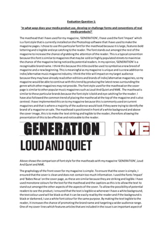
- 1. Evaluation Question 1: 'In what ways does your media product use, develop or challenge forms and conventions of real media products?' The mastheadthat I have usedformy magazine,'GENERATION',Ihave usedthe font'Impact' which isa fontstyle thatis currentlyinstalledonthe Photoshopsoftware thatIhave usedtomake the magazine pages.Ichose to use thisparticularfontfor the mastheadbecause itislarge,featuresbold letteringandislegible andeye catchingtothe reader.The fontstandsout amongstthe rest of the magazine toincrease the chance of grabbingthe attentionof the reader.Thisisa typical convention because thisfontissimilartomagazinesthatmaybe soldonhighlypopulatedstreetstomaximise the chance of the magazine beingnoticedbypotentialreaders.Inmyopinion,'GENERATION'isa recognisable brandname.Ithinkthisbecause thistitlecouldbe used tosymboliseanew breedof magazine anda newbeginning.Thisismeaningful asmymagazine isunique andisa new additionto indie/alternative musicmagazineindustry.Ithinkthe title willimpactonmytarget audience because theymayhave alreadyreadothereditionsandbrandsof indie/alternative magazines,somy magazine wouldbe able tocontinue withthistrendbyproducingthe latestnewssurroundingthe genre whichothermagazinesmaynotprovide.The fontstyle usedforthe mastheadonthe cover page is similartootherpopularmusicmagazinessuchasLoud AndQuietandNME. The mastheadis similartothese particularbrandsbecause the fontstyle isboldandeye catchingforthe reader.I have alsofollowedthe commontrendof placingthe mastheadatthe topof the magazine andisalso centred.Ihave implementedthisontomymagazine because thisiscommonlyusedoncurrent magazinesandthat iswhere a majorityof the audience wouldlookif theywere tryingtoidentifythe brand of a magazine onsale.The mastheadispositionedinfrontof awhite backgroundandabove the cover image,thisistomake the textstrikingandlegible tothe reader,therefore allowingthe presentationof thistobe effective andnoticeable tothe reader. Above showsthe comparisonof fontstyle forthe mastheadswithmymagazine 'GENERATION',Loud AndQuietandNME. The graphologyof the front coverfor mymagazine issimple.Toensure thatthe coverissimple,I ensuredthatthe coveris cleananddoesnot containtoo muchinformation.Iusedthe fonts'Impact' and 'BabesNeue'onthe cover page,as these are similarbecause theyare strikingandlegible.Ihave usedmonotone coloursforthe textforthe mastheadandthe captionsasthis isto allow the text to standout amongstthe other aspectsof the aspectsof the cover.To allow the possibilityof potential readersto see the product,I ensuredthatthe textislegiblesowheneverIhave a white background, the textcolourusedwill be blacksothat it can be easilyreadbythe readerandif the backgroundis blackor darkened,Iuse a white fontcolourfor the same purpose.Bymakingthe textlegibletothe reader,itincreasesthe chance of promotingthe brandname and targetinga wideraudience range. One of mycover lineswhichfeaturesarticlesthatare includedinthe issue isanimportantaspectof
- 2. the magazine,soto make itstand out andengage withthe reader,Icolouredthe textlayerblackso that the texton the page is legibleandeye catching.Mymaincover line,concerningthe mainstory, iscolouredinwhite textbecause thisparticularcolourstandsoutamongstthe darkercolourof the coverimage as thisis inblackand white.The colourforthe textof 'DannyMorrison' and 'Support frommy fanshas helpedme throughthis'now standsoutamongstthe coverimage. A white colourbackgroundforthe mastheadonthe cover page isa powerful andessentialaspectof the magazine as thisparticularlayerattractsthe attentionof the audience due tothe colour variationsused.The size of the textonthe coverdependsontheirimportance andwhatshouldbe seenat firstglance.Forexample,Iintendedonmymastheadtobe noticedfirst,soI made the size of thistextverylarge,then'DannyMorrison' and 'Supportfrommy fanshas helpedme throughthis' witha slightlysmallertext,the otherarticlesincludedwithasmallertextandlastlythe issue number,date andprice have the smallestsize textbecause these are the leastimportantand engagingwiththe audience.The page layoutforthe coverpage can be interpretedwiththe conventionof 'Loudand Quiet'magazine asI thinkthatthe title andinformationonthe coverimage share similarities.However,thisconventionwasdevelopedonmymagazine asI have placeda bar code and price on mymagazine,whereas'LoudandQuiet'whodo nothave a price on their products.I have positionedthe barcode towardsthe top rightcorner of the coverimage because thisthendoesnotdraw attentionawayfromthe coverimage and otherinformationonthe page.I have sizedthe bar code to be reasonablysmall andstockysothat it can be fittedslightlyunderthe top of the image as I intendedittobe.Similarcharacteristicsbetweenmymagazine and'Loudand Quiet'include the mastheadbeingpositionedatthe topof the page and isthe largestsizedtext,so that itis engagingwithpotentialaudienceswhilstensuringthe textisboldtofurtherincrease this potential.Like 'LoudandQuite'Ihave alsoopteda simplisticstyle onthe coverpage toensure that the cover page isnot clutteredanddoesnotcontainan overloadof information.Ihave decidedto onlyinclude asmall amountof informationthatthe audience wouldbe interestedin,asthese factors will allow forasimple andcleanapproachto the coverpage. The cover model 'DannyMorrison'was styledusingclothingthatcanbe perceivedas indie/alternative clothingduringthe photoshootsforthe pagesof the magazine.Although,the
- 3. clothingthatthe model iswearingisthe same on the page that includedanimage of him.The clothingthatthe model waswearingfeaturedalongsleevedbuttonedtopwithadark greenand blue checkedpattern.The clothingimpactsthe model astheylookfairlymainstreambutalsodoes standout amongstothersas these particularstylesof clothingusuallyfeaturedbrightcolours whereasthe clothingusedonthe model isdarkenedandmysterious.The clothingcanbe purchased at commonstoresand couldimpact the audience because theymaydressina similarstyle,soa relationbetweenthe readerandthe model canbe metthroughthe style of clothingimplemented. Throughmy researchintoclothingrelatedtothe indie/alternative genre,Ihave discoveredthat trendisreasonablymainstreambutstandsoutamongstthe rest.Thistherefore showsthatthe target audience canbe inspiredmycovermodel because if theywearsimilarclothing,the model can be an inspirational figure thatthe readercanrelate to.I have styledmymodel tolooklike atypical mainstreamteenage figure withfashionableclothingthatisrelatable andsoI thinkitstandsout amongstthe genre.It maynot be differentorunique,butthe mainstreamapproachismore inspirationalandrelatable.Conventionsof real mediaproductshave beenimplementedonmy magazine asinclude the maincoverartistwearingindie/alternativeormainstreamclothingsothatit fitsthe genre anddoesnot appearas a cheapcopyof a genre magazine.Byunderstanding the genre further,IunderstoodthatI mustkeepthe same style frommycover page and implementitonmy contentspage and double page spread.Thisstyle iskeepingacontinuousmonotone andsimple layoutthroughoutthe magazine process.Byminimisingthe use of colouracrossall of my pages,I have ensuredthatthe blackand white fontcolourscheme ismade simple andclearlystandsouton a white or blackbackground.Thisscheme isimplementedonasmanypagesas possible onmy magazine.
- 4. The contentspage doesfitsome conventionsasbecause itisprintedasA4, liststhe storiesthatare includedinthe magazine andcontainsimagesfromthose articles.The informationforthe stories are alignedandspacedoutevenlytoensure that the presentationlooksreasonablyformal.Some A4 contentspageshave alreadybeencreatedbycurrentmediabrands.Ihave chosento presentmy contentspage inthisformat because Ifeltthatthere isonlya certainamountof informationneeded for a contentspage,soI have restrictedmypage to onlycontainnecessarydetailsthatshouldbe included.Anotherreasonastowhy I have chosentoapplyan A4 page forthe contentsisso that I couldcontinue toapplya simple theme whilststylingitsothatthe necessaryinformationis displayed. The coloursthat are usedvary as I didnotcontinue toapplya blackand white approachasthiscan be viewedasboringanddull to the reader.Inresponse,Ihave keptthe colourof some of the images takenfrommy photoshoot.Thisis sothat a brighterapproachcan come from the contentspage and providesaninterestingandappealinglooktothe contentspage.The colourscan draw the audience'sattentionawayfromthe standardblackandwhite text,asthiscan be viewedas intriguingandinteresting.The layoutforthe contentspage didnotfollow aparticularstyle asI did not applyanyinspirationintothe appearance of thispage.InsteadIappliedmyownlayoutusingthe functionsavailable onthe Photoshopsoftware.There are existingmediaproductsthatfeature a variationof coloursto attract an audience towardsimagesratherthanthe text. The photosusedon the contentspage do follow conventionsastheyappearinboxesandvary in sizes.Also these are positionednexttothe textwhichagainfollowsconventions.However,thisdoes challenge some conventionsasonlyasingle image canbe includedandbe viewedasthe main contentsimage,due toitbeingable tofill the entire page.Below shows examplesof currentmedia productsthat my magazine challenges:
- 5. I thinkthat mydouble page spreaddoesfollow conventionsasmypage consistsof a mainimage on one withthe story contentonthe other.Thismeansthat whenthe page is folded,the information and mainphotowill be onseparate pages.Thisisa commonstyle of layoutfor some media magazines,suchas'Q' magazine and'NME'. Due to the mainimage andcontentbeingonseparate pages,mydouble page spreaddoeschallenge conventionsasa majorityof double page spreadsconsistof asingle image thatfillsbothpagesand leaksontothe secondpage.By challengingthisconvention, Ifeelthatthe audience canengage with the article ina differentwaytothe commonconventionbecause thisway,the audience cantake in
- 6. the informationformthe article andthenrevertbackto the cover image orvice versa.Additionally, my page challengesthe conventionastextforthe mainarticle isstructuredin columnsratherthan beinglayeredsothatitfollowsthe shape of the model.Ihave chosentoapplythisstyle because it ensuresthatthe magazinesretainsitsformalityandmaturitybystructuringitincolumnsratherthan surroundingthe model asthiscouldinterpretthe magazine tobe informal.The inclusionof adrop capital on the firstline of the article complieswithconventionsbecause mostmagazinesbegintheir articlesbyincludingthistoengage the readerwiththe article aswell asproducinganinteresting outwardappearance. In conclusion,mymagazine doeschallenge mostconventionsof atypical musicmagazine because theyare typicallyfilledwithinformationandfollowastrictcolourscheme,comparedtomy magazine 'GENERATION'whichfollowsarelativelysimple andstylisedlayoutthatisinterestingto lookat. I thinkthatmy magazine issimilarinstyle tocurrentmediaproductssuchas Crack, The Wire and Clash.