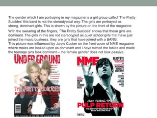
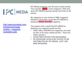
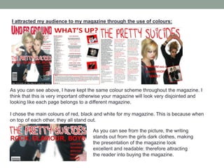
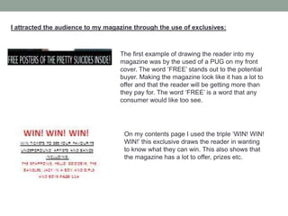
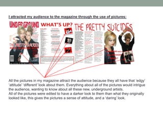
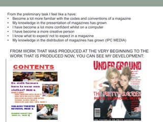
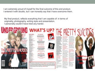
The document summarizes the key aspects of an underground magazine created for a media studies assignment. It discusses conventions used and challenged in the magazine's design, such as cover lines, mastheads, images, and barcodes. Social groups represented include young people aged 14-20 interested in indie/rock music. A double page spread on a band called "The Pretty Suicides" uses different text colors and includes photos and a quote. The gender portrayed is strong, dominant teenage girls rather than stereotypical quiet ones. IPC Media is suggested as a suitable distributor since it produces magazines like NME that the underground magazine is similar to. The target audience is described as those who read magazines aimed at people interested in pop culture and
2. IN WHAT WAYS DOES YOUR MAGAZINE USE, DEVELOP OR CHALLENGE FORMS AND CONVENTIONS OF REAL MEDIA PRODUCTS?
3. FRONT COVER OF UNDERGROUND MAGAZINE The cover lines are all in a red font, matching the theme of the colour red throughout the magazine. Cover lines are typical conventions in which you find on a magazine, however I have challenged these conventions by putting the cover lines on the opposite side of the page (where you would expect to see them on the left.) The cover lines are in bigger writing and underneath these cover lines is a bit of information about that certain cover line in smaller black writing. I think that this gives the magazine an edge. Again NME influenced this. http://www.google.co.uk/imgres?imgurl=http:// A masthead is a convention that you would find on any magazine, portraying the name of the magazine. I chose this certain font for the masthead because I think it suited the type of magazine in which I wanted to produce. The masthead is a dominating masthead being spread right over the top of the page. The style of this masthead was influenced by NME magazine. With the colour being red and having the main image cover the masthead. Just like Lily Allen does in this edition http://www.google.co.uk/imgres?imgurl=http:/ On any front cover you would need a strong main image, showing what the magazine mainly features and it also shows what type of genre the magazine is. I chose to have this image because I think it’s a strong image that coveys the type of magazine I want to convey. Showing that these teenage girls really don’t care and showing that they have a lot of attitude. Drawing the potential buyer in. I think that this picture also matches with the house style with their red lipstick and ring, giving the magazine overall a better look with co-ordainating colours. By also placing my main image over the masthead, creates the overall presentation of my magazine a lot better, this influenced by NME magazine. This is the register in which I wanted to portray. The name of the band I decided to put across the front cover, illustrating the main band that is going to feature in the magazine. I chose this font because I thought it illustrated the band that I wanted to portray, having a ‘school girl’ handwriting look. But obviously these two girls don’t go to school and they are ‘rebelling’ so the name of the band contrasts with the main image. This triple I have used ‘rock, glamour, boys’ is effective because it shows the reader that these girls have a lot going for them. It also has a nice ring to it. I decided to put it underneath the title because it’s all about the pretty suicides and it gives an insight into their life through this triple. A barcode on the front cover of magazines is a typical convention of a magazine. However I challenged this convention by rotating the barcode and placing it on the left hand side of the magazine. This makes UNDERGROUND magazine look original and authentic because its something different to the eye. I have used this PUG at the bottom of the page as a strip because it draws the reader into the magazine knowing that they get something free. PUGS and PUFFS are typical conventions on a magazine cover, with a purpose of convincing the reader to buy the magazine
4. CONTENTS PAGE OF UNDERGROUND MAGAZINE For the title of the contents page, I decided to put the rhetorical question ‘what’s up?’ this having an attitude, just like the magazine which I wanted to portray. Instead of just having the title of the contents page being called ‘contents’ I challenged this by using language which would go well with the magazine and have an impact on the reader, because the language is colloquial young teenagers would be able to associate themselves more with it. The size of the font is also big and red, matching the house style.The date is also included underneath which is a convention in any magazine saying what month the issue is being produced at. The pictures on my contents page, are in the framing of a polaroid picture. I thought that this gave the page a authentic, original look. Which shows that I have ‘thought outside the box’ for the presentation of my pictures on the contents page. The backgrounds of the pictures match the magazine main colours of black, red and white. The page number and name of the band/artist is displayed underneath giving the reader a quick advantage to turn to whatever page they would like to read. I think that the pictures also match the genre of magazine I was going for. The band index idea was influenced by NME magazine. Sticking to the colour scheme of black and red, this band index – situated at the left hand side of the page really has challenged the conventions of any normal magazine. Where you can quickly find the band/ artist you want to read about and you can turn to the page number. The strength of this band index is that it makes the magazine look like it has lots on information inside. http://www.google.co.uk/imgres?imgurl=http The middle column of the contents page consists of the main pages in the magazine. The colours in which this is written in matches with the same colours used throughout the magazine. Under each main heading there are two sections. One with extra information and the other with what bands this involves. The colours for this are alternate. I chose this because I felt like I had to break up the text, otherwise it would look like too much text and it would look a much plainer magazine if it was all in one colour. The Editors note I have decided to be placed at the bottom of the page in a red box. I have challenged the conventions of an editors note by changing the font so it looks like it is hand written. The word ‘UNDERGROUND’ is also in the same font and colour as the title ‘what's up’ to differentiate the writing from the name of the magazine. The writing is also colloquial, making it look realistic.
5. DOUBLE PAGE SPREAD OF UNDERGROUND MAGAZINE The title of my double page spread is the same title which was shown on the front cover: same font, same colour. I think that this is extremely important because the band would be then recognised by that font. If in the future readers see this font, they would associate it with ‘The Pretty Suicides.’ The main image I chose was one with a lot of attitude because this is what I wanted to portray to the audience, as I did exactly the same thing on the front cover. I decided to also have it overlapping on the title because I think that this has a nice looking effect presentation wise. The writing I chose to have the colours of red and black, as this is consistent throughout my magazine. The questions of the interviewer is in red and the answers are in black, this differentiates the sections of text and also breaks up the text so the reader isn’t overpowered with big blocks of writing. In this text I have included a lot of information about the band including their new album and latest news on merchandise. The introduction of the band is also underlined at the beginning to give the reader a first glimpse into this band. This picture is smaller to the other one, it makes the presentation of the double page spread. The picture also covers a lot of space which shouldn’t be wasted. The picture is also in a red box, similar to the editors note on the contents page, having the same style and colours throughout the magazine is important so the pages look like they actually are from the same magazine. This quote is very important because it also features in the Q&A itself. I chose this short quote because its quite quirky and fun, which is the message that I also want to portray for ‘The Pretty Suicides’
6. HOW DOES YOUR MAGAZINE REPRESENT PARTICULAR SOCIAL GROUPS?
16. MY MAGAZINE WOULD BE SUITED TO BE DISTRIBUTED BY IPC MEDIA, JUST LIKE NME MAGAZINE.http://www.ipcmedia.com/brands/nme/media studies - magazine evaluation.pptx
21. LANGUAGE - the language used refers to more feminine subjects: designing clothes, how their mom is an inspiration, past relationships with boyfriends etc.
22.
23. I attracted my audience to my magazine through the use of colours: As you can see above, I have kept the same colour scheme throughout the magazine. I think that this is very important otherwise your magazine will look very disjointed and looking like each page belongs to a different magazine. I chose the main colours of red, black and white for my magazine. This is because when on top of each other, they all stand out. As you can see from the picture, the writing stands out from the girls dark clothes, making the presentation of the magazine look excellent and readable: therefore attracting the reader into buying the magazine.
24. I attracted the audience to my magazine through the use of exclusives: The first example of drawing the reader into my magazine was by the used of a PUG on my front cover. The word ‘FREE’ stands out to the potential buyer. Making the magazine look like it has a lot to offer and that the reader will be getting more than they pay for. The word ‘FREE’ is a word that any consumer would like too see. On my contents page I used the triple ‘WIN! WIN! WIN!’ this exclusive draws the reader in wanting to know what they can win. This also shows that the magazine has a lot to offer, prizes etc.
25. I attracted my audience to the magazine through the use of pictures: All the pictures in my magazine attract the audience because they all have that ‘edgy’ ‘attitude’ ‘different’ look about them. Everything about all of the pictures would intrigue the audience, wanting to know about all these new, underground artists. All of the pictures were edited to have a darker look to them than what they originally looked like, this gives the pictures a sense of attitude, and a ‘daring’ look.
26. I attracted the audience to my magazine through the use of language: Double page spread – the Q&A is very chatty, easy going. Making it a nice read for the readers. Also having a lot of useful information inside, keeping the reader interested. The use of three (on front cover) all associate with the modern day, attracting all teenagers in. On my contents page, instead of being called ‘CONTENTS’ this rhetorical question gives a lot of attitude and originality to the page, matching with the style of my magazine. On my contents page, in editors note. Editor addresses UNDERGROUND readers personally, making the reader feel welcomed to the magazine
27. I attracted my aduience to my magazine through the attitude throughout: The attitude on the front cover by the band is extremely important. It attracts the audience straight away by their body language. That really does give the message out as ‘WE DON’T CARE?!’ The use of the swearing of the fingers also attracts the audience. That because the girls are only young, why do they look so original, different and why do they have so much attitude? The girls faces are also quite stern, they are not smiling, yet able to look pretty. This attracts the reader too. I think that for the attitude of the magazine portrayed this needs to be done on the front cover, because this is the page the potential consumer will look at when looking for a music magazine.
28. I attracted the audience to my magazine by the masthead: I chose the name of my magazine of ‘UNDEGROUND’ because this is where first indie/rock bands originated from, this is the place where they started. The colour red was influenced by NME magazines masthead. I think that this is a very strong, bold colour which stands out well. This masthead matched my magazine because the letters are all distorted and uneven, and this reflects most indie bands - scruffy looking. This links in with the audience which will be mostly people who are interested in indie music and this masthead gives off the ‘indie’ look. With it being edgy and authentic.
29. WHAT HAVE YOU LEARNT ABOUT THE TECHNOLOGIES FROM THE PROCESS OF CONSTRUCTING THE MAGAZINE?
30. Throughout this whole process these are the soft wares which I have used: Apart from Microsoft word, I had never used Photoshop, Paint.net or BlogSpot.comSo along the way I came across a few problems..
31. I had never edited pictures in Photoshop before so I had photos looking like this: To resolve this issue, I fiddled round with the different effects until I got the perfect picture.
32. When I first drafted my front cover, I could never get rid of the white background, this meant that I could not have my main image covering my masthead which was what I planned. My first draft looked with the main image looked like this: Then, I learnt how to copy and paste my image into Photoshop and erase all the background that I didn’t want away. One I had erased all the background out I then placed it on the front of my magazine
33. I also didn’t know how to get the white box away from the writing in a text box on Microsoft word. I then learnt that you had to format the text box and set the settings as ‘no line’ and ‘no fill.’ Because I learnt how to do this, my magazine went from looking like this… TO THIS…
34. BLOGSPOT.COM was very easy to understand and a very fast process. Being not so good on computers, like myself, it was a simple, quick was to upload work. WHEN CREATING THE THREE ELEMENTS I WORKED IN CHRONOLOGICAL ORDER, I FIRSTLY PRODUCED THE FRONT COVER, THEN THE CONTENTS PAGE AND THEN THE DOUBLE PAGE SPREAD.
35. LOOKING BACK TO YOUR PRELIMINARY TASK, WHAT DO YOU FEEL YOU HAVE LEARNT IN THE PROGRESSION FROM IT TO THE FULL PRODUCT?
40. I know what to expect/ not to expect in a magazine
41. My knowledge in the distribution of magazines has grown (IPC MEDIA)FROM WORK THAT WAS PRODUCED AT THE VERY BEGINNING TO THE WORK THAT IS PRODUCED NOW, YOU CAN SEE MY DEVELOPMENT:
43. The feedback that I received from the magazine was mixed. I handed a questionnaire out to the target audience 14- 20 years olds.Here is the positive feedback I received: The use of colour is really good, I like the red mixed with the black on the front cover Main image on front cover is strong, showing what the magazine had to offer Good use of language and pictures on contents There’s a lot to offer in the magazine All the separate pages fit with each other, they look like they are from the same magazine It looks like a magazine from a shop! However there were some improvements that I could make to the magazine: On the DPS there could be more pictures On DPS there could be more colour The colours scheme throughout could have changed on the DPS
44. HOW SUCCESSFUL DO YOU FEEL YOUR END PRODUCT IS IN THE FULFILLING TASK HOW WELL DOES IT FIT THE BRIEF?
45. I am extremely proud of myself for the final outcome of this end product.I entered it with doubts, but I can honestly say that I have overcome them. My final product, reflects everything that I am capable of: in terms of originality, photography, writing style and presentation. I personally couldn’t have tried any harder.