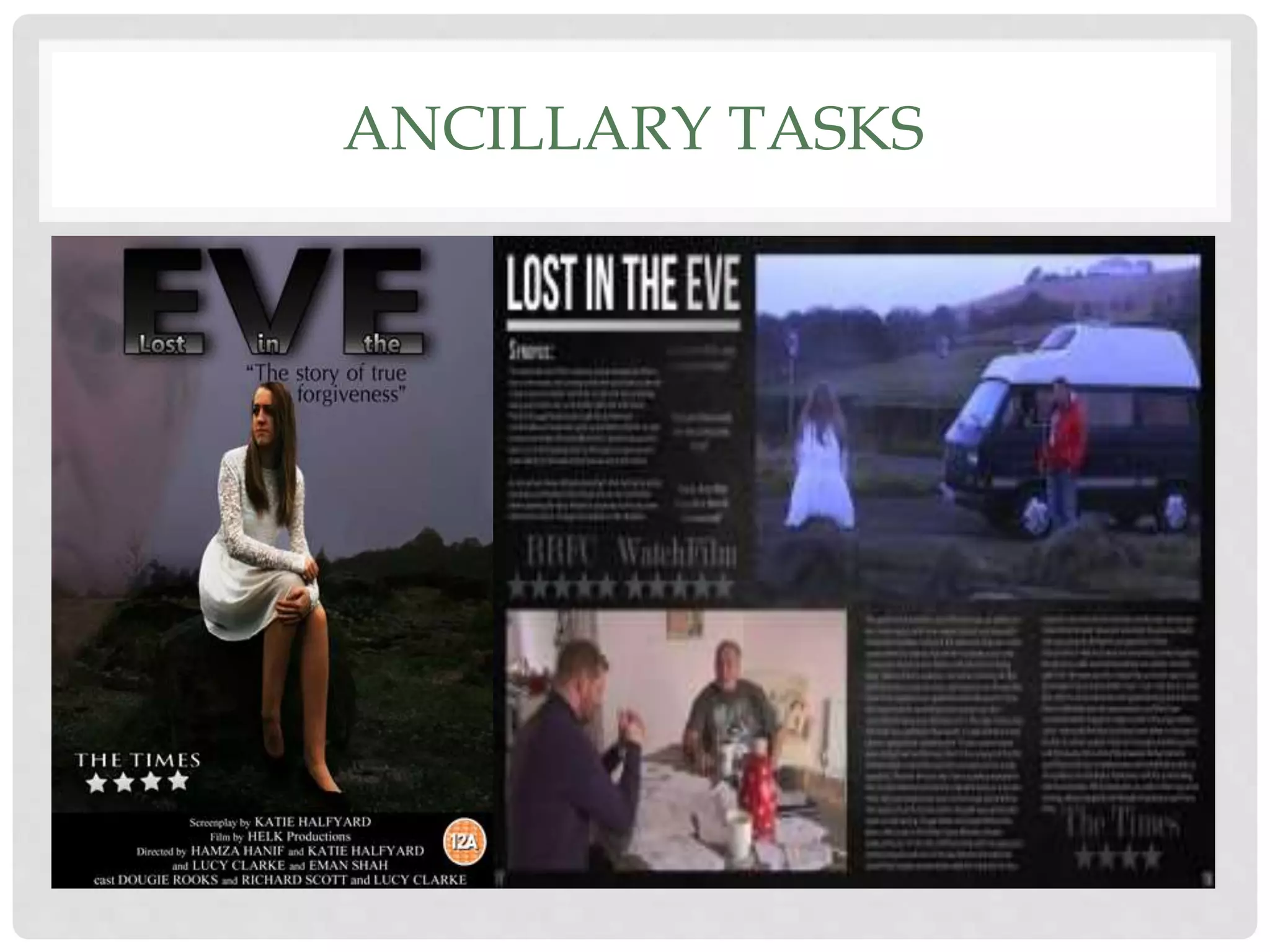
1) The document discusses the effectiveness of combining a film's main product (poster, short film) with ancillary tasks (magazine review).
2) Key elements like mise-en-scene, semiology, paradigm/syntagm, color scheme, shot types were considered to effectively represent the psychological thriller genre and story across products.
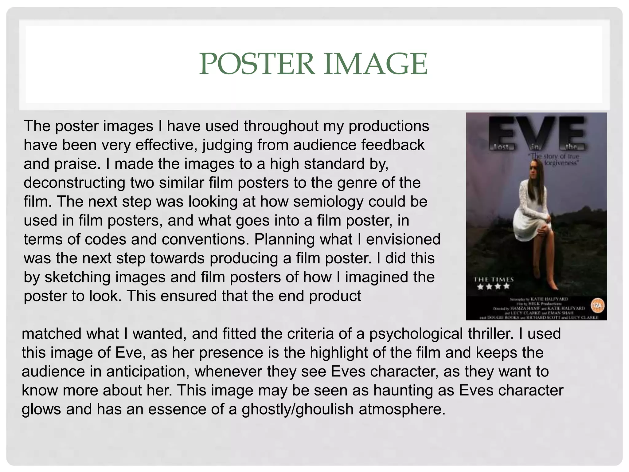
3) Feedback was that the poster and tasks portrayed the film's mood, characters, and narrative well while avoiding spoilers, through choices like Eve's vulnerable expression and white dress, Richard's worried look, and subtle narrative hints in still images.