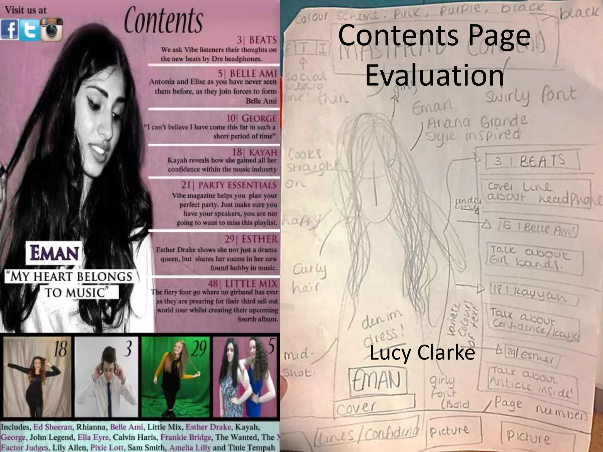
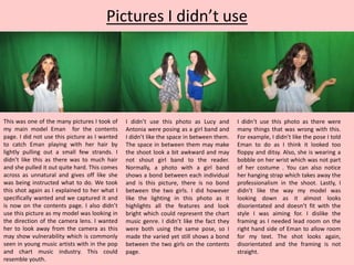
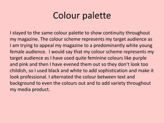
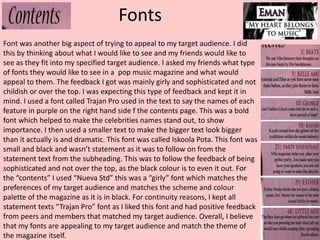
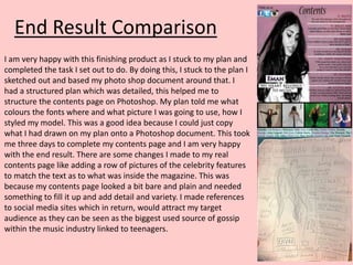
The document discusses the evaluation of photo selections for a magazine's contents page, focusing on the portrayal of the main model, Eman, and the visual elements used to appeal to a young female audience. The author emphasizes the importance of vulnerability, natural beauty, and an appropriate color palette that resonates with the target demographic. Additionally, the document outlines font choices that align with the desired sophistication and appeal of the magazine, concluding with a reflection on the successful execution of the planned design.