This magazine cover features Cheryl Cole as the main image. The large main cover line "Cheryl Cole rocks" engages readers about what may be said about her in the magazine. Additional cover lines in red and white text advertise other music artists and stories featured inside. The masthead at the top identifies this as issue of "Q" magazine.
Model Attribute Check Company Auto PropertyCeline George
In Odoo, the multi-company feature allows you to manage multiple companies within a single Odoo database instance. Each company can have its own configurations while still sharing common resources such as products, customers, and suppliers.
Unit 8 - Information and Communication Technology (Paper I).pdfThiyagu K
This slides describes the basic concepts of ICT, basics of Email, Emerging Technology and Digital Initiatives in Education. This presentations aligns with the UGC Paper I syllabus.
This is a presentation by Dada Robert in a Your Skill Boost masterclass organised by the Excellence Foundation for South Sudan (EFSS) on Saturday, the 25th and Sunday, the 26th of May 2024.
He discussed the concept of quality improvement, emphasizing its applicability to various aspects of life, including personal, project, and program improvements. He defined quality as doing the right thing at the right time in the right way to achieve the best possible results and discussed the concept of the "gap" between what we know and what we do, and how this gap represents the areas we need to improve. He explained the scientific approach to quality improvement, which involves systematic performance analysis, testing and learning, and implementing change ideas. He also highlighted the importance of client focus and a team approach to quality improvement.
Synthetic Fiber Construction in lab .pptxPavel ( NSTU)
Synthetic fiber production is a fascinating and complex field that blends chemistry, engineering, and environmental science. By understanding these aspects, students can gain a comprehensive view of synthetic fiber production, its impact on society and the environment, and the potential for future innovations. Synthetic fibers play a crucial role in modern society, impacting various aspects of daily life, industry, and the environment. ynthetic fibers are integral to modern life, offering a range of benefits from cost-effectiveness and versatility to innovative applications and performance characteristics. While they pose environmental challenges, ongoing research and development aim to create more sustainable and eco-friendly alternatives. Understanding the importance of synthetic fibers helps in appreciating their role in the economy, industry, and daily life, while also emphasizing the need for sustainable practices and innovation.
The Art Pastor's Guide to Sabbath | Steve ThomasonSteve Thomason
What is the purpose of the Sabbath Law in the Torah. It is interesting to compare how the context of the law shifts from Exodus to Deuteronomy. Who gets to rest, and why?
Ethnobotany and Ethnopharmacology:
Ethnobotany in herbal drug evaluation,
Impact of Ethnobotany in traditional medicine,
New development in herbals,
Bio-prospecting tools for drug discovery,
Role of Ethnopharmacology in drug evaluation,
Reverse Pharmacology.
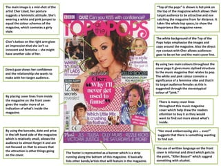
1. The main image is a mid-shot of the
artist Cher Lloyd, her posture
suggests a feministic attitude. She’s
wearing a white and pink jumper to
equal the colour schemes of the
magazine, which connotes a girly
style.
Cher’s tattoo on the right arm gives
an impression that she isn’t so
innocent and feminine – she might
have another side of her.
Direct gaze shows her confidence
and the relationship she wants to
make with her target audience.
By placing cover lines from inside
the magazine on the front cover
gives the reader more of an
indication of what’s inside the
magazine.
By using the barcode, date and price
in the left hand side of the magazine
which is relatively small, allows the
audience to almost forget it and are
not focused on that to ensure that
the attraction is other things going
on the cover.
The footer is represented as a banner which is a strip
running along the bottom of this magazine. It basically
lists other bands/artists that will feature in the magazine.
“Her most embarrassing pics … ever!”
suggests that there is something wanting
to find out.
By using two main colours throughout the
cover page it gives more stylised structure
to the music magazine that relates to pop.
The white and pink colour connote a
significance of a feminine vibe and that it
its target audience females as this is
suggested through the stereotypical
colour of “pink.”
The white background of the Top of the
Pops helps emphasise the images and
copy around the magazine. Also the direct
eye contact with Cher allows audiences
gaze to be on her and the main cover line.
“Top of the pops” is shown is hot pink on
the top of the magazine which allows their
target audience to be attractive and eye
catching the magazine from far distance. It
takes the whole top space, to show the
importance the magazine name.
The use of written language on the front
cover is informal and direct which gets to
the point, “Killer Booze!” which suggest
something with alcohol.
There is many cover lines
throughout this music magazine
cover which help draw the readers
attention to buy it as they would
want to find out more about what’s
inside.
2. The costume that Katy is a floral
print dress with flowers all in her
hair and also on her dress. Her
makeup is very natural but pink,
which all together gives a feminine
look which would appeal to female
readers only.
The tagline gives the audience more
information about the main feature, -
which is Katy Perry article. Calling her the
‘New Queen of Pop’ entices the reader to
buy it by making them think she is an
interesting person to read about.
The masthead is bold and striking, so it
stands out on the page. Its placed
behind the image, so although we can’t
see the entire title as we are expected
to recognise the name of the magazine.
By having the centre of ‘D and A’ filled in
give the page colour and make it more
visually appealing, as well as drawing
attention to the masthead.
The other secondary cover lines are in capital black letters in a clear
font, which is fitting with the magazine sophisticated style.
The data makes it sellable and lets
readers know what they are buying
the most up to data issue.
The main image is of a celebrity
endorsement Katy Perry looking
innocent, while dominating the
front cover. She has her head lilted
towards the left, which could be
given an indication to read what is
going to in the magazine. The mise-
en-scence (the flowers, her dress,
her makeup and hair) gives the
cover a very feminine look to appeal
to its largely female target
audience.
The background is all pink which
gives it an even more feminine look.
One of the disadvantage of this look
is that it may only attract female
attention because of the colour
used.
The main cover line anchors the image
and tells the audience who she is.
Although she is a world wide famous
star and the target audience of the
magazine probably already recognise
her, but having her name in a big, bold
font makes her the focus of the
magazine and will capture peoples
attention when they see it on a shelf.
The majority of main images are
covering the masthead which makes
the image stand out a lot more.
However, if a new reader has never
heard/seen of Billboard before they
may not know what the magazine is
called.
The flashers adds colour and
draws attention to the
feature inside it.
3. The new NME logo has stuck to
the original font however the
colours of the logo vary and the
white outline has been removed.
Slogan is placed under
the NME logo, the
slogan is simply telling
the reader what the
initials NME stand for.
Cover image have used a close
up shot for the cover of this
particular issue. I think that the
close –up shot creates a kind of
personal feel, as you generally
only see someone this close up if
you are physically face to face
with them. This is a features that
may make someone more
inclined to read the magazine.
The image fits in well with the
colour scheme. Florence’s red
hair contrasts with the white
logo, however her pale
complexion and white top match
the logo which makes the hair a
physical stand out features,
which is the same for Florence in
reality.
Main cover line shows the reader the main story in the magazine and often
relates to the cover star. This is a feature that NME used in my first cover
analysis. The black font is the only black text used therefore it stands out
the most.
Barcode allows the shop to
scan the magazine which the
customer can then pay for .
Without it the magazine could
not be taken, unless it was a
free magazine.
Cover line acts as an
advertisement to the reader
by telling them the other good
features inside the magazine
to encourage the reader to
buy the issue. The white text
contrasts with the red
background so it can be read
easily.
Cover line tells the reader that
they are looking at a special
edition of NME and that they are
looking at the second special
edition cover out of 10 different
covers. It also tell the reader that
NME has changed which will make
the reader want to buy the
magazine to see what has
changed.
Price and issue informs the reader of how much the magazine will cost and the exact issue number.. The
issue number is more helpful for regular readers of NME and the price is relevant to those who do not
always read NME.
4. The header of the magazine
represents how it is the biggest music
magazine in the UK, motivating and
encouraging people to buy it has
been voted best in the UK.
The masthead of this magazine is in
the top left hand third of the page.
Being more of a logo than a
masthead, it is easily recognisable due
to the one letter on top of the red
back ground makes the masthead
very eye catching to its readers. The
layout of the masthead conforms to
stereotypical magazine front covers
as it is appears at the top of the
magazine and is the first thing the
reader sees. The fact that it also
covers the main central image of the
magazine expresses the importance it
has to its readers.
The barcode featured on the magazine is located
underneath the logo/masthead and the price of the
magazine can be found on the barcoded. The print is very
small as the magazine is expensive compared to other
magazines offering the same things, so the company does
not want to advertise the price too much.
The main image has been placed in
the centre third. It dominates the
entire frame and appeals extremely
well to the audience. Cheryl Cole is
the image displayed and she is very
well known for being in the music
industry as well as being a judge on
the x-factor. This makes the reader
very interested in what the magazine
has to offer about her. The image also
depicts her ‘sex appeal’ and is shown
very well dues to the image of her.
This may raise sale in this edition as
readers may just buy the magazine
purely for the main image.
The main cover line on this
edition of ‘Q’ is ‘Cheryl Cole
rocks’. This engages and
interest the reader into what
the magazine may have to
say about her .the editor has
made the word ‘rocks’ in a
large, red print with spaced
out letters. Compared to the
rest of the magazine, to font
is relatively large and makes
the word stand out, giving an
importance to the word and
the magazine. Connotations
of red are lust and sexual
attraction and this is
reinforced by central image.
A puff has been used to show
vital information that needs
to stand out against the front
page. On this magazine, the
front page. On this magazine,
‘John Lennon’ has been
mentioned in the puff. This
depicts that there will be
information about him
included in the issues.
The cover line on this edition
revolves around music artist. The
colours are either red or white which
matches the main cover line below,
making the magazine very consistent
as the colours are whitin the house
style of ‘Q’ magazine.