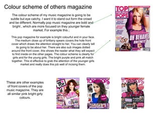
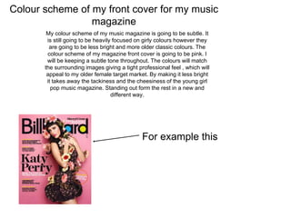
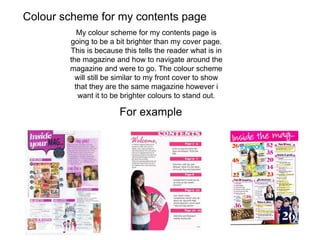
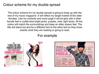
The document discusses font and color scheme choices for different elements of a music magazine, including the cover, contents page, and double-page spread. For the cover, the font Segoe Print was chosen to give a classic, fun style that appeals to the target market of older, higher-class readers. The contents page and double-page spread use consistent fonts and color schemes to provide uniformity throughout the magazine. The color scheme aims to be subtly eye-catching rather than bright like other pop magazines, using lighter pinks and purples to appeal to an older female audience.