SlideShare a Scribd company logo
1 of 3
Font and type size:
the font and type
size is very small,
using a smart font
type it gives the text
a sophisticated edge.
There is only a few
bold bits of text and
they are starting
letters to some
paragraphs and the
heading at the top.
Basic layout:
the layout is
very plain and it
uses up nearly
all of the blank
space and
dedicates on
page entirely to
a large image of
the star.
Colum width and positioning: the positioning of the
columns are tight and compact and its fitting a lot of
small area. As well there is long paragraphs that don’t
contain many spaces.
Colours: the use of
colours are minimal
and they use only the
safest and cleanest
colours apart from the
bold red L in the
background of the
text. As well because
of the page break the
black and white of the
text is the only thing
that ties the theme of
the double pages read
together.
Use of space; the
use of space has
been planned out
very well so that
there is hardly
any blank areas
apart from the
very top of the
page that has
the heading on it.
Page number: the page numbers at the bottom
of the page are fitting with the house theme of
Q magazine and it has there front cover logo
on the bottom of the page
The heading of this
article is large and
eye catching. The
black colour makes it
contrast with the
background of the
article. This helps is
emphasise it and
make it stand out.
The font its round
and bubbly. This
makes it seem quite
feminine, this
suggests that this
specific article is
aimed at females.
The subheading of
this article outline
what it included in
the article. The
subheading links to
the main image of
Katy Perry. This is
because it says how
she link to wear ‘hot
pants’ and she's is
wearing hot pants in
this image.
The page number is featured on
every page of a music magazine or
every other page. This helps the
reader navigate through the
magazine.
The article is set out
in two columns. This
is starched down the
whole length of the
left page. It is laid
out in two columns
to make it look well
structures and
professional.
The main image is black
and white effect. This
makes it look vintage
and original. This clothes
Katy Perry is wearing
also links to the vintage
theme of the image the
clothes she is wearing
makes her look very
appealing to the target
audience. The lighting
seems very brings to
enhance the model in
the image.
The main image in the article fills a whole page of the
magazine.(half of the double page spread) this shows
that the image is very important and domination in this
article
The masthead of this page is ‘The Gospel
According to Nicki Minaj’ it is a very large
masthead and covers a large proportion of the
page. Similar to the masthead from ‘Q’ this has
two contrasting fonts, in order to make it stand
out to the reader. The artists name is in a
simple, bold font, which is a pink, whereas the
lettering above it has a script font which looks
to be handwritten.`
The overall look of this double
page spread is vibrant and
exiting, this is created by the
bold image used and bright
colour scheme. This spread is
taken from NME magazine
which is not usually known for
featuring such mainstream, pop
artists, therefore the style of
this article is slightly different
from others that I have seen
from NME magazine. Another
feature of this DPS is that the
first letter of the article is much
bigger and bold than the rest, in
order to make it clear where it
starts, this is something I have
found is common with
magazine articles.
The design balance on this DPS
is informal, in order to give it
an exciting, fun look. Even
though the text is structured
effectively, there is no balance
in it and the image is
positioned to the right hand
side.
The Gutenberg design
principle has been
applied to this DPS as
the masthead is in the
top left hand corner,
meaning it is in the
primary optical area.
This means it is the
first thing the reader
sees, and they can
instantly know who the
article is about.
Similar to the Q double page spread only one images is used. A
bold, fun image has been include, which dearly represents the
‘pop’ genre of music being featured. The artist is wearing
vibrant pink lipstick which compliments the pink background
colour. The artist is wearing bold , unique costume jeweller
highlights the exciting, fun tone of the page. The image also has
direct mode of address , which would entice the reader and
creates a unique photo
The layout of the next
is different compared
to the Q magazine
article as it is split up
into different section
each discussing a
different topic. This is
most likely to appeal to
a younger age range,
as they will not want to
read large amounts of
text. Certain quotes
have been pulled out
of the article and put in
a bigger font and also
highlighted in a dark
pink: this is to attract
the readers as they are
usually the most
‘exclusive’ part of the
interview.
The main audience of this DPS is very
different from the audience of the ‘Q’
magazine. This article is aimed at a
much younger demographic and
mainly girls, as these are the type of
people that would listen to Nicki
Minaj.
The main colours used on this page are
pink, black and white. The pink gives the
page an extremely girly and feminine loo
which would attract young girls, who are
interested in her music and fits with the
‘pop’ genre of music. The black and pink
contrast well with each other and allow the
text to stand out easily.

More Related Content

What's hot

Music magazine research
Music magazine researchMusic magazine research
Music magazine research
broganlan
 
Analyising music magazines
Analyising music magazinesAnalyising music magazines
Analyising music magazines
jessasmedia4
 
Task 2,3
Task 2,3Task 2,3
Task 2,3
akii786
 
Analysis of three double page spreads from music magazines
Analysis of three double page spreads from music magazinesAnalysis of three double page spreads from music magazines
Analysis of three double page spreads from music magazines
zoewarwood
 
Music Magazine Research
Music Magazine ResearchMusic Magazine Research
Music Magazine Research
asiyam
 
Lifestyle Magazine Analysis
Lifestyle Magazine AnalysisLifestyle Magazine Analysis
Lifestyle Magazine Analysis
guest01ece09
 
Analyising music magazines
Analyising music magazinesAnalyising music magazines
Analyising music magazines
Jess Stafford
 

What's hot (20)

Front cover analysis
Front cover analysisFront cover analysis
Front cover analysis
 
Magazine front cover analysis
Magazine front cover analysisMagazine front cover analysis
Magazine front cover analysis
 
Magazine Cover Analysis
Magazine Cover AnalysisMagazine Cover Analysis
Magazine Cover Analysis
 
Gossip Magazine Cover Analysis
Gossip Magazine Cover Analysis Gossip Magazine Cover Analysis
Gossip Magazine Cover Analysis
 
Music Magazine Cover Analysis
Music Magazine Cover AnalysisMusic Magazine Cover Analysis
Music Magazine Cover Analysis
 
Music magazine research
Music magazine researchMusic magazine research
Music magazine research
 
Music magazine anaylsis
Music magazine anaylsisMusic magazine anaylsis
Music magazine anaylsis
 
Analyising music magazines
Analyising music magazinesAnalyising music magazines
Analyising music magazines
 
Magazine Pre-production
Magazine Pre-productionMagazine Pre-production
Magazine Pre-production
 
GCSE Media Studies Magazine Production
GCSE Media Studies Magazine ProductionGCSE Media Studies Magazine Production
GCSE Media Studies Magazine Production
 
Kerrang analysis
Kerrang analysisKerrang analysis
Kerrang analysis
 
Task 2,3
Task 2,3Task 2,3
Task 2,3
 
Analyising music magazines
Analyising music magazinesAnalyising music magazines
Analyising music magazines
 
Analysis of three double page spreads from music magazines
Analysis of three double page spreads from music magazinesAnalysis of three double page spreads from music magazines
Analysis of three double page spreads from music magazines
 
Magazine cover analysis
Magazine cover analysisMagazine cover analysis
Magazine cover analysis
 
Music Magazine Research
Music Magazine ResearchMusic Magazine Research
Music Magazine Research
 
Lifestyle Magazine Analysis
Lifestyle Magazine AnalysisLifestyle Magazine Analysis
Lifestyle Magazine Analysis
 
Analyising music magazines
Analyising music magazinesAnalyising music magazines
Analyising music magazines
 
GCSE Magazine Research and Planning
GCSE Magazine Research and PlanningGCSE Magazine Research and Planning
GCSE Magazine Research and Planning
 
Analyising music magazines
Analyising music magazinesAnalyising music magazines
Analyising music magazines
 

Similar to DPS

Similar to DPS (20)

Tasks 1 4 and hwk 1
Tasks 1 4 and hwk 1Tasks 1 4 and hwk 1
Tasks 1 4 and hwk 1
 
Double page spreads for analysis
Double page spreads for analysisDouble page spreads for analysis
Double page spreads for analysis
 
Tasks 1 4 and hwk 2
Tasks 1 4 and hwk 2Tasks 1 4 and hwk 2
Tasks 1 4 and hwk 2
 
As media 2u
As media 2uAs media 2u
As media 2u
 
Analysing music magazines
Analysing music magazinesAnalysing music magazines
Analysing music magazines
 
SIMILAR PRODUCT RESEARCH (SPR) OF 3 FEATURE ARTICLES
SIMILAR PRODUCT RESEARCH (SPR) OF 3 FEATURE ARTICLESSIMILAR PRODUCT RESEARCH (SPR) OF 3 FEATURE ARTICLES
SIMILAR PRODUCT RESEARCH (SPR) OF 3 FEATURE ARTICLES
 
Double page
Double pageDouble page
Double page
 
Deconstructing 3 dps
Deconstructing 3 dpsDeconstructing 3 dps
Deconstructing 3 dps
 
Mojo
MojoMojo
Mojo
 
Research and planning all 3
Research and planning all 3Research and planning all 3
Research and planning all 3
 
Own magazine double page spread
Own magazine double page spreadOwn magazine double page spread
Own magazine double page spread
 
Music magazine Analysis
Music magazine Analysis Music magazine Analysis
Music magazine Analysis
 
Analysis of Music Magazines
Analysis of Music MagazinesAnalysis of Music Magazines
Analysis of Music Magazines
 
Magazine analysing
Magazine analysingMagazine analysing
Magazine analysing
 
Magazine front cover analysis
Magazine front cover analysis Magazine front cover analysis
Magazine front cover analysis
 
Analysis of other double page spreads
Analysis of other double page spreadsAnalysis of other double page spreads
Analysis of other double page spreads
 
Magazine analysis 3
Magazine analysis 3Magazine analysis 3
Magazine analysis 3
 
Contents Page Analysis
Contents Page AnalysisContents Page Analysis
Contents Page Analysis
 
Textual Analysis
Textual AnalysisTextual Analysis
Textual Analysis
 
Analysis of music magazine one nme
Analysis of music magazine one nmeAnalysis of music magazine one nme
Analysis of music magazine one nme
 

Recently uploaded

The basics of sentences session 3pptx.pptx
The basics of sentences session 3pptx.pptxThe basics of sentences session 3pptx.pptx
The basics of sentences session 3pptx.pptx
heathfieldcps1
 

Recently uploaded (20)

How to Create and Manage Wizard in Odoo 17
How to Create and Manage Wizard in Odoo 17How to Create and Manage Wizard in Odoo 17
How to Create and Manage Wizard in Odoo 17
 
COMMUNICATING NEGATIVE NEWS - APPROACHES .pptx
COMMUNICATING NEGATIVE NEWS - APPROACHES .pptxCOMMUNICATING NEGATIVE NEWS - APPROACHES .pptx
COMMUNICATING NEGATIVE NEWS - APPROACHES .pptx
 
dusjagr & nano talk on open tools for agriculture research and learning
dusjagr & nano talk on open tools for agriculture research and learningdusjagr & nano talk on open tools for agriculture research and learning
dusjagr & nano talk on open tools for agriculture research and learning
 
Details on CBSE Compartment Exam.pptx1111
Details on CBSE Compartment Exam.pptx1111Details on CBSE Compartment Exam.pptx1111
Details on CBSE Compartment Exam.pptx1111
 
On_Translating_a_Tamil_Poem_by_A_K_Ramanujan.pptx
On_Translating_a_Tamil_Poem_by_A_K_Ramanujan.pptxOn_Translating_a_Tamil_Poem_by_A_K_Ramanujan.pptx
On_Translating_a_Tamil_Poem_by_A_K_Ramanujan.pptx
 
OSCM Unit 2_Operations Processes & Systems
OSCM Unit 2_Operations Processes & SystemsOSCM Unit 2_Operations Processes & Systems
OSCM Unit 2_Operations Processes & Systems
 
Tatlong Kwento ni Lola basyang-1.pdf arts
Tatlong Kwento ni Lola basyang-1.pdf artsTatlong Kwento ni Lola basyang-1.pdf arts
Tatlong Kwento ni Lola basyang-1.pdf arts
 
Python Notes for mca i year students osmania university.docx
Python Notes for mca i year students osmania university.docxPython Notes for mca i year students osmania university.docx
Python Notes for mca i year students osmania university.docx
 
Wellbeing inclusion and digital dystopias.pptx
Wellbeing inclusion and digital dystopias.pptxWellbeing inclusion and digital dystopias.pptx
Wellbeing inclusion and digital dystopias.pptx
 
The basics of sentences session 3pptx.pptx
The basics of sentences session 3pptx.pptxThe basics of sentences session 3pptx.pptx
The basics of sentences session 3pptx.pptx
 
Graduate Outcomes Presentation Slides - English
Graduate Outcomes Presentation Slides - EnglishGraduate Outcomes Presentation Slides - English
Graduate Outcomes Presentation Slides - English
 
HMCS Max Bernays Pre-Deployment Brief (May 2024).pptx
HMCS Max Bernays Pre-Deployment Brief (May 2024).pptxHMCS Max Bernays Pre-Deployment Brief (May 2024).pptx
HMCS Max Bernays Pre-Deployment Brief (May 2024).pptx
 
Economic Importance Of Fungi In Food Additives
Economic Importance Of Fungi In Food AdditivesEconomic Importance Of Fungi In Food Additives
Economic Importance Of Fungi In Food Additives
 
Our Environment Class 10 Science Notes pdf
Our Environment Class 10 Science Notes pdfOur Environment Class 10 Science Notes pdf
Our Environment Class 10 Science Notes pdf
 
Model Attribute _rec_name in the Odoo 17
Model Attribute _rec_name in the Odoo 17Model Attribute _rec_name in the Odoo 17
Model Attribute _rec_name in the Odoo 17
 
What is 3 Way Matching Process in Odoo 17.pptx
What is 3 Way Matching Process in Odoo 17.pptxWhat is 3 Way Matching Process in Odoo 17.pptx
What is 3 Way Matching Process in Odoo 17.pptx
 
Play hard learn harder: The Serious Business of Play
Play hard learn harder:  The Serious Business of PlayPlay hard learn harder:  The Serious Business of Play
Play hard learn harder: The Serious Business of Play
 
HMCS Vancouver Pre-Deployment Brief - May 2024 (Web Version).pptx
HMCS Vancouver Pre-Deployment Brief - May 2024 (Web Version).pptxHMCS Vancouver Pre-Deployment Brief - May 2024 (Web Version).pptx
HMCS Vancouver Pre-Deployment Brief - May 2024 (Web Version).pptx
 
Sensory_Experience_and_Emotional_Resonance_in_Gabriel_Okaras_The_Piano_and_Th...
Sensory_Experience_and_Emotional_Resonance_in_Gabriel_Okaras_The_Piano_and_Th...Sensory_Experience_and_Emotional_Resonance_in_Gabriel_Okaras_The_Piano_and_Th...
Sensory_Experience_and_Emotional_Resonance_in_Gabriel_Okaras_The_Piano_and_Th...
 
Introduction to TechSoup’s Digital Marketing Services and Use Cases
Introduction to TechSoup’s Digital Marketing  Services and Use CasesIntroduction to TechSoup’s Digital Marketing  Services and Use Cases
Introduction to TechSoup’s Digital Marketing Services and Use Cases
 

DPS

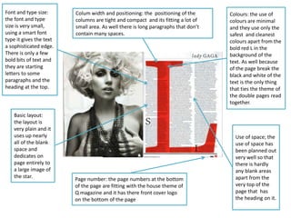
  • 1. Font and type size: the font and type size is very small, using a smart font type it gives the text a sophisticated edge. There is only a few bold bits of text and they are starting letters to some paragraphs and the heading at the top. Basic layout: the layout is very plain and it uses up nearly all of the blank space and dedicates on page entirely to a large image of the star. Colum width and positioning: the positioning of the columns are tight and compact and its fitting a lot of small area. As well there is long paragraphs that don’t contain many spaces. Colours: the use of colours are minimal and they use only the safest and cleanest colours apart from the bold red L in the background of the text. As well because of the page break the black and white of the text is the only thing that ties the theme of the double pages read together. Use of space; the use of space has been planned out very well so that there is hardly any blank areas apart from the very top of the page that has the heading on it. Page number: the page numbers at the bottom of the page are fitting with the house theme of Q magazine and it has there front cover logo on the bottom of the page
  • 2. The heading of this article is large and eye catching. The black colour makes it contrast with the background of the article. This helps is emphasise it and make it stand out. The font its round and bubbly. This makes it seem quite feminine, this suggests that this specific article is aimed at females. The subheading of this article outline what it included in the article. The subheading links to the main image of Katy Perry. This is because it says how she link to wear ‘hot pants’ and she's is wearing hot pants in this image. The page number is featured on every page of a music magazine or every other page. This helps the reader navigate through the magazine. The article is set out in two columns. This is starched down the whole length of the left page. It is laid out in two columns to make it look well structures and professional. The main image is black and white effect. This makes it look vintage and original. This clothes Katy Perry is wearing also links to the vintage theme of the image the clothes she is wearing makes her look very appealing to the target audience. The lighting seems very brings to enhance the model in the image. The main image in the article fills a whole page of the magazine.(half of the double page spread) this shows that the image is very important and domination in this article
  • 3. The masthead of this page is ‘The Gospel According to Nicki Minaj’ it is a very large masthead and covers a large proportion of the page. Similar to the masthead from ‘Q’ this has two contrasting fonts, in order to make it stand out to the reader. The artists name is in a simple, bold font, which is a pink, whereas the lettering above it has a script font which looks to be handwritten.` The overall look of this double page spread is vibrant and exiting, this is created by the bold image used and bright colour scheme. This spread is taken from NME magazine which is not usually known for featuring such mainstream, pop artists, therefore the style of this article is slightly different from others that I have seen from NME magazine. Another feature of this DPS is that the first letter of the article is much bigger and bold than the rest, in order to make it clear where it starts, this is something I have found is common with magazine articles. The design balance on this DPS is informal, in order to give it an exciting, fun look. Even though the text is structured effectively, there is no balance in it and the image is positioned to the right hand side. The Gutenberg design principle has been applied to this DPS as the masthead is in the top left hand corner, meaning it is in the primary optical area. This means it is the first thing the reader sees, and they can instantly know who the article is about. Similar to the Q double page spread only one images is used. A bold, fun image has been include, which dearly represents the ‘pop’ genre of music being featured. The artist is wearing vibrant pink lipstick which compliments the pink background colour. The artist is wearing bold , unique costume jeweller highlights the exciting, fun tone of the page. The image also has direct mode of address , which would entice the reader and creates a unique photo The layout of the next is different compared to the Q magazine article as it is split up into different section each discussing a different topic. This is most likely to appeal to a younger age range, as they will not want to read large amounts of text. Certain quotes have been pulled out of the article and put in a bigger font and also highlighted in a dark pink: this is to attract the readers as they are usually the most ‘exclusive’ part of the interview. The main audience of this DPS is very different from the audience of the ‘Q’ magazine. This article is aimed at a much younger demographic and mainly girls, as these are the type of people that would listen to Nicki Minaj. The main colours used on this page are pink, black and white. The pink gives the page an extremely girly and feminine loo which would attract young girls, who are interested in her music and fits with the ‘pop’ genre of music. The black and pink contrast well with each other and allow the text to stand out easily.