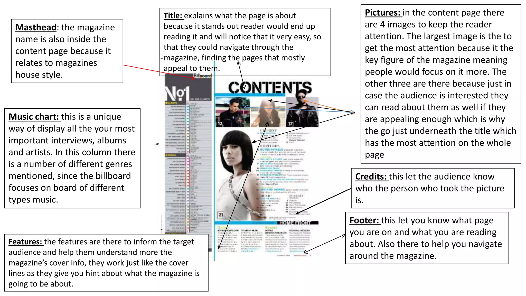
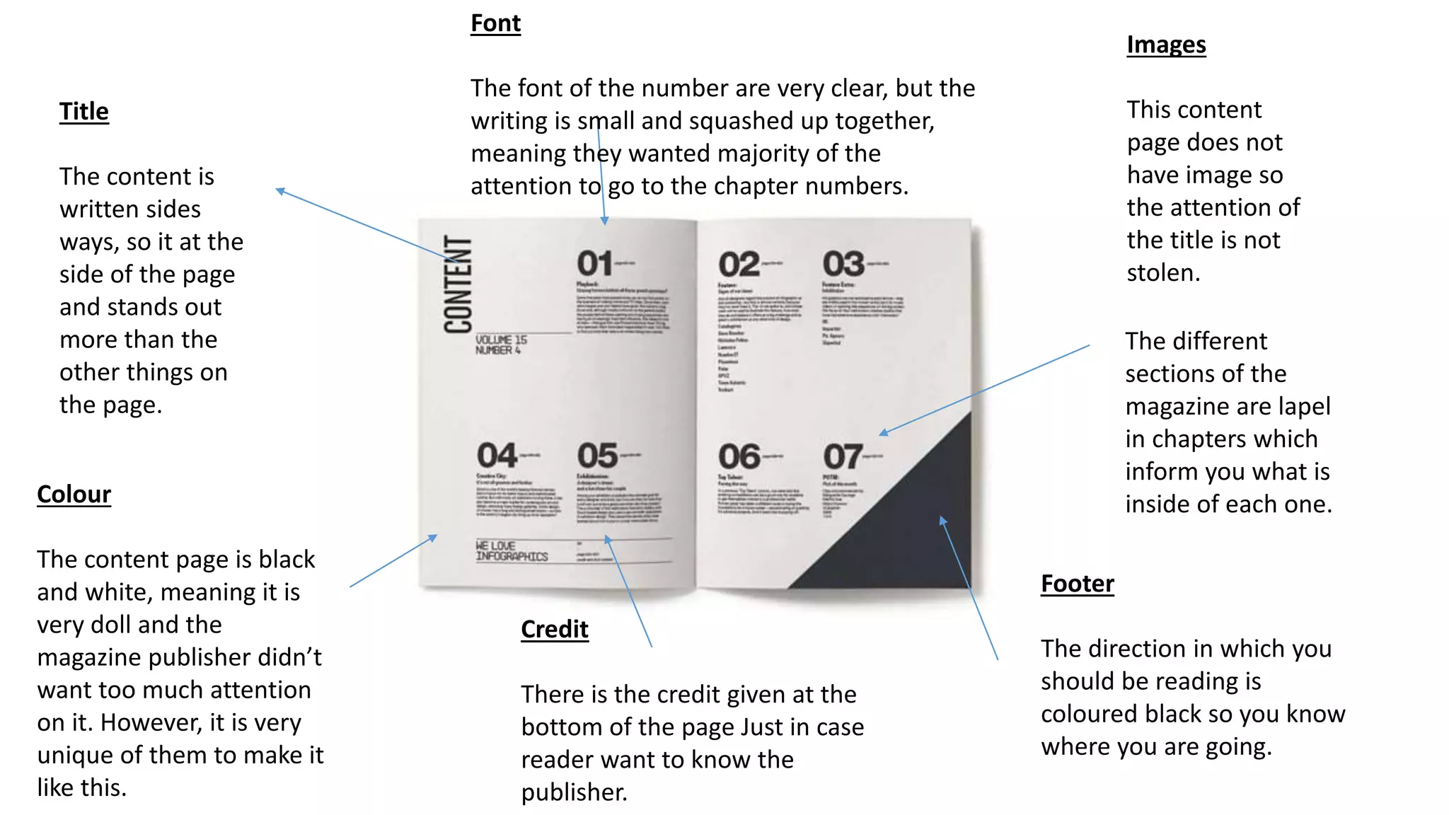
Title: explains what the page is about
because it stands out reader would end up
reading it and will notice that it very easy, so
that they could navigate through the
magazine, finding the pages that mostly
appeal to them.
Pictures: in the content page there
are 4 images to keep the reader
attention. The largest image is the to
get the most attention because it the
key figure of the magazine meaning
people would focus on it more. The
other three are there because just in
case the audience is interested they
can read about them as well if they
are appealing enough which is why
the go just underneath the title which
has the most attention on the whole
page
Credits: this let the audience know
who the person who took the picture
is.
Footer: this let you know what page
you are on and what you are reading
about. Also there to help you navigate
around the magazine.
Features: the features are there to inform the target
audience and help them understand more the
magazine’s cover info, they work just like the cover
lines as they give you hint about what the magazine is
going to be about.
Music chart: this is a unique
way of display all the your most
important interviews, albums
and artists. In this column there
is a number of different genres
mentioned, since the billboard
focuses on board of different
types music.
Masthead: the magazine
name is also inside the
content page because it
relates to magazines
house style.
The vibe magazine
logo is at the top of the
page were it doesn’t
take to much space.
Under it is the date.
V stands for vibe
magazine
the content page a
“content” in huge letter is
placed in a strange place
making it individual as its
unique. The colour white is
used to contrasts with the
rube red in the back.
The colour in the
background a dark
which helps the
celebrity stand out and
put him in the spotlight.
This means it allows the
audience to focus on
the artist as you will be
more aware that the
main story is going to
be about him.
The features are listed
in a unique way as it is
very fancy. The makes
the magazine look like
it is classy and making
it different to other
magazines.
All Subtitles written in
Capitals and are bold in
Order to make sure the
Writing Could be read.
The celebrity is holding up
expensive jewelry which suggest
that the magazine is trying draw
the attention of reader as
jewelry is attractive.
The celebrity is not wearing a shirt to show
the readers his tattoos meaning he knows
that his is a stereotypical hip hop star.
Title
The content is
written sides
ways, so it at the
side of the page
and stands out
more than the
other things on
the page.
Images
This content
page does not
have image so
the attention of
the title is not
stolen.
The different
sections of the
magazine are lapel
in chapters which
inform you what is
inside of each one.
Footer
The direction in which you
should be reading is
coloured black so you know
where you are going.
Colour
The content page is black
and white, meaning it is
very doll and the
magazine publisher didn’t
want too much attention
on it. However, it is very
unique of them to make it
like this.
Credit
There is the credit given at the
bottom of the page Just in case
reader want to know the
publisher.
Font
The font of the number are very clear, but the
writing is small and squashed up together,
meaning they wanted majority of the
attention to go to the chapter numbers.

Content page

  • 1.
    Title: explains whatthe page is about because it stands out reader would end up reading it and will notice that it very easy, so that they could navigate through the magazine, finding the pages that mostly appeal to them. Pictures: in the content page there are 4 images to keep the reader attention. The largest image is the to get the most attention because it the key figure of the magazine meaning people would focus on it more. The other three are there because just in case the audience is interested they can read about them as well if they are appealing enough which is why the go just underneath the title which has the most attention on the whole page Credits: this let the audience know who the person who took the picture is. Footer: this let you know what page you are on and what you are reading about. Also there to help you navigate around the magazine. Features: the features are there to inform the target audience and help them understand more the magazine’s cover info, they work just like the cover lines as they give you hint about what the magazine is going to be about. Music chart: this is a unique way of display all the your most important interviews, albums and artists. In this column there is a number of different genres mentioned, since the billboard focuses on board of different types music. Masthead: the magazine name is also inside the content page because it relates to magazines house style.
  • 2.
    The vibe magazine logois at the top of the page were it doesn’t take to much space. Under it is the date. V stands for vibe magazine the content page a “content” in huge letter is placed in a strange place making it individual as its unique. The colour white is used to contrasts with the rube red in the back. The colour in the background a dark which helps the celebrity stand out and put him in the spotlight. This means it allows the audience to focus on the artist as you will be more aware that the main story is going to be about him. The features are listed in a unique way as it is very fancy. The makes the magazine look like it is classy and making it different to other magazines. All Subtitles written in Capitals and are bold in Order to make sure the Writing Could be read. The celebrity is holding up expensive jewelry which suggest that the magazine is trying draw the attention of reader as jewelry is attractive. The celebrity is not wearing a shirt to show the readers his tattoos meaning he knows that his is a stereotypical hip hop star.
  • 3.
    Title The content is writtensides ways, so it at the side of the page and stands out more than the other things on the page. Images This content page does not have image so the attention of the title is not stolen. The different sections of the magazine are lapel in chapters which inform you what is inside of each one. Footer The direction in which you should be reading is coloured black so you know where you are going. Colour The content page is black and white, meaning it is very doll and the magazine publisher didn’t want too much attention on it. However, it is very unique of them to make it like this. Credit There is the credit given at the bottom of the page Just in case reader want to know the publisher. Font The font of the number are very clear, but the writing is small and squashed up together, meaning they wanted majority of the attention to go to the chapter numbers.