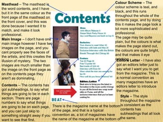
The document discusses how the student's music magazine product uses and develops conventions of real music magazines.
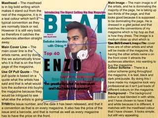
The student followed typical conventions like placing the masthead, pictures, and cover lines in standard locations. Research was conducted to determine what content audiences want.
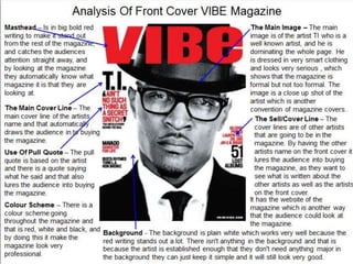
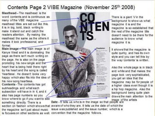
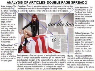
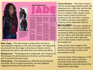
The magazine is then compared to examples of existing magazine covers, contents pages, and double page spreads. Elements like colors, fonts, image sizes, and headlines are analyzed and shown to generally align with conventions. Maintaining conventions helps the student's magazine look professional while also experimenting with some elements like unique color schemes.
