CARRIE (2013)
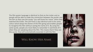
The film poster language is identical to that on the trailer and so
people will be able to make the connection between the poster and
the film as they saw the quote “you will know her name” when they
watched the trailer. The serif font is also identical and in the same
colour which keeps the theme of the film going and enables people
to recognise the film without seeing the name of it. By using the
same quote, people are more likely to remember it and think of it
when they are speaking about the film. This means that if they see
this quote, they will automatically associate it with the film.
Seeing how effective it is using the same font style on each piece of
marketing helps me as I will be able to copy this by using the same
font style on my film trailer and the film poster to ensure it remains
consistent and you can recognise the film by the film poster.
I will also try and use the same or similar language to also keep the
marketing of the film consistent and so there is a slogan that the
audience will recognise the film by.
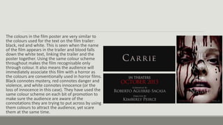
The colours in the film poster are very similar to
the colours used for the text on the film trailer:
black, red and white. This is seen when the name
of the film appears in the trailer and blood falls
down the white text, linking the trailer and the
poster together. Using the same colour scheme
throughout makes the film recognisable only
through colour. It also means the audience will
immediately associate this film with a horror as
the colours are conventionally used in horror films.
Black connotes mystery, red connotes danger and
violence, and white connotes innocence (or the
loss of innocence in this case). They have used the
same colour scheme on each bit of promotion to
make sure the audience are aware of the
connotations they are trying to put across by using
them colours to attract the audience, yet scare
them at the same time.
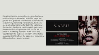
Knowing that the same colour scheme has been
used throughout with the Carrie film helps me
greatly as it gives me an indication of how to use
colour in my marketing. For example, I will now
use a set colour scheme for both the trailer and
film posters like Carrie has to make it look more
professional as using random colours for each
piece of marketing wouldn’t make sense and
would mean the audience wouldn’t immediately
recognise the film from the posters as completely
different colours would be used.
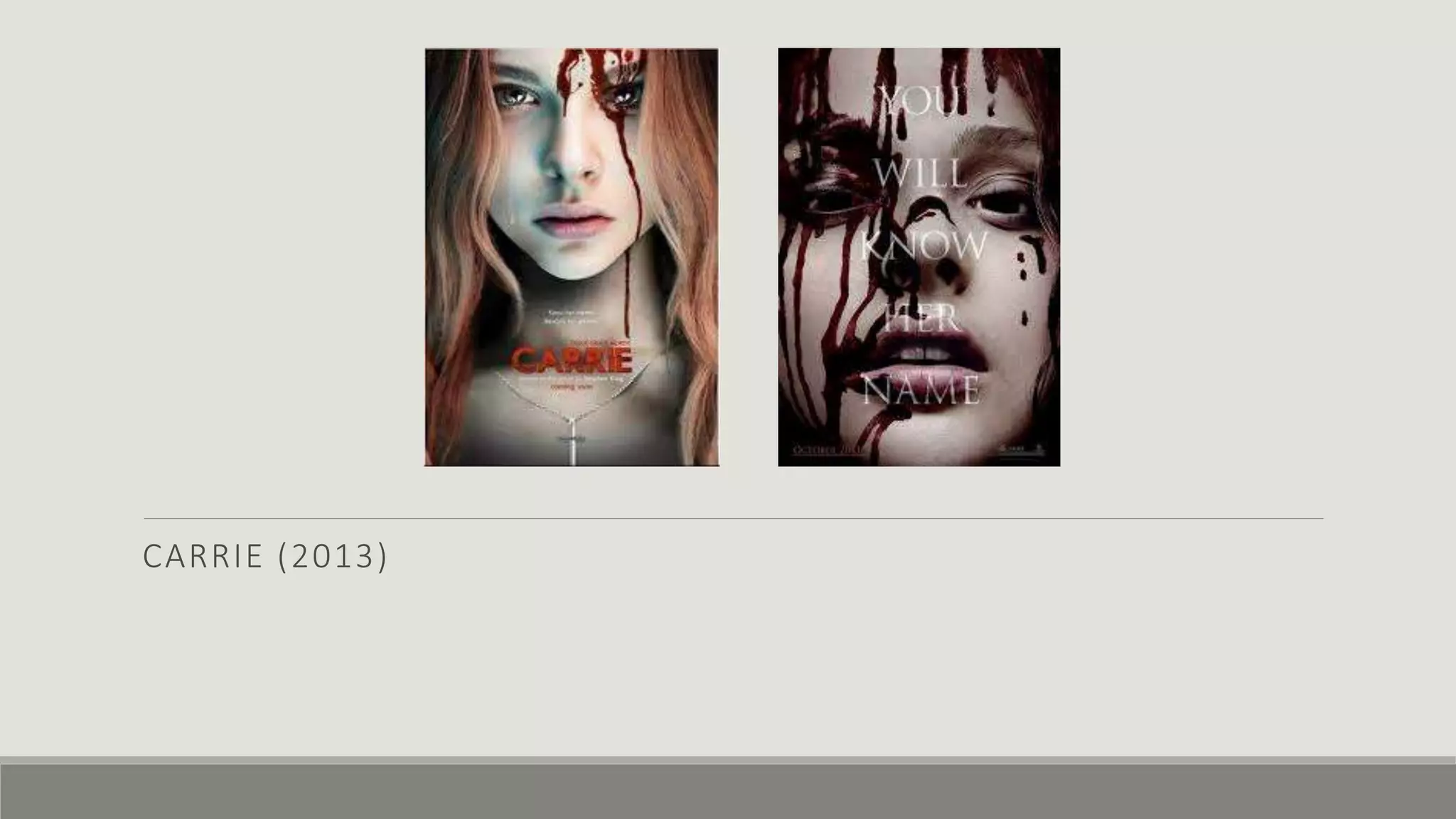
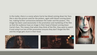
In the trailer, there is a scene where Carrie has blood coming down her face.
She is also the picture used for the posters, again with blood running down
her, making further connections between the trailer and the posters. This
image has been used excessively in the promotion and marketing of the film
so that the audience have an image in their head of blood running down
Carrie’s face. This means that when they think of the film, they want to watch
it and using it on lots of film promotion ensures they don’t forget the film
and the image gets stuck in their head.
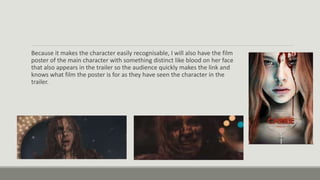
Because it makes the character easily recognisable, I will also have the film
poster of the main character with something distinct like blood on her face
that also appears in the trailer so the audience quickly makes the link and
knows what film the poster is for as they have seen the character in the
trailer.
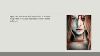
Again, red and white with some black is used for
this poster, showing a clear colour theme to the
audience.

Carrie

  • 1.
  • 2.
    The film posterlanguage is identical to that on the trailer and so people will be able to make the connection between the poster and the film as they saw the quote “you will know her name” when they watched the trailer. The serif font is also identical and in the same colour which keeps the theme of the film going and enables people to recognise the film without seeing the name of it. By using the same quote, people are more likely to remember it and think of it when they are speaking about the film. This means that if they see this quote, they will automatically associate it with the film.
  • 3.
    Seeing how effectiveit is using the same font style on each piece of marketing helps me as I will be able to copy this by using the same font style on my film trailer and the film poster to ensure it remains consistent and you can recognise the film by the film poster. I will also try and use the same or similar language to also keep the marketing of the film consistent and so there is a slogan that the audience will recognise the film by.
  • 4.
    The colours inthe film poster are very similar to the colours used for the text on the film trailer: black, red and white. This is seen when the name of the film appears in the trailer and blood falls down the white text, linking the trailer and the poster together. Using the same colour scheme throughout makes the film recognisable only through colour. It also means the audience will immediately associate this film with a horror as the colours are conventionally used in horror films. Black connotes mystery, red connotes danger and violence, and white connotes innocence (or the loss of innocence in this case). They have used the same colour scheme on each bit of promotion to make sure the audience are aware of the connotations they are trying to put across by using them colours to attract the audience, yet scare them at the same time.
  • 5.
    Knowing that thesame colour scheme has been used throughout with the Carrie film helps me greatly as it gives me an indication of how to use colour in my marketing. For example, I will now use a set colour scheme for both the trailer and film posters like Carrie has to make it look more professional as using random colours for each piece of marketing wouldn’t make sense and would mean the audience wouldn’t immediately recognise the film from the posters as completely different colours would be used.
  • 6.
    In the trailer,there is a scene where Carrie has blood coming down her face. She is also the picture used for the posters, again with blood running down her, making further connections between the trailer and the posters. This image has been used excessively in the promotion and marketing of the film so that the audience have an image in their head of blood running down Carrie’s face. This means that when they think of the film, they want to watch it and using it on lots of film promotion ensures they don’t forget the film and the image gets stuck in their head.
  • 7.
    Because it makesthe character easily recognisable, I will also have the film poster of the main character with something distinct like blood on her face that also appears in the trailer so the audience quickly makes the link and knows what film the poster is for as they have seen the character in the trailer.
  • 8.
    Again, red andwhite with some black is used for this poster, showing a clear colour theme to the audience.