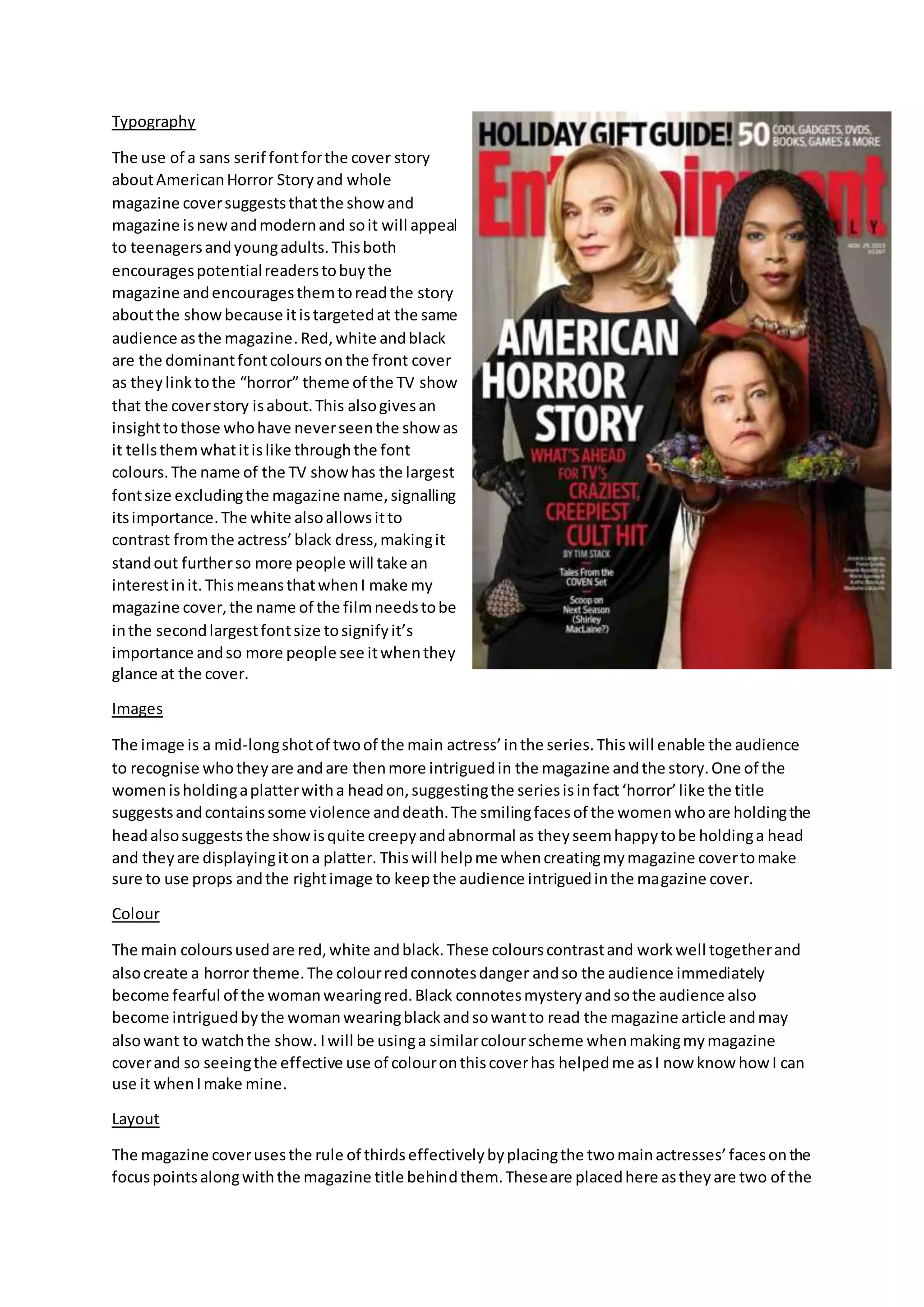
Typography
The use of a sans serif fontforthe cover story
aboutAmericanHorror Storyand whole
magazine coversuggeststhatthe showand
magazine isnewandmodernand soit will appeal
to teenagersandyoungadults.Thisboth
encouragespotentialreaderstobuythe
magazine andencouragesthemtoreadthe story
aboutthe showbecause itistargetedat the same
audience asthe magazine.Red,white andblack
are the dominantfontcoloursonthe front cover
as theylinktothe “horror” theme of the TV show
that the coverstory isabout.This alsogivesan
insighttothose whohave neverseenthe show as
it tellsthemwhatitislike throughthe font
colours.The name of the TV showhas the largest
fontsize excludingthe magazine name,signalling
itsimportance.The white alsoallowsitto
contrast fromthe actress’black dress,makingit
standout furtherso more people will take an
interestinit. ThismeansthatwhenI make my
magazine cover,the name of the filmneedstobe
inthe secondlargestfontsize tosignifyit’s
importance andso more people see itwhenthey
glance at the cover.
Images
The image is a mid-longshotof twoof the main actress’inthe series.Thiswill enable the audience
to recognise whotheyare andare thenmore intriguedin the magazine andthe story.One of the
womenisholdingaplatterwitha headon,suggestingthe seriesisinfact‘horror’like the title
suggestsandcontainssome violence anddeath.The smilingfacesof the womenwhoare holdingthe
headalsosuggests the showisquite creepyandabnormal as theyseemhappytobe holdinga head
and theyare displayingitona platter. Thiswill helpme whencreatingmymagazine covertomake
sure to use props andthe rightimage to keepthe audience intriguedinthe magazine cover.
Colour
The main coloursusedare red,white andblack.These colourscontrastand workwell togetherand
alsocreate a horror theme.The colourredconnotesdanger andso the audience immediately
become fearful of the womanwearingred.Black connotesmysteryandsothe audience also
become intriguedbythe womanwearingblackandsowantto read the magazine article andmay
alsowant to watchthe show. Iwill be usinga similarcolourscheme whenmakingmymagazine
coverand so seeingthe effective use of colouronthiscoverhas helpedme asI now know how I can
use it whenImake mine.
Layout
The magazine coverusesthe rule of thirdseffectivelybyplacingthe twomainactresses’facesonthe
focuspointsalongwiththe magazine title behindthem.Theseare placedhere astheyare two of the
mostimportantthingsonthe entire coverandso itis vital thatthe audience’sattentionisgrabbed
by these assoonas theysee the cover.
The simple andorderedlayoutof the magazine coverisunconventional butisvital tokeepthe main
focuson the cover storytheyare advertisingsothatmore people take aninterestinthatratherthan
smaller,lessimportantstoriesbeingadvertised.Anorderedlayouthasbeenusedwithonlythe
coverstory beingadvertisedsothatthe image iseasyto see as there isa lot of interestingaspects
that couldbe missedif textwasplacedinthe foreground. Because of this,Iwill use anordered
layoutformy magazine coverto make sure itis easyto see everythingandsoitdoesn’tlook
clutteredandunprofessional.
Conventionsof formandgenre
Thismagazine coverisconventional asithasthe mastheadacrossthe top and hasthe coverstory
title inthe secondlargestfonttosignifyitsimportance.The use of colourisconventionalforthe
horror genre as eachcolourconnotesthingssuchas death,violence andgore,all of whichare
associatedwiththe horrorgenre andis whatthe audience wouldexpecttosee ina horror show.
A longshot,however,isunconventional foramagazine cover.Theyoftenleavetoomuchempty
space whichmeansclose upsare favouredmore butbecause of the complexityandnumberof
characters inthe shot,a mid-longshotwasessential andstill suitsthe cover.
Typography
All the fontson the magazine coverare sansserif
whichindicatestothe audience thatthe magazine is
modernandwill therefore appeal toayounger
audience.Usingthisfontalsoindicatesthatthe film
featuredonthe frontis new.Puttingthe whole cover
storyin capital lettersindicatestothe audience that
the filmisveryaggressive andmasculine.However,
usingcapital lettersalsomeansitstandsoutagainst
the mastheadandother storiesatthe top of the
magazine.The name of the filmbeingfeaturedisthe
secondlargestfontonthe page,afterthe masthead,
signallingthatitisimportantandso the readerwill
automaticallylookhere.The majorityof the texton
the magazine coveriswhite,meaningitcontrastswith
the dark image andbackgroundso it standsout more
and grabs the reader’s attention. Thishashelpedme
as I will probablyuse capital lettersforthe name of
the filmtomake itseemmore aggressive andmake it
suitthe horror genre more.
Images
The image is of an anonymouspersondressedinablackcloakwitha scary ghost maskconcealing
the face.This frightensthe audience asthe personunderthe maskisn’tknown.Thisclose upof the
cloakedpersoninthe maskcoversthe majorityof the coverand leavesonlyasmall sectionof
background.Usingthismask alsomeansthe audience whohave seenScreambeforerecognise the
maskand immediatelyknowwhatthe coverstoryisaboutbecause thatmask isalwaysassociated
withthe Screamfilms. ThismeansthatwhenI create my magazine cover,Ineedtomake the photo
recognisable assomeonethatisa maincharacter in the trailerandwearingthe same outfitsothat
the audience canmake a connectionbetweenthe two.
Colour
The main coloursare black,white anda deepred.The deepredcolouris similarto the colourof
bloodandsince it isusedinthe background,the audience associate the filmwithbloodand
therefore gore andviolence. Blackconnotesmysteryandaddsto the audience’sfearaboutwhois
behindthe mask. The coloursare also veryconventionalforhorrorfilmcoloursandso people will
quicklyknowthatthe filmisa horror and are more likelytoreaditknowingitisa genre of filmthey
enjoytowatch.
Layout
The magazine coverusesthe route of the eye effectivelybyplacingall the importantinformationon
the route.The mastheadandmainimage are the twomostimportantthingsonthe page and have
beenplaceddirectlyonthe route sothat the audience seesitstraightawayatfirstglance.This
meanstheyare more likelytopickthe magazine upandreadit if theysee somethinginteresting
instantly.The layoutof the magazine coverisveryorderedandnothingmakesthe image difficultto
see.Thishasbeendone sothat the audience canclearlysee the image andknow whatit iswithout
lotsof storiescoveringitandtakingawaythe fearthe image can cause. I will alsouse the route of
the eye on mymagazine coveras ithas provento be effectivehere withthe placementof textand
imagestomake sure all keyelementsare easilyseen.
Conventionsof formandgenre
The magazine isveryconventional forthe horrorgenre asit usesthe scary aspectof the filmasthe
focal pointof the cover.The use of colourisalso extremelyconventional forthe horrorgenre asred,
white andblackare almostalwaysusedinthe filmandinthe marketingof the filmas theyhave
alwaysbeenassociatedwiththe genre due totheirdarkconnotations.
A close upis alsoconventional foramagazine asitallowsthe audience tosee whothe personis
clearlywithoutleavinglotsof backgroundspace whichcanmake a magazine coverlook
unprofessional.

Ancillary analysis 3 & 4

  • 1.
    Typography The use ofa sans serif fontforthe cover story aboutAmericanHorror Storyand whole magazine coversuggeststhatthe showand magazine isnewandmodernand soit will appeal to teenagersandyoungadults.Thisboth encouragespotentialreaderstobuythe magazine andencouragesthemtoreadthe story aboutthe showbecause itistargetedat the same audience asthe magazine.Red,white andblack are the dominantfontcoloursonthe front cover as theylinktothe “horror” theme of the TV show that the coverstory isabout.This alsogivesan insighttothose whohave neverseenthe show as it tellsthemwhatitislike throughthe font colours.The name of the TV showhas the largest fontsize excludingthe magazine name,signalling itsimportance.The white alsoallowsitto contrast fromthe actress’black dress,makingit standout furtherso more people will take an interestinit. ThismeansthatwhenI make my magazine cover,the name of the filmneedstobe inthe secondlargestfontsize tosignifyit’s importance andso more people see itwhenthey glance at the cover. Images The image is a mid-longshotof twoof the main actress’inthe series.Thiswill enable the audience to recognise whotheyare andare thenmore intriguedin the magazine andthe story.One of the womenisholdingaplatterwitha headon,suggestingthe seriesisinfact‘horror’like the title suggestsandcontainssome violence anddeath.The smilingfacesof the womenwhoare holdingthe headalsosuggests the showisquite creepyandabnormal as theyseemhappytobe holdinga head and theyare displayingitona platter. Thiswill helpme whencreatingmymagazine covertomake sure to use props andthe rightimage to keepthe audience intriguedinthe magazine cover. Colour The main coloursusedare red,white andblack.These colourscontrastand workwell togetherand alsocreate a horror theme.The colourredconnotesdanger andso the audience immediately become fearful of the womanwearingred.Black connotesmysteryandsothe audience also become intriguedbythe womanwearingblackandsowantto read the magazine article andmay alsowant to watchthe show. Iwill be usinga similarcolourscheme whenmakingmymagazine coverand so seeingthe effective use of colouronthiscoverhas helpedme asI now know how I can use it whenImake mine. Layout The magazine coverusesthe rule of thirdseffectivelybyplacingthe twomainactresses’facesonthe focuspointsalongwiththe magazine title behindthem.Theseare placedhere astheyare two of the
  • 2.
    mostimportantthingsonthe entire coverandsoitis vital thatthe audience’sattentionisgrabbed by these assoonas theysee the cover. The simple andorderedlayoutof the magazine coverisunconventional butisvital tokeepthe main focuson the cover storytheyare advertisingsothatmore people take aninterestinthatratherthan smaller,lessimportantstoriesbeingadvertised.Anorderedlayouthasbeenusedwithonlythe coverstory beingadvertisedsothatthe image iseasyto see as there isa lot of interestingaspects that couldbe missedif textwasplacedinthe foreground. Because of this,Iwill use anordered layoutformy magazine coverto make sure itis easyto see everythingandsoitdoesn’tlook clutteredandunprofessional. Conventionsof formandgenre Thismagazine coverisconventional asithasthe mastheadacrossthe top and hasthe coverstory title inthe secondlargestfonttosignifyitsimportance.The use of colourisconventionalforthe horror genre as eachcolourconnotesthingssuchas death,violence andgore,all of whichare associatedwiththe horrorgenre andis whatthe audience wouldexpecttosee ina horror show. A longshot,however,isunconventional foramagazine cover.Theyoftenleavetoomuchempty space whichmeansclose upsare favouredmore butbecause of the complexityandnumberof characters inthe shot,a mid-longshotwasessential andstill suitsthe cover. Typography All the fontson the magazine coverare sansserif whichindicatestothe audience thatthe magazine is modernandwill therefore appeal toayounger audience.Usingthisfontalsoindicatesthatthe film featuredonthe frontis new.Puttingthe whole cover storyin capital lettersindicatestothe audience that the filmisveryaggressive andmasculine.However, usingcapital lettersalsomeansitstandsoutagainst the mastheadandother storiesatthe top of the magazine.The name of the filmbeingfeaturedisthe secondlargestfontonthe page,afterthe masthead, signallingthatitisimportantandso the readerwill automaticallylookhere.The majorityof the texton the magazine coveriswhite,meaningitcontrastswith the dark image andbackgroundso it standsout more and grabs the reader’s attention. Thishashelpedme as I will probablyuse capital lettersforthe name of the filmtomake itseemmore aggressive andmake it suitthe horror genre more. Images The image is of an anonymouspersondressedinablackcloakwitha scary ghost maskconcealing the face.This frightensthe audience asthe personunderthe maskisn’tknown.Thisclose upof the
  • 3.
    cloakedpersoninthe maskcoversthe majorityofthe coverand leavesonlyasmall sectionof background.Usingthismask alsomeansthe audience whohave seenScreambeforerecognise the maskand immediatelyknowwhatthe coverstoryisaboutbecause thatmask isalwaysassociated withthe Screamfilms. ThismeansthatwhenI create my magazine cover,Ineedtomake the photo recognisable assomeonethatisa maincharacter in the trailerandwearingthe same outfitsothat the audience canmake a connectionbetweenthe two. Colour The main coloursare black,white anda deepred.The deepredcolouris similarto the colourof bloodandsince it isusedinthe background,the audience associate the filmwithbloodand therefore gore andviolence. Blackconnotesmysteryandaddsto the audience’sfearaboutwhois behindthe mask. The coloursare also veryconventionalforhorrorfilmcoloursandso people will quicklyknowthatthe filmisa horror and are more likelytoreaditknowingitisa genre of filmthey enjoytowatch. Layout The magazine coverusesthe route of the eye effectivelybyplacingall the importantinformationon the route.The mastheadandmainimage are the twomostimportantthingsonthe page and have beenplaceddirectlyonthe route sothat the audience seesitstraightawayatfirstglance.This meanstheyare more likelytopickthe magazine upandreadit if theysee somethinginteresting instantly.The layoutof the magazine coverisveryorderedandnothingmakesthe image difficultto see.Thishasbeendone sothat the audience canclearlysee the image andknow whatit iswithout lotsof storiescoveringitandtakingawaythe fearthe image can cause. I will alsouse the route of the eye on mymagazine coveras ithas provento be effectivehere withthe placementof textand imagestomake sure all keyelementsare easilyseen. Conventionsof formandgenre The magazine isveryconventional forthe horrorgenre asit usesthe scary aspectof the filmasthe focal pointof the cover.The use of colourisalso extremelyconventional forthe horrorgenre asred, white andblackare almostalwaysusedinthe filmandinthe marketingof the filmas theyhave alwaysbeenassociatedwiththe genre due totheirdarkconnotations. A close upis alsoconventional foramagazine asitallowsthe audience tosee whothe personis clearlywithoutleavinglotsof backgroundspace whichcanmake a magazine coverlook unprofessional.