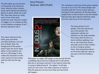
Poster Analysis
Chloe Baker.
The red letters at the top of the poster catches
our eye as its in red. This shows danger and
connotes with the ‘horror movie’ persona.
Having all of the producers at the top means
people have to look at them to see the release
date but they dont take the attention away
from the main focus of the characters.
The main picture is of 3
people. The main person we
see is the woman. Her
expression catches our
attention as she looks shocked.
This shows that the film is a
horror without spelling it out
for us. Her protective stance
also tells us she is their mother
as she is trying to protect
them. Also having Rose Byrne
on the front adds star value as
she was in the first Insidious
film.
The poster is a slight cliff hanger as we can see she has
a wedding ring on but her husband isn't in the photo.
Also she is carrying a hammer in her hand to show she
is trying to defend herself. The tagline ‘It will take
what you love most’ also adds suspense as it gives a
little bit away but not too much that we know what
will happen.
The colour scheme of red,
black, grey and white
connotes darkness, evil and
fear of death. Also, the
background of the poster
doesn't give too much away
either so the audience are
left on a cliff hanger It also
makes the characters on the
cover stand out more along
with the title and the tag
line.
The title takes up a lot of room
on the poster as to stand out
more. Also the colour choices
show red for blood and white for
ghosts or spirits which are in the
film. Also they stand our really
well in front of the dark
mysterious wall. Also the number
2 is bigger as it is a follow up film,
so the audience recognise it and
become excited to see it.
Sony Pictures.
Revenue: $83,574,831
Plan B is a famous singer. Having
his name on the poster for this
film automatically adds star value
and more people will come and
see it.
The main image is of one of the
main characters. His pose is solid
and shows us that the films is
gritty and he is important.
However the estate around his
seems to be rising above him. This
leads us to believe he is actually
intimidated by this.
The tag line at the top of the poster is
in dark writing against the lightest past
of the poster. This makes it stand out a
little bit more and we pay attention to
it.
The reviews on the front make
people believe the film is more
worth while and want to see it
more. Even if they don’t actually
read what the reviews say, they
can clearly see the 5 stars above
one.
The colour scheme of the poster is
grey and dark. This emphasises the
seriousness of the film and
reminding the audience that its a
serious film and is addressing real
life issues
The use of the gun in the poster shows a lot about
the story line. It tells us there will be violence and
that we need to expect it. Also, putting the gun over
the writing makes it stand out more as it contrasts
with the write letters.
The title of the film is big on the
poster. This is so it stands out. Also it
being white, stands out against the
dark colours of the rest of the
poster. All of the writing they want
to stand out is in white on this
poster, the rest is in black. This
means they want the audience to
notice what is written.

Poster Analysis

  • 1.
  • 2.
    The red lettersat the top of the poster catches our eye as its in red. This shows danger and connotes with the ‘horror movie’ persona. Having all of the producers at the top means people have to look at them to see the release date but they dont take the attention away from the main focus of the characters. The main picture is of 3 people. The main person we see is the woman. Her expression catches our attention as she looks shocked. This shows that the film is a horror without spelling it out for us. Her protective stance also tells us she is their mother as she is trying to protect them. Also having Rose Byrne on the front adds star value as she was in the first Insidious film. The poster is a slight cliff hanger as we can see she has a wedding ring on but her husband isn't in the photo. Also she is carrying a hammer in her hand to show she is trying to defend herself. The tagline ‘It will take what you love most’ also adds suspense as it gives a little bit away but not too much that we know what will happen. The colour scheme of red, black, grey and white connotes darkness, evil and fear of death. Also, the background of the poster doesn't give too much away either so the audience are left on a cliff hanger It also makes the characters on the cover stand out more along with the title and the tag line. The title takes up a lot of room on the poster as to stand out more. Also the colour choices show red for blood and white for ghosts or spirits which are in the film. Also they stand our really well in front of the dark mysterious wall. Also the number 2 is bigger as it is a follow up film, so the audience recognise it and become excited to see it. Sony Pictures. Revenue: $83,574,831
  • 3.
    Plan B isa famous singer. Having his name on the poster for this film automatically adds star value and more people will come and see it. The main image is of one of the main characters. His pose is solid and shows us that the films is gritty and he is important. However the estate around his seems to be rising above him. This leads us to believe he is actually intimidated by this. The tag line at the top of the poster is in dark writing against the lightest past of the poster. This makes it stand out a little bit more and we pay attention to it. The reviews on the front make people believe the film is more worth while and want to see it more. Even if they don’t actually read what the reviews say, they can clearly see the 5 stars above one. The colour scheme of the poster is grey and dark. This emphasises the seriousness of the film and reminding the audience that its a serious film and is addressing real life issues The use of the gun in the poster shows a lot about the story line. It tells us there will be violence and that we need to expect it. Also, putting the gun over the writing makes it stand out more as it contrasts with the write letters. The title of the film is big on the poster. This is so it stands out. Also it being white, stands out against the dark colours of the rest of the poster. All of the writing they want to stand out is in white on this poster, the rest is in black. This means they want the audience to notice what is written.