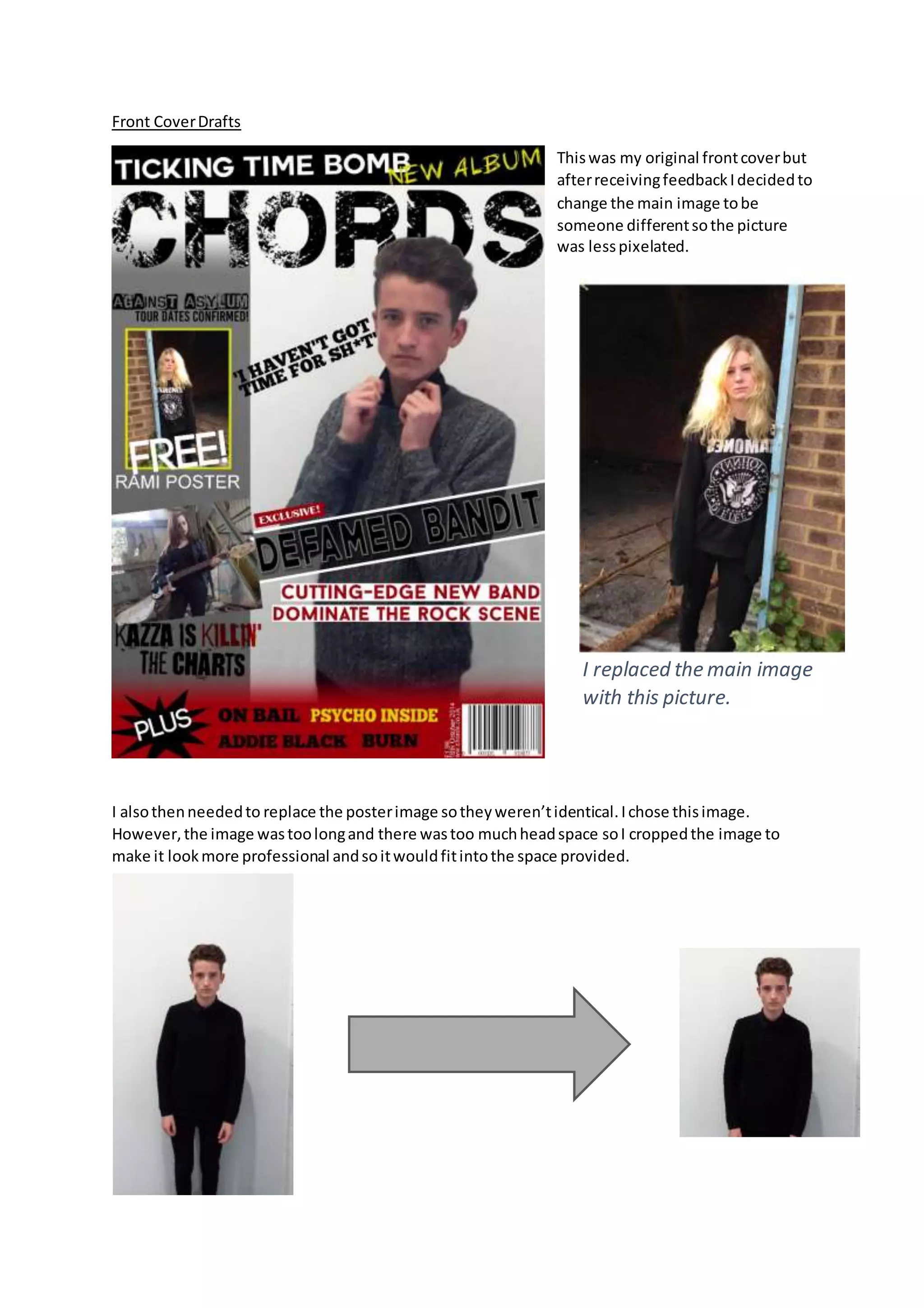
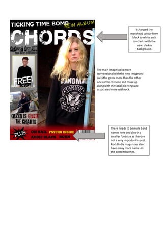
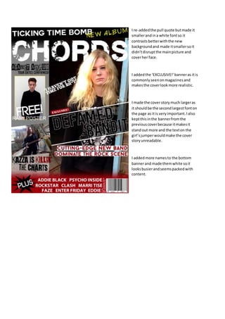
Front Cover Drafts 
This was my original front cover but 
after receiving feedback I decided to 
change the main image to be 
someone different so the picture 
was less pixelated. 
I replaced the main image 
with this picture. 
I also then needed to replace the poster image so they weren’t identical. I chose this image. 
However, the image was too long and there was too much head space so I cropped the image to 
make it look more professional and so it would fit into the space provided.
I changed the 
masthead colour from 
black to white so it 
contrasts with the 
new, darker 
background. 
The main image looks more 
conventional with the new image and 
suits the genre more than the other 
one as the costume and makeup 
along with the facial piercings are 
associated more with rock. 
There needs to be more band 
names here and also in a 
smaller font size as they are 
not a very important aspect. 
Rock/Indie magazines also 
have many more names in 
the bottom banner.
I re-added the pull quote but made it 
smaller and in a white font so it 
contrasts better with the new 
background and made it smaller so it 
didn’t disrupt the main picture and 
cover her face. 
I added the ‘EXCLUSIVE!’ banner as it is 
commonly seen on magazines and 
makes the cover look more realistic. 
I made the cover story much larger as 
it should be the second largest font on 
the page as it is very important. I also 
kept this in the banner from the 
previous cover because it makes it 
stand out more and the text on the 
girl’s jumper would make the cover 
story unreadable. 
I added more names to the bottom 
banner and made them white so it 
looks busier and seems packed with 
content.

Front cover drafts

  • 1.
    Front Cover Drafts This was my original front cover but after receiving feedback I decided to change the main image to be someone different so the picture was less pixelated. I replaced the main image with this picture. I also then needed to replace the poster image so they weren’t identical. I chose this image. However, the image was too long and there was too much head space so I cropped the image to make it look more professional and so it would fit into the space provided.
  • 2.
    I changed the masthead colour from black to white so it contrasts with the new, darker background. The main image looks more conventional with the new image and suits the genre more than the other one as the costume and makeup along with the facial piercings are associated more with rock. There needs to be more band names here and also in a smaller font size as they are not a very important aspect. Rock/Indie magazines also have many more names in the bottom banner.
  • 3.
    I re-added thepull quote but made it smaller and in a white font so it contrasts better with the new background and made it smaller so it didn’t disrupt the main picture and cover her face. I added the ‘EXCLUSIVE!’ banner as it is commonly seen on magazines and makes the cover look more realistic. I made the cover story much larger as it should be the second largest font on the page as it is very important. I also kept this in the banner from the previous cover because it makes it stand out more and the text on the girl’s jumper would make the cover story unreadable. I added more names to the bottom banner and made them white so it looks busier and seems packed with content.