As you can see from the screen shots that I have
made to show how I have continued to use the
same fonts and similar colours between my
Magazine front cover, Poster and Film Trailer.
Although the top masthead has a white
background it uses the same coloured text and the
same font through all the products. I wanted to
make sure that they were the same throughout so
they linked together and looked professional with
them all being matching when put next to each
other. Having them all the same fonts and styles
ensures that the audience are familiar with what
the film is called and each type of promotional
material that is given with the horror film is the
same. The film name is the most popular and
talked about feature that makes up the
production. Although the film trailer title only has
capital letters at the beginning of each word, this
still stands out and links with the others because
of the background it has been placed with.
Although because of the editing some of the
images look different, but you can clearly tell that
the same main character is being used throughout
all the products. Having the same main character
featured on the magazine front cover, poster and
film trailer shows to the audience the consistency
of the production and enables them all to
intervene with each other. Straight away without
seeing the film trailer having the poster and
magazine front cover with the same character on
enables the audience to remember her and
understand straight away that she is the main
character and suspects that something happens to
her. The innocence of the young girl is continue
throughout which is something I wanted to
ensure because she is a young girl. As well as this
if the character has been seen in previous
successful films this will entice viewers to watch
the film because of the actress this relates back to
the Dyer Star theory.
The different colours I used in my front cover,
poster and film trailer we very much the
same. As I am relating back to the horror
genre I wanted to use dark colours which
connotes the word horror. When you think of
horror you typically think of blacks, deep
reds, greys, whites, browns and yellows. For
this reason I wanted to include these into
each of my production pieces. Having this
colour schemes allows me to make the
atmosphere created in a dark thrilling way.
The use of colours like the red may suggest to
the audience that there will be blood in the
film so having these colours put in place and
continued through each section gives the
audience an incline of what the storyline may
involve. The darker colours could give off the
fear factor and the mystery of unknown to
the audience.

How are you ensuring continuality of fonts and colours between the magazine, trailer and poster?

  • 2.
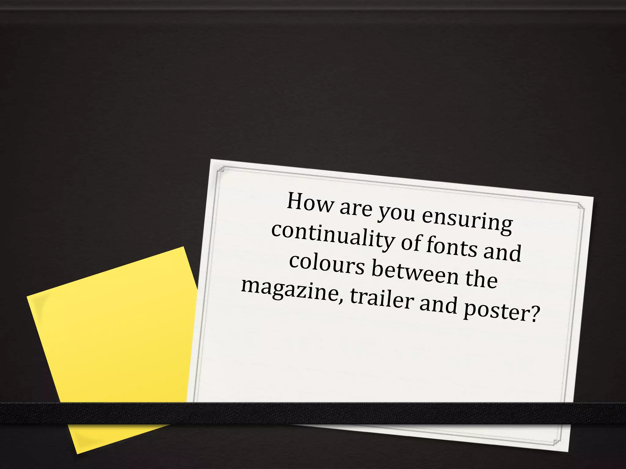
    As you cansee from the screen shots that I have made to show how I have continued to use the same fonts and similar colours between my Magazine front cover, Poster and Film Trailer. Although the top masthead has a white background it uses the same coloured text and the same font through all the products. I wanted to make sure that they were the same throughout so they linked together and looked professional with them all being matching when put next to each other. Having them all the same fonts and styles ensures that the audience are familiar with what the film is called and each type of promotional material that is given with the horror film is the same. The film name is the most popular and talked about feature that makes up the production. Although the film trailer title only has capital letters at the beginning of each word, this still stands out and links with the others because of the background it has been placed with.
  • 3.
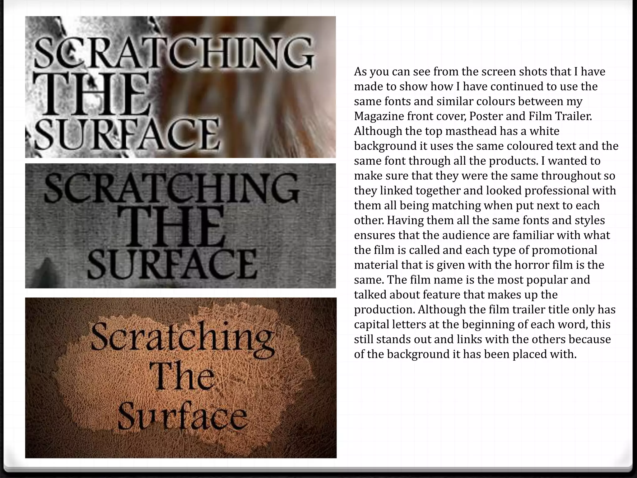
    Although because ofthe editing some of the images look different, but you can clearly tell that the same main character is being used throughout all the products. Having the same main character featured on the magazine front cover, poster and film trailer shows to the audience the consistency of the production and enables them all to intervene with each other. Straight away without seeing the film trailer having the poster and magazine front cover with the same character on enables the audience to remember her and understand straight away that she is the main character and suspects that something happens to her. The innocence of the young girl is continue throughout which is something I wanted to ensure because she is a young girl. As well as this if the character has been seen in previous successful films this will entice viewers to watch the film because of the actress this relates back to the Dyer Star theory.
  • 4.
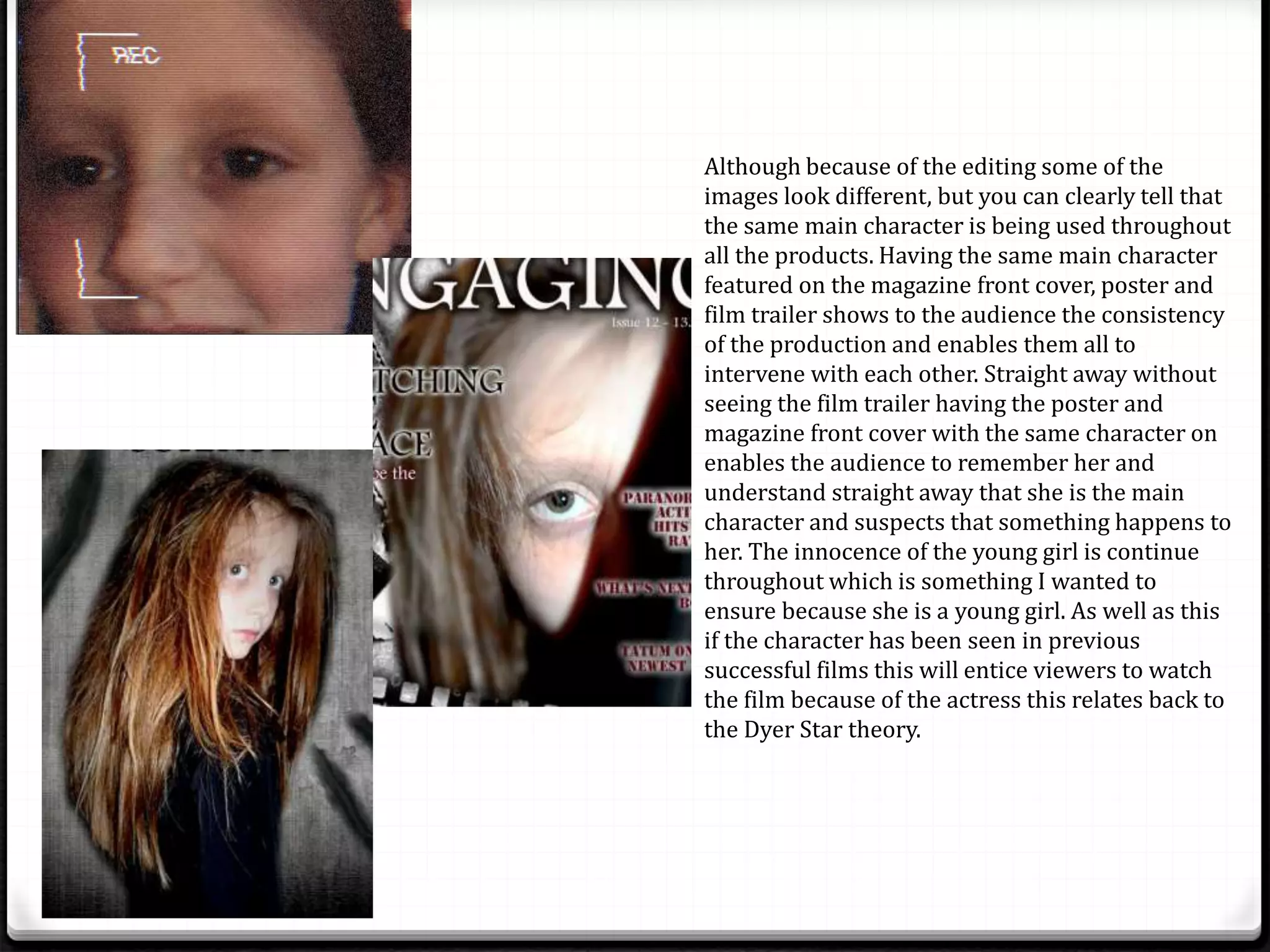
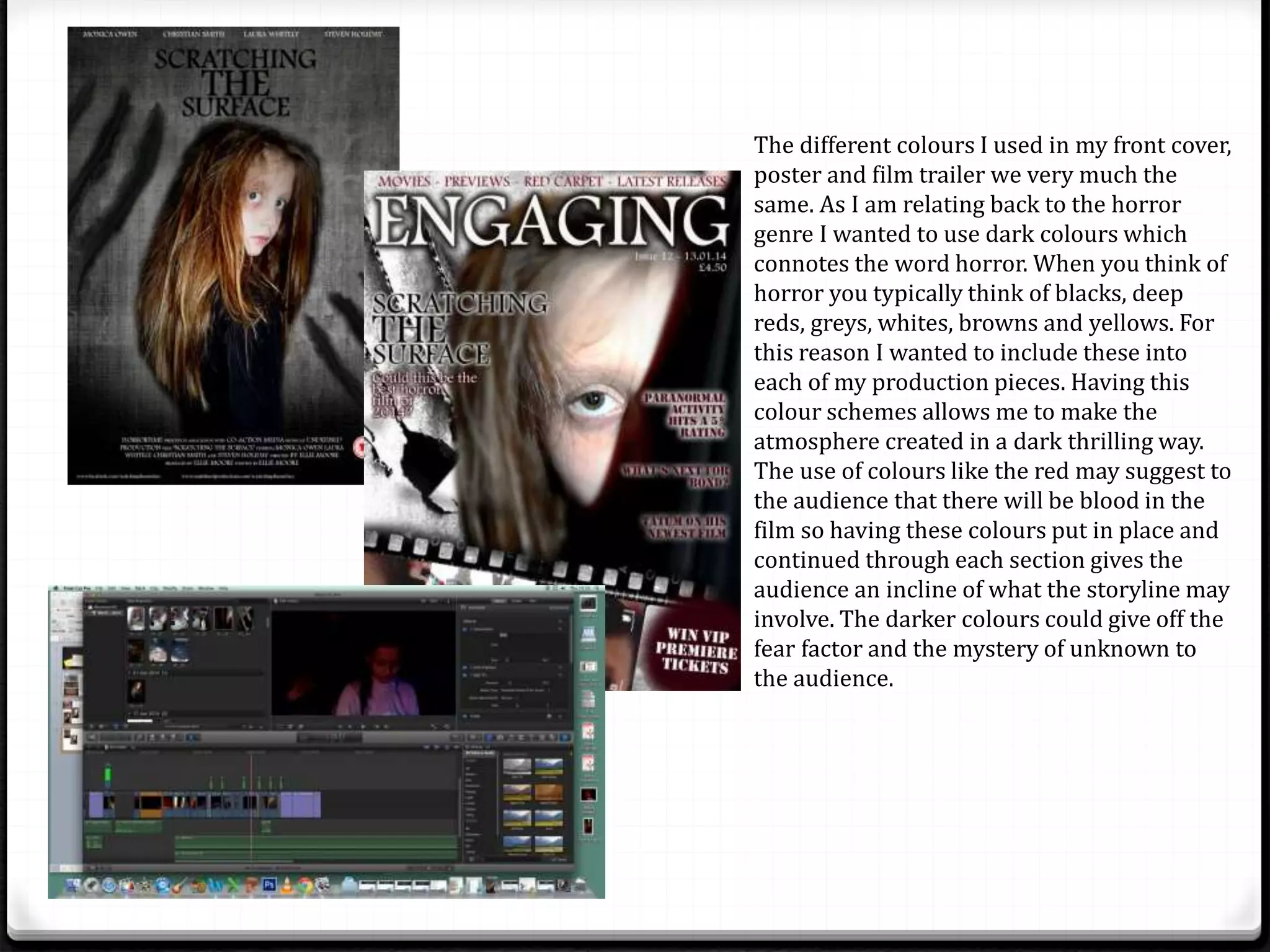
    The different coloursI used in my front cover, poster and film trailer we very much the same. As I am relating back to the horror genre I wanted to use dark colours which connotes the word horror. When you think of horror you typically think of blacks, deep reds, greys, whites, browns and yellows. For this reason I wanted to include these into each of my production pieces. Having this colour schemes allows me to make the atmosphere created in a dark thrilling way. The use of colours like the red may suggest to the audience that there will be blood in the film so having these colours put in place and continued through each section gives the audience an incline of what the storyline may involve. The darker colours could give off the fear factor and the mystery of unknown to the audience.