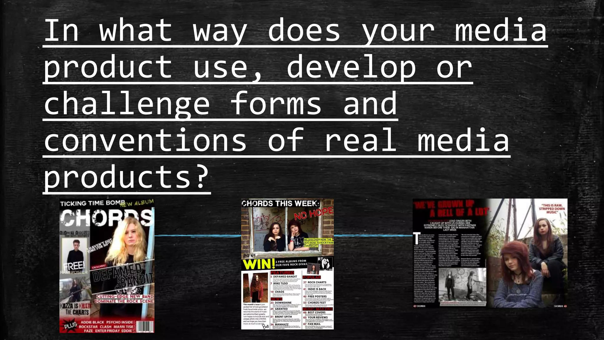
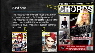
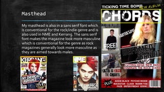
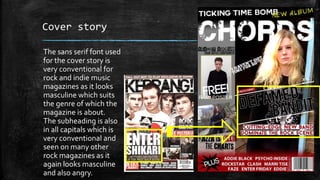
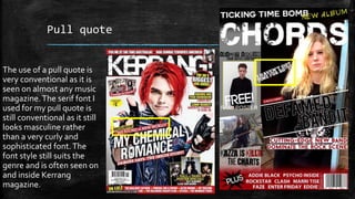
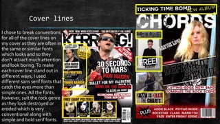
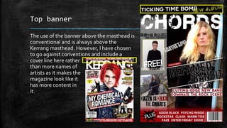
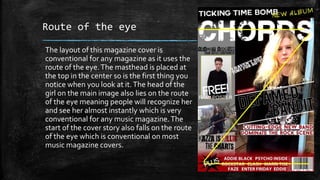
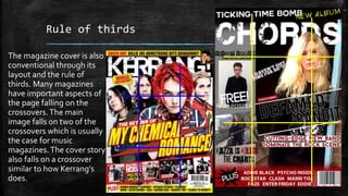
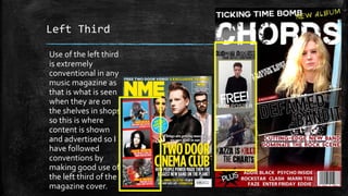
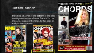
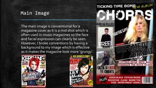
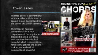
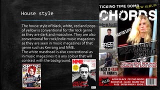
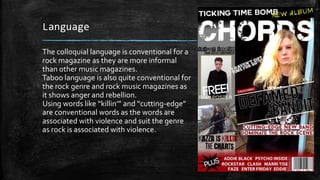
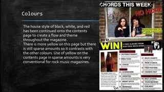
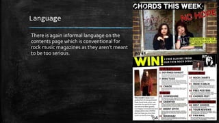
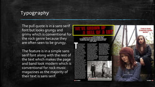
The document discusses the conventions used in the design of a mock rock music magazine cover and contents. It summarizes how elements like the masthead, cover lines, images, layout, typography, and language employ conventions of existing rock magazines like Kerrang and NME while also breaking some conventions. For example, the placement and styling of the masthead, use of sans-serif fonts, rule of thirds layout, and informal language are all conventional, though some images introduce unconventional backgrounds and the banner includes a cover line rather than artist names. Overall, the magazine draws from real conventions but also challenges some expectations.