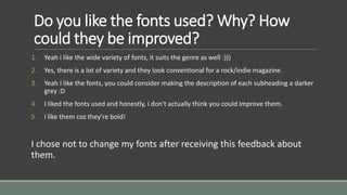
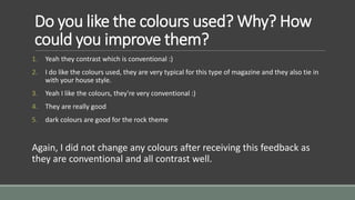
Contents Page Feedback 
RECEIVING FEEDBACK ON MY CONTENTS PAGE IN ORDER TO 
IMPROVE IT.
Do you like the fonts used? Why? How 
could they be improved? 
1. Yeah i like the wide variety of fonts, it suits the genre as well :))) 
2. Yes, there is a lot of variety and they look conventional for a rock/indie magazine. 
3. Yeah I like the fonts, you could consider making the description of each subheading a darker 
grey :D 
4. I liked the fonts used and honestly, i don't actually think you could improve them. 
5. i like them coz they're bold! 
I chose not to change my fonts after receiving this feedback about 
them.
Do you like the colours used? Why? How 
could you improve them? 
1. Yeah they contrast which is conventional :) 
2. I do like the colours used, they are very typical for this type of magazine and they also tie in 
with your house style. 
3. Yeah I like the colours, they're very conventional :) 
4. They are really good 
5. dark colours are good for the rock theme 
Again, I did not change any colours after receiving this feedback as 
they are conventional and all contrast well.
Do you like the layout? Why? How could it 
be improved? 
1. Yeah because it looks like a rock magazine 
2. Yeah, it is very 'KERRANG' style and I think the layout is both conventional and suitable for 
your magazine. 
3. Yes the layout is great :) don't change anything!:D 
4. Its really conventional to a music magazine and it can't be improved as it is as good as it 
could get 
5. yes! it's busy & conventional, looks professional 
The feedback informs me that the layout is conventional and busy, 
which is what I was aiming for.
Do you like the language used? Why? 
How could you improve the language? 
1. yes 
2. Yes, the language used helps to identify the genre of your magazine. You have included the 
words 'indie' and 'rock' which helps signify your genre of magazine. 
3. Yes :) it's very conventional and descriptive 
4. TBH, i only skimmed it but it is quite good from what i read 
5. yeah it's informal & relaxed, 
The feedback indicates the language does not need improving.
Do you like the images used? Why? How 
would you improve the images? 
1. yes the variety is sick 
2. Yes, the technical elements within the photo clearly portray your genre and look really 
professional. 
3. Yes, I especially like the image at the top :) 
4. I like the images, although they are posed they don't really look it 
5. they're fun, & not like plain 
This feedback tells me the images are good and do not need to be 
changed.
Do you think the Contents Page looks 
conventional? Why? Is there any way I could 
make it look more conventional? 
1. yeah :) 
2. Yeah I do, I really like the layout, use of cinematography and everything really! I don't think it 
needs to be improved! :) 
3. Yes, you use columns, images and make good use of subheadings, and you also include the 
editors letter, there's nothing really you could do to make it more conventional :) 
4. Yes it does and i don't really think so yes, the images, fonts & layout are conventional & if you 
saw it om a shelf you wouldn't think it was done by a student!! the one thing i don't like 
about it is the shape with the page number in 
I will remove the shape behind the page number on the main image.

Contents page feedback

  • 1.
    Contents Page Feedback RECEIVING FEEDBACK ON MY CONTENTS PAGE IN ORDER TO IMPROVE IT.
  • 2.
    Do you likethe fonts used? Why? How could they be improved? 1. Yeah i like the wide variety of fonts, it suits the genre as well :))) 2. Yes, there is a lot of variety and they look conventional for a rock/indie magazine. 3. Yeah I like the fonts, you could consider making the description of each subheading a darker grey :D 4. I liked the fonts used and honestly, i don't actually think you could improve them. 5. i like them coz they're bold! I chose not to change my fonts after receiving this feedback about them.
  • 3.
    Do you likethe colours used? Why? How could you improve them? 1. Yeah they contrast which is conventional :) 2. I do like the colours used, they are very typical for this type of magazine and they also tie in with your house style. 3. Yeah I like the colours, they're very conventional :) 4. They are really good 5. dark colours are good for the rock theme Again, I did not change any colours after receiving this feedback as they are conventional and all contrast well.
  • 4.
    Do you likethe layout? Why? How could it be improved? 1. Yeah because it looks like a rock magazine 2. Yeah, it is very 'KERRANG' style and I think the layout is both conventional and suitable for your magazine. 3. Yes the layout is great :) don't change anything!:D 4. Its really conventional to a music magazine and it can't be improved as it is as good as it could get 5. yes! it's busy & conventional, looks professional The feedback informs me that the layout is conventional and busy, which is what I was aiming for.
  • 5.
    Do you likethe language used? Why? How could you improve the language? 1. yes 2. Yes, the language used helps to identify the genre of your magazine. You have included the words 'indie' and 'rock' which helps signify your genre of magazine. 3. Yes :) it's very conventional and descriptive 4. TBH, i only skimmed it but it is quite good from what i read 5. yeah it's informal & relaxed, The feedback indicates the language does not need improving.
  • 6.
    Do you likethe images used? Why? How would you improve the images? 1. yes the variety is sick 2. Yes, the technical elements within the photo clearly portray your genre and look really professional. 3. Yes, I especially like the image at the top :) 4. I like the images, although they are posed they don't really look it 5. they're fun, & not like plain This feedback tells me the images are good and do not need to be changed.
  • 7.
    Do you thinkthe Contents Page looks conventional? Why? Is there any way I could make it look more conventional? 1. yeah :) 2. Yeah I do, I really like the layout, use of cinematography and everything really! I don't think it needs to be improved! :) 3. Yes, you use columns, images and make good use of subheadings, and you also include the editors letter, there's nothing really you could do to make it more conventional :) 4. Yes it does and i don't really think so yes, the images, fonts & layout are conventional & if you saw it om a shelf you wouldn't think it was done by a student!! the one thing i don't like about it is the shape with the page number in I will remove the shape behind the page number on the main image.