
Recommended
More Related Content
What's hot
What's hot (20)
Similar to Ancillary products
Similar to Ancillary products (20)
More from jphibbert
More from jphibbert (20)
Recently uploaded
Recently uploaded (20)
Ancillary products
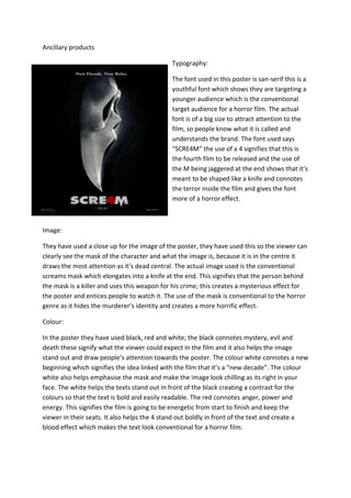
- 1. Ancillary products Typography: The font used in this poster is san-serif this is a youthful font which shows they are targeting a younger audience which is the conventional target audience for a horror film. The actual font is of a big size to attract attention to the film, so people know what it is called and understands the brand. The font used says “SCRE4M” the use of a 4 signifies that this is the fourth film to be released and the use of the M being jaggered at the end shows that it’s meant to be shaped like a knife and connotes the terror inside the film and gives the font more of a horror effect. Image: They have used a close up for the image of the poster, they have used this so the viewer can clearly see the mask of the character and what the image is, because it is in the centre it draws the most attention as it’s dead central. The actual image used is the conventional screams mask which elongates into a knife at the end. This signifies that the person behind the mask is a killer and uses this weapon for his crime; this creates a mysterious effect for the poster and entices people to watch it. The use of the mask is conventional to the horror genre as it hides the murderer’s identity and creates a more horrific effect. Colour: In the poster they have used black, red and white; the black connotes mystery, evil and death these signify what the viewer could expect in the film and it also helps the image stand out and draw people’s attention towards the poster. The colour white connotes a new beginning which signifies the idea linked with the film that it’s a “new decade”. The colour white also helps emphasise the mask and make the image look chilling as its right in your face. The white helps the texts stand out in front of the black creating a contrast for the colours so that the text is bold and easily readable. The red connotes anger, power and energy. This signifies the film is going to be energetic from start to finish and keep the viewer in their seats. It also helps the 4 stand out boldly in front of the text and create a blood effect which makes the text look conventional for a horror film.
- 2. Layout: The image is in the central is it’s the most important part of the poster, it’s use of being in the centre helps emphasise the poster and draw viewers to the poster which creates brand awareness. The text at the bottom is in bold with a lot of space so that it’s a big size to attract viewers to the posters. The use of the smaller text at the top helps reveal where they are in the film (a new decade) the use of it being at the top is that it’s not as important as the film name and image so it requires a smaller size. Conventions of form and genre: The conventions of genre: This poster is conventional to the horror genre because the character on the front has a knife attached to his mask which is conventional to the genre because horror films have masks to make the villains more mysterious and horrific and the use of a weapon in the poster is also conventional as most villains wield weapons to spark terror in their victims. The use of colours is also conventional as they signify aggression and mystery which is the conventional colours for a horror film. Conventions of form: They have used an image which relates to the film is conventional for a film poster, the use of the film name and tagline are also conventional parts for a poster and signify what the film is called and what the location is. The use of the date used in the poster identifies when the film is released and the use of the studios being shown shows that produced the film.
- 3. Typography: They have used a serif font this is because the film is meant to look like it’s set in previous years, the use of the serif font helps create a less modern effect and more of an older more historic effect. They have used a large size font to help generate a bold title which will attract people to the poster and so they can identify the film name. The use of the smaller text across the top stating “from the director of Saw and Insidious” reveals to the audience it is a similar film to saw and insidious which draw people to watch it as they want to see if it relates to these type of films. Image: They have used women in a rocking chair holding a small doll, this reveals that the doll may be the haunted character and the other characters are blissfully unaware of this which creates a chilling effect. The use of the doll creates a creepier of effect and signifies that a childish element may be applied in the film as they are linked with children. They have used a wide shot so you can see the whole of the image and see the whole of the image, the image is positioned in the centre again so it draws attention to the film. The use of the doll looking towards the viewer and the women looking forwards shows the doll has a mind of its own which creates a creepy effect. Colour: They have used dark colours such as black and brown which signifies the old setting and also makes the image look threatening as its dark and connotes the evil in the film. The use of the white font helps make the writing bold in front of the dark colours and creates a clear contrast between the 2 colours to emphasise the film name and the text around the poster. The doll is dressed in white so that she stands out in front of the dark colours and so she catches the viewers’ attention which creates a chilling effect as dolls create a childish creepy effect.
- 4. Layout: The use of the women in the chair and the doll in the centre creates an effect of isolation and signifies that they are on their own and creates a horrific effect as there is no one around which connotes they are in trouble. They have also followed the route of eye approach which starts from the tagline and then it goes across the picture and then across the bottom text. This is conventional for a poster as it shows where the viewer will read first. Conventions of form and genre: Conventions of genre: They have used a doll which is a conventional prop for a horror film as they create a creepy effect and create more horror in the film; they have also used conventional horror colours in their posters to create a better effect. They have used a contrast of dark and white colours to help make the text stand out and create a feel of evil and isolation to their viewers. Conventions of form: They have used a tagline at the top which is conventional for a poster as it’s a sentence about what the film is about. They have also used an image which relates to the film which is also conventional for a poster. They have also used text at the bottom which displays the studios, the release date and the film name which is again conventional items for a poster to have to achieve maximum awareness.